Kalon Entry "1" by mikey

Based on Click to view
Artist mikey [gallery]
Time spent 2 hours, 33 minutes
Drawing sessions 4
19 people like this Log in to vote for this drawing

Kalon Entry "1"

Postby mikey » Fri Jul 14, 2017 8:45 pm

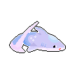
    I've decided to redo my entries again. I would allow this to be open for myo's but I really like this one.. So I'm gonna keep her. ;;v;;

    Critique is very welcome, as I'd love to improve!
Image


      hal/mikey ; he/him ; lesbian
      kinda inactive - rentry
      ‎ ‎ ‎ ‎ ‎ ‎ ‎‎ ‎‎ ‎ ‎ ‎ ‎ ‎ ‎ ‎ ‎ Image
User avatar
mikey
 
Posts: 5595
Joined: Wed Oct 12, 2016 6:37 pm
My pets
My items
My wishlist
My gallery
My scenes
My dressups
Trade with me

Re: Kalon Entry "1"

Postby Silver Pandorica » Sat Jul 15, 2017 1:48 am

Ooh, I love this!
Image
Hi, I'm Silver! Local socially
awkward English nerd, cat
lover, co-owner of floravits,
and Animal Crossing fan.
♡♡♡
art threadtrade thread
avatar credpixel cred
Image
Image
User avatar
Silver Pandorica
 
Posts: 39910
Joined: Sat Dec 19, 2015 11:27 am
My pets
My items
My wishlist
My gallery
My scenes
My dressups
Trade with me

Re: Kalon Entry "1"

Postby mikey » Sat Jul 15, 2017 2:10 am

Silver Pandorica wrote:Ooh, I love this!

    Ohh my thank you so much, that means a lot to me ;; v ;;
Image


      hal/mikey ; he/him ; lesbian
      kinda inactive - rentry
      ‎ ‎ ‎ ‎ ‎ ‎ ‎‎ ‎‎ ‎ ‎ ‎ ‎ ‎ ‎ ‎ ‎ Image
User avatar
mikey
 
Posts: 5595
Joined: Wed Oct 12, 2016 6:37 pm
My pets
My items
My wishlist
My gallery
My scenes
My dressups
Trade with me

kalon entry '1'

Postby lavah » Sat Jul 15, 2017 2:54 am

might i suggest making the tail more.. fluffy? it looks a bit thin at the end around the shine, and if you were kind of going for a dog-like curled tail, it should be fluffier. (it's really hard drawing that on oekaki from my experience though- especially on kal lines) also! possibly colour the inside lines of the hair? (pm me if you don't know what i'm on about otl) because i found loads of black lines to be kind of messy looking.

i honestly struggled to give a few pointers in this because i really like it?? good job!!
Image
User avatar
lavah
 
Posts: 281
Joined: Sat Dec 24, 2016 5:01 am
My pets
My items
My wishlist
My gallery
My scenes
My dressups
Trade with me

Re: Kalon Entry "1"

Postby Unleashed Squiid » Sat Jul 15, 2017 3:02 am

Ah, she looks really precious! c: What a doll. I hope you don't mind if I do some critique? ;;

Stylistically, it looks pretty nice. It appears you have a straight (meaning not blended) style, which is fine, however what a lot of artists find when they do this is that the picture looks 'flat' so to say. What they do is add layers to the design which can be done in ways such as Having a blend of colors underneath the straight design (for the base), or introducing a complex design to the pattern where it is needed. (but notice that the black still is shaded into multiple undertones underneath the straight circles where it is less complicated.)

I do like the colors as they all seem to work, although they've contrast between the green could be a tiny bit more (even for pastel), as it is almost hard to see? This is a stylistic thing though so you don't have to worry too hard about it. I believe that if there was more depth as stated above, it would actually help your colors to pop more? ^^

Another point in question would be your lineart. It looks good, especially that eye, wow, although you can see a bit of shakiness at the base of the hair, and the top of the tail. I'm not sure if you already are doing this, but an easy was to help this is by setting your pen to about 50% smoothing? Lastly, you could add a bit more detail into the hair. (Also keep the pen at the same setting and don't overlap. You want all your lines to look the same.) if you would like, you could also try coloring your lineart? With lighter designs, it helps it to not look so bold. (Color is another stylistic thing. Not as important)

Now to the positives! c;
The shading, and light in the hair looks really nicely done! I also really like (as said before) the eye. It is literal perfection. ^^

The color choice and stripey design compliments the shape of lineart, and I also like the shapes of the hair and tail. This means that you seem to have a good artistic mind, so you defiantly have potential! Keep up the good work, it definitely looks lovely. <3

Sorry if it sounds like I'm picking it apart. I do hope it helped though? I know it sounds like a lot, but it really wasn't. Your design overall was awesome! Good job! .A.
Last edited by Unleashed Squiid on Sat Jul 15, 2017 3:10 am, edited 1 time in total.
Squid || She/Her || ENFP || Kals
Image hello I am tiny and you can’t read me! :) Imagehello I am font and you can’t read me! :) Image
User avatar
Unleashed Squiid
 
Posts: 7484
Joined: Tue Aug 09, 2016 10:48 am
My pets
My items
My wishlist
My gallery
My scenes
My dressups
Trade with me

Re: kalon entry '1'

Postby mikey » Sat Jul 15, 2017 3:10 am

lavah wrote:might i suggest making the tail more.. fluffy? it looks a bit thin at the end around the shine, and if you were kind of going for a dog-like curled tail, it should be fluffier. (it's really hard drawing that on oekaki from my experience though- especially on kal lines) also! possibly colour the inside lines of the hair? (pm me if you don't know what i'm on about otl) because i found loads of black lines to be kind of messy looking.

i honestly struggled to give a few pointers in this because i really like it?? good job!!


Thank you! I see what you mean with the hair line colour and tail. I'll fix them soon <3
Image


      hal/mikey ; he/him ; lesbian
      kinda inactive - rentry
      ‎ ‎ ‎ ‎ ‎ ‎ ‎‎ ‎‎ ‎ ‎ ‎ ‎ ‎ ‎ ‎ ‎ Image
User avatar
mikey
 
Posts: 5595
Joined: Wed Oct 12, 2016 6:37 pm
My pets
My items
My wishlist
My gallery
My scenes
My dressups
Trade with me

Re: Kalon Entry "1"

Postby mikey » Sat Jul 15, 2017 3:13 am

Unleashed Squid wrote:Ah, she looks really precious! c: What a doll. I hope you don't mind if I do some critique? ;;

Stylistically, it looks pretty nice. It appears you have a straight (meaning not blended) style, which is fine, however what a lot of artists find when they do this is that the picture looks 'flat' so to say. What they do is add layers to the design which can be done in ways such as Having a blend of colors underneath the straight design (for the base), or introducing a complex design to the pattern where it is needed. (but notice that the black still is shaded into multiple undertones underneath the straight circles where it is less complicated.)

I do like the colors as they all seem to work, although they've contrast between the green could be a tiny bit more (even for pastel), as it is almost hard to see? This is a stylistic thing though so you don't have to worry too hard about it. I believe that if there was more depth as stated above, it would actually help your colors to pop more? ^^

Another point in question would be your lineart. It looks good, especially that eye, wow, although you can see a bit of shakiness at the base of the hair, and the top of the tail. I'm not sure if you already are doing this, but an easy was to help this is by setting your pen to about 50% smoothing? Lastly, you could add a bit more detail into the hair. (Also keep the pen at the same setting and don't overlap. You want all your lines to look the same.) if you would like, you could also try coloring your lineart? With lighter designs, it helps it to not look so bold. (Color is another stylistic thing. Not as important)

Now to the positives! c;
The shading, and light in the hair looks really nicely done! I also really like (as said before) the eye. It is literal perfection. ^^

The color choice and stripey design compliments the shape of lineart, and I also like the shapes of the hair and tail. This means that you seem to have a good artistic mind, so you defiantly have potential! Keep up the good work, it definitely looks lovely. <3

Sorry if it sounds like I'm picking it apart. I do hope it helped though? I know it sounds like a lot, but it really wasn't. Your design overall was awesome! Good job! .A.


Thank you so much. All the information you have given me is greatly helpful. I'm going to fix up some of the line art after yours and lavah's helpful critiquing. Thank you!!
Image


      hal/mikey ; he/him ; lesbian
      kinda inactive - rentry
      ‎ ‎ ‎ ‎ ‎ ‎ ‎‎ ‎‎ ‎ ‎ ‎ ‎ ‎ ‎ ‎ ‎ Image
User avatar
mikey
 
Posts: 5595
Joined: Wed Oct 12, 2016 6:37 pm
My pets
My items
My wishlist
My gallery
My scenes
My dressups
Trade with me

Who is online

Users browsing this forum: No registered users and 24 guests