Veins of Opal - oh cool, a Fae from Kingdom of Amalur! Very nice, your painting is really good. For colour, I am wondering if adding a bit of the purplish or a bluish colour for the shadows might look good, your shadows look rather blackish thus far. For the hair, try lots of thin brush strokes or downloading a brush for hair to get a more realistic look there. But overall he looks really great x3
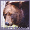
Capone - Nice and fluffy, and he looks very happy! The paws on the left side of the picture look like they are bent backwards though, they should be facing the other way or more towards the viewer. The shading looks nice, you might like to add a bit under the neck perhaps, on the chest to emphasise all that wonderful fluff, and a bit more on the back legs too, but overall it looks really nice c:
H&W - Impressive picture! Very nice. With the wings, the lines look a bit wobbly; the body linework looks much better by comparison. It looks like you worked very hard on the body but were tired by the time you got to the wings? You put a lot more shading on the body than the wings too. Anyway your picture looks really nice overall ^.^
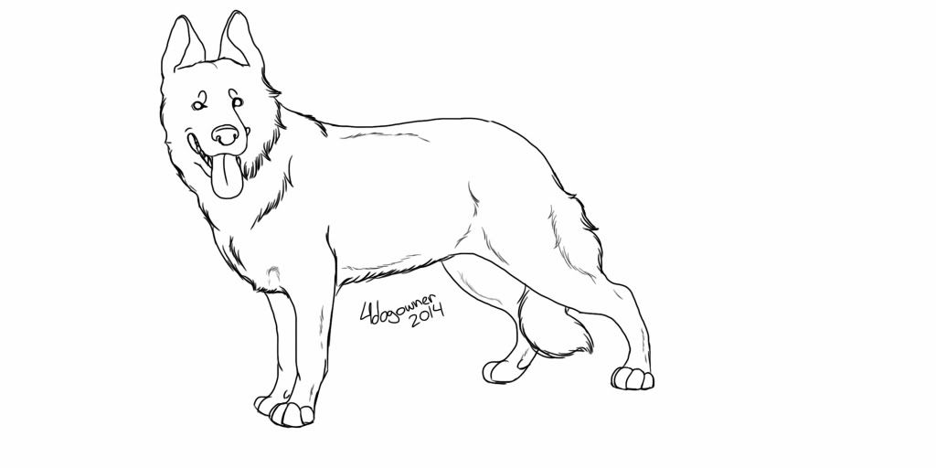
4dogowner - Really nice dog! Very cool. One thing that stands out is that it looks like he has a lot fluffier cheek on his left side (our right as we face him) than the other side. Anyway he looks great, will you colour him? He's very nice c:
-------------------------------------------------
I've decided to make the Dewi lines in Photoshop since I really don't like oekaki, so this is what I've sketched out for the base lines. Any tips or redlines? Particularly with the paws, they look kind of off to me.
This is what they are based off.

 The ears look kinda wonky to me so if you have suggestions for those too that'd be great!


