frogfan wrote:wanted to add an update with some of the visual change suggestions ive seen. ive almost certaintly missed something so please feel free to quote anything i looked over. link to Lacuna's original compilation
want to start this off by saying that visual accessibility is not a one size fits all, and options are ideal. hopefully any visual changes will be toggleable so that anyone can chose what helps them best :3
-a mockup of the star rarity bar on page 50. made by Pyromaniacal. (a later suggestion was to make custom rarities on this system a shooting star, which is very cute to me. This whole stars concept is just really good)
-a color suggestion and mockup from LostInTheEcho on page 58. ill be using the first option because it works the best in my opinion.
-color suggestions from Zeroness using the mockup by LostInTheEcho on page 62. ill be using the colors marked as option number 1 because they work the best in my opinion
- a suggestion to use a bar with numbers in place of shapes on page 40. mockup of what that might look like (forgive me for my art skills lol)
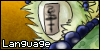
LostInTheEcho Colors
Zeroness colors
-im just gonna copy Lacunas interpretation of my original post because its worded better then i ever couldLacuna wrote:-snip-
There are 3 categories and the colors I suggested are like so: common (blue/green), uncommon (yellow/orange) and rare (red/purple) that take up approximately 1/3 of the bar each. While it can be hard to determine an exact color for people with visual impairment/colorblindness, a section of an approximate color and a symbol is more noticeable. So, if you determine which third you're in a symbol would be used instead of just stars:
- Stars - stay for the OMG rarities
- Square - for the Extremely rarities (a square and an E are a similar shape)
- Triangle (upside down) - for the Very rarities (upside down triangle and V are similar shape)
- Circle - for the plain common, uncommon, and rare labels, which also acts as a divider between rarities
-snip-
i think trying to make a visual for this really helped me understand some issues im having with both my suggestion, and the suggested rarity names, and i hope it can help other people as well
LostInTheEcho colors
Zeroness colors
my takeaways:
youll notice that common and uncommon are both similar in color, and right next to each other, so the circle distinction is doing... well probably more confusion then clarification
it could potentially also be hard to understand and remember that VERY common means MORE common. and VERY uncommon means LESS common. theres not a clear pattern in word usage, (shown at the top of the image) which could make it difficult to understand or remember
im not.. necessarily in the best state of mind to write out my thoughts carfeully and completely, so im trusting someone later on in the forum to help haha! hope this is useful to someone!


Ngl I love the first one (the one with the stars), it looks very nice and adorable ❤️


.png)