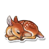
entry 03 by hazama
| Based on | Click to view |
| Artist | hazama [gallery] |
| Time spent | 1 hour, 59 minutes |
| Drawing sessions | 1 |
| 28 people like this | Log in to vote for this drawing |
4 posts
• Page 1 of 1
entry 03
- hazama - they/he
may be very slow at replying to private messages,
if i dont reply i may have forgotten
deviantart
art blog
gorls
fatherwise
-
hazama - Posts: 10038
- Joined: Sat Aug 07, 2010 10:58 am
- My pets
- My items
- My wishlist
- My gallery
- My scenes
- My dressups
- Trade with me
-

lovestruck - Posts: 11089
- Joined: Thu Dec 03, 2015 12:24 am
- My pets
- My items
- My wishlist
- My gallery
- My scenes
- My dressups
- Trade with me
Re: entry 03
hot damn the way you draw hair and eyes and the tongue shading??? teach me your secrets
mmm and the edits flow so nicely too, fits with the lines but still has your own style
alright critiques too
okay but a lot of these are nitpicks and seriously h o w do you do highlights that nice
i'm hype to see more entries from you, the second one especially was super nice 👌
mmm and the edits flow so nicely too, fits with the lines but still has your own style
alright critiques too
- - i'm not sure what the lei's doing? it's placed a little too high so it kinda looks like it's floating instead of sitting on the neck -
the top part should touch where the neck and body meet!
- i'd love to see the blue used a little more extensively! it looks so nice on the eyes and hair, but using it more (part of the shine? the paw pads?) would help unify the design
- the body has a lot of markings, while the head and tail have none - it makes the design look a little unfinished! even just the little dots coming off the stamen being placed under the eye would help
- the shine is a little small??? it'd be cool if it was placed in a way that it showed the shape of the tail - like this one over the top or this one wrapping around or even this one with some three-dimensionality
- okay okay last thing i promise but the markings are pretty stark in contrast to the body, to the point that all of them are fighting to be the focal point - adding them on a layer setting like this kid, using intermediate shades to soften it like this kalon, or limiting the design to certain areas like this beauty would all fix that.
okay but a lot of these are nitpicks and seriously h o w do you do highlights that nice
i'm hype to see more entries from you, the second one especially was super nice 👌

avery • they/them • artist


mostly inactive. yes, i still love my adopts.
mostly inactive. yes, i still love my adopts.
-
nebulavery - Posts: 1358
- Joined: Mon Jan 12, 2015 9:19 am
- My pets
- My items
- My wishlist
- My gallery
- My scenes
- My dressups
- Trade with me
Re: entry 03
diamondfox wrote:I love this entry! And your second!
thank you! :-D
nebulavery wrote:hot damn the way you draw hair and eyes and the tongue shading??? teach me your secrets
mmm and the edits flow so nicely too, fits with the lines but still has your own style
alright critiques too- i'm not sure what the lei's doing? it's placed a little too high so it kinda looks like it's floating instead of sitting on the neck -
the top part should touch where the neck and body meet!
- i'd love to see the blue used a little more extensively! it looks so nice on the eyes and hair, but using it more (part of the shine? the paw pads?) would help unify the design
- the body has a lot of markings, while the head and tail have none - it makes the design look a little unfinished! even just the little dots coming off the stamen being placed under the eye would help
- the shine is a little small??? it'd be cool if it was placed in a way that it showed the shape of the tail - like this one over the top or this one wrapping around or even this one with some three-dimensionality
- okay okay last thing i promise but the markings are pretty stark in contrast to the body, to the point that all of them are fighting to be the focal point - adding them on a layer setting like this kid, using intermediate shades to soften it like this kalon, or limiting the design to certain areas like this beauty would all fix that.
okay but a lot of these are nitpicks and seriously h o w do you do highlights that nice
i'm hype to see more entries from you, the second one especially was super nice 👌
thank you very much haha! as for the critique, i dont want to sound like that one guy who goes "OH IT WAS ALL ON PURPOSE" (we all know that guy, the guy that draws broken anatomy and says its meant to be like that gsdhjgfdjh) but a lot of the things you mentioned i actually tried/didnt work/was actually on purpose haha. the entire design is based on a tacky hawaiian shirt that i saw in an 80s movie lmao which is specifically why the markings heavily contrast ^u^ i actually did try doing that exact thing you mentioned with little parts of the stamen design under the eye but the color combo made it invisible.. and i tried doing what you mentioned with the shine too haha! it was just extremely difficult to wrap around the shape and lines of the tail and still make it look organic so i settled for just making it visible. as for the lei, i figured it would be sitting on the fluff! dense animal fluff doesnt let things fall down haha, its sort of the opposite of that as far as i can tell. that effect would probably be doubled with something as light as a fake lei! i dunno, i mostly just think of my really fluffy dog for this kind of thing.
omg though i just noticed how much i wrote and im so sorry if i sound like a douche, your critique is legit since you cant just assume everyone knows whats in your head and you always gotta think about what other people see and take that into mind (since after all im drawing these for the community and not myself)! thank you again, im sorry this was super long! ><
omg though i just noticed how much i wrote and im so sorry if i sound like a douche, your critique is legit since you cant just assume everyone knows whats in your head and you always gotta think about what other people see and take that into mind (since after all im drawing these for the community and not myself)! thank you again, im sorry this was super long! ><


- hazama - they/he
may be very slow at replying to private messages,
if i dont reply i may have forgotten
deviantart
art blog
gorls
fatherwise
-

hazama - Posts: 10038
- Joined: Sat Aug 07, 2010 10:58 am
- My pets
- My items
- My wishlist
- My gallery
- My scenes
- My dressups
- Trade with me
4 posts
• Page 1 of 1
Who is online
Users browsing this forum: No registered users and 19 guests


