
Kessler+Fudge wrote:soo I made this creature
http://fc00.deviantart.net/fs70/i/2011/ ... 4ki666.jpg
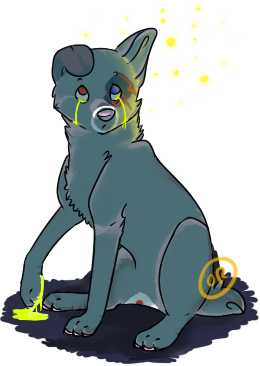
and he's supposed to be a mega powerful being, based off a quasar, I was wondering, does anyone have any suggestions or tips as to what I can add or remove? I feel he is too cluttered in a way ;u;
Since I'm one of these "less is more" people, I have to agree that it feels quite cluttered^^'. The basic idea is really creative though, and I love the over-all body structure with the chinky chest and strong legs which makes it look very powerful and strong. The slim face makes it look fox-like, cunning yet mild, and I love it together with the body. I wish I would be able to read all those little notes around it, because that would probably make commenting a lot easier, but they are all too tiny to read. Either way, I'm personally not a fan of designs that are floating around the body unattached or with just little connection to the body, I think I see some floating objects in there and it's one of the things that can really clutter up a design. I think that the spikes on the lower back is looking slightly disconnected from the rest of the design, perhaps add some more spikes close to them or remove them? I like the antler like things on it's head, and the beam from it's mouth is really neat.
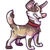
JtHMlover8 wrote:
I drew this for myself, the larger animal is supposed to be a wolf-cat hybrid; does anyone have any pointers on how to make him look... how you say, more flow-y physically, if possible? (Without altering his design)

Aw, it's so adorable, the poses and expressions are just lovely! I'm not sure how you mean with flow-y, but I think that if the tail was less thin near the base it would continue the body a bit longer and making it feel a little smoother. I think that the shoulder to elbow part of the front leg looks a bit long which also might blunt of the body a bit, perhaps try to rise the lower arms up a bit, closer to the chest^^.


.png)


.png)


