

but this time... vastly better
I MISSED MY LAPTOP OK
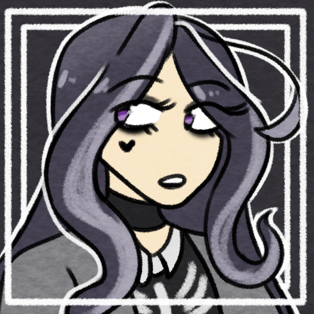
skarz 2!! by sicknasty
| Based on | Click to view |
| Artist | sicknasty [gallery] |
| Time spent | 30 minutes |
| Drawing sessions | 1 |
| One person likes this | Log in to vote for this drawing |
2 posts
• Page 1 of 1
skarz 2!!
![]() by sicknasty » Fri Aug 17, 2018 9:03 am
by sicknasty » Fri Aug 17, 2018 9:03 am
back in the building! ish!
probably going to do a bit of an account clearout, but i'm mostly here to putter around and see what's changed
box - any pronouns
really into vampires now idk how this happened
avatar credit
probably going to do a bit of an account clearout, but i'm mostly here to putter around and see what's changed
box - any pronouns
really into vampires now idk how this happened
avatar credit
-

sicknasty - Posts: 8477
- Joined: Wed Oct 31, 2012 5:57 am
- My pets
- My items
- My wishlist
- My gallery
- My scenes
- My dressups
- Trade with me
Re: skarz 2!!
![]() by kiwipen » Tue Sep 04, 2018 7:39 am
by kiwipen » Tue Sep 04, 2018 7:39 am
I know you fixed this one up with the help of the discord, but I'm here to add a few more things;
I'm not a big fan of those red spots at all. I think they should have been completely solid and placed with a BIT more purpose than they were placed. Also, the overuse of the premade checker patterning is just a /touch/ distracting.
I do like the color palette you chose; however, it is one that must be handled delicately. Your usage of white was a smart one, but I think this design would need a bit of working in order to fix it up. I'd suggest limiting the checker patterns to two (two) places; personally, my choices would be the hair and the paws. The rest of them should be solid --- a solid white underbelly and a tailtip would already make this design easier on my eyes. The stripes I think still need a bit more rhyme or rhythm to them, either that or there needs to be /more/ of them, but they still feel a /touch/ random with their swirling and their placement/where they go. I also think that the white stripes on the flank were a step in the right direction, however, are also a touch randomly placed. You have a broken heart motif --- it would befit it more to be a broken heart. Or, if you're going for a 'torn' view, such as the case with the 'bloodspatters' (which I'm realizing that the red spots are now), then make it clear that's what you're going for, and use that to help push your red spot narrative so everything ties together.
This is a long one, but you requested honest feedback and I'm here to help you get better <3
focusing on species. ff14 brainrot.
nonbinary | they/them or kii neos
husband: nuggetseb | qpp: keryth


nonbinary | they/them or kii neos
husband: nuggetseb | qpp: keryth


-
kiwipen - Posts: 12992
- Joined: Thu Aug 27, 2009 6:19 am
- My pets
- My items
- My wishlist
- My gallery
- My scenes
- My dressups
- Trade with me
2 posts
• Page 1 of 1
Who is online
Users browsing this forum: No registered users and 0 guests