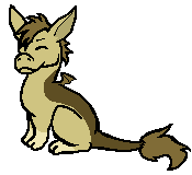
- username: inferno,
name: caspian
number: 127
opinions/critique?: i overall adore the design. you made the colors fit together perfectly. the two
things i'd suggest needing some work would be the lines which you put on the kal, since overall i
believe it makes the design look more pixelated? the other thing is the oval shape you put on his/her
face. i'm not really a big fan of that since it almost sits above the lines? it just feels as if everything
else clearly has a lot of work put into it whereas that was just kinda slapped on there. otherwise, the
design is very impressive. i look forward to seeing more of your work.