Join or create fan clubs about your favorite things!
 by rocoboq » Mon May 30, 2016 4:32 pm
Haven't actually posted here for anything but answering questions for a while... glad to be back! Anyways...
@Nightsent
I really like the way your character form looks! It fits perfectly fine on my screen, and I enjoy how simple it appears. The choice to go monochrome, in my opinion, was a good one, and I like how everything is weighed, if that makes any sense. It's balanced between images/lines and text, and I think the varying shades of gray you used really worked. I also like how you didn't make it too massive, and had everything very condensed into a smaller place as to not make it overly eye-straining. Overall, I believe it is a successful character form!
@gods
I'm a real sucker for monochrome/grayscale, and your signature was really able to pull that off. I like how you make a smaller sig that didn't even fit the width of the available space; it allows for a much more simplistic style. I also enjoyed how almost minimalist it seems with the few images. As for the GIF on the far left, I like how you put the black smoke GIF in the background of the image of Frankenstein. It really fits the character's seemingly malicious personality/appearance, and the short quote you chose really fit contextually. I believe the size of the quote really worked out well, and I like how you enlarged the first letter - the first 'K' - of the quote.
@everyone else
I am in love with all of your signatures! All I see is pure awesomeness, and I enjoy looking at all of your unique styles. They are all very well done, and I cannot wait to see what you all produce in the future!
I can't really think of much else to say or talk about, lol. Oh, I know!
Do you guys ever just hate it when you think up this amazing layout and plan for a signature (you have it all drawn up and the color scheme is already selected) and you are absolutely in love with it, and then you try and make it and it all goes wrong? I tried actually planning out a signature once (since I usually kind of go with whatever my mind comes up with on the spot), and I couldn't even place a single image because that's just not how I work. Most of the time, when I try and pre-plan or create an outline of anything, it doesn't turn out as well as it could have and/or I set amazingly high standards for myself because of it.
I suppose, because of this, I have a question for you all:
- Code: Select all
[b]Do you often plan out/create a pre-planned layout for your siggies/coding projects? Why/why not?[/b]
-

rocoboq
-
- Posts: 4301
- Joined: Sun Oct 27, 2013 3:16 am
- My pets
- My items
- My wishlist
- My gallery
- My scenes
- My dressups
- Trade with me
by Zetirian » Mon May 30, 2016 6:20 pm
Do you often plan out/create a pre-planned layout for your siggies/coding projects? Why/why not?
I do because I like to challenge myself. How can I create a unique signature within this given space? I try and focus on similar layouts because I wish not to infringe on other's and their layouts as well, this is my most important rule of thumb, because of past experiences of this, I try and keep to my own skill set, and don't tend to adventure out because of this.
▬▬▬▬▬▬▬▬▬▬▬▬▬▬▬▬▬▬▬▬▬▬▬▬▬▬▬▬▬▬▬▬▬▬▬▬▬▬▬▬▬▬▬▬▬▬▬▬▬▬▬▬▬▬▬▬▬▬▬▬▬▬▬▬▬▬▬▬▬▬▬▬▬▬▬▬
@Storm coming:
Your signature looks like this for me

Critique wise it looks lovely from what I can figure it would properly look like. The colour scheme well and overall the appeal is light and delicate, which brings a nice feel to the table when it is displayed. For the most part, the images used are well crafted and the vector art is a nice touch to the elegance the signature has. With that said, I do believe this is based on my poor eyesight, this image:

Is somewhat obscured for me. It took me to squinting to figure out what the word said,and it say's 'THE'. None the less, I do like the font usage, an strong elegant font, and image quality is high. Well done!
@terrence.
There is a lot of what I like about your signature. To start with, the overall thin, strong and stern lettering and coding keeps the elegance of the signature together and perfectly complements the signature as a whole. The colours used are contrast to the avatar, but this works extremely well as it expands the colour palette. The image quality is incredible, especially the long gifs which are amazingly high quality despite their longitude, it's marvelous really. My favourite part of the signature however is the gif dividers in the center column of the signature, it brings a sort of twinkle to the signature which is a nice touch. Finally, the text font used is complementary and flows very well.
@Kristen
Welcome back!
The pink, grey and black colour palette is an interesting one and one I long to use myself, but without knowing the context of the signature and the characters involved in the signature, it looks complementary to the least and extravagant at the most. The layout is a nearly tied together one and the image quality is phenomenal. I have to admit, the creation of this image here:

Is a well done one, and I adore it for it's addition to the signature and the overall appeal it has as a solo image. I love it!
@Nightsent
Sans the coding not fitting on the forum, it looks really nicely coded. I love the story, the complementary colour scheme of pure shades and the image to the right, which ties it all together. I admit, I am a huge fan of the font you used for the quote with the word EASILY.
@gods
Your signature is incredible. It's a small, compact signature but that is ok because that is all it needs to be for it to shine like it does. The background of the forum colour posts with the halloween theme work in this signature's favour to ensure that the signature does indeed shine and push itself off the map. The liquid gif is incredible and I find myself a fan of all these types of gifs you do, because they flow so valiantly it is insane. The coding is well co-originated and it is incredible.
▬▬▬▬▬▬▬▬▬▬▬▬▬▬▬▬▬▬▬▬▬▬▬▬▬▬▬▬▬▬▬▬▬▬▬▬▬▬▬▬▬▬▬▬▬▬▬▬▬▬▬▬▬▬▬▬▬▬▬▬▬▬▬▬▬▬▬▬▬▬▬▬▬▬▬▬
May I please ask for comments on my signature? I want to know if the imagery works well, it was a test run crafted from my desire to figure out how I can do text animations. I may make a tutorial on these at a later date once I master this skill.
May I also ask for a review on Digitally Distinct if anyone has the time to do so? I need feedback on it since I am stressing about not updating it as much as I should be and otherwise -Being inactive/uninspired-
Thanks guys!
I am on mobile.
Current mood: Bachelor’s in psychology and having Aged care induced PTSD? What do you mean?
Least I helped change legislation for the better. Thank you aged care workers. ❤️
 Don’t you want to see a highlight?
Join your union
-
Zetirian
-
- Posts: 7990
- Joined: Tue Sep 27, 2011 3:49 pm
- My pets
- My items
- My wishlist
- My gallery
- My scenes
- My dressups
- Trade with me
by +30mg » Tue May 31, 2016 3:39 am
@gods - awesome awesome sig, i like the victorian feel to it, hence, it really brings a more compact meaning to the black and white tone. i also feel a bit of a muted motion coming from the gif to further the mysterious edge to it. the slow, inky texture in the water REALLY heightens on the thriller-esque factor of it, i can already envision a bloody massacre cotillion-styled. nice!
why must black and white be a thing oml. i'm trying to deviate from my overused black and white motif and ya'll came up with these awesome sigs and i'm just here being a carrot.
@ZeyDaan - smhsmhsmhsmh, well what else is there to say? the gif of the texts somehow 'synchronize' in a sense, the lag in between the words marvelously lines up to create an easily comprehendible and somehow satisfying look to it. ooh i like how the grayscale pic on the right shares the same colour pattern with all your other texts, making the red and the more vibrant pattern to well, stay put and not greedily seep into the whole details. although, i would like to state that -- even though i think this is 100% in my mind only but idk -- i think the words from the quote "or live and fight your sorrow" is a bit 'defeated' in comparison to the words that appear before it, i don't know why but something positioned it lower than the significance of the other words. but still, i am irrelevant so yesh, great job! always.
Do you often plan out/create a pre-planned layout for your siggies/coding projects? Why/why not?
yes! sometimes i sketch it first, and compare the colours that i am about to apply in said sig because i don't know, i feel much more content to have things planned out and to know what i am to do with it. though sometimes i'd like to ruthlessly code stuff up, lel.
---
um question please. i'm about to make a new signature (yay), using these gifs...


and also this one... (of course, smaller)

and i'm really confused as to what should be the colour scheme of it omg pls help me. i tried using this to match the flower in her hair:
▊ ▊ ▊ ▊ ▊ ▊
but it didn't work oh my lorddddddddd... please help me ppl.
-

+30mg
-
- Posts: 9980
- Joined: Sun May 11, 2014 8:41 pm
- My pets
- My items
- My wishlist
- My gallery
- My scenes
- My dressups
- Trade with me
by ryuunosuke » Tue May 31, 2016 5:54 am
Do you often plan out/create a pre-planned layout for your siggies/coding projects? Why/why not?
hm, sometimes i plan a layout, but most of the time i stray away entirely from it! my color palette i determine after
i look at CS's background - sometimes it might be too pale, or too standoffish. sometimes my layouts have to change,
either because it's impossible, or i'm just... too lazy to do it orz
@gods;
your signature is lovely as per the usual! i love how smooth the gif is, no artifacts. the monochromatic color scheme is
kind of common, but your signature really pulls it off! my only tic is that the quote seems really squashed to try and fit
it in... consider finding another font, or changing the percentage of the kerning :>
@ZeyDaan;
ah, your photoshop skills are impeccable! the colors are bright and very lovely. the quote is seamless and it really suits
the mood of the signature. maybe coloring the other text would compliment the images, and making the statistics a
lighter shade of black would make the sketch fit in more!
@terrence.;
the shadow on the person's face, or their hair color, would compliment the gif of the tiger nicely! the purple is a smaller
part - consider using it only for small 'accent images' (ex: birds in my signature)
-
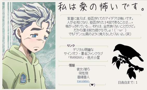
phew! i'd love some feedback on my signature - it's all in Japanese, trying to learn it with my younger sister...
in the case you can't see it properly, here's a screenshot!

 Leon - Male (He/Him) - Adult - VN+JP OK
My waifu (Madara) is better than yours
Signature WIP
-

ryuunosuke
-
- Posts: 4786
- Joined: Tue Jun 26, 2012 5:30 am
- My pets
- My items
- My wishlist
- My gallery
- My scenes
- My dressups
- Trade with me
-
by Zetirian » Tue May 31, 2016 9:19 pm
Announcement Regarding Digitally Distinct.I have rearranged the whole of the front of the first page. These are the following changes.
- Created the 'Rotating image' tutorial located here: [x]
- Front page touch ups [Linked a few things to the updated thread, updated art theft section under 'Image Manipulation' and emphasized it for it being important.]
- Added a TOC to supplementary tutorials located at the top of the post Here
- Rearranged front of the thread, removing the 'Apply you knowledge' section of the thread and adding a post dedicated to Symbols and then pushed everything down one post
- Moved Image symbols [Links to buttons and other various images that are free to use] to under Image Manipulation and updated the TOC on the post.
- Emphasized the FAQ here
- Requested for a separate thread for 'How to make a successful signature shop' with making it pinned to the top of the coding and signature design shop forum section [Link to proof]
PLEASEFamiliarize yourself with these changes, both veterans and new users to the thread, this helps with the flow of the thread to ensure that there is the most accurate answer can be given when a question is asked.
Thank you all for your patience!
Thank you all for the comments on my signature! I appreciate the criticism as well as the signature was an experiment to see how things work out. I call it a success!
@terrence.
I think maybe a colour of medium grey, the pink you have there, a darker version of that pink that has grey in it, a dark grey tinted green and a grey dark brown would be the colour scheme I would choose to go with the gif images you have there.
@jyushimatsu.
Learning a language is tough, and I wish you luck!
With that said, I like your signature, the image on the left works together with the coding, colour scheme and layout wise. I do think the silhouette of the birds to the right of the signature make a really bold addition to the signature, and I find myself wondering if a lighter coloured / toned signature would have worked better with the signature as a whole. With that said though, it is a well coded and well done signature.
-
Zetirian
-
- Posts: 7990
- Joined: Tue Sep 27, 2011 3:49 pm
- My pets
- My items
- My wishlist
- My gallery
- My scenes
- My dressups
- Trade with me
by asteria- » Tue May 31, 2016 10:52 pm
i haven't actually posted here in a while...? wow.
@gods. -- ?????? your sig is so good??? like i use greyscale a lOT (mostly when i can't think of anything else //shot) but you really really make it work here...one thing is that on my computer, the second skull emoji drops below the second part of the quote...? aa that might have been intentional or just in safari.
anyway, the box looks amazing (i haTe making boxes they always show up weird in the actual sig....;;) and your signature is overall very compact and very nice to look at. i always notice something different -- the blood splattered on his shirt in your gif overlay, for example. anyway your signature is really nicely done!!!
@terrence. -- a few other people have some really good suggestions, but i'd also try an accent / text color of, like, a dark blue? i'm not sure, i just think i saw some blue in the shadows of all the gifs haha!
@jyushimatsu. -- oh my gosh your signature is a+ . i'm (slacking off on) learning japanese myself (as well as like 20 other languages hah), and it would be really hard to make such a text-heavy, cohesive signature that not only makes sense but looks great, both of which i think you've definitely accoplished here. the subtle cuts on the image are really impressive, kudos for that too!! aaah a+ signature it's really good....!!
and while we're at it, i'd appreciate signature feedback too!! c:
neo | she/her | enfp | always tired
-

asteria-
-
- Posts: 264
- Joined: Wed Nov 05, 2014 3:26 pm
- My pets
- My items
- My wishlist
- My gallery
- My scenes
- My dressups
- Trade with me
-
by Zetirian » Thu Jun 02, 2016 4:59 pm
@jyushimatsu.
In the first case, there is nothing that can really be done as a whole to prevent this entirely, this will happen wherever you go and whatever you do no matter what. In regards to this however, I have requested for permission to type up a guide for the Signature / coding section of the thread with how customers should act and how signature people should act because this is a thing that has been appearing a lot more as people enter the coding community and it ends up making things sour without some sort of guide to help protect both artists and customers. Hopefully I will get a reply on this soon so I can get started on this.
-----------------------------------------------------------------------
In the second case, one thing you need to remember is this isn't chicken smoothie uncensored, confessions or and otherwise that are found on Tumblr, posting this stuff on here is a little bit of a problem because CS doesn't take kindly of members being picked out on in forums in the forum of screenshots onsite. CS is a child aimed game, therefore you will get messages that are childish no matter what you do, I have had my fair some of childish encounters; being abused because I refused to make a signature or otherwise over anything under the sun and at times it is ridiculous. On signing up to the site, it is made clear that the site is a children's game, you will get immature reactions on this site and that is inevitable. CS will not change to accommodate the older generation because while we have grown up on the site, the site's primary target are those who are younger / family friendly audience.
If you report it, report it under harassment and explain the whole situation to the mods. They will deal with it how they see please while it co-ensigns with the rules of the site. It is worth mentioning the user whom sent you that message is a new user and might not know better, only posting 14 times on the forums, so who knows what may happen. Is it over the top to report the message? No, if you felt like crap after you received that PM please use the report function and explain in detail the circumstances that lead up to the situation (including links to the post and otherwise.)
If I was in your situation, I would report all the PM's. Mods (most likely, this is a guestimate) cannot see PM's unless they are reported, so reporting all of them would help further your case.
In the future, because this is a situation best suited for mods, I would recommend sending a help ticket about the situation asking what you should do, since by posting what you have here in a public setting even with name scrapped out, could also be seen as harassment because it doesn't take a genius to find the post you originally made in the rate the sig thread and for users to send hate to the person above, whom would be the person who has been PMing you, and this is the ABSOLUTE LAST THING the community needs to resort to.
I hope this helped somewhat and I do apologize if I sound a little negative here, I can see how by making this post you might have just done the wrong thing and you might not get any sympathy from the mods for this and my overall intention of making this post is while replying to help, try and discourage this behaviour because I don't feel like it is necessary for users on CS to make these kinds of posts, even though it is a rant and asking for help; not to make them public and take it up privately.
Last edited by
Zetirian on Thu Jun 02, 2016 6:27 pm, edited 2 times in total.
-
Zetirian
-
- Posts: 7990
- Joined: Tue Sep 27, 2011 3:49 pm
- My pets
- My items
- My wishlist
- My gallery
- My scenes
- My dressups
- Trade with me
by Zetirian » Thu Jun 02, 2016 5:13 pm
ahsoka wrote:I've added a rule to RtSaAAY about not harassing people over ratings and such.
You are not allowed to add another rule to RTSAAAY thread. It is a public forum, therefore will be treated as a game like the rest of the games, the rules there now are only there to help users and to ensure that minimal rudeness occurs in the thread because it can lead to sour grapes forming. Signatures have had a horrible history with this thread before and hopefully it won't happen again, which has lead to why the rules haven't really been changed since Bernouli changed them back to tolerable rules years ago.
For proof, I have posts of previous instances where added rules have been removed.
viewtopic.php?f=9&t=2432531&hilit=mod&start=2990#p77173769
This is the post which had mods remove the rules before.
viewtopic.php?f=9&t=2432531&hilit=mod#p76763205
This is the post to which the rules were changed to for that thread.
viewtopic.php?f=9&t=2987455#p96441260
This is the rules from the last thread.
As you can see, the rules are to stay like this thread and no changes are allowed as there have been problems with people adding rules before. As Bernouli said, just use the report button when a situation occurs. I would think removing that added rule would be a good idea considering it links to a post which therefore can promote bullying.
The key word of thumb here is to use the report button over everything. If you felt like you were harassed or whichever, use the report button. If something went wrong in something, report the incident or send a help ticket.
Again, apologies for the harshness of my words if they read to be harsh, that is the last thing I intend to be here.
Last edited by
Zetirian on Thu Jun 02, 2016 6:27 pm, edited 1 time in total.
-
Zetirian
-
- Posts: 7990
- Joined: Tue Sep 27, 2011 3:49 pm
- My pets
- My items
- My wishlist
- My gallery
- My scenes
- My dressups
- Trade with me
by sataire » Thu Jun 02, 2016 6:14 pm
wassup all
i havent been on here in eons it feels like
but its good to be back c;
--
@wren
mmm your sig is clean
nicly organized and everything is symmetrical
my ocd side loves it.
the colors scheme is also nice
one thing tht i think could add to it
is the links "Friend Friend ect." should be changed
to other words cos it seems repetitive.
so like for one friend it could be bbf and another could be loser
yknw, just to keep it fresh.
and the collom of "░" on the far right
should hug the text/rest of the sig like
the one on the right does ^^
-

sataire
-
- Posts: 6142
- Joined: Thu May 30, 2013 8:28 am
- My pets
- My items
- My wishlist
- My gallery
- My scenes
- My dressups
- Trade with me
-
Who is online
Users browsing this forum: No registered users and 12 guests


