
@luminescence.
i think it looks really pretty! it can look a bit cluttered at first look, but once you figure it out, it looks really nice!
@towel
welcome to the club!
@hatome
yeah, it seems like the image is a bit too long, because it still doesn't fit just right yet.
this isn't really a signature question, but, i just finished the majority of the coding for my new shop, does it fit for all of you, and does it look okay? i'm not sure. here it is c:
Signing Off: A Signature Fanclub - Come Join!
Re: Signing Off: A Signature Fanclub - [RULE UPDATES!]
![]() by rentropy » Mon Apr 11, 2016 1:44 pm
by rentropy » Mon Apr 11, 2016 1:44 pm
-

rentropy - Posts: 20503
- Joined: Thu May 08, 2014 5:15 am
- My pets
- My items
- My wishlist
- My gallery
- My scenes
- My dressups
- Trade with me
Re: Signing Off: A Signature Fanclub - [RULE UPDATES!]
![]() by Suhø » Mon Apr 11, 2016 1:58 pm
by Suhø » Mon Apr 11, 2016 1:58 pm
hatome: I agree with the others. It seems that the gif pixel is a bit much and pushes part of the left border down.
Maow: It fits and all, but the borders are a bit spaced funny. There are gaps.
Made a siggy for myself. Thoughts and critique on it?
Maow: It fits and all, but the borders are a bit spaced funny. There are gaps.
Made a siggy for myself. Thoughts and critique on it?
▌
▌
▌
▌
▌

▬▬▬[ ᴛɪᴄᴋ ᴛᴏᴄᴋ ]▬

█████████████████
▬▬▬▬▬▬▬▬▬▬▬▬


▬▬▬▬▬▬▬▬▬▬▬▬
▬▬▬▬▬▬▬▬▬▬▬▬
▬▬▬▬▬▬▬▬▬▬▬▬

◤xxxxxxxxxxxxxxx◥
- link one - link two -
- link three - link four -
© credit
◣xxxxxxxxxxxxxxx◢
▬▬▬▬▬▬▬
◤xxxxxxxxxxxxxxx◥
#VIXXinCanada
-Oct. 27th, Toronto-
◣xxxxxxxxxxxxxxx◢
██████████
-

Suhø - Posts: 2930
- Joined: Tue May 29, 2012 11:01 am
- My pets
- My items
- My wishlist
- My gallery
- My scenes
- My dressups
- Trade with me
Re: Signing Off: A Signature Fanclub - [RULE UPDATES!]
![]() by Zetirian » Mon Apr 11, 2016 5:55 pm
by Zetirian » Mon Apr 11, 2016 5:55 pm
Note
Guys, please remember that if you want a comment on your signature, you need to comment on OTHER signatures or posts that are above / previous to your post first. The only exceptions to this is if you are asking for help (Help is asking for links, how to do coding etc [NOT ASKING FOR DESIGN OPINIONS.]) [This applies to thread mods as well unless a global announcement such as this one is being made.] and if you are asking for group questions [Like 'What was your first signature?' etc etc where everyone can comment and reply] If you are asking for design options, comments, criticism, screenshots etc, please comment on posts above or previous, even on peoples signatures who haven't asked for comments is fine. You will be warned if you do not comment on previous posts.
I have handed out a handful of warnings and and so have other thread mods for the same reason. We unitedly chose to change up the rules because there was an irritation where people were not getting replied to and ignored and now when we have changed the rules, people aren't following the rules, some whom were asking for the rule changes in the first place.
If you are new to the thread welcome and read the rules, if you are returning to the thread, welcome back and read the rules.
There is no excuse for not reading the rules. If there is any question of concern or otherwise please PM one of the thread mods.
Thank you for reading.
I am on mobile.
Current mood: Bachelor’s in psychology and having Aged care induced PTSD? What do you mean?
Least I helped change legislation for the better. Thank you aged care workers. ❤️

Don’t you want to see a highlight?
Join your union
Current mood: Bachelor’s in psychology and having Aged care induced PTSD? What do you mean?
Least I helped change legislation for the better. Thank you aged care workers. ❤️

Don’t you want to see a highlight?
Join your union
- Zetirian
- Posts: 7990
- Joined: Tue Sep 27, 2011 3:49 pm
- My pets
- My items
- My wishlist
- My gallery
- My scenes
- My dressups
- Trade with me
Re: Signing Off: A Signature Fanclub - [RULE UPDATES!]
![]() by appi » Mon Apr 11, 2016 7:57 pm
by appi » Mon Apr 11, 2016 7:57 pm
- @Maow
this is what it looks like for me:

-

appi - Posts: 8152
- Joined: Tue Nov 19, 2013 11:29 pm
- My pets
- My items
- My wishlist
- My gallery
- My scenes
- My dressups
- Trade with me
Re: Signing Off: A Signature Fanclub - [RULE UPDATES!]
![]() by bite sized kuiper » Tue Apr 12, 2016 4:33 am
by bite sized kuiper » Tue Apr 12, 2016 4:33 am
bless
its been so long since ive posted here oh lorde
i apologize for the absence, but i was hiatus for a little while, but im back <33
anywho;;
@ pain,
the borders alongside the gifs is a bit shorter than needed qwq other than that, i
like the formatting cx its nice and simple and the viewer's attention will go to the
gifs first and spread out !! its quite nice to be frank.
@ maow,
oh my stars i love that so much aaaa its just,,, so neat and adorable <33 it fits a-ok
on my screen, all of it qwq and can i just say, your coding is really neat and simple
and the flow is really great, even with different types of fonts use !! the only thing
id have to say really about it is maybe have a color scheme, seeing as the only colored
image/thing there is that image, and the rest is quite plain, being only black qwq
@ hatome,
i agree with teresa qwq it doesnt particularly fit, but maybe you could resize or crop
the image a bit more if you still want that in there?? alongside that, maybe you could
align this text? that, or it could just be me pffht. i think it looks lovely as it <33
and alongside that, i tried my hand at some editing and what not and i suffered for a lil
bit, but i made my first sig in like. two months so far |DD i dont particularly like it, but
im starting off slow again pffht. does it look alright for everyone? i wanted to try some
thing new and interesting, and the song i actually listened to the whole time i made it
was this song, Set Free.
@ lumi,
oh my goodness,,, that is an aDORABLE sig just. ahhh <33 i love the simplicity and the
use of different fonts,,, its just plain gorgeous qwq the color scheme is light and easy on
the eyes, and just how you used all those dingbats and what not, its something i know id
struggle with qwq you pulled it off incredibly, and honestly- i dont see anything that should
be changed ^^ the theme is quite adorable, and the lyrics too !! i remember listening to that
song a while while back pffht.
so after coming back from a tiring hiatus, i tried my hand at a 'simple' sig and uhh,,, im not
sure how i feel particularly?? the lyrics of course are meant to be that small i guess pffht. ill
fill up the X's and what not later, but im just not sure if i particularly like it?? any opinions or
critiques would be appreciated qwq im just iffy on it as it took a while to edit and create the
effects, and the resizing/cropping process was p a i n. coming back from a hiatus and i already
spent about four hours on a 'simple' sig qwq oh deerie me.
☼
- bite sized kuiper
- Posts: 8545
- Joined: Mon Jul 29, 2013 2:29 am
- My pets
- My items
- My wishlist
- My gallery
- My scenes
- My dressups
- Trade with me
Re: Signing Off: A Signature Fanclub - [RULE UPDATES!]
![]() by Nightsent » Tue Apr 12, 2016 10:16 am
by Nightsent » Tue Apr 12, 2016 10:16 am
@pain - I like it. it's nice and simple, as well as on-topic. =3
@nekoma's lion - its bootiful!!! =D the coloring fits together nicely, and the I think the lyrics match the signature juuuust right! a lox of x's though XD jk, jk!
@all - this isn't exactly for a signature, but it's still coding all the same, right? =)
I need some comments on this layout that I've made for a roleplay. (the lines are a bit goofed, but you get the point, I hope!)
-

Nightsent - Posts: 6600
- Joined: Tue Nov 25, 2014 10:04 am
- My pets
- My items
- My wishlist
- My gallery
- My scenes
- My dressups
- Trade with me
Re: Signing Off: A Signature Fanclub - [RULE UPDATES!]
![]() by gods » Tue Apr 12, 2016 3:30 pm
by gods » Tue Apr 12, 2016 3:30 pm
- @night; i like what youve got so far! i think the layout would be pretty interesting & has a lot of potential (cant wait to see it with actual images and text). i like how theres not too much space for images & more for text, since writing should be the focus of a rp c: tho i think i would want the title towards the top, since youd usually want the title to be the first thing someone sees; it will bring the focus from the title and then flow down to the rest of the sig. id have to see it finished to really judge that, however!
@nekoma; i love the glitch effect in the gifs, and the red/blue. the layout may be simple, but i think it works well, especially considering how you cropped parts of the gif out as opposed to simply cutting it. that was a very smart move imo! i cant wait to see what it'll look like when you add some text to the bio spots! i think my only suggestion would be on "But we burn
on our own coals" to move up the "on" to the line above, since "on our own coals" extends past the images a bit, as does the little divider. other than that tiny detail, i think it looks fantastic!
@pain; very interesting choice of font; i dont think ive seen it being used before! i do think it fits the quote well tho. i like the gifs youve chosen and how they work together. the text area is simple, and i think that is good in this case. the only thing i might edit would be making the borders longer, since the images extend past them a bit.
@maow; it looks like this for me at the moment. the other posts seem to not fit either (i can cap those too if youd like). other than the sizing issues, i think the layouts would look great! i especially like that theres a lot of room for information.
im here with a new sig again :') i wanted to switch it up a bit since i felt inspired to make the edit in my current one. comments or critique? i hope the sizing comes out alright, since i know it can differ from machine to machine...

oliver/noll - he/him
-
gods - Posts: 2960
- Joined: Thu Oct 08, 2009 8:23 am
- My pets
- My items
- My wishlist
- My gallery
- My scenes
- My dressups
- Trade with me
Re: Signing Off: A Signature Fanclub - [RULE UPDATES!]
![]() by kristenn11 » Thu Apr 14, 2016 10:42 am
by kristenn11 » Thu Apr 14, 2016 10:42 am
- @ ﴾Pᴀɪɴ﴿ Your signature looks great. The quote itself speaks to everyone looking at the signature and truly makes them sit there and think. The color scheme (red and black) makes the signature look well organized. I do like how you took the red from the gif under the quote and used it in your bio. The only critique I have is that it is a little bland and the bio doesn't fit inside the box. When I say a little bland, I mean very little. I feel like you could include something to spice it up. It's already very appealing the the eye, but adding something extra will make the view go "..wow!" I suggest adding more red to the signature, perhaps around the vertical parts of the quote.
@Nekoma's Lion Upon first glance, I am not only amazed with this signature, but also shocked that you're coming back for hiatus. You look like you practice coding quite a bit. I suppose you were born to be a signature coder... :'D The pixelating gif makes the overall signature release vibes that I can't put into words. To a coder, it looks simple, which is exactly what you were going for. To a regular member, it makes them want to learn to code or go buy a signature from a shop. It isn't colorful, but I think adding colors would change the vibe it gives off. The gif does have red and purple, so perhaps adding one of those colors would make it even more appealing. It depends on what you're going for. I suggest making the quote stand out more because it's difficult to distinguish from the bio. I have to put effort into finding it and reading it. How to do that? It's up to you. You can change the color, bold it, make it slightly larger...anything. Or, you can keep it how it is. It's your signature!
@gods Wow. Just wow. This signature makes me jealous. I've tried to do the thing with a picture where you make it all black and white except one color and then you use that color for the quote just like you did...except you did it with a gif. Even better. I don't know if you found the gif like that or you used your mad animating skills to do it, but claps to you either way. I only have one problem with the signature. It's not a problem, but it slightly bothers me. You overused ▒ in the signature. They're everywhere. I recommend replacing those with two bio boxes (found on digitally distinct). Other than that, it's flawless. Keep up the amazing work!
@Nightsent I'm not ignoring your post, but I am almost helpless when it comes to roleplay layouts. Do you mean that you will use this layout each time you post? Meaning in the "plot" space will be where you actually roleplay? If you can explain more, I can try to help.
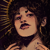
@AllI could not take the bad quality gifs in the signature I made, so I changed it. I changed the big pictures and changed some gifs. I've never made a black and white signature, so I need some tips on making those. I was going to leave her eyes blue and match the quote to that color, but you couldn't even tell they were blue with this picture. Also, which version of the signature should I use? This one or the one I have now? Thank you!

**Keep in mind this is a gif of the signature. The signature itself (pictures, quotes, etc) are much better resolution. You can compare the quote in this and in my signature to try to imagine the actual quality of the signature. The gifs in this signature also change upon refresh.
I chose the black and white one.
Last edited by kristenn11 on Sun Apr 17, 2016 7:05 am, edited 1 time in total.
- kristenn11
- Posts: 9355
- Joined: Sun Sep 02, 2012 12:37 pm
- My pets
- My items
- My wishlist
- My gallery
- My scenes
- My dressups
- Trade with me
![]() by canada » Thu Apr 14, 2016 11:12 am
by canada » Thu Apr 14, 2016 11:12 am
towel, ooo! a new member!!! welcome, welcome cx
lumi, oh my LORD i love your signature!!! it's just soo
perfect. i love the quote you used, it's really really 'c
ute justlikeyou and the image you picked just adds''o
n to the cuteness of this sig. but there is one thing 'i'
d change is the text- like, how close together it is ''&
how much of it there is. other than that, it's'''flawles
s! i love it so much omg you're such a good coder xxx
pain, i like it! i really do. it's coded nicely, and, know
ing that the coding is well-done really gives off such a
nice tone to it. i like it a lot!! i would just narrow do-
wn the "• pain • god • savior of thi
-s world •" so it fits better in the sig. c: xxxxxxx
side note, i made myself a sig! finally any thoughts? c:
xxxxxXXXXXXXxxXXXxxxxxxxxxxxxxxxXXXXxxxxx

-

canada - Posts: 21452
- Joined: Sat Feb 01, 2014 3:34 pm
- My pets
- My items
- My wishlist
- My gallery
- My scenes
- My dressups
- Trade with me
Re: Signing Off: A Signature Fanclub - [RULE UPDATES!]
![]() by gods » Thu Apr 14, 2016 1:59 pm
by gods » Thu Apr 14, 2016 1:59 pm
Kristen wrote:@gods Wow. Just wow. This signature makes me jealous. I've tried to do the thing with a picture where you make it all black and white except one color and then you use that color for the quote just like you did...except you did it with a gif. Even better. I don't know if you found the gif like that or you used your mad animating skills to do it, but claps to you either way. I only have one problem with the signature. It's not a problem, but it slightly bothers me. You overused ▒ in the signature. They're everywhere. I recommend replacing those with two bio boxes (found on digitally distinct). Other than that, it's flawless. Keep up the amazing work!
@All I could not take the bad quality gifs in the signature I made, so I changed it. I changed the big pictures and changed some gifs. I've never made a black and white signature, so I need some tips on making those. I was going to leave her eyes blue and match the quote to that color, but you couldn't even tell they were blue with this picture. Also, which version of the signature should I use? This one or the one I have now? Thank you!
**Keep in mind this is a gif of the signature. The signature itself (pictures, quotes, etc) are much better resolution. You can compare the quote in this and in my signature to try to imagine the actual quality of the signature. The gifs in this signature also change upon refresh.
- thanks for the feedback! i do make my gifs myself (both overlaying it and making of the ink gif and making the manga cap transparent). moving on, i rather like how i did the bios so i probably wont change them, but i appreciate the opinion! i'll keep it in mind for future sigs c:
i think the black and white one looks nice, except for the cropped subtitles in the one gif. they distract the viewer from the character. the black and white one seems to pull the signature together more, since its all one color theme (except for the brain, which stands out a bit). either way, i think whatever sig you choose to go with in the end will look great. the layout is easy to read and has great flow.
Canada wrote:
side note, i made myself a sig! finally any thoughts? c:
- looking great! its very straightforward and simple. the pixel is super cute and i love the subtle animation. all the words are lined up perfectly, and i like how they give a lot of information in such a tiny space. its nice that your bio areas and links are separated as well. on the subject of links, its interesting how you did only the first letter as the link. i definitely enjoy the simplicity of it!
oliver/noll - he/him
-
gods - Posts: 2960
- Joined: Thu Oct 08, 2009 8:23 am
- My pets
- My items
- My wishlist
- My gallery
- My scenes
- My dressups
- Trade with me
Who is online
Users browsing this forum: No registered users and 9 guests