
Signature Criticism! [v.1]
Re: Signature Criticism! [v.1]
![]() by Makki » Sun Feb 07, 2016 7:06 am
by Makki » Sun Feb 07, 2016 7:06 am
OMG I can't..these gifs on the right looks so awesome I can't really describe it lol
Everything seems to be very well organised.
But oh well on the left side I would probably use 3 gifs instead of two and I would write that text as well.
I would also add more shades of blue or make these ''★'' yellow
but so far I love it c:
Everything seems to be very well organised.
But oh well on the left side I would probably use 3 gifs instead of two and I would write that text as well.
I would also add more shades of blue or make these ''★'' yellow
but so far I love it c:

-

Makki - Posts: 8529
- Joined: Sun Oct 21, 2012 9:17 am
- My pets
- My items
- My wishlist
- My gallery
- My scenes
- My dressups
- Trade with me
Re: Signature Criticism! [v.1]
![]() by kobra » Sun Feb 07, 2016 7:11 am
by kobra » Sun Feb 07, 2016 7:11 am
Agh, this is hard... I really like yours.
The only thing I really have to comment on is the fact that on my screen, it cuts off. However, this is most likely just due to the fact I'm on an iPad
The only thing I really have to comment on is the fact that on my screen, it cuts off. However, this is most likely just due to the fact I'm on an iPad


──-─────────────────────
Huge Star Wars and Star Trek fan
Offering C$ for human art. PM me!
i want to be a cow in moo moo meadows
─────────────────────-──

──-───────────────
███░██████████████


███░██████████████
───────────────-──
███░██████████████
███░██████████████
───────────────-──


-
kobra - Posts: 10691
- Joined: Sun Feb 15, 2015 1:48 am
- My pets
- My items
- My wishlist
- My gallery
- My scenes
- My dressups
- Trade with me
Re: Signature Criticism! [v.1]
![]() by Nitro Indigo » Sun Feb 07, 2016 8:32 pm
by Nitro Indigo » Sun Feb 07, 2016 8:32 pm
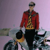
The cut-in-half images look a bit odd, because of the Fallout Boy being cut in half and not being continued on the other side.

Greetings, citizens of the internet! You can call me Nitro Indigo, and I want to be identified by what I do, not what I am. I like Pokémon, The Legend of Zelda, Klonoa, among other things. I also have a YouTube channel.
-
Nitro Indigo - Posts: 16273
- Joined: Tue May 15, 2012 4:31 am
- My pets
- My items
- My wishlist
- My gallery
- My scenes
- My dressups
- Trade with me
Re: Signature Criticism! [v.1]
![]() by InfernoVulpes » Sun Feb 07, 2016 10:23 pm
by InfernoVulpes » Sun Feb 07, 2016 10:23 pm
Your signature is nicely organized. All I can really say is that you could perhaps add a little color to the right hand side of you signature to make the color spread out a bit c:


Hello, I am InfernoVulpes. You can call me IV or just Inferno if you prefer. I am a girl so I prefer she/her. I love to chat so don't be afraid to shoot over a Pm. I love TV shows, cartoons and Anime especially Fairy Tail.
_________________________
||DC scroll || SH Website || DC Thread||
_________________________
||DC scroll || SH Website || DC Thread||
-

InfernoVulpes - Posts: 9213
- Joined: Fri Mar 16, 2012 3:18 pm
- My pets
- My items
- My wishlist
- My gallery
- My scenes
- My dressups
- Trade with me
Re: Signature Criticism! [v.1]
![]() by .normal.human. » Thu Feb 11, 2016 5:13 am
by .normal.human. » Thu Feb 11, 2016 5:13 am
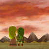
The gif on the left is nice. The image on the right is cut off weirdly, and the image under the words is kinda squished. Overall it looks nice.
- .normal.human.
- Posts: 10353
- Joined: Tue Dec 17, 2013 8:27 am
- My pets
- My items
- My wishlist
- My gallery
- My scenes
- My dressups
- Trade with me
Re: Signature Criticism! [v.1]
![]() by kobra » Thu Feb 11, 2016 5:20 am
by kobra » Thu Feb 11, 2016 5:20 am
Yours looks really nice, especially with the colours matching the gif. The only thing I have to say is that 'signature' is typed wrong, but other than that it's really nice. (Again though, the signature does cut off, but I'm guessing it's just because I'm on iPad)
──-─────────────────────
Huge Star Wars and Star Trek fan
Offering C$ for human art. PM me!
i want to be a cow in moo moo meadows
─────────────────────-──
──-───────────────
███░██████████████
███░██████████████
───────────────-──
███░██████████████
███░██████████████
───────────────-──
-
kobra - Posts: 10691
- Joined: Sun Feb 15, 2015 1:48 am
- My pets
- My items
- My wishlist
- My gallery
- My scenes
- My dressups
- Trade with me
Re: Signature Criticism! [v.1]
![]() by Aliria » Thu Feb 11, 2016 11:21 am
by Aliria » Thu Feb 11, 2016 11:21 am
Mostly, it looks pretty good. The copy of the person on the left appears to be cut off at the waist, it would be good if you could find a version of the image with the full body. The words in the middle are kind of plain, might want to add some stuff to make it a little fancier. I would also suggest moving down the middle text, so it's even distance from the top and bottom, and maybe putting some images/borders into the space above/below it.
I'll send out my soul

To worlds more beautiful
To worlds more beautiful
✯
✯
✯
✯
✯
✯
✯
✯
✯
-

Aliria - Posts: 10988
- Joined: Mon Nov 12, 2012 2:44 am
- My pets
- My items
- My wishlist
- My gallery
- My scenes
- My dressups
- Trade with me
Re: Signature Criticism! [v.1]
![]() by .normal.human. » Fri Feb 12, 2016 1:41 am
by .normal.human. » Fri Feb 12, 2016 1:41 am
Ayyy Aliria)
Well, being a little nit-picky the columns are ~2 pixels taller than the dinosaur, and the lines between the buttons are slightly shorter than the buttons themselves. But no one is going to notice/care about either of those things, I think it looks really great!
Well, being a little nit-picky the columns are ~2 pixels taller than the dinosaur, and the lines between the buttons are slightly shorter than the buttons themselves. But no one is going to notice/care about either of those things, I think it looks really great!
- .normal.human.
- Posts: 10353
- Joined: Tue Dec 17, 2013 8:27 am
- My pets
- My items
- My wishlist
- My gallery
- My scenes
- My dressups
- Trade with me
![]() by chon » Fri Feb 12, 2016 10:33 am
by chon » Fri Feb 12, 2016 10:33 am
- well first off, the theme is awesome and that's my favorite anime
this is what it looks like on my screen so it's kinda a problem on my part
but i mean, i can always look on your profile but i really like the way it
looks although the very right seems a bit empty compared to the left bc
the left has 3 gifs and it looks like it's "filled" i guess and the right looks
like it may be missing something? and it's probably just me but the font
color is like all orange and then BAM there's black and idk to me it seems
out of place that it's black but it's my opinion idkkkkk but i like your sig
over all, it's nicely put together with a solid theme! c:
my signature is a wip so far, i know it's probably really bad but fadsjfha
╒══════⭐︎══════╕
hiatus
will i ever come back?
╘═════════════╛
╒═════════════╕
young professional | shop
╘══════⭐︎══════╛
hiatus
will i ever come back?
╘═════════════╛
╒═════════════╕
young professional | shop
╘══════⭐︎══════╛
██
██
██
██
- chon
- Posts: 4146
- Joined: Fri Jan 02, 2015 10:39 am
- My pets
- My items
- My wishlist
- My gallery
- My scenes
- My dressups
- Trade with me
Re: Signature Criticism! [v.1]
![]() by Suhø » Sat Feb 13, 2016 2:09 pm
by Suhø » Sat Feb 13, 2016 2:09 pm
I really like it for a wip. Only thing is that the gray text between the images really clashes with the background. Other than that, it's great.
▌
▌
▌
▌
▌

▬▬▬[ ᴛɪᴄᴋ ᴛᴏᴄᴋ ]▬

█████████████████
▬▬▬▬▬▬▬▬▬▬▬▬


▬▬▬▬▬▬▬▬▬▬▬▬
▬▬▬▬▬▬▬▬▬▬▬▬
▬▬▬▬▬▬▬▬▬▬▬▬

◤xxxxxxxxxxxxxxx◥
- link one - link two -
- link three - link four -
© credit
◣xxxxxxxxxxxxxxx◢
▬▬▬▬▬▬▬
◤xxxxxxxxxxxxxxx◥
#VIXXinCanada
-Oct. 27th, Toronto-
◣xxxxxxxxxxxxxxx◢
██████████
-

Suhø - Posts: 2930
- Joined: Tue May 29, 2012 11:01 am
- My pets
- My items
- My wishlist
- My gallery
- My scenes
- My dressups
- Trade with me
Who is online
Users browsing this forum: .*Rose*., 22dull, Cardiii, CoffeeEX, cwutsiefawn, Daxx, Ɗɑŋɑ, hah, birds, Hellishborn, Hollyleaf6217, Kaiiba, Lunarhaven, NERV AGENT, snowdrake, vein and 5 guests