
Signature Respect! V. 19! [Update: New Rule]
Re: Signature Respect! V. 19!
![]() by sonderr » Sat Sep 19, 2015 2:02 pm
by sonderr » Sat Sep 19, 2015 2:02 pm
heyyy you changed it! and it's still awesome! c:
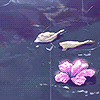
I love how you kept the images towards the left, it adds flow to the signature, and the pixels lined up at the bottom is nice. The bio is well placed and stands out well, and of course, what are thoooooseeeeeee
please excuse my work in progress below
I love how you kept the images towards the left, it adds flow to the signature, and the pixels lined up at the bottom is nice. The bio is well placed and stands out well, and of course, what are thoooooseeeeeee
please excuse my work in progress below

she/her - 23 - INFP
___________
not quite so active at the
time being, mostly because
I sold my soul to sim games.
I make art sometimes,
head over to my dA for
commissions if interested!
Live in the sunshine,
swim the sea, drink the wild air
swim the sea, drink the wild air


-

sonderr - Posts: 1261
- Joined: Tue Sep 01, 2009 9:22 am
- My pets
- My items
- My wishlist
- My gallery
- My scenes
- My dressups
- Trade with me
Re: Signature Respect! V. 19!
![]() by heresalittlefaith » Sat Sep 19, 2015 2:14 pm
by heresalittlefaith » Sat Sep 19, 2015 2:14 pm
Good signature! Nice and orginized so far! Can't wait to see it done.
(Amazing icon Castiel for the win!)
(Amazing icon Castiel for the win!)
│
│
│
│
│
│
│
│
│
│
│
│
│
│
│
│
│
│
│
│
│
│
│
│
│
│
│
│
│
│
│
│
│
│
│
│
│
│


│
│
│
│
│
│
│
│
│
│
│
│
│
│
│
│
│
│
│
│
│
│
│
│
│
│
│
│
│
│
│
│
│
│
│
│
│
│

|Faith - She/They - Adult|
|Special Needs Teacher - Artist - Writer|
|Trade With Me! |
||All Hail Swiftpaw||


-
heresalittlefaith - Posts: 6054
- Joined: Fri Apr 05, 2013 3:01 pm
- My pets
- My items
- My wishlist
- My gallery
- My scenes
- My dressups
- Trade with me
Re: Signature Respect! V. 19!
![]() by Hubble » Sat Sep 19, 2015 2:52 pm
by Hubble » Sat Sep 19, 2015 2:52 pm
• I'll start with an honest opinion; I do think the gif is a tad bit immature. Just my opinion, though.
• I like the font and color you used for the image text.
• The text looks nice.
• The links are very well placed and provide useful information.
• The different shades of purple work very well together.
• Overall, very useful and informational while also being unique and personalized.
• I like the font and color you used for the image text.
• The text looks nice.
• The links are very well placed and provide useful information.
• The different shades of purple work very well together.
• Overall, very useful and informational while also being unique and personalized.
emptying this account out for art // voskhodd on discord, if you need me.
- Hubble
- Posts: 4597
- Joined: Sun Oct 12, 2014 3:59 pm
- My pets
- My items
- My wishlist
- My gallery
- My scenes
- My dressups
- Trade with me
Re: Signature Respect! V. 19!
![]() by potatoscones » Sat Sep 19, 2015 3:07 pm
by potatoscones » Sat Sep 19, 2015 3:07 pm
oh, it's very nice! I really love the bird images and the feather, plus the matching quote which fits so well. the way it's organized is cool too, and the info and links are very neat. it's got a nice feel to it, great job! c:

tofu shop speedway

-

potatoscones - Posts: 4206
- Joined: Sun Aug 05, 2012 7:55 am
- My pets
- My items
- My wishlist
- My gallery
- My scenes
- My dressups
- Trade with me
Re: Signature Respect! V. 19!
![]() by Love To Ride » Sat Sep 19, 2015 3:13 pm
by Love To Ride » Sat Sep 19, 2015 3:13 pm
I like the quote, but to be honest it is a tad bit bland. The colors mix well and I like how you have a 'song of the day' thing.
Quitting cs! Don't think about trading me, I won't be on after this!
Sorry about all my rps, but get someone else to do it...?
Sorry about all my rps, but get someone else to do it...?
-

Love To Ride - Posts: 3765
- Joined: Fri Apr 18, 2014 7:12 pm
- My pets
- My items
- My wishlist
- My gallery
- My scenes
- My dressups
- Trade with me
![]() by alegreya. » Sat Sep 19, 2015 3:14 pm
by alegreya. » Sat Sep 19, 2015 3:14 pm
Not really into horses all
that much but I love the
b&w + the quote is good.
Great overall
that much but I love the
b&w + the quote is good.
Great overall

-

alegreya. - Posts: 3599
- Joined: Sun Jan 06, 2013 9:03 am
- My pets
- My items
- My wishlist
- My gallery
- My scenes
- My dressups
- Trade with me
Re: Signature Respect! V. 19!
![]() by compass; » Sat Sep 19, 2015 3:15 pm
by compass; » Sat Sep 19, 2015 3:15 pm
- I love the layout and the gif on right. It's all very simple but so effective. The colours of the borders go really well too. c:
Beautiful! This really makes horses amazing to me lol. The text in the middle is really nicely set out, and the grey images just pull it all together. <3
The text doesn't work on my screen, and is just a ton of squares but I like the gif. cx
-

compass; - Posts: 5802
- Joined: Sat Jan 18, 2014 4:25 pm
- My pets
- My items
- My wishlist
- My gallery
- My scenes
- My dressups
- Trade with me
Re: Signature Respect! V. 19!
![]() by joji » Sat Sep 19, 2015 3:33 pm
by joji » Sat Sep 19, 2015 3:33 pm
simple! i like the organization and centered-ness of it all.
the links are especially helpful & the sketch is cool! id love to see it finished.
the links are especially helpful & the sketch is cool! id love to see it finished.

-

joji - Posts: 8971
- Joined: Mon Nov 25, 2013 3:31 am
- My pets
- My items
- My wishlist
- My gallery
- My scenes
- My dressups
- Trade with me
Re: Signature Respect! V. 19!
![]() by {Kira} » Sat Sep 19, 2015 3:47 pm
by {Kira} » Sat Sep 19, 2015 3:47 pm
I like how it's very simple, it's a black and white themed to


◤xxxxxxxxxxx◥


◣xxxxxxxxxxx◢
◣xxxxxxxxxxx◢

Character
Its What You
╔═══════════════════╗
Why hello there im just
a person who is obsessed
With Pokemon,Team for-
Tress 2 and Steven
Universe, Nothing else
Much to say
╚═══════════════════╝
Are When
╔═══════════════════╗
Links
Sig shop
pkmnrpg-utube-Da
Jam1-Jam2-Jam3(Love)
Friends
Toast bae-Birb caller
╚═══════════════════╝
No-One is
Looking
-

{Kira} - Posts: 827
- Joined: Wed Aug 05, 2015 2:51 pm
- My pets
- My items
- My wishlist
- My gallery
- My scenes
- My dressups
- Trade with me
Re: Signature Respect! V. 19!
![]() by compass; » Sun Sep 20, 2015 12:09 am
by compass; » Sun Sep 20, 2015 12:09 am
I like the picture on the left, and the larger text. The little clickables are also quite cute.
-
compass; - Posts: 5802
- Joined: Sat Jan 18, 2014 4:25 pm
- My pets
- My items
- My wishlist
- My gallery
- My scenes
- My dressups
- Trade with me
Who is online
Users browsing this forum: Daxx, hah, birds, kxynine, Lunarhaven, MoonRaeven and 4 guests