The Artist Army

Join or create fan clubs about your favorite things!

Re: The Artist Army

Postby Utterly. » Sat Mar 21, 2015 10:17 am

@gwanu
Thank you for the advice! I probably should've mentioned this,but I'd have a small problem putting your advice/any advice into effect with the burn/dodge/smudge tool thing because I use Sketchbook Pro,not PhotoShop >.<".The tools are entirely different. Does the mane look like a pile of leaves ;A;?
User avatar
Utterly.
 
Posts: 17269
Joined: Thu Jun 30, 2011 2:49 pm
My pets
My items
My wishlist
My gallery
My scenes
My dressups
Trade with me

Re: The Artist Army

Postby Susiron » Sat Mar 21, 2015 1:40 pm

@Utterly

I hate to override Gwanu's critique a bit, but I would really never recommend the burn or dodge tools to anyone so don't be worried that you don't have them. Those two tools can be used decently in moderation, but they can leave some really nasty splashes of saturation on an image (especially burn). It's a lot better to learn how to add in that pretty saturation without burn or dodge. I will agree that overlay can make for a nice final touch, though (it's good for "unifying" colours and applying textures).

The smudge tool is also a bit dangerous if you're not careful. In moderation, again, it can give a drawing a nice effect-- just what it needs to blend some colours together where your brushstrokes did not-- but using too much of the smudge tool can give a very "cheap" or fuzzy look to a drawing.
The smudge tool will really never beat quality brushstrokes. If you want to improve the blending on your image, I would recommend using brushes that blend colours better, not the smudge tool. This will not only help with shading, but it will also help with transitioning different types of colours within your image.
Not that using the smudge tool is endgame.

That being said, there is nothing that says that you need to drastically blend your colours more than you are already doing as far as shading goes. It would be good to blend the various colours within your shadows (like those specks of purple on the back of the neck that are within the shadow), and I would say that the highlights might look better blended into the colours more (or maybe make the highlights smaller if you don't want to blend them), but it's very easy to pull off shadows without actually blending your shades. Your shading already has a cel shaded quality to, honestly. If you wanted to, you could go in the opposite direction and not blend your shades at all-- or at least very little.

Here is a tutorial from a VERY talented artist who hardly blends her shading at all! C:

If you're not into cel shading, though, blending your shading more-- or applying less shaded sections-- could be a good route to take. I mainly recommend cel shading since the way your localized shading looks really reminds me of it (I'm also a big fan of cel shading though so ahahaha).
Really, don't be afraid to not shade portions of a drawing. I know it's tempting to put shading on every portion of a drawing, but sometimes lighting will only mean that a small portion of the drawing has shading (like if the light was strong on your bust, you would really only see some shading around the chin, behind the horn and ear, at the back of the neck, and on the hair behind the neck-- not much, or any, on the face itself).

One other suggestion I would give for shading though would be to try and avoid the colour black and desaturated versions of colours. Perhaps try and experiment with red and blue shadows (you can make a new layer and select multiply to use the same exact shade for the entire image), or try more saturated or exaggerated versions of the colours you intend to shade. So if you are shading something yellow, instead of shading it with a dark, greyish yellow, perhaps try a red-orange! C:
Avoiding black (and pure white) in an image will really allow you to expand on your colours.

I actually think that the eye of your image is my favorite part. I would recommend using less highlights on the eye (you have three in random places on the eye, while one can usually do the trick), but I like how you didn't outline the inside portions of the eye or overwork it, it has a nice effect.
Image
User avatar
Susiron
Official Artist
 
Posts: 6571
Joined: Fri Apr 15, 2011 11:42 am
My pets
My items
My wishlist
My gallery
My scenes
My dressups
Trade with me

Re: The Artist Army

Postby gwanu » Sun Mar 22, 2015 3:35 am

Utterly. wrote:
@gwanu
Thank you for the advice! I probably should've mentioned this,but I'd have a small problem putting your advice/any advice into effect with the burn/dodge/smudge tool thing because I use Sketchbook Pro,not PhotoShop >.<".The tools are entirely different. Does the mane look like a pile of leaves ;A;?

In that case, since I have used sketchbook pro aswell when it comes to realistic fur since it is pro you will have quite a few more options with brushes, which completely eliminate the need for the smudge tool. Play with the brushes and you'll see many that automatically blend giving the drawing a very nice touch.
Ah no it doesn't, only the bottom three pieces which I assumed are leaves. The rest does not look like it.

@Susiron
Everything used with caution will not give saturation.
Infact I've used it many times with eyes and whilst being careful I got a very nice result. So all in all it can be used and it can give a very nice effect so I do not see why I should not recommend it. We all have our tastes.
The smudge tool is used as a beginning type of thing. For example when you're trying to do base shading you can very nicely blend an area and give it a shape. Whilst over it must go a brush aka strokes of a brush with pressure sensitivity. Also, it can only be used with fur. The smudge tool helps with soft shading on skin. Also, the smudge tool has an option for brush settings so I have no idea what you're talking about. Setting a brush with multiple strokes as the smudge tool will infact do a LOT. Try it out. I've had it recommended and tested. Of course it has a technique.
Image
Image
xxxxxxxxxxxxxxxxxxx
Greetings, I happen to be the
mad knight and you've
stumbled upon my profile.

xxxxxxxxxxxxxxxxxxx
Image
female • INTP • eru
Most call me Gwanu.
I love fictional characters.
I'm a rather nice person.

________________________
maki ari noya
Image
Image
Image
User avatar
gwanu
 
Posts: 3335
Joined: Thu Nov 07, 2013 8:48 am
My pets
My items
My wishlist
My gallery
My scenes
My dressups
Trade with me

Re: The Artist Army

Postby Sabu » Sun Mar 22, 2015 3:42 am

@Utterly, I agree with everything pretty much stated here, I did not really notice any flaws in your drawing..
and being new to digital myself, I can't really give you technique advice, but I really love how you did the face of the character.
The I feel like the shading and highlights are placed perfectly and overall the image looks great..
and no the hair does not look like leaves.. I knew it was hair right away! ; u ;

--

Could I possibly get some critique on this?
Anything really.. I just want to improve.
It was my first digital piece and my first art piece in 2 years.
Please don't hold back, be as blunt as possible
and if anyone could offer techniques or tutorials on shading/making the fur look like fur and not flat, that would be much appreciated u w u


Image


Also, I did originally have the other eye drawn in, but the hair made the eye look weird, thats why it's not there.


design by TalonEX


Edit.
Can I also get a critique on this?
Please dont comment on the background with the image and making the image harder to see.
The background is the base color that I used and I didn't realize until half way through that I hadnt actually cut out the image I was drawing and so I was stuck with either trying to cut out the image, or leave the background..
I attempted to cut it out and it didnt look right.
Anyways here is the piece, any critique is welcome; nice or blunt.
I know I need to work on my fur techniques a LOT but this was my second digital piece and very first attempt at lineless.
Linked for size.
Character/Design credit goes to cordovaselena527 on dA
Last edited by Sabu on Sun Mar 22, 2015 10:21 am, edited 1 time in total.
User avatar
Sabu
 
Posts: 7142
Joined: Wed Nov 02, 2011 9:15 am
My pets
My items
My wishlist
My gallery
My scenes
My dressups
Trade with me

Re: The Artist Army

Postby Susiron » Sun Mar 22, 2015 7:36 am

@Gwanu

We all have our tastes, and just as you can recommend burn and dodge, I can warn of its use. Burn and dodge in moderation isn't extremely problematic, but it's a tool that I'd really never recommend to newer artists or people seeking help with shading since it's very easy to abuse.

Smudge tool is another thing I'm cautious about recommending people for the same reason. Smudge in of itself can be used for good, but it's another tool that is best done in moderation and not for a whole image. It's a little too easy to wash away details with the smudge tool. Airbrushes, watercolor brushes, straight up paintbrushes, and other brushes that blend colors very well can be used on all manner of textures-- fur, skin, bark, grass, etc-- once you get a good handle on them. Smudge is somewhat limited to glossy and smooth things, unless you are willing to put forth the effort to then go back into the smudged portions and repaint the lost details

Smudge tool is in no way endgame-- if it works for you, then that's great! Everyone has their own way of tackling an image-- I'm just cautious about recommending smudge tool as the immediate solution to blending colours when it can be really beneficial to learn how to blend colors with your brushstrokes. My eyes are very sensitive to blurry images, and I have a hard time looking at drawings that have been done in entirely smudge tool since many of them lose their sharp quality and gain a fuzzy look.


@Sabu

Oh wow, Sabu-- that's your first digital piece? I'm genuinely impressed : D
You seem to have a good handle on digital coloring already, and for not drawing in 2 years the anatomy looks quite nice.
I will say that the lines look a bit shaky, but if this is your first digital piece than that is no way a bad thing. It can be hard to get adjusted to digital lining-- I still have trouble with it myself, honestly.
Do you have pressure sensitivity on your tablet? I want to assume you do based on the coloring, but I'm not sure with the lines

The only other thing that looks a bit off to me would be that the front foot that is farthest from us (the raised one) could be a bit lower and show more of the leg. Where it is now, it creates a sort of tangent with the neck and almost makes an optical illusion that that foot is more forward than it needs to be-- if that makes sense

But really, that's an amazing job for your first digital image! I hope that you had fun with it, and that you continue with it in the future : D

EDIT:

Here are some fur-related tutorials:

X X X

Hope those help! If you're looking for any other tutorials, I have a tutorial masterpost linked in my signature that may have what you need.
Image
User avatar
Susiron
Official Artist
 
Posts: 6571
Joined: Fri Apr 15, 2011 11:42 am
My pets
My items
My wishlist
My gallery
My scenes
My dressups
Trade with me

Re: The Artist Army

Postby Utterly. » Wed Mar 25, 2015 8:15 am

Thank you,thank you ^^!So I went in and tried doing another piece. It did start off being cell-shaded, but I couldn't get the shade to be sharp enough.Critiques and advice for this one? It's a sketch for now, but I plan to keep working on it with advice/tips I get sorry if I sound annoying o.o!.
Image


@Sabu
I agree with Susiron,that coloring is amazing!Especially for it to be your first digital piece.And the lines are much less shaky than I could ever do XD.Howevr\er, the anatomy is a bit off. The back leg touching the ground shouldn't be directly behind the lifted one. It should be aligned on a sort of slanted vertical line with the front paw touching the ground,or horizontally with the lifted paw,if that makes any sense ^^". It's still a great piece though c:!
User avatar
Utterly.
 
Posts: 17269
Joined: Thu Jun 30, 2011 2:49 pm
My pets
My items
My wishlist
My gallery
My scenes
My dressups
Trade with me

Re: The Artist Army

Postby meowool » Thu Mar 26, 2015 9:40 am

Utterly. wrote:
Thank you,thank you ^^!So I went in and tried doing another piece. It did start off being cell-shaded, but I couldn't get the shade to be sharp enough.Critiques and advice for this one? It's a sketch for now, but I plan to keep working on it with advice/tips I get sorry if I sound annoying o.o!.
Image

[/size]

I really like how you coloured the piece, but I think the eyes look slightly out of place, and also a bit too big. I don't really know about canines though...


Could I have help on this, need to improve on 3/4 angles... the legs are the problem! comments and/or redlines are so welcome! http://sta.sh/01itmqmss00e The three layers are the initial sketch, and then 2 edits. The pinky red is the most recent layer and kinda as good as I could get the sketch.

Thankyou in advance!
User avatar
meowool
 
Posts: 6093
Joined: Fri Oct 23, 2009 7:03 am
My pets
My items
My wishlist
My gallery
My scenes
My dressups
Trade with me

Re: The Artist Army

Postby Ciriun » Thu Mar 26, 2015 11:12 am

@Sabu

I had to stare at your drawing awhile to figure this out, but I think your critter's muzzle is angled differently than the rest of the face. I think this genet has its head angled pretty closely to your drawing, and the entire nose is visible as well as a little of both sides of the muzzle. Or if you want a further turned head, your eye is a little low. Similarly, the front paw closer to the camera should probably be turned toward the camera a bit since that is the direction the body is curving.

@Utterly.

Aww, it is adorable! It makes me think of a corgi with those ears. I can't tell if the nose is white or really shiny grey. I also think you could go a bit lighter on the highlights of the hair to give that more shine. I wish I could help you on cell shading, but other than finding a program that does vector art I have no idea.

P.S. if you're annoying, then I must be super obnoxious by now. :P

----------------

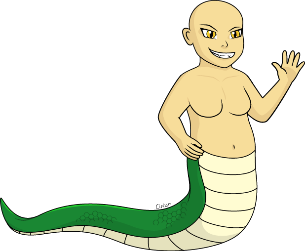
And I am annoying because I am back with the same drawing, but new problems. I got the pecs fixed, but now I've got breast trouble. I'm not too worried if they're a bit low because some body shapes are like that, but I have no clue how to space them horizontally. You'll also notice something terrible has happened to the lower hand. >-< It was supposed to be cupped around the hip, but it just sort of... squished when I tried.

Redlines or advice please? (Larger size to show detail.)

Image

The good news is I think I've finally got the shading on the tail right!


---Image---
Adopt a Teamaid at Mythicarium!
Click the teacup to see!


User avatar
Ciriun
 
Posts: 2513
Joined: Mon Sep 22, 2008 1:47 pm
My pets
My items
My wishlist
My gallery
My scenes
My dressups
Trade with me

Re: The Artist Army

Postby gwanu » Tue Apr 07, 2015 6:05 am

I'd love some feedback on this. Also constructive criticism, I am okay with harsh criticism, if I could get that I'd be most thankful.

Image

@Utterly
I think it has been improved quite a lot. It's very nice.
Also, I have a tip for straight lines, use a free program called FireAlpaca and in it there is a stabiliser option which can help a LOT with shaky lines. It's in the top part of the program.

@meowool
Now, I have done a redline for you and I'm going to explain a little so you actually know what to do without just going over my sketch as a finishing product and actually trying to develop it more and make it even nicer. It is very important to study pictures of cats. Also, if you're going for very correct anatomy I do suggest looking at a skeleton as the bones really show where each line should go and that is much better than to just go from the top of your head. With cats it's all about proportion. The head is usually the smallest and the back is usually arched slightly near the end. The style of how one draws the legs, which expression you chose and how you draw the ears is up to you mostly. It's all about style. My back legs ended up pretty thick so if you were to fix anything I do suggest you think down the back legs. I also haven't done anything to the paws as everybody has their own way of drawing the paws. I've went for making the top of the leg look like a half oval as that shows how the shape of the leg goes. Now it's all up to you to develop. The tail can vary in length, thickness, shape and fluff.
Here's my take on that initial sketch {cartoon style} :
Image
User avatar
gwanu
 
Posts: 3335
Joined: Thu Nov 07, 2013 8:48 am
My pets
My items
My wishlist
My gallery
My scenes
My dressups
Trade with me

Re: The Artist Army

Postby dorkasaurus » Fri Apr 10, 2015 9:44 am

    hello! it's my first time posting here, so I hope I've followed all of the rules! ^v^

    I mostly draw animals, ponies (mlp:fim), and Pokémon, but I also occasionally attempt to draw in humans in an anime/manga
    style. I use an app called 'Drawcast' to do a majority of my digital art. I use a maximum of two layers.
    here's just a couple of things I've drawn {I plan to post more in the future. this is all I have on hand at the moment}:
    pony
    kaneki ken sketch {{reference}}
    any feedback or constructive criticism is greatly appreciated!

    @gwanu

    ahh~! so pretty! I adore the background, the fur texture, and the colour scheme! like seriously, teach me how to fur :0
    I don't have too much to say constructive criticism wise aside for some minor changes... For instance, I believe that the chest could be puffing out a bit more. Looking at the angle of the nose, I believe that the head should be angled forward a bit as well so that a bit of the left half of the face should be visible. Other than that, a job well done!

    @Ciriun

    The anatomy looks great to me! I also like the lineart, and the tail shading looks very nice. As for the hand on the hip, perhaps try adding a bit of wrist and knuckle details?

    @Utterly

    A very nice sketch! As for just a bit of advice (which you can totally ignore if you want ^^), I think that the hair should fall more downwards since hair doesn't normally stick out? If it's styled in that manner because of thickness/density, try adding shading to make it appears as if each 'clump' is a thick lock. The bottom half of the muzzle should be a bit thicker, and the jawline should be curved, not a straight line. Looks great otherwise! ^^ hope to see it completed
you did well, kim jonghyun (040890 — 121817)
whaddup, i'm dork & i'm addicted to autochess+webtoons
ask for my discord + one-on-one search / kim bbjae bb
User avatar
dorkasaurus
 
Posts: 9176
Joined: Mon May 19, 2014 8:48 am
My pets
My items
My wishlist
My gallery
My scenes
My dressups
Trade with me

Who is online

Users browsing this forum: No registered users and 8 guests