
Forum rules
Oekaki posts must follow our Rules for the Site and Forum,
including the Oekaki Rules and Art Rules.
Having trouble using oekaki? Check out the Oekaki Guide or send in a help ticket.
Oekaki posts must follow our Rules for the Site and Forum,
including the Oekaki Rules and Art Rules.
Having trouble using oekaki? Check out the Oekaki Guide or send in a help ticket.
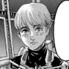
[knight of heat and clockwork] by saintesque

| Artist | saintesque [gallery] |
| Time spent | 3 hours, 54 minutes |
| Drawing sessions | 4 |
| 32 people like this | Log in to vote for this drawing |
7 posts
• Page 1 of 1
[knight of heat and clockwork]
![]() by saintesque » Fri Mar 20, 2015 7:42 am
by saintesque » Fri Mar 20, 2015 7:42 am
edit: //lazily adds other wing//
---
comments and critiques please!
---
i have escaped the pit of homestuck before, but dave strider is still one of my all-time favorite characters.
the lineart is pretty rough; that's because i just like the sketch and didn't want to ruin the "feel" of it by making neater lines.
also, i felt the need to draw something with wings and armor so here is the fruit of my labor. enjoy the eye candy.
---
dave strider belongs to andrew hussie.
art belongs to me.
Last edited by saintesque on Fri Mar 20, 2015 10:33 am, edited 1 time in total.

░
░
░
░
░
░
░
░
░
░
░
░
░
░
░
░
░
我会回来的。───
┏xxxxxxxxxxxxx┓
hi, call me saint
pan . artist . writer
blm
┖xxxxxxxxxxxxx┚
⋆ - ⋆ - ⋆ - ⋆ - ⋆ - ⋆
『xxxi.xii.xiii.xxx』
──── 殿下,信我。
┏xxxxxxxxxxxxx┓
hi, call me saint
pan . artist . writer
blm
┖xxxxxxxxxxxxx┚
⋆ - ⋆ - ⋆ - ⋆ - ⋆ - ⋆
『xxxi.xii.xiii.xxx』
──── 殿下,信我。
░
░
░
░
░
░
░
░
░
░
░
░
░
░
░
░
░

-

saintesque - Posts: 7257
- Joined: Thu Nov 07, 2013 2:28 pm
- My pets
- My items
- My wishlist
- My gallery
- My scenes
- My dressups
- Trade with me
Re: [knight of heat and clockwork]
![]() by voittoisa » Fri Mar 20, 2015 10:05 am
by voittoisa » Fri Mar 20, 2015 10:05 am
Pros:
Okay, first off, I love the drawing. The messy lines on the armor adds to the feel of his title. The cape has nice detail, it looks quite professional. As for the wings, they are very good. The feathers are aligned in crooked and ways, such as a real bird's wing would. That is very well done. The shading is just phenomenal. It's in all the right places and just fits perfectly; not too dark and not too light. It's just perfect. Dave's hair looks almost exactly like the one in his original sprite. The same bends and curls. I really do like that. And his eyes, his beautiful eyes, they are perfect. The shape, the color, the angle, it's just great.
Cons:
Unfortunately, there are a few cons. The blood on Dave's face is not noticeable (not on my screen at least) and I couldn't tell it was blood at first. With further examination, however, it was obvious your intention. Since I figured out what it was, I'll give you props!! The other wing behind Dave is a bit weird. It looks too short/small and is just in an odd angle. The outline color, however much I adore it, doesn't really match the picture it'self. Maybe add more detail to the fingers too. I mean, show it's the hand. I at first though that his elbow was his hand holding a sword (strange huh? x3). Of course, after looking at the cape, I found out his hand was over to the side. Perhaps show that a bit more?


.jpg)
.jpg)


-
voittoisa - Posts: 7464
- Joined: Sun Nov 03, 2013 5:07 pm
- My pets
- My items
- My wishlist
- My gallery
- My scenes
- My dressups
- Trade with me
Re: [knight of heat and clockwork]
![]() by saintesque » Fri Mar 20, 2015 11:26 am
by saintesque » Fri Mar 20, 2015 11:26 am
APH Iceland wrote:
Pros:
Okay, first off, I love the drawing. The messy lines on the armor adds to the feel of his title. The cape has nice detail, it looks quite professional. As for the wings, they are very good. The feathers are aligned in crooked and ways, such as a real bird's wing would. That is very well done. The shading is just phenomenal. It's in all the right places and just fits perfectly; not too dark and not too light. It's just perfect. Dave's hair looks almost exactly like the one in his original sprite. The same bends and curls. I really do like that. And his eyes, his beautiful eyes, they are perfect. The shape, the color, the angle, it's just great.
Cons:
Unfortunately, there are a few cons. The blood on Dave's face is not noticeable (not on my screen at least) and I couldn't tell it was blood at first. With further examination, however, it was obvious your intention. Since I figured out what it was, I'll give you props!! The other wing behind Dave is a bit weird. It looks too short/small and is just in an odd angle. The outline color, however much I adore it, doesn't really match the picture it'self. Maybe add more detail to the fingers too. I mean, show it's the hand. I at first though that his elbow was his hand holding a sword (strange huh? x3). Of course, after looking at the cape, I found out his hand was over to the side. Perhaps show that a bit more?
thanks for the critique. c:
i'll be sure to make the pose more accurate and clear next time,
as well as be more careful in my choice of colors.
i'll be sure to make the pose more accurate and clear next time,
as well as be more careful in my choice of colors.
░
░
░
░
░
░
░
░
░
░
░
░
░
░
░
░
░
我会回来的。───
┏xxxxxxxxxxxxx┓
hi, call me saint
pan . artist . writer
blm
┖xxxxxxxxxxxxx┚
⋆ - ⋆ - ⋆ - ⋆ - ⋆ - ⋆
『xxxi.xii.xiii.xxx』
──── 殿下,信我。
┏xxxxxxxxxxxxx┓
hi, call me saint
pan . artist . writer
blm
┖xxxxxxxxxxxxx┚
⋆ - ⋆ - ⋆ - ⋆ - ⋆ - ⋆
『xxxi.xii.xiii.xxx』
──── 殿下,信我。
░
░
░
░
░
░
░
░
░
░
░
░
░
░
░
░
░
-
saintesque - Posts: 7257
- Joined: Thu Nov 07, 2013 2:28 pm
- My pets
- My items
- My wishlist
- My gallery
- My scenes
- My dressups
- Trade with me
- '''
- Posts: 32393
- Joined: Wed Nov 12, 2014 5:18 am
- My pets
- My items
- My wishlist
- My gallery
- My scenes
- My dressups
- Trade with me
Re:
![]() by saintesque » Sat Mar 21, 2015 12:04 pm
by saintesque » Sat Mar 21, 2015 12:04 pm
{inc.} wrote:I think it looks amazing. ~
thank you!
░
░
░
░
░
░
░
░
░
░
░
░
░
░
░
░
░
我会回来的。───
┏xxxxxxxxxxxxx┓
hi, call me saint
pan . artist . writer
blm
┖xxxxxxxxxxxxx┚
⋆ - ⋆ - ⋆ - ⋆ - ⋆ - ⋆
『xxxi.xii.xiii.xxx』
──── 殿下,信我。
┏xxxxxxxxxxxxx┓
hi, call me saint
pan . artist . writer
blm
┖xxxxxxxxxxxxx┚
⋆ - ⋆ - ⋆ - ⋆ - ⋆ - ⋆
『xxxi.xii.xiii.xxx』
──── 殿下,信我。
░
░
░
░
░
░
░
░
░
░
░
░
░
░
░
░
░
-
saintesque - Posts: 7257
- Joined: Thu Nov 07, 2013 2:28 pm
- My pets
- My items
- My wishlist
- My gallery
- My scenes
- My dressups
- Trade with me
![]() by zombles » Sat Mar 21, 2015 5:17 pm
by zombles » Sat Mar 21, 2015 5:17 pm
- tHIS IS REALLY GOOD MAN
LIKE BLOWN AWAY GOT NO WORDS FOR IT GOOD
-

zombles - Posts: 7140
- Joined: Sun May 12, 2013 4:28 am
- My pets
- My items
- My wishlist
- My gallery
- My scenes
- My dressups
- Trade with me
Re:
![]() by saintesque » Sat Mar 21, 2015 5:35 pm
by saintesque » Sat Mar 21, 2015 5:35 pm
rye-bread wrote:tHIS IS REALLY GOOD MAN
LIKE BLOWN AWAY GOT NO WORDS FOR IT GOOD
OI I-UHH THANK YOU DUDE
░
░
░
░
░
░
░
░
░
░
░
░
░
░
░
░
░
我会回来的。───
┏xxxxxxxxxxxxx┓
hi, call me saint
pan . artist . writer
blm
┖xxxxxxxxxxxxx┚
⋆ - ⋆ - ⋆ - ⋆ - ⋆ - ⋆
『xxxi.xii.xiii.xxx』
──── 殿下,信我。
┏xxxxxxxxxxxxx┓
hi, call me saint
pan . artist . writer
blm
┖xxxxxxxxxxxxx┚
⋆ - ⋆ - ⋆ - ⋆ - ⋆ - ⋆
『xxxi.xii.xiii.xxx』
──── 殿下,信我。
░
░
░
░
░
░
░
░
░
░
░
░
░
░
░
░
░
-
saintesque - Posts: 7257
- Joined: Thu Nov 07, 2013 2:28 pm
- My pets
- My items
- My wishlist
- My gallery
- My scenes
- My dressups
- Trade with me
7 posts
• Page 1 of 1
Who is online
Users browsing this forum: No registered users and 1 guest