
The 2 renders on the left and right are nice,plus the pixels are great! I like how everything in the middle it's centered.
It's neat how you balance everything and there isn't more on just one side. The layout of the signature is organized, and nothing looks out of place! c:
Signature Respect! V. 18! (New rules, please read)
Re: Signature Respect! V. 18! Read the rules.
![]() by spectres » Fri Feb 06, 2015 5:26 pm
by spectres » Fri Feb 06, 2015 5:26 pm
-

spectres - Posts: 3002
- Joined: Wed Dec 18, 2013 3:11 pm
- My pets
- My items
- My wishlist
- My gallery
- My scenes
- My dressups
- Trade with me
Re: Signature Respect! V. 18! Read the rules.
![]() by symmetry » Fri Feb 06, 2015 5:28 pm
by symmetry » Fri Feb 06, 2015 5:28 pm
I live the simplicity and the lack of color!
The gifs are adorable and the organization is absolutely wonderful!
I love it!
The gifs are adorable and the organization is absolutely wonderful!
I love it!

-

symmetry - Posts: 14760
- Joined: Wed May 21, 2014 12:17 pm
- My pets
- My items
- My wishlist
- My gallery
- My scenes
- My dressups
- Trade with me
Re: Signature Respect! V. 18! Read the rules.
![]() by ʞ ɔ ǝ ɹ ʍ d ı ʞ s » Fri Feb 06, 2015 6:38 pm
by ʞ ɔ ǝ ɹ ʍ d ı ʞ s » Fri Feb 06, 2015 6:38 pm
- Ooh, I really like how the drawing is a pencil sketch with a transparent background! And the quote is awesome <3


-

ʞ ɔ ǝ ɹ ʍ d ı ʞ s - Posts: 12175
- Joined: Sat Oct 03, 2009 12:42 pm
- My pets
- My items
- My wishlist
- My gallery
- My scenes
- My dressups
- Trade with me
Re: Signature Respect! V. 18! Read the rules.
![]() by insult » Fri Feb 06, 2015 6:40 pm
by insult » Fri Feb 06, 2015 6:40 pm
I love the layout! the pictures are gorgeous 


-

insult - Posts: 901
- Joined: Tue Apr 29, 2014 12:08 pm
- My pets
- My items
- My wishlist
- My gallery
- My scenes
- My dressups
- Trade with me
Re: Signature Respect! V. 18! Read the rules.
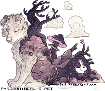
![]() by Pyromaniacal » Fri Feb 06, 2015 6:44 pm
by Pyromaniacal » Fri Feb 06, 2015 6:44 pm
The gif is very pretty c:
linebreak
✧ ---------- PYRO - HE/ANY ---------- ✧
✧ STATUS: Cringe and free.x
✧ ANIMAL: Wukongopterusx
✧ GAME: Deltarunexxxxxxxiii
----------------------------------------
Friend ✧ Trades ✧ Simas
----------------------------------------
IF THE WORLD CHOOSES TO
BECOME MY ENEMY, I WILL
FIGHT LIKE I ALWAYS HAVE!
✧ ------------------------------------------ ✧
-

Pyromaniacal - Official Artist
- Posts: 8594
- Joined: Wed Apr 17, 2013 1:19 am
- My pets
- My items
- My wishlist
- My gallery
- My scenes
- My dressups
- Trade with me
Re: Signature Respect! V. 18! Read the rules.
![]() by Devonsona » Fri Feb 06, 2015 8:32 pm
by Devonsona » Fri Feb 06, 2015 8:32 pm
the art
the font
everything
colors
JUST
UGH
PERFECT
the font
everything
colors
JUST
UGH
PERFECT

Y O U T U B E • D E V I A N T A R T • R E D P E T S • S O N G

⫸ 𝑻 𝒉 𝒐 𝒖 𝒈 𝒉 𝒕 𝑰 ' 𝒅 𝒃 𝒆 𝒅 𝒆 𝒂 𝒅 𝒃 𝒚 𝒏 𝒐 𝒘 ⫷

T U M B L R • S P O T I F Y M I X • B O Y F R I E N D • P E T S

-

Devonsona - Posts: 4676
- Joined: Tue Oct 29, 2013 1:11 pm
- My pets
- My items
- My wishlist
- My gallery
- My scenes
- My dressups
- Trade with me
Re: Signature Respect! V. 18! Read the rules.
![]() by vincent, » Fri Feb 06, 2015 9:08 pm
by vincent, » Fri Feb 06, 2015 9:08 pm
I like the quote you have used and the image is very cute too.
Its simple and the font is very nice as well.
Its simple and the font is very nice as well.
- vincent,
- Posts: 6229
- Joined: Wed Nov 12, 2014 12:23 pm
- My pets
- My items
- My wishlist
- My gallery
- My scenes
- My dressups
- Trade with me
Re: Signature Respect! V. 18! Read the rules.
![]() by Normal » Fri Feb 06, 2015 9:13 pm
by Normal » Fri Feb 06, 2015 9:13 pm
The layout is amazing! and wow his outfits change that's pretty cool
-

Normal - Posts: 2900
- Joined: Sat Nov 20, 2010 2:40 pm
- My pets
- My items
- My wishlist
- My gallery
- My scenes
- My dressups
- Trade with me
Re: Signature Respect! V. 18! Read the rules.
![]() by oat » Fri Feb 06, 2015 9:21 pm
by oat » Fri Feb 06, 2015 9:21 pm
Love how simple it is!
the stampies are gorgeous
and the roses and chickens are so cute!
the stampies are gorgeous
and the roses and chickens are so cute!
-

oat - Posts: 6303
- Joined: Sun Dec 07, 2014 4:19 pm
- My pets
- My items
- My wishlist
- My gallery
- My scenes
- My dressups
- Trade with me
Re: Signature Respect! V. 18! Read the rules.
![]() by FriendsWantCake » Fri Feb 06, 2015 11:05 pm
by FriendsWantCake » Fri Feb 06, 2015 11:05 pm
Since your signature is just wonderful, I will split it up into left, center, right.
Left: I love your weaving, it doesn't actually go OVER the person/image but it still gives it the nice effect you desired. The drop shadow effect is also pretty cool. It looks neat for you stayed with the same color scheme.
Center: It's so neat! Starting with a quote, then your bio and then your links. I never thought that you could use 1 letter for 1 link ^^ Smart idea!
Right: Again, same as the left side, but it looked a bit better because you had a circle shape, making it look like you spent even MORE effort.
Overall, great job!


┏XXXXXXXXXXXXXXXXXXXXXXXX
Tell me Something I Need to Know
Then Take my Breath and Never let it go
If you Just let me Invade Your Space
I'll Take the Pleasure,
Take it with the Pain
XXXXXXXXXXXXXXXXXXXXXXXX┚
┏XXXXXXXXXXXXXXXXXXXXXXXX
Coding Shoppe | Auction
XXXXXXXXXXXXXXXXXXXXXXXX┚


-

FriendsWantCake - Posts: 1814
- Joined: Wed Jul 30, 2014 4:40 pm
- My pets
- My items
- My wishlist
- My gallery
- My scenes
- My dressups
- Trade with me
Who is online
Users browsing this forum: Deturath, donutajj, fιяєfℓу, jjumpydoll, wildheart2002 and 15 guests