The Artist Army

Join or create fan clubs about your favorite things!

Re: The Artist Army

Postby Ciriun » Sat Jan 31, 2015 2:06 pm

@Oddly Shaded
Don't forget to comment on someone else's art when you post yours.

@Kristen
For the fire and air, you might want to try drawing invidual wisps instead of one solid shape. Sort of like the patterns you have filling them now, just take shapes like those and arrange them radiating from their sources. You can also look up screenshots from the show to use as reference.


@CrazyClaw+
Thank you so much, it looks a ton better now! I've also added on wings, since it is going to be a fairy. Now I'm onto the not so fun part of drawing on clothes. xX If anyone happens to know a good tutorial for drawing dresses/skirts/gown, please let me know!

Image


---Image---
Adopt a Teamaid at Mythicarium!
Click the teacup to see!


User avatar
Ciriun
 
Posts: 2513
Joined: Mon Sep 22, 2008 1:47 pm
My pets
My items
My wishlist
My gallery
My scenes
My dressups
Trade with me

Re: The Artist Army

Postby salmondragon » Sun Feb 01, 2015 10:07 am

@Oddly Shaded

Wow, quite an interesting character you've got there. I really like the pose (and that hair *grabby hands*), this drawing is amazing! <3

@Ciriun
There's a few tumblr pages listed on this page that have done clothing
one here on clothing folds (it does cover skirts I'm pretty sure)

--

I was kind of wondering if anybody here to help me out with this; (large image)
Image

(Sorry that the actually character is so small yet the actual canvas is so big x.x The main part of the drawing is the background which I haven't started ^.^")

I was wondering if any of you could possibly give me help with the scarf especially (though any help is appreciated!)

(only ref used was a toy deer I have, like a schleich one)
User avatar
salmondragon
 
Posts: 3869
Joined: Mon Sep 17, 2012 7:35 am
My pets
My items
My wishlist
My gallery
My scenes
My dressups
Trade with me

Re: The Artist Army

Postby crystal gryphon » Tue Feb 03, 2015 4:22 pm

@turtlezsoup
image.jpg
image.jpg (33.44 KiB) Viewed 49 times

Here's a redline for you! I don't have much experience with deer so it isn't that great, sorry. ;v;

---

I would love to get some critique/redlining on my anatomy for this:
image.jpg
Ethan the fabulous
image.jpg (120.78 KiB) Viewed 49 times

This is my new character Ethan. (both of them XD)
I've been practicing a lot with people recently, and only have a few months worth of experience drawing them, because I NEVER drew them before now. :,D
Since this is just a colored sketch, I just want advice on anatomy. ^_^
Image
User avatar
crystal gryphon
 
Posts: 1463
Joined: Mon Oct 12, 2009 2:44 pm
My pets
My items
My wishlist
My gallery
My scenes
My dressups
Trade with me

Re: The Artist Army

Postby Silverhart » Tue Feb 03, 2015 9:49 pm

Alright, I'm gonna try my hand at critiquing here. *takes a deep breath*

TurtlezSoup wrote:@Ciriun
There's a few tumblr pages listed on this page that have done clothing
one here on clothing folds (it does cover skirts I'm pretty sure)

--

I was kind of wondering if anybody here to help me out with this; (large image)
Image

(Sorry that the actually character is so small yet the actual canvas is so big x.x The main part of the drawing is the background which I haven't started ^.^")

I was wondering if any of you could possibly give me help with the scarf especially (though any help is appreciated!)

(only ref used was a toy deer I have, like a schleich one)


The eye is misplaced in comparison to the ears and nostrils. You should be able to draw a line through the nostril to the base of the ear, and bisect the eye. This is true of most animals (well, those that have eyes, and ears, and nostrils at least). The far back leg is also a bit too... bendy looking. Feet should always look like they're firmly planted - keep in mind that they are supporting the animal's weight. I would also look at the far front leg as well. Even with a toy for reference it should look like it's legs can support it. I really like Crystal gryphon's redline of the scarf, and how it falls down straight. Your scarf looks off in that it appears to be "billowing" backwards, yet the strands on the end don't follow this motion, and that's what's causing it to look off for me. The scarf could also benefit from some wrinkles in it - just one or two well placed lines within the bulk of the scarf. I will say, I really like the simple line work and style. The near front leg and shoulder, even without a lot of detail, look really solid to me.

Crystal gryphon wrote:I would love to get some critique/redlining on my anatomy for this:
-snip-
This is my new character Ethan. (both of them XD)
I've been practicing a lot with people recently, and only have a few months worth of experience drawing them, because I NEVER drew them before now. :,D
Since this is just a colored sketch, I just want advice on anatomy. ^_^


Urgh... you're probably better then me at this, and all you did was a sketch. XP Still, I've been studying human anatomy for a few months now - so you'd think I'd have some knowledge to share. At least I hope.
First off, it looks very flat. It's really good to start off a sketch with straight angular lines like you did, but the next step is definitely adding curves and dimension. That left arm is really suffering from this. Remember they are representing 3D shapes, not 2D ones. He's made up of cubes, spheres, and cones, not squares, circles, and triangles.

Now... the left arm. It's longer then the right which is a bit of a problem (rule of thumb is the arm comes down to about mid thigh, so the problem may be the right arm is too short), but it's main issues is flatness. There's a 'rule' in drawing biological creatures. Things are generally thicker at their base, and then taper toward their joint. This is true of the lower arm, (as well as the upper arm) which should be wider near the elbow, and taper down toward the wrist. I won't even say anything about the hands, since I totally fail at hands. XP

Lastly, it's a bit stiff. I think you'll get better at this with time and practice. I know I struggle with it myself, but have been slowly improving - still I don't know how much good advice I can offer here. Look for the big connecting lines in a composition. The dog in the picture for example has wonderful rhythm to it. The way the curve of the neck, and the muzzle just sort of leads you to the main focus point of the eye.

Those are the only points I can think of right now. It's a bit hard to judge anatomy when most of it's covered with clothes. But, remember, you're trying to create the illusion of a 3D object - a human. Just try thinking of it as a 3D shape instead of a 2D one.

Also those wings are gorgeous, and I hope you finish the piece.
Image
User avatar
Silverhart
 
Posts: 2603
Joined: Tue Nov 03, 2009 9:21 am
My pets
My items
My wishlist
My gallery
My scenes
My dressups
Trade with me

Re: The Artist Army

Postby FeatherHeavy » Wed Feb 04, 2015 4:17 am

Hey! I draw realistically, but I'd like some help. Any criticisms?
Attachments
image.jpg
image.jpg (251.67 KiB) Viewed 242 times
image.jpg
image.jpg (29.5 KiB) Viewed 242 times
FeatherHeavy
 
Posts: 1
Joined: Tue Feb 03, 2015 4:32 am
My pets
My items
My wishlist
My gallery
My scenes
My dressups
Trade with me

Re: The Artist Army

Postby geinkotsu » Wed Feb 04, 2015 10:29 am

@TurtlezSoup
I'll see about helping you out as much as I can as I've been studying cervidae as much as I can lately.

The first thing I want to say, and this pretty much goes for everyone, is that if you are studying from someone else's craft you have to be very aware that you are also studying their mistakes. This goes for other drawings or sketches, toys or sculptures, diagrams. Anything. Usually none of these are perfect and will have mistakes that you will be learning if you aren't careful to determine what is acurate.

The best way for you to study in the most acurate form is to study from life. Photos are your most acurate aid- but they can also be lacking in the information you need. Use other illustrations, which are exaggerated in forms, to apply to your studies and it'll make it easier to determine the forms you want to learn.

With that being said, I'll move on.

You mainly wanted help with the scarf yes?

I was not sure which style you were wanted, I assume it was an over knot. But I've also sketched some other styles for you to help differentiate and kind of see the forms they create.

[scrubbed image/link]

Now, what you have so far is actually very good, it's just lacking that extra push of form to tell us where that fold is going. Right now, what you have looks kind of like a wrap, only because it lacks that last bit of scrunched detail to look like it's tucked. Also, depending on the weight of your scarf determines how much fold there is or how heavy it is (meaning how much straighter it is with gravity). A knitted scarf will be very stiff and thick with very thick folds. While a light weight scarf will bunch up a lot and will also be a lot more curvy and twisty.

For my scarves I have made them fairly thick both because it is easier to draw and it is easier for you to make out the shapes.

Now for a little bit of anatomy- don't try to over think this too much, I know it looks pretty intimadating. Just follow along with me bit by bit.

[scrubbed image/link]
Now what I did here to try and help you compare the anatomy is I created a proportional grid on a photo of a stag.

All of these lines are all beginings or ends to all the very basic forms. The scapula, or shoulder, the ankles, stomach, and pelvise. Each point is the highest, lowest, furthest, or center point where each line is based off of.
I personally always start with the pelvis and shoulder area and work my way to the stomach and then legs.

I did the same thing with your drawing and then put them side by side and overlaped them so you can see the two different proportions.

What I can see from both of these grids is that your front arm is quite wide, and your legs are quite short. This is, I assume, due to you studying off your toy figurine. Most animal toys are intentionally made stalky in proportion to seem cute. I do not recomend studying from toys unless they are very intentionally realistic figurines- even then, agian, you have to be very wary of mistakes made by creators.

However, your initial body sketch is well done and thusly I have based the rest of my redline off it because for me, and for reworking onto something already there, it's best to work within the dimensions already presented. So instead of enlarging everything, I proportionalized what was needed in correlation with the body already made.

[scrubbed image/link]

What I did here was make the slight adjustments to the proportions (as seen on the left) and I drew out the corrections of lengthening and thinning the legs. I, as well, sloped the pelvis and moved it's highest point forther towards the pelvis line.

A problem which has been pointed out previous is the weight on your back legs. This is due to your back leg being sloping too far for this standing stance. To put more weight on it, simply straighten it out a little (as seen on my sketch) and it'll easily give a better sense of weight.

Now for a quick proportional guide of the skull.

[scrubbed image/link]
I have, again, cut it in thirds and have crated the line in corelation to the nose, eye, and ear.
The base of your skull is alright, however the snout is too broad and the base of the ear too high. Deers have very triangular shaped heads with muscle structures similiar in horses.

Also, to generalize, your head is rather large compared to the body. Compared to the body their skulls are actually quite small.
All in all, here's the finished redline-

[scrubbed image/link]

My apologies if that was a lot to take in, I tried to make it as simple as possible.

The biggest problem is your study material. Study accurately, not conveniently. You have to do your best to wrap your mind around the proportions and the structures. I know it isn't easy, but it's well worth it once you figure it out.

For me, studying is mostly illustrations of bone, muscle, and posing and then putting that together with photos of that animal and it's bone structure. Illustrations drawn by other people whom have studied the animal helps me because the drawn forms are easier for me to see. However, like I have said many times now, I have to be careful about the potential mistakes in said illustrations. So you have to take it all with a grain of salt and do what's best for you to see the forms accurately.
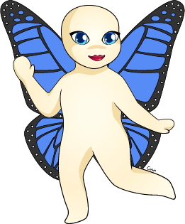

@Crystal gryphon
You're doing really great for only a few months of experience with humanoids! Your face looks really good, though probably leave some more room for the chin by raising the mouth a little. The ear could come down a tad as well. But that's just nit picking.

Your shoulders and neck area are looking good though the neck could use a smoother transition into the shoulders. As it's been said, everything is pretty 'flat'. Only because it's lacking a few finessing curves such as around the mid section of the abdomen, the neck area, and forearms. With clothes added on this can be difficult as clothing makes everything pretty bulky and shapeless.

For some actual anatomy, your arms are a little wonky. Your elbow on the left (technical right arm) is rather low, and it makes your forearm rather low. Your wrist should reach the middle or so of your deltoid (thats your shoulder muscle!). As for the other arm. It looks short, but I can easily dismess that as perspective because it can look like that if you turn your arm back intoward your body. However if it were to be straight from your body, it would have a more pronounce bend.

@FeatherHeavy
I'm afraid I'm not as familiar with bird as I would like! At least other than the wings.
The wings themselves from my experience, however, looks really good for the pose! My main problem is the legs and the bottom area. I can't really say why, again I'm not as familiar with birds as I'd like. I'm afraid that's all I can offer you.
Last edited by geinkotsu on Tue Nov 29, 2022 4:14 pm, edited 2 times in total.
User avatar
geinkotsu
 
Posts: 4278
Joined: Sun Sep 05, 2010 8:33 am
My pets
My items
My wishlist
My gallery
My scenes
My dressups
Trade with me

Re: The Artist Army

Postby Neon-chan » Thu Feb 05, 2015 9:21 am

FeatherHeavy wrote:Hey! I draw realistically, but I'd like some help. Any criticisms?

I don't really know much, but it looks like the owl's legs are too small, he's going to topple over!
Image

Image
Image
Image
wip
User avatar
Neon-chan
 
Posts: 2939
Joined: Mon Sep 01, 2014 3:50 am
My pets
My items
My wishlist
My gallery
My scenes
My dressups
Trade with me

Re: The Artist Army

Postby Silverhart » Sat Feb 07, 2015 5:14 pm

Geinkotsu! Long time, no see! And also, you're so much better at this critiquing then I am. XP I learned something new today, so that's good.

Do you have any specific illustrators you recommend to study? I have a few books on animal anatomy, but I wouldn't mind looking into other artists.

@FeatherHeavy
I gotta agree with everyone else in saying the bottom legs doesn't quite look in proportion to the rest of the owl. The face looks a bit wide to me as well, and the wings could use more definition. The feathers should feel more... separate I think? On the right (those are the primary flight feathers, I believe?) they feel very much like just a big clump. Varying them up a bit would create a bit more interest there.
Image
User avatar
Silverhart
 
Posts: 2603
Joined: Tue Nov 03, 2009 9:21 am
My pets
My items
My wishlist
My gallery
My scenes
My dressups
Trade with me

Re: The Artist Army

Postby Ciriun » Fri Feb 13, 2015 7:08 pm

Hi, me again! I tried to wait for more other people to post so I'm not spamming this, but it's been a bit, sooo...

@FeatherHeavy
Please remember that you have to comment on someone else's art when you post your own. It is one of the rules for this thread.

@Crystal Gryphon
I think everyone else has covered what to fix, so I'll just say that you did a great job on the wings and the facial expression. He looks slightly irritated, which combined with the gesture makes me think he's telling someone to take a hike. XD

@TurtlezSoup
Wow, other people have really covered anatomy for yours. You'll definitely want to take all of it into account in your future drawings, but don't be afraid to keep it a little bit stylized. That doesn't mean ignoring anatomy, but if for example you wanted to make a leggy little deer with a big head and huge eyes *cough*bambi*cough*, then you should totally go for it.

-----
Still working on that fairy, but until I figure out the dress making business, here is my newest little guy. He's supposed to have a little bit of a belly, and overall have a fierce yet cuddly look to him. I think I botched my shading direction, it's supposed to be the upper right corner. I'm also pretty certain his pecs are in the wrong spot. Redlines would be greatly appreciated!

Image


---Image---
Adopt a Teamaid at Mythicarium!
Click the teacup to see!


User avatar
Ciriun
 
Posts: 2513
Joined: Mon Sep 22, 2008 1:47 pm
My pets
My items
My wishlist
My gallery
My scenes
My dressups
Trade with me

Re: The Artist Army

Postby kristenn11 » Tue Feb 17, 2015 3:34 am

Ciriun wrote:Still working on that fairy, but until I figure out the dress making business, here is my newest little guy. He's supposed to have a little bit of a belly, and overall have a fierce yet cuddly look to him. I think I botched my shading direction, it's supposed to be the upper right corner. I'm also pretty certain his pecs are in the wrong spot. Redlines would be greatly appreciated!

Image


I really like how this is drawn and because I'm not all that great with humans, I'm going to tell you more about the coloring. I think that the switch from the tail to human is too subtle. If you're trying to do a serpent, I recommend putting scales on the human part or prehaps just on the lower stomach so the tail and human half can blend more easily.

----
I wanted to critique on a picture a drew a few weeks ago. I know the snout is all wrong and I tried looking up cats, but when I draw the snout it just looks really odd. I'm not going for realistic, but I'd still love to get the ananamy correct. Redlines are greatly appreciated. I want to keep this cartoon, but well drawn. Thanks for any help! Image
kristenn11
 
Posts: 9355
Joined: Sun Sep 02, 2012 12:37 pm
My pets
My items
My wishlist
My gallery
My scenes
My dressups
Trade with me

Who is online

Users browsing this forum: GoogleBotOther, KissKisser and 17 guests