
Signature Respect V.17! Read the rules.
Re: Signature Respect V.17!
![]() by vinny. » Thu Jan 01, 2015 10:38 pm
by vinny. » Thu Jan 01, 2015 10:38 pm
I love the galaxy thing and the way there on the sides and the curves on the images also the text is very pleasant.
-

vinny. - Posts: 1795
- Joined: Wed Oct 16, 2013 11:29 am
- My pets
- My items
- My wishlist
- My gallery
- My scenes
- My dressups
- Trade with me
Re: Signature Respect V.17!
![]() by W A R R I O R S . » Thu Jan 01, 2015 10:43 pm
by W A R R I O R S . » Thu Jan 01, 2015 10:43 pm
I like five nights at treasure island and i cant really read what it says yea sorry D:
-

W A R R I O R S . - Posts: 12570
- Joined: Thu Mar 13, 2014 11:47 am
- My pets
- My items
- My wishlist
- My gallery
- My scenes
- My dressups
- Trade with me
c:
![]() by hyena. » Fri Jan 02, 2015 12:17 am
by hyena. » Fri Jan 02, 2015 12:17 am
so simple and so powerful, lovely text and very clean <3 xo
Tex
-

hyena. - Posts: 5541
- Joined: Wed Jun 27, 2012 5:01 am
- My pets
- My items
- My wishlist
- My gallery
- My scenes
- My dressups
- Trade with me
Re: Signature Respect V.17!
![]() by vinny. » Fri Jan 02, 2015 12:22 am
by vinny. » Fri Jan 02, 2015 12:22 am
I love the font and the way and its placed and the size of it how it goes up and down and its just so beautiful. Also that fawn is so cute.
-
vinny. - Posts: 1795
- Joined: Wed Oct 16, 2013 11:29 am
- My pets
- My items
- My wishlist
- My gallery
- My scenes
- My dressups
- Trade with me
Re: Signature Respect V.17!
![]() by The Smiler » Fri Jan 02, 2015 1:44 am
by The Smiler » Fri Jan 02, 2015 1:44 am
Whoa. I love the way you put in the image of photo-negative Mickey. I guess it helps that I love that creepypasta and Five Nights at Treasure Island. The Zalgo text is a really clever way to quote him, it gives it the added concept of horror. The "Abandoned by God" part looks very cool layered above the image, too! c:

who do you belong to?
-

The Smiler - Posts: 3062
- Joined: Wed Oct 28, 2009 5:09 am
- My pets
- My items
- My wishlist
- My gallery
- My scenes
- My dressups
- Trade with me
Re: Signature Respect V.17!
![]() by germ! » Fri Jan 02, 2015 1:50 am
by germ! » Fri Jan 02, 2015 1:50 am
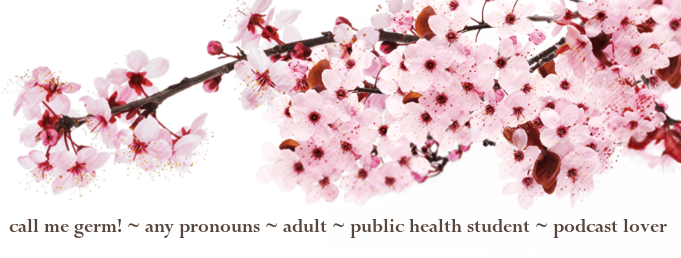
The organization is really nice, and I really like how its left sort of simple and uncluttered, but it's still not empty c:
-

germ! - Posts: 167
- Joined: Tue Nov 04, 2014 2:23 am
- My pets
- My items
- My wishlist
- My gallery
- My scenes
- My dressups
- Trade with me
Re: Signature Respect V.17!
![]() by solipsism. » Fri Jan 02, 2015 3:19 am
by solipsism. » Fri Jan 02, 2015 3:19 am
I like the simplicity and it's neatly organised. I also like the gifs and how you've included what you're currently doing. (go Supernatural! c:)

she/her - intp - virgo - slavic - autistic - adult

-

solipsism. - Posts: 1962
- Joined: Sat Nov 16, 2013 10:50 pm
- My pets
- My items
- My wishlist
- My gallery
- My scenes
- My dressups
- Trade with me
Re: Signature Respect V.17!
![]() by Hawky<3 » Fri Jan 02, 2015 3:24 am
by Hawky<3 » Fri Jan 02, 2015 3:24 am
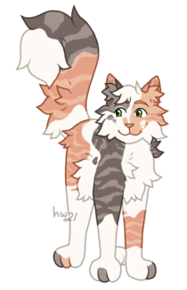
love how neat it is! i like the CS birds, and the pet is beautiful <3
-

Hawky<3 - Posts: 10616
- Joined: Sat May 18, 2013 12:14 pm
- My pets
- My items
- My wishlist
- My gallery
- My scenes
- My dressups
- Trade with me
Re: Signature Respect V.17!
![]() by Cooluser1615 » Fri Jan 02, 2015 3:27 am
by Cooluser1615 » Fri Jan 02, 2015 3:27 am
The image of the squid is cute and quite original looking. I like the way you have a neat, organised little box for text in the centre of your signature. The way that the text says a little bit about yourself is certainly appealing, and the links at the bottom of the box are all well laid out. I also appreciate the lack of any blindingly bright colours. I think that it's an overall great signature with a simple sort of charm to it.
-

Cooluser1615 - Posts: 3326
- Joined: Tue Apr 02, 2013 10:34 am
- My pets
- My items
- My wishlist
- My gallery
- My scenes
- My dressups
- Trade with me
Re: Signature Respect V.17!
![]() by {willow;; » Fri Jan 02, 2015 3:35 am
by {willow;; » Fri Jan 02, 2015 3:35 am
i love the color scheme you chose for this signature, it's very attractive and goes together nicely. i like how the clickable pets even go with the colors as well. c: the image in the center make's it all very neat and tied together. i also like how you filled in the space on the side with stuff about yourself. the borders you used on top of the text goes very neatly and looks very elegant, and i also like how you added the snowflake in the middle. <3
[new account is {bloom ]
-

{willow;; - Posts: 3317
- Joined: Fri Feb 15, 2013 1:27 pm
- My pets
- My items
- My wishlist
- My gallery
- My scenes
- My dressups
- Trade with me
Who is online
Users browsing this forum: .*Rose*., 22dull, Antipathy, Daxx, Ɗɑŋɑ, Hellishborn, Lunarhaven, NERV AGENT, opossuwu and 3 guests