
« literate aliens » eating earthlings since 2013
Re: « literate aliens » eating earthlings since 2013
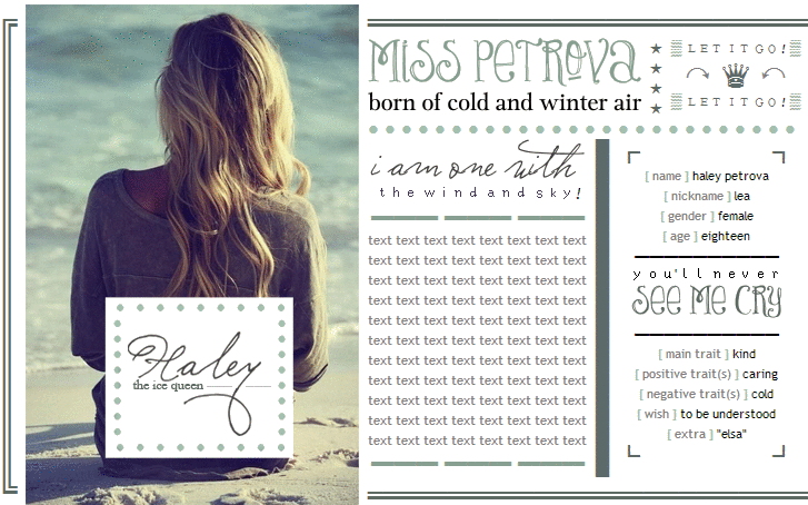
![]() by mercie » Sun Jun 15, 2014 3:51 am
by mercie » Sun Jun 15, 2014 3:51 am
-

mercie - Posts: 56
- Joined: Thu Dec 19, 2013 12:31 am
- My pets
- My items
- My wishlist
- My gallery
- My scenes
- My dressups
- Trade with me
« literate aliens » eating earthlings since 2013
![]() by europa, » Sun Jun 15, 2014 3:54 am
by europa, » Sun Jun 15, 2014 3:54 am
- @Charmey; Aw thankyou very much for the comment on my coding cx
I'm glad you like it! I am just relieved that it fits XD
@milenia; Danke for letting me know my form looks alright on your screen!
and thank you for the comment also cx Hmm... I might have a go at the compettion,
I'll see how things go XD
@Abandoned; deh stars XD Ha ha, thank you! Also best of luck with your coding!
I'm sure you'll do really well ^^
@Tundra; I am glad I could help! The form you have done now looks like a great improvment!
however, I think you should lower the text, just to make it look a bit more level cx
@Chagrin; Loving the image and the boxes! I also love the structure you are going for!
My only advice would be to add a bit of colour but for now that is the only critizism I can give cx
@calli; ooh they look both look lovely! I think I like the first one though cx
Extra note; Could anyone give a comment on this
form I made? I am debating about the colours I chose XD
Last edited by europa, on Sun Jun 15, 2014 7:21 am, edited 1 time in total.


━━━━━━━━━━━━━━━
IN A PITCH BLACK SKY
┗--------------------------------------┛▬▬ ▬ ▬▬ ▬ ▬▬ ▬ ▬▬ ▬ ▬▬ ▬ ▬▬
shimee buddy americag! winnie kpop master
-

europa, - Posts: 426
- Joined: Mon Feb 24, 2014 9:28 pm
- My pets
- My items
- My wishlist
- My gallery
- My scenes
- My dressups
- Trade with me
Re: « literate aliens » eating earthlings since 2013
![]() by mercie » Sun Jun 15, 2014 4:00 am
by mercie » Sun Jun 15, 2014 4:00 am
- ariadne, your intro page is still a bit off (the arrows above and below "dark demons" are too wide. remove one from above and below, and then the picture will fit (for me). but your second form is perfect.
(reference: my monitor is around 18 inches diagonally)
-
mercie - Posts: 56
- Joined: Thu Dec 19, 2013 12:31 am
- My pets
- My items
- My wishlist
- My gallery
- My scenes
- My dressups
- Trade with me
![]() by pumpkin. » Sun Jun 15, 2014 7:17 am
by pumpkin. » Sun Jun 15, 2014 7:17 am
- @calli I think I prefer the first one as well c:
guys, I'm terribly curious.
how are you all posting forms as a full picture, or doing something of the sort?
like, calli, what you did with your form.
how the heck did you do that? cx
(sorry if this is confusing whoops.)
-

pumpkin. - Posts: 19373
- Joined: Fri Sep 21, 2012 7:21 am
- My pets
- My items
- My wishlist
- My gallery
- My scenes
- My dressups
- Trade with me
![]() by chagrin » Sun Jun 15, 2014 7:30 am
by chagrin » Sun Jun 15, 2014 7:30 am
- @pumpkin - i don't know about the rest and if they do it differently but i use pixlr and screenshots and just crop it out and everything i need. xD i try to avoid doing it tho, cause it's tricky to edit the text and information afterwards
-
chagrin - Posts: 5542
- Joined: Sat Jun 25, 2011 4:11 am
- My pets
- My items
- My wishlist
- My gallery
- My scenes
- My dressups
- Trade with me
![]() by pumpkin. » Sun Jun 15, 2014 7:34 am
by pumpkin. » Sun Jun 15, 2014 7:34 am
- @'chagrin thanks for the information; it sounds way too complicated for me cx
I'll just stick to my simple, incompetent coding woo-hey.
-
pumpkin. - Posts: 19373
- Joined: Fri Sep 21, 2012 7:21 am
- My pets
- My items
- My wishlist
- My gallery
- My scenes
- My dressups
- Trade with me
![]() by chagrin » Sun Jun 15, 2014 7:52 am
by chagrin » Sun Jun 15, 2014 7:52 am
- x do you some times find it hard to write the right amount of words in a role play template you have made?
way too often! i usually always do the coding first before writing the details and i have a hard time writing the exact length i need for everything to look as it is supposed to :c
@pumpkin - no problem love. your coding is perf anyway
@ariadne - thanks for the critique. i'll see what i can do about it. c:
and your form looks beautiful. the colors go together nicely. i wouldn't change anything about it.
@calli - i'd use the second one.
[the one where the name box cuts trough the whole picture]
i just think it looks better that way.
-
chagrin - Posts: 5542
- Joined: Sat Jun 25, 2011 4:11 am
- My pets
- My items
- My wishlist
- My gallery
- My scenes
- My dressups
- Trade with me
Re: « literate aliens » eating earthlings since 2013
![]() by spiff » Sun Jun 15, 2014 10:20 am
by spiff » Sun Jun 15, 2014 10:20 am
@calli I agree with chagrin, I like the second version better ;o
@all I'm facing a bit of a dilemma here, which
color palette do you guys think looks best?
▉▉▉ this one, ▉▉▉ or this one?
▉▉▉▉ or should I combine them?
@all I'm facing a bit of a dilemma here, which
color palette do you guys think looks best?
▉▉▉ this one, ▉▉▉ or this one?
▉▉▉▉ or should I combine them?
-

spiff - Posts: 12076
- Joined: Mon Oct 12, 2009 11:46 am
- My pets
- My items
- My wishlist
- My gallery
- My scenes
- My dressups
- Trade with me
![]() by chagrin » Sun Jun 15, 2014 10:25 am
by chagrin » Sun Jun 15, 2014 10:25 am
- @sak - i don't know what to say.
it really depends on the picture you have and everything else
the first choice are all similar by tone which is good if you want a simplistic and low feel to it
the second one the pink is kind of stronger than the rest and will be easier to make an emphasis with it
they also look really good when they are combined
but i'll say it again, it really depends on what you want
-
chagrin - Posts: 5542
- Joined: Sat Jun 25, 2011 4:11 am
- My pets
- My items
- My wishlist
- My gallery
- My scenes
- My dressups
- Trade with me
![]() by pumpkin. » Sun Jun 15, 2014 10:27 am
by pumpkin. » Sun Jun 15, 2014 10:27 am
- @sak I think the combined one is preferable? I clicked on your profile because I'm a creep and found your character thread and I think I see the image you want to use. the first one matches with all of the colors in the photo, and while the second scheme is nice, I don't think the tan-ish pink color would fit on its own. but, I also don't think the color scheme should completely match the photo, seeing how that can look weird depending on how you use it. so, I think you should use the combined color scheme. I sound really moronic.
-
pumpkin. - Posts: 19373
- Joined: Fri Sep 21, 2012 7:21 am
- My pets
- My items
- My wishlist
- My gallery
- My scenes
- My dressups
- Trade with me
Who is online
Users browsing this forum: No registered users and 5 guests