The Artist Army

Join or create fan clubs about your favorite things!

Re: The Artist Army

Postby Thalassic » Mon Jan 06, 2014 8:32 am

@Summer~Breeze
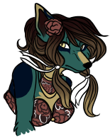
You could try drawing the hair in strands, not as a single mass. It would look a lot more flowy and dynamic that way. uvu
The clothing could use a bit of folds here and there. Even if you wear a tight fitting outfit, when you sit down, there are places where folds appear, for example, near the sides and belly. You could google people sitting and check for yourself - it's pretty hard to explain, but easy to understand when you see it!
About the swings themelves - gravity! The girl probbaly has at least a little weight, so she would be pulling the swings down, which means that the chains should be going straight down.
And one last thing, more like a tip about the plant. I've found that plants such as this one look a lot more appealing if you draw them thinner, but with larger flowers, buds and leaves. uvu


Edit:
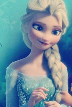
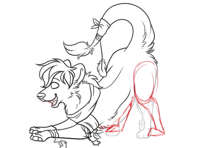
Could I get some critique/tips/whatever on this sketch I did of my new favorite Disney character? :'D (You can tell by the huge eyes that the movie influenced my style pretty much lmao)

Image
Image
xxxxx xxxxxxxxxxxxxxxxxxxxxxxxxxxx
xxxxxxxxxx
x
x
x
x
xxxx

x
x
x
x
xxxxxxxx

x
x
xxx

x
xxxxxxx
Image
xxxxxxxxxxxxxxxxxx
Zan | NB | they/them | pan/ace
xxxxxx lgbtq+ | atheist | satanist | artist xxxxxx
sig art ; avatar art
xxxxxxxxxx
x
x
x
x
xxxx

x
x
x
x

xxxxxxxx
x
x
xxxxxx

x

xxxxxxx
User avatar
Thalassic
 
Posts: 13130
Joined: Sun Apr 11, 2010 6:11 am
My pets
My items
My wishlist
My gallery
My scenes
My dressups
Trade with me

Re: The Artist Army

Postby jellykiwi » Tue Jan 07, 2014 5:56 am

@Zanjux - That looks gorgeous! I really love how you drew her hair and those doe eyes are just lovely *v* The only thing I noticed is that the eye on the left side of her face is smaller than the one and the right and the left eyebrow is a little too high

I have a sketch I'd like some feedback on; the whole pose just looks awkward to me so I might just scrap it and start over, but if anyone has any advice I'd love to hear it :>

tone.png
tone.png (509.54 KiB) Viewed 205 times
twitter
Image
watch me grow!!
User avatar
jellykiwi
 
Posts: 6358
Joined: Sat Oct 10, 2009 12:10 pm
My pets
My items
My wishlist
My gallery
My scenes
My dressups
Trade with me

Re: The Artist Army

Postby fishbait » Tue Jan 07, 2014 8:04 am

Zanjux;; oh my lord i love elsa! your drawing is soo good. i seriously love the shading on the hair and the eyes are v swag. my only critiques are that she looks pretty young. i mean, elsa is supposed to be 21 and she looks maybe 16 in your drawing. you could try making the face less rounded and the nose smaller. also elsa's eyes are really angular and her lips are pretty thin in the movie. in this picture she's only slightly smiling and her eyes are still very oval-ish.
i mean it could be your style (and probably is) so these are just a few suggestions to make it more "elsa-like". there's also a few things i could point out about the clothes but it's just a sketch so i don't think you really care haha ^^"

also ps i use swag ironically
it is the highest of compliments


jellykiwi;; the only thing i can say is that the back feet look kinda funky. maybe you could try something like this? i think would make it look a little more stable c:
Image
      semi-hiatus//
      will mostly be on during the weekend
      about//
      bisexual, i like turtwig and kpop
User avatar
fishbait
 
Posts: 4732
Joined: Fri Oct 22, 2010 12:52 pm
My pets
My items
My wishlist
My gallery
My scenes
My dressups
Trade with me

Re: The Artist Army

Postby Duh » Tue Jan 07, 2014 7:28 pm

Alright guys, with this thread becoming more active once again, I've noticed a few problems around here, so I figured it was just time for a refresher for our newer members/older members who have been inactive for a while. This is not targeted at anyone specifically, these are things I have seen a few times recently and want to (hopefully) keep from happening.

First of all -- if your anatomy isn't at a higher level than that of the original artist(I don't know of a nicer way to say this I'm so sorry), it is generally not beneficial to give them a redline. Seeing worse anatomy over their own drawing and trying to improve their art based on that can actually set an artist back quite a bit! You probably shouldn't be redlining a drawing if you aren't confident in your grasp of anatomy on the subject. Everyone should be able to trust their own judgement with this, and it hasn't been a huuuuge problem lately, but there was a point once a while ago where it was. I wouldn't want to see that happening again!

Also, please do not compliment a redline. I know it may seem harmless, or even like a good thing to do for the redliner, but it is extremely rude to the original artist! It disregards the work they put into that original piece and is just... disrespectful. Don't feel bad if you've done this recently, because you probably didn't know, but I ask that we all try not to compliment redlines in the future? Say something nice to the original artist instead. c: Everyone appreciates the work that those of you who redline put in, so please know that, even if you aren't getting compliments on your redlines all the time.

And everyone who is familiar with the thread is pretty good at reminding people about this, but please comment on all works within ten posts of your own. That would be all the posts that you can see in the scrollbox below where you type up your post. uwu Even if you don't have anything to critique a person on, tell them what you like about the piece! And hopefully make it something a little more than "it's cute".

I think that's all that needs to be said for now. It's great to see this thread finally becoming active again! You all are wonderful yes <3
User avatar
Duh
 
Posts: 4053
Joined: Sat Apr 04, 2009 12:34 pm
My pets
My items
My wishlist
My gallery
My scenes
My dressups
Trade with me

Re: The Artist Army

Postby Solloby » Tue Jan 07, 2014 8:28 pm

Thanks guys x3

Zanjux - That looks lovely <3 I know very little about people, but I am unsure if the eyebrows look aligned? If you were going for that for expression purposes, perhaps make the difference a bit more noticeable. Otherwise, I think the one on our left (her right) could be lowered a touch.

Jellykiwi - Aw, he looks neat, don't scrap him! As for suggestions, his ears and eyes look like he's facing straight ahead and is mostly side-view to us, while his nose and mouth makes him look more 3/4 view with his head tilted to the side. So adjusting either of those areas to match the other would make his face look even more awesome. His fluffy ears and mane etc, and his feathers and tail all look so cool <3

Duh - I see no rules on the front page about not complimenting redlines? I'm really confused about why you think it's not ok to do so. If you compliment the original artist, then when a redline is posted you also compliment the redliner, I don't see why the original artist should be offended. If anything, it reinforces that the redliner's work is good, so the original artist might feel a touch safer using it.
Solloby
I take care of the CS archives and
sometimes submit pet/item designs.

Characters :: Artwork :: Christmas Art Shop

Help
You can find Help in the main navigation menu.
If your question or problem is not answered there, please use the Help System.
I am not a mod and cannot help you so please don't PM me for site help.
User avatar
Solloby
Archivist
 
Posts: 15774
Joined: Sat Jun 21, 2008 7:27 pm
My pets
My items
My wishlist
My gallery
My scenes
My dressups
Trade with me

Re: The Artist Army

Postby jellykiwi » Wed Jan 08, 2014 9:21 am

@Forward - Thank you for that redline! I'll try to adjust those back legs so they look more natural 'v'
@Solloby - Thank you! :> Hmm, now that you mentioned it, I can definitely see how awkward that looks now, eheh. I'll definitely patch that up!
@Duh - Thanks for the heads up on the rules uvu
twitter
Image
watch me grow!!
User avatar
jellykiwi
 
Posts: 6358
Joined: Sat Oct 10, 2009 12:10 pm
My pets
My items
My wishlist
My gallery
My scenes
My dressups
Trade with me

Re: The Artist Army

Postby The_Tide_Keeper » Wed Jan 08, 2014 3:19 pm

I don't even know how but one of my favorite artist popped up in my shop and I was hoping someone would double check my sketch and point me in the right direction. It's my version of a chibi so it is supposed to be stylized, but I'm just hung up on the pose and cuteness of the piece. Imagine it with sparkles, is it cute? Does he look cocky? How could I make him look a little more full of himself? Red Lines are welcome, and advice on anything you see would be very appreciated <3 You guys can be honest.

http://i41.tinypic.com/1gkj87.png

Thanks in advance <33

-------------------------------------------------------------------------------------------

  • Summer~Breeze Reminds me of "Alice in Wonderland"... it just needs a few big mushrooms lol. I love it, and when I was not quite a teenager, everything I drew looked kind of like a blob with eyes. Think 7 year old xD. You are doing a great job sweetie, by the time you're my age you'll probably be able to draw life like realism /end jealous rant xS Everyone gave great pointers, so I can say is that is very impressive.
  • Zanjunx What even... I can't think of critique or a decent compliment other than :o
  • JellyKiwi Ohhh, I like your style a lot. Kimara's anatomy is kind of a pain for me but if it were me I would erase the back leg (because of the way the back is turned you shouldn't see it... I think. Maybe part if any, I'd at least move it over some c:), make the poof on the tail bigger because kimaras tails have more fur at the end, and possibly spread out the toes on the back leg or something. It just doesn't look like it's supporting the weight that it is if that makes since. I'm really tired, sorry.
***So, we've got a sun jewel, toxics, balloon dogs, you name it and 15 different characters. If you enter our contest. You've got a good chance of winning something. ***

────────────────────────────────
T I D E

[ WIN RARES LIST | Art Shop | The Artist Army

in Just-
spring         
when the world is mud-luscious the little
lame balloonman
whistles far and wee
and eddieandbill come running from marbles and
piracies and it's
spring
when the world is puddle-wonderful
the queer
old balloonman whistles far and wee
and bettyandisbel come dancing
from hop-scotch android jump-rope and
it's spring and the goat-footed
balloonMan whistlesfarandwee
───────────────────────────────
Image
User avatar
The_Tide_Keeper
 
Posts: 2916
Joined: Tue Jan 05, 2010 12:29 pm
My pets
My items
My wishlist
My gallery
My scenes
My dressups
Trade with me

Re: The Artist Army

Postby antler apathy » Wed Jan 08, 2014 3:59 pm

@summer~breeze - I think Zanjux's advice to make the hair in strands or parts is a very good idea~ but it looks really good otherwise!

@zanjux - I think her right eye (from our perspective, left from Elsas) is a little bit to low and it's throwing off the face. I may attempt a little red line in a minute. But Seriously, I adore the way you did her hair, beautiful

@jellykiwi - looks great! really love your style. I'd just suggest pulling the front legs up higher and reaching the end farther back, kind of like this.


@ tide - that's super awesome that your favorite artist came in! I tried to do a little redlining on the piece but I realize we have two very different styles, so use this or not x3 just thought I'd give you some pointers~

I myself actually have a few pieces I was looking for some critique on:
This sta.sh folder has the pieces I'm looking for critique on. Especially if any of you have any coloring technique ideas. But any critique/comments are welcome!
Image
[ oh you were a phonograph, I was a kid
I sat with an ear close, just listening
was there when the rain tapped her way down your face
you were a miracle and I was just holding your space ]

art trades: ask | commissions: closed [info here]
my character list | my deviant art
User avatar
antler apathy
 
Posts: 13423
Joined: Fri Jan 30, 2009 4:46 am
My pets
My items
My wishlist
My gallery
My scenes
My dressups
Trade with me

Re: The Artist Army

Postby The_Tide_Keeper » Wed Jan 08, 2014 4:12 pm

Gwen, yes! Especially on the face, that's what I wanted but I was having a hard time actually drawing it. Thank you.
***So, we've got a sun jewel, toxics, balloon dogs, you name it and 15 different characters. If you enter our contest. You've got a good chance of winning something. ***

────────────────────────────────
T I D E

[ WIN RARES LIST | Art Shop | The Artist Army

in Just-
spring         
when the world is mud-luscious the little
lame balloonman
whistles far and wee
and eddieandbill come running from marbles and
piracies and it's
spring
when the world is puddle-wonderful
the queer
old balloonman whistles far and wee
and bettyandisbel come dancing
from hop-scotch android jump-rope and
it's spring and the goat-footed
balloonMan whistlesfarandwee
───────────────────────────────
Image
User avatar
The_Tide_Keeper
 
Posts: 2916
Joined: Tue Jan 05, 2010 12:29 pm
My pets
My items
My wishlist
My gallery
My scenes
My dressups
Trade with me

Re: The Artist Army

Postby wickedpup » Wed Jan 08, 2014 11:52 pm

@zanjux-
the shading on that looks really nice ! :0
her eyes are a bit too low down on her face,and her left eye(not ours) is a bit uneven and low
otherwise it looks great!

@kiwi -
i agree with the others on the one foot underneath the body,also the perspective is a bit off with the way the butt is turning
also you may want to have the arms pointing down to the ground instead of flat,because thats usually what a laying pose looks like instead of this 'playing' pose
i think your pose is super cool tho,usually im too afraid to do cool poses tbh
redline
srry for the mess aaa

@tide -
redline
if he's full of himself he'll probably puff himself up,and look down upon others,so think of that
body language is super cool,and it really shows a character while being more than just an expression
sorry for the bad anatomy but i figured since you're looking for more expression than anatomy why bother,and its a chibi style anyways

@gwen -
on the one with wings i'd suggest using a blending brush on the wing marks as they look a bit rough,i hate to be the type to show off my own brushes but if you have sai i'd suggest #4,its what i use to paint and shade and it works wonders
all of these look super nice tho!!

im looking for some help on this pose ?? she's not a dog or cat,more of a dragon thing with paws lmao
im trying to make the arms not look so human(??) and its rly bugging me erg
Image
also i just feel like showing off this scc i did on aywas woops

also i'd like to thank those who help me out when i come around,usually by the time i come back around its been too long to reply,but i really appreciate the help ;;
User avatar
wickedpup
 
Posts: 8885
Joined: Wed Feb 16, 2011 2:24 pm
My pets
My items
My wishlist
My gallery
My scenes
My dressups
Trade with me

Who is online

Users browsing this forum: No registered users and 19 guests