
mods please delete.
Re: ◄ Advanced Artist Army ◄
![]() by foreign-potato » Fri Feb 08, 2013 2:23 pm
by foreign-potato » Fri Feb 08, 2013 2:23 pm
Kite;;
Black Sabbath;;
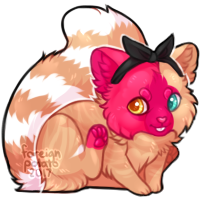
- Amazing Kite! I can not do water color to save my life, but the way you make those ink spot markings around it was amazing, and the skill level in using water colors is really very good! The iris is perfect. <3 The only thing I suggest is looking at pictures of real human eyes, or someone else's eye to practice the anatomy of the eye a little more. But you are very good!
Black Sabbath;;
- Really nice picture, I love the way you shade and highlight and make fur. What program do you use? ouo The only suggestion I have is trying to make the face a little angrier looking- the ears folded back, eyes squinting, folds on the bridge of the nose and forehead - and practicing big cat anatomy. As you can see in here and here the nose is farther away from the eyes with a longer muzzle, the eyes' inner corners are align to the top edges of the nose, and the ears are folded backwards. There also are more folds of the skin from the mouth pulling up, but you did a really nice job. :]
characters
★nontheist; pro-choice; human rights ★
Find me on dA!
looking for art or designs --
offering very rare list pets and more

-

foreign-potato - Posts: 8679
- Joined: Sun Feb 22, 2009 12:23 pm
- My pets
- My items
- My wishlist
- My gallery
- My scenes
- My dressups
- Trade with me
Re: ◄ Advanced Artist Army ◄
![]() by CaptiveLegacy » Fri Feb 08, 2013 2:49 pm
by CaptiveLegacy » Fri Feb 08, 2013 2:49 pm
@SK:)
Thank you for the lovley compliment, I really appreciate it <3
@Kite
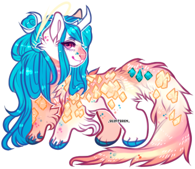
Oh my that watercolor painting is gorgeous <3 . I'm very jealous, I have a water color set and i'm not nearly as good as you c:
I love PixieCold's work, so I love this so much as well! I love the colors you used and the detail, it really makes is beautiful <3
@Black Sabbath
I really like this piece, very pretty and expressive. I love the shading and highlights and that fur, it looks so clean and nice <3
I'm not the best at big cat anatomy, so I wont critique much. It all seems well in place, but I agree with foreign.potato with some things as in the ears folded back more and to have the eyes squint a tad bit more in anger. I think it would add a lot more of any 'angry' look to it. Other then that, I really love this piece, its gorgeous <3
Plus thank you so much for the critique! Now looking back at my photos, I do realize the repetitive angle I use, probably since it sits up nicer and is easier to take pictures of. I will definitely try to do some more different angle shots to give it that more 'moving' and 'flying' look to it. I did recently try to do a different angle with the Pegasus figure I used in the last picture before. It was a harder shot to take, my camera did not want to focus on it correctly, which is usually why I give up on different angles. But, after monkeying with it for awhile, I managed to get a half-way decent shot. I do like this much better then the other one, it definitely gives it that more flowing and moving feel to go along with the fantasy theme. I will definitely try to get some different angles the next time I take photos c:

Larger View
hope this picture and angle gives it a more true flying look P:
Thank you for the lovley compliment, I really appreciate it <3
@Kite
Oh my that watercolor painting is gorgeous <3 . I'm very jealous, I have a water color set and i'm not nearly as good as you c:
I love PixieCold's work, so I love this so much as well! I love the colors you used and the detail, it really makes is beautiful <3
@Black Sabbath
I really like this piece, very pretty and expressive. I love the shading and highlights and that fur, it looks so clean and nice <3
I'm not the best at big cat anatomy, so I wont critique much. It all seems well in place, but I agree with foreign.potato with some things as in the ears folded back more and to have the eyes squint a tad bit more in anger. I think it would add a lot more of any 'angry' look to it. Other then that, I really love this piece, its gorgeous <3
Plus thank you so much for the critique! Now looking back at my photos, I do realize the repetitive angle I use, probably since it sits up nicer and is easier to take pictures of. I will definitely try to do some more different angle shots to give it that more 'moving' and 'flying' look to it. I did recently try to do a different angle with the Pegasus figure I used in the last picture before. It was a harder shot to take, my camera did not want to focus on it correctly, which is usually why I give up on different angles. But, after monkeying with it for awhile, I managed to get a half-way decent shot. I do like this much better then the other one, it definitely gives it that more flowing and moving feel to go along with the fantasy theme. I will definitely try to get some different angles the next time I take photos c:
Larger View
hope this picture and angle gives it a more true flying look P:
--------------------------
hello! feel free to drop a pm if you want
to chat or have any questions, and if I haven't
responded please don't mind sending
me a reminder ✉ !!
myo's : ask
⚘ kalon site ⚘
--------------------------
avatar by yoonbit
signature art by _silentsiren_
-

CaptiveLegacy - Posts: 17648
- Joined: Sun Sep 20, 2009 10:44 am
- My pets
- My items
- My wishlist
- My gallery
- My scenes
- My dressups
- Trade with me
Re: ◄ Advanced Artist Army ◄
![]() by Black Sabbath » Fri Feb 08, 2013 3:30 pm
by Black Sabbath » Fri Feb 08, 2013 3:30 pm
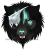
- Thank you both, however he is not a big cat. Amadeus is a housecat, and their noses do not tend to wrinkle as much as big cats but I can see why you thought that. I agree his ears could go back a little more so thank you both very much for that. Also, foreign.potato I use Sai, why do you ask?
Cartie911: That looks less static than the other shots and I think it attracts more attention (not to say your other photos were bad) to the shot- keep it up.
- xxx

- XXXX▂▂▂▂▂▂▂▂▂▂▂▂▂▂▂▂▂▂▂▂▂▂▂▂▂▂▂▂▂▂▂▂▂▂▂▂
XXXXthey ask no quarter
- XXXAsk.fm || DA || Tiba Adopts || Characters
my birthday is August 5th
▂▂▂▂▂▂▂▂▂▂▂▂▂▂▂▂▂▂▂▂▂▂▂▂▂▂▂▂▂▂▂▂▂▂
-
Black Sabbath - Posts: 1647
- Joined: Sun Jan 08, 2012 1:46 pm
- My pets
- My items
- My wishlist
- My gallery
- My scenes
- My dressups
- Trade with me
Re: ◄ Advanced Artist Army ◄
![]() by foreign-potato » Fri Feb 08, 2013 3:34 pm
by foreign-potato » Fri Feb 08, 2013 3:34 pm
Black Sabbath;;
Ah, I see now. Very nice picture, though. ^^ And I was just wondering because I really like your work and wanted to know what you used to make it! I use SAI, too. ouo
Ah, I see now. Very nice picture, though. ^^ And I was just wondering because I really like your work and wanted to know what you used to make it! I use SAI, too. ouo
characters
★nontheist; pro-choice; human rights ★
Find me on dA!
looking for art or designs --
offering very rare list pets and more
-
foreign-potato - Posts: 8679
- Joined: Sun Feb 22, 2009 12:23 pm
- My pets
- My items
- My wishlist
- My gallery
- My scenes
- My dressups
- Trade with me
Re: ◄ Advanced Artist Army ◄
![]() by Singularity » Sat Feb 09, 2013 6:43 pm
by Singularity » Sat Feb 09, 2013 6:43 pm
@Black Sabbath
The colours you choose were nice but the anatomy and metal earrings need some work
The cats eyes should be a bit closer together and the teeth need more singularity to them. The canines on the sides of the mouth are not that pointy and the middle teeth have more exact definition and size to them. The ears should be smaller if its a house cat (unless the design specifically calls for larger ears, than it looks fine).
The earrings need to be more contrasted to look more like metal. Usually metal has the bright spot where the light is shining on it, a very black shaded area and then a light reflected on the other side. @ is a example of this effect. Usually metal does some other crazy things but for the earring this should suffice. Also, the earring would probably have some weight to it (unless it was made of plastic or something of the sort) so if there was a little gap between the top of the piercing and the earring it might look a little better.
There are a couple other things but they are pretty much minimal, it looks wonderful and the angle and colouring is nice.
Overall good work
----
On an unrelated note, I did half of a running animation sketch
http://lillithsong.deviantart.com/art/A ... a_recent=1
Any critiques for what I have so far would be appreciated. I would like to have had more to present here but I'm much too tired to do the other half because that would involve changing the size of all the layers individually because of Photoshop's GIF options.
yehaw

-
Singularity - Posts: 1349
- Joined: Sat Jun 06, 2009 2:15 pm
- My pets
- My items
- My wishlist
- My gallery
- My scenes
- My dressups
- Trade with me
Re: ◄ Advanced Artist Army ◄
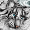
![]() by SK:) » Wed Feb 27, 2013 7:00 am
by SK:) » Wed Feb 27, 2013 7:00 am
Aww Sorry singularity...but i can't See the Animation ;u;


Comissions
Slot 1 : CLOSED
Info
VERY INACTIVE because of School an' stuff .__.
OMG ME HAZ AN OMGSR O3O<3 wrote:
Pet's name: Beast

Info
asdfghjkl nothin' up guys :B
HAPPY NEW YEAR CS<3

Comissions
Slot 1 : CLOSED
Slot 2 : CLOSED
reserved by fox.
-
SK:) - Posts: 2708
- Joined: Mon Sep 12, 2011 4:03 am
- My pets
- My items
- My wishlist
- My gallery
- My scenes
- My dressups
- Trade with me
Re: ◄ Advanced Artist Army ◄
![]() by Singularity » Wed Feb 27, 2013 12:56 pm
by Singularity » Wed Feb 27, 2013 12:56 pm
oh yeah it was too slow so i took it off ive been meaning to fix it but ive just never gotten around to it due to recent events
yehaw
-
Singularity - Posts: 1349
- Joined: Sat Jun 06, 2009 2:15 pm
- My pets
- My items
- My wishlist
- My gallery
- My scenes
- My dressups
- Trade with me
Re: ◄ Advanced Artist Army ◄
![]() by apricity » Sun Mar 10, 2013 4:52 pm
by apricity » Sun Mar 10, 2013 4:52 pm
- meep! Like your birthday. meeehehehe
Sorry for not posting. (: will be scanning stuff from sketch book soon
-

apricity - Posts: 11176
- Joined: Wed Jun 02, 2010 11:43 am
- My pets
- My items
- My wishlist
- My gallery
- My scenes
- My dressups
- Trade with me
Re: ◄ Advanced Artist Army ◄
![]() by SK:) » Sun Mar 10, 2013 9:48 pm
by SK:) » Sun Mar 10, 2013 9:48 pm
oh yeah i am sure that it will look great °D°
Comissions
Slot 1 : CLOSED
Info
VERY INACTIVE because of School an' stuff .__.
OMG ME HAZ AN OMGSR O3O<3 wrote:
Pet's name: Beast
Info
asdfghjkl nothin' up guys :B
HAPPY NEW YEAR CS<3
Comissions
Slot 1 : CLOSED
Slot 2 : CLOSED
reserved by fox.
-
SK:) - Posts: 2708
- Joined: Mon Sep 12, 2011 4:03 am
- My pets
- My items
- My wishlist
- My gallery
- My scenes
- My dressups
- Trade with me
Re: ◄ Advanced Artist Army ◄
![]() by apricity » Mon Apr 08, 2013 8:04 am
by apricity » Mon Apr 08, 2013 8:04 am
- new drawing, sorry I haven't posted in a while. (: I know the hair is sketchy and stuff but ehh. x:
-
apricity - Posts: 11176
- Joined: Wed Jun 02, 2010 11:43 am
- My pets
- My items
- My wishlist
- My gallery
- My scenes
- My dressups
- Trade with me
Who is online
Users browsing this forum: No registered users and 0 guests