
The CAAA v.7 - We've moved again!
Re: Character Adoption Addicts Anonymous - v.7 - Open!
![]() by Oddly Shaded » Tue Jan 22, 2013 5:53 pm
by Oddly Shaded » Tue Jan 22, 2013 5:53 pm
Say you were going for Kiamara 95 and this was your form. What would you change about it? How would you suggest to improve it?
As others have stated, bold the questions, center it. Umm another suggestion I could make is try doing this:
Username:
Name:
Also, another suggestion - make things BIGGER, but never smaller. You also don't need to space between question and answer if you make something bigger: I suggest 120 as a suitable size. So;
You could also add colour, but don't colour the entire form. That makes it hard to read and quite annoying to judges - unless it's a suitable colour which isn't bright yellow etc.
But yeah, experiment. Try cool things.
With your gifs - try to only LINK those. It lease a more intese feeling to the judge as they click the link to see what magic is waiting.
With your art - if they are bigger than 640 x - try to link those two. You should also put an artist statement, it shows some depth into the artwork, more than what the judge can just see. So try adding: artwork name/artist (even if its you)/artist statement - explain what is going on in the picture and why you decided everything would sit as it was. Never criticize your own artwork in this section.
Um... I think thats all from me Good luck!!
As others have stated, bold the questions, center it. Umm another suggestion I could make is try doing this:
Username:
~*Oddly Shaded*~
Name:
Cool Kiamara's name
Also, another suggestion - make things BIGGER, but never smaller. You also don't need to space between question and answer if you make something bigger: I suggest 120 as a suitable size. So;
Username:
~*Oddly Shaded*~
Name:
Cool Kiamara's name
~*Oddly Shaded*~
Name:
Cool Kiamara's name
You could also add colour, but don't colour the entire form. That makes it hard to read and quite annoying to judges - unless it's a suitable colour which isn't bright yellow etc.
Username:
~*Oddly Shaded*~
Name:
Cool Kiamara's name
~*Oddly Shaded*~
Name:
Cool Kiamara's name
But yeah, experiment. Try cool things.
With your gifs - try to only LINK those. It lease a more intese feeling to the judge as they click the link to see what magic is waiting.
With your art - if they are bigger than 640 x - try to link those two. You should also put an artist statement, it shows some depth into the artwork, more than what the judge can just see. So try adding: artwork name/artist (even if its you)/artist statement - explain what is going on in the picture and why you decided everything would sit as it was. Never criticize your own artwork in this section.
Um... I think thats all from me


Commissions: Closed
Designing: Mooo
Breedings: Closed
Teddy Deer Shop!
Character Thread:
Currently building my
Toyhou.se
Main Characters
Adopted Characters
WME’s
Euro Quarter Horse
Lone Bashkir Curly
Range Trotters
Designing: Mooo
Breedings: Closed
Teddy Deer Shop!
Character Thread:
Currently building my
Toyhou.se
Main Characters
Adopted Characters
WME’s
Euro Quarter Horse
Lone Bashkir Curly
Range Trotters
-

Oddly Shaded - Posts: 18377
- Joined: Fri Oct 30, 2009 10:58 pm
- My pets
- My items
- My wishlist
- My gallery
- My scenes
- My dressups
- Trade with me
Re: Character Adoption Addicts Anonymous - v.7 - Open!
![]() by albinny trancy » Tue Jan 22, 2013 5:56 pm
by albinny trancy » Tue Jan 22, 2013 5:56 pm
You guys are too good to me, I swear. XD Now I feel like I'm gonna win her!
So excited! Getting my first Kiamara in a month because of train. and .Blue.'s breeding!!! <333
-

albinny trancy - Posts: 4624
- Joined: Tue Jul 24, 2012 6:33 am
- My pets
- My items
- My wishlist
- My gallery
- My scenes
- My dressups
- Trade with me
Re: Character Adoption Addicts Anonymous - v.7 - Open!
![]() by Soteria » Tue Jan 22, 2013 5:59 pm
by Soteria » Tue Jan 22, 2013 5:59 pm
Question time!
- Code: Select all
[i]What do you think of co-ownership? Experiences?[/i]
[i]If someone asked me for co-ownership, what specifications should I make?[/i]

-
Soteria - Posts: 8085
- Joined: Sun May 23, 2010 1:36 pm
- My pets
- My items
- My wishlist
- My gallery
- My scenes
- My dressups
- Trade with me
Re: Character Adoption Addicts Anonymous - v.7 - Open!
![]() by -PLEASE DELETE- » Tue Jan 22, 2013 6:04 pm
by -PLEASE DELETE- » Tue Jan 22, 2013 6:04 pm
What do you think of co-ownership? Experiences?
If someone asked me for co-ownership, what specifications should I make?
I think co-ownership is ok. I co own three characters now. 2 with Stripey and 1 with NARANDA.
as for Specifications, it would depend. Lets use my Chasibandra for example, I know co-own him with Stripey. I asked stripey to PM me when/if they get art of chasi. I hadn't written out a full complete personality for Chasi so Stripey asked if they could. Im fine with Stripey doing this as long as i agree with the final product! Basically ask them to ask/notify you before and after they do something!
MODS PLEASE DELETE!!!
- -PLEASE DELETE-
- Posts: 17932
- Joined: Wed Feb 23, 2011 2:35 pm
- My pets
- My items
- My wishlist
- My gallery
- My scenes
- My dressups
- Trade with me
Re: Character Adoption Addicts Anonymous - v.7 - Open!
![]() by Batman » Tue Jan 22, 2013 6:04 pm
by Batman » Tue Jan 22, 2013 6:04 pm
What do you think of co-ownership? Experiences?
If someone asked me for co-ownership, what specifications should I make?
I like co-ownership. Never done it, but there are two of my dream character I would happily co-own.
Blah and Pseudonym. And for specifications?
1) NEVER EVER TRADE/SELL
2) maybe rules of developing stories and personality
3) a double sided agreement of not letting character collect dust:3


┏xxxxxxxxxxxxxxxx..┓
xxxxxxx Links
xxxxxx
xxxxxx
xxxxxx
xxxxxx
xxxxxx


┖xxxxxxxxxxxxxxxx..┚
xxxxxxx Links
xxxxxx
xxxxxx
xxxxxx
xxxxxx
xxxxxx
┖xxxxxxxxxxxxxxxx..┚

- - - - - - - - - - - - - - - - - - - -
Credits: pfp + nav buttons | pixel fullbody | soft fullbody | deco art | </>
-
Batman - Posts: 13464
- Joined: Fri Mar 18, 2011 7:25 am
- My pets
- My items
- My wishlist
- My gallery
- My scenes
- My dressups
- Trade with me
Re: Character Adoption Addicts Anonymous - v.7 - Open!
![]() by mawsoleum » Tue Jan 22, 2013 6:14 pm
by mawsoleum » Tue Jan 22, 2013 6:14 pm
Looking for someone to draw a ref for me. I have the characters already, here, but I'd like a new sheet. I really hate drawing reference sheets myself, so. lol
I can pay with pets or characters, pm me! Also, that character is a coyote.
I can pay with pets or characters, pm me! Also, that character is a coyote.


┌─────────✧─┐
│
│
│
│
│
│
│
hi! you can call me grim
or maw. i am your local
horror n metal obsessed
biologist/chemist :3
adult member, she/they
│or maw. i am your local
horror n metal obsessed
biologist/chemist :3
adult member, she/they
│
│
│
└─✧─────────┘


█
█
█
█
█
█
█
█
█
█
█
█
█
█
█
┌───────────┐
│
│
└───────────┘
xxx
 x ☆☆☆
x ☆☆☆
┌───────────┐
└───────────┘
│
│
│
│
│
estou a aprender
português (🇵🇹) e falo
em nível b1.
leio melhor do
que escrevo
│português (🇵🇹) e falo
em nível b1.
leio melhor do
que escrevo
│
│
└───────────┘
xxx
x ☆☆☆┌───────────┐
│
│└───────────┘

-

mawsoleum - Posts: 9815
- Joined: Fri Aug 29, 2008 9:38 am
- My pets
- My items
- My wishlist
- My gallery
- My scenes
- My dressups
- Trade with me
Re: Character Adoption Addicts Anonymous - v.7 - Open!
![]() by Auyn » Tue Jan 22, 2013 6:20 pm
by Auyn » Tue Jan 22, 2013 6:20 pm
I could use a little advice, so if someone wouldn't mind PMing me, that would be great. I would just say it here, but it's indirectly related to characters, so i'd rather not spam up the thread.
I have a contest that could use some entries, the link is in my signature.
I have a contest that could use some entries, the link is in my signature.


-
Auyn - Posts: 3269
- Joined: Thu Apr 05, 2012 10:17 am
- My pets
- My items
- My wishlist
- My gallery
- My scenes
- My dressups
- Trade with me
Re: Character Adoption Addicts Anonymous - v.7 - Open!
![]() by Haagen-Daagen » Tue Jan 22, 2013 6:37 pm
by Haagen-Daagen » Tue Jan 22, 2013 6:37 pm
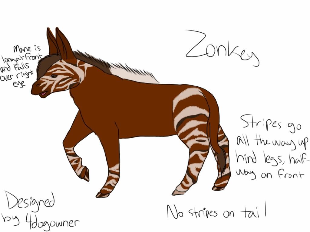
I changed up my zonkey's stripes a bit, and I think they look better. XP http://i1207.photobucket.com/albums/bb4 ... 1a82fd.jpg What do you guys think?
Also, I finished that aardvark. XD I was rather uninspired for this one, but eh. It's forsale. ;]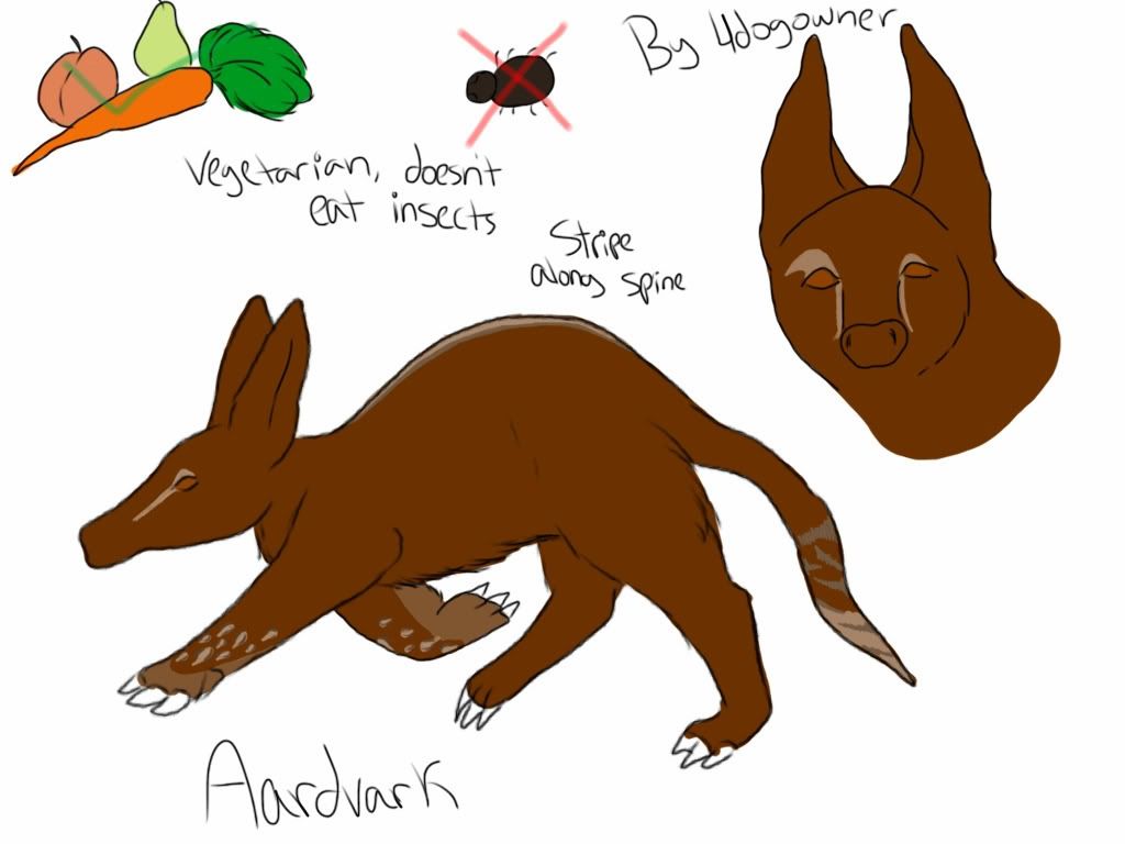 http://i1207.photobucket.com/albums/bb4 ... 95f573.jpg
Also, I have a character design contest going, and I would love some more entries! :] viewtopic.php?f=43&t=1589437
Also, I finished that aardvark. XD I was rather uninspired for this one, but eh. It's forsale. ;]
http://i1207.photobucket.com/albums/bb4 ... 95f573.jpg Also, I have a character design contest going, and I would love some more entries! :] viewtopic.php?f=43&t=1589437


Do you own characters designed by me? (old username is 4dogowner) PM me! I'd love to draw art of some of my older designs, free of charge. <3
Toyhou.se
"Being courageous isn't the same as being fearless; it is doing what's right even when you're scared to death."
"Great spirits have always found violent opposition from mediocre minds."
"You are never a failure until you begin blaming your mistakes on someone else."

"Joy is a fully loaded magazine and a puppy."
-
Haagen-Daagen - Posts: 13311
- Joined: Wed Jul 14, 2010 4:16 pm
- My pets
- My items
- My wishlist
- My gallery
- My scenes
- My dressups
- Trade with me
Re: Character Adoption Addicts Anonymous - v.7 - Open!
![]() by Oddly Shaded » Tue Jan 22, 2013 6:44 pm
by Oddly Shaded » Tue Jan 22, 2013 6:44 pm
What do you think of co-ownership? Experiences?
I did at one stage try to start a co-ownership, but we never ended up finishing any agreement (she was my character anyway). But I think it's alright, as long as both parties are at an agreement.
If someone asked me for co-ownership, what specifications should I make?
Be sure that your not making art of the character while the other person is not. Never breed without permission from both parties. Of course the major no trading/selling etc. But just be careful with everything.
Commissions: Closed
Designing: Mooo
Breedings: Closed
Teddy Deer Shop!
Character Thread:
Currently building my
Toyhou.se
Main Characters
Adopted Characters
WME’s
Euro Quarter Horse
Lone Bashkir Curly
Range Trotters
Designing: Mooo
Breedings: Closed
Teddy Deer Shop!
Character Thread:
Currently building my
Toyhou.se
Main Characters
Adopted Characters
WME’s
Euro Quarter Horse
Lone Bashkir Curly
Range Trotters
-
Oddly Shaded - Posts: 18377
- Joined: Fri Oct 30, 2009 10:58 pm
- My pets
- My items
- My wishlist
- My gallery
- My scenes
- My dressups
- Trade with me
Re: Character Adoption Addicts Anonymous - v.7 - Open!
![]() by albinny trancy » Tue Jan 22, 2013 6:44 pm
by albinny trancy » Tue Jan 22, 2013 6:44 pm
Okay, spruced up my form. c: I have a really good feeling about this.
- Code: Select all
[b][i]Have you ever found a character you'd overpay for? Did you get them?[/i][/b]
So excited! Getting my first Kiamara in a month because of train. and .Blue.'s breeding!!! <333
-
albinny trancy - Posts: 4624
- Joined: Tue Jul 24, 2012 6:33 am
- My pets
- My items
- My wishlist
- My gallery
- My scenes
- My dressups
- Trade with me
Who is online
Users browsing this forum: No registered users and 1 guest