
Rate The Character Above You!
Re: Rate The Character Above You!
![]() by Panne » Mon Dec 17, 2012 6:31 pm
by Panne » Mon Dec 17, 2012 6:31 pm
4.5/10
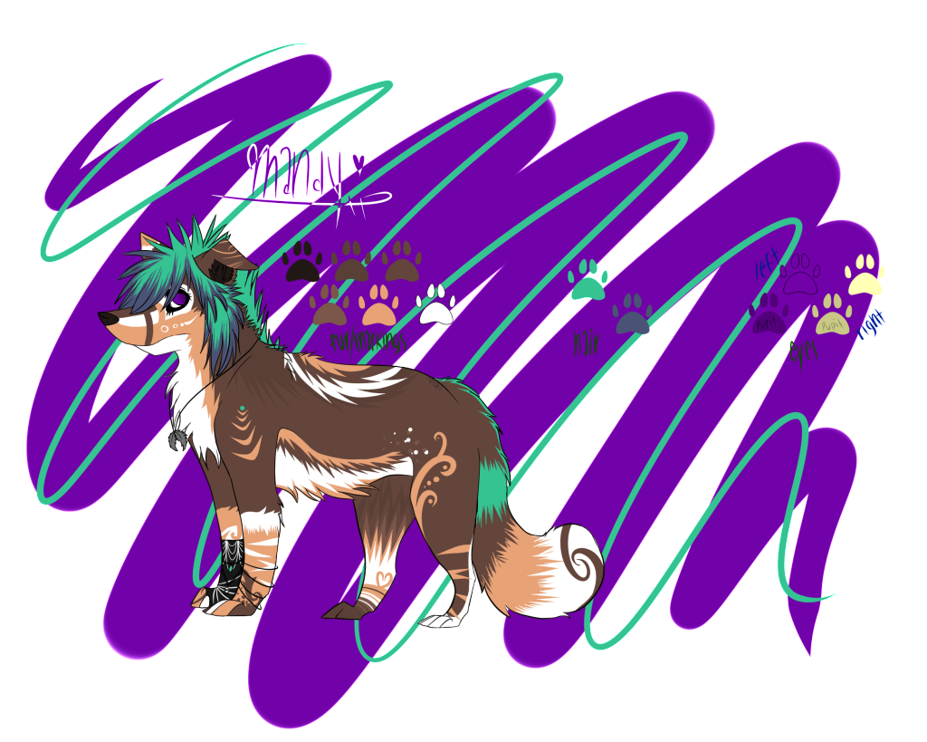
The lack of color doesnt sit well with me, it seems almost as if it's unfinished. The "story" behind it is interesting though ^_^
How about my Mandy?
(I keep asking about her because I want to get an accurate estimate of the general populations opinion on her)


The lack of color doesnt sit well with me, it seems almost as if it's unfinished. The "story" behind it is interesting though ^_^
How about my Mandy?
(I keep asking about her because I want to get an accurate estimate of the general populations opinion on her)


.png)
-

Panne - Posts: 14951
- Joined: Fri Jan 01, 2010 6:26 pm
- My pets
- My items
- My wishlist
- My gallery
- My scenes
- My dressups
- Trade with me
Re: Rate The Character Above You!
![]() by Fenric » Mon Dec 17, 2012 6:40 pm
by Fenric » Mon Dec 17, 2012 6:40 pm
3/10.
As far as design goes, there's too much. I would try to tone down the markings/accessories. Less is more in some cases, and it's also easier to draw. Try to express more with less, especially if the markings has some meaning to them. I'm not really a fan of the color scheme as well, but it's not bad. Could be better.

This is Xavier. Sort of old character. I don't draw my characters much on Oekaki (especially since I'm not good at humans) so I'll just give you this to look at. Sorry for the low quality art. (I should color in something.)
In my defense, it IS extremely old, but still laughably bad. Try to focus on the design itself, rather than the quality of the drawing.


-

Fenric - Posts: 8452
- Joined: Fri Jul 06, 2012 12:41 pm
- My pets
- My items
- My wishlist
- My gallery
- My scenes
- My dressups
- Trade with me
Re: Rate The Character Above You!
![]() by Sheepcat » Mon Dec 17, 2012 8:04 pm
by Sheepcat » Mon Dec 17, 2012 8:04 pm
5-6/10
From what the design shows, the only thing that stands out to me is the wings. Since it's not a fullbody I can't yet really judge it. Though, I really love the floppy ears. I have a soft spot for them.
Batal.

From what the design shows, the only thing that stands out to me is the wings. Since it's not a fullbody I can't yet really judge it. Though, I really love the floppy ears. I have a soft spot for them.
Batal.
-

Sheepcat - Posts: 5372
- Joined: Fri Jul 29, 2011 2:22 pm
- My pets
- My items
- My wishlist
- My gallery
- My scenes
- My dressups
- Trade with me
Re: Rate The Character Above You!
![]() by Snips. » Mon Dec 17, 2012 9:03 pm
by Snips. » Mon Dec 17, 2012 9:03 pm
6/10
The design is pretty cool, and the eyes really make it pop c:

Reese Ayren
The design is pretty cool, and the eyes really make it pop c:
Reese Ayren
ON HIATUS
-

Snips. - Posts: 7356
- Joined: Wed Sep 01, 2010 11:38 am
- My pets
- My items
- My wishlist
- My gallery
- My scenes
- My dressups
- Trade with me
Re: Rate The Character Above You!
![]() by Alaskie » Tue Dec 18, 2012 3:23 am
by Alaskie » Tue Dec 18, 2012 3:23 am
2/10 sorry, I'm just not a fan of human charries c:


it's all not good
-
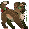
Alaskie - Posts: 8531
- Joined: Wed Nov 09, 2011 4:24 am
- My pets
- My items
- My wishlist
- My gallery
- My scenes
- My dressups
- Trade with me
Re: Rate The Character Above You!
![]() by Fenric » Tue Dec 18, 2012 7:42 pm
by Fenric » Tue Dec 18, 2012 7:42 pm
5/10
I'm not the fondest of the color scheme, but I feel you have something going there with the markings. It seems like a start, but I think it could be improved... Somehow, though I'm not sure how? I like the heart in her ear, and the swirls on her shoulder. I think it's effective in expressing a lot without it being everywhere. The bands around her neck and the markings on her snout and forehead are rather nice too. I think it's a good character design for the most part, but I feel as if it's missing something, and that some of the markings are filler. (Like the lines on her side.) I don't know why I think any of this, I just can't place it at all.

Here's Wesley.
viewtopic.php?t=1536608
^The base.
-
Fenric - Posts: 8452
- Joined: Fri Jul 06, 2012 12:41 pm
- My pets
- My items
- My wishlist
- My gallery
- My scenes
- My dressups
- Trade with me
Re: Rate The Character Above You!
![]() by king-rascal. » Tue Dec 18, 2012 8:08 pm
by king-rascal. » Tue Dec 18, 2012 8:08 pm
3/10 but it seems to represent a Count Dracula but in animal font..Atleast in my eyes. But the design is simple and i not really find of just the three colors for his design and eyes but as i said he reminds me of the count.

How About Alexandra?
How About Alexandra?
xxxxxxxx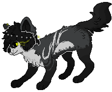
- hiya i was focalor.
- call me rascal or kyle, both work just fine!
// wifu // deviantart // commissions //
-

king-rascal. - Posts: 1973
- Joined: Wed Sep 05, 2012 12:33 pm
- My pets
- My items
- My wishlist
- My gallery
- My scenes
- My dressups
- Trade with me
Re: Rate The Character Above You!
![]() by Lily.Sweet » Tue Dec 18, 2012 8:09 pm
by Lily.Sweet » Tue Dec 18, 2012 8:09 pm
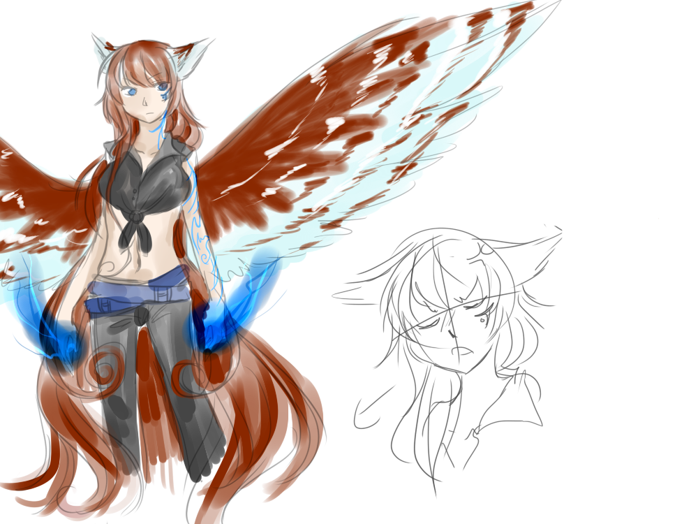
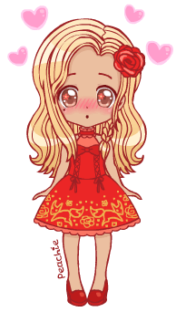
Image of Fennel by PrincessPeachie.
Link to my Character Collection
-

Lily.Sweet - Posts: 5455
- Joined: Sat Mar 03, 2012 1:51 pm
- My pets
- My items
- My wishlist
- My gallery
- My scenes
- My dressups
- Trade with me
Re: Rate The Character Above You!
![]() by Fenric » Tue Dec 18, 2012 8:11 pm
by Fenric » Tue Dec 18, 2012 8:11 pm
Uh, Count Dracula? I guess it must be the editable I used...
Also, what's wrong with simple designs? The only thing that's supposed to be unnatural about him is his eyes and the fact he wears glasses. O.o
7/10
It's honestly, truly beautiful. The colors were in good choice, the feathers in good choice, the build in good choice, but I'm not so fond of the fact he has hair. I don't know, I don't think it looks right for canines to have hair like that. e.o
8/10
I really love the design! It looks like something I could see from a tv screen.
-
Fenric - Posts: 8452
- Joined: Fri Jul 06, 2012 12:41 pm
- My pets
- My items
- My wishlist
- My gallery
- My scenes
- My dressups
- Trade with me
Re: Rate The Character Above You!
![]() by Everett. » Tue Dec 18, 2012 8:14 pm
by Everett. » Tue Dec 18, 2012 8:14 pm
4/10
Cute, I like the glasses and the red eyes~

Cute, I like the glasses and the red eyes~
-

Everett. - Posts: 3555
- Joined: Sun Jul 24, 2011 12:28 pm
- My pets
- My items
- My wishlist
- My gallery
- My scenes
- My dressups
- Trade with me
Who is online
Users browsing this forum: .*Rose*., Antipathy, bwainrot, Daxx, dsn1prr, Ɗɑŋɑ, Hellishborn, Hollyleaf6217, Kaiiba, Lemshiu, Lunarhaven, NERV AGENT, opossuwu, reaptherisk, sammmy, Skullscarada, sosadtoobad and 1 guest