

- imageCAD8D595.jpg (75.56 KiB) Viewed 36 times
Forum rules
Reminder: Copying another person's art without permission to reproduce their work is a form of art-theft!
Click here to see the full Art Rules!
Need help using the Oekaki? Check out this Guide to the Oekaki!
Reminder: Copying another person's art without permission to reproduce their work is a form of art-theft!
Click here to see the full Art Rules!
Need help using the Oekaki? Check out this Guide to the Oekaki!
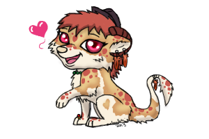
Another rune dragon by Coexist
| Artist | Coexist [gallery] |
| Time spent | 1 hour, 18 minutes |
| Drawing sessions | 1 |
| One person likes this | Log in to vote for this drawing |
3 posts
• Page 1 of 1
Another rune dragon
![]() by Coexist » Tue Jun 19, 2012 6:04 am
by Coexist » Tue Jun 19, 2012 6:04 am
ya this one looks nothing like the origional in my opionion.
I would like to appoligize to everyone for my behavior. Apparently one of my meds needed adjusted. I decided to stay but I will soon start a thread about High Functioning Autisum so that maybe a few people can better understand when I do slip. Love you all!
-

Coexist - Posts: 8409
- Joined: Wed Dec 01, 2010 12:36 am
- My pets
- My items
- My wishlist
- My gallery
- My scenes
- My dressups
- Trade with me
Re: Another rune dragon
![]() by maluruloki » Wed Jun 20, 2012 8:32 am
by maluruloki » Wed Jun 20, 2012 8:32 am
You asked for a critique, so here is one! 
I feel like you got the basic design down very well! Despite it being smaller in size, the proportions are fairly accurate and very few people could say that it doesn't look like the original.
My suggestion is to use the layers in the program to sketch out the body in a larger size (e.g. one layer for sketching, one layer for the outlining, one layer for coloring, etc). That way, you can work more on the little details like the markings on the Rune's wings. Drawing the creature in a larger size lets you play around with shading, highlights, and the brushes within the program.
Featured wrote:


-

maluruloki - Posts: 1760
- Joined: Sun Feb 01, 2009 10:33 am
- My pets
- My items
- My wishlist
- My gallery
- My scenes
- My dressups
- Trade with me
Re: Another rune dragon
![]() by Coexist » Wed Jun 20, 2012 11:34 am
by Coexist » Wed Jun 20, 2012 11:34 am
that makes scence, thanks so much!!
I would like to appoligize to everyone for my behavior. Apparently one of my meds needed adjusted. I decided to stay but I will soon start a thread about High Functioning Autisum so that maybe a few people can better understand when I do slip. Love you all!
-
Coexist - Posts: 8409
- Joined: Wed Dec 01, 2010 12:36 am
- My pets
- My items
- My wishlist
- My gallery
- My scenes
- My dressups
- Trade with me
3 posts
• Page 1 of 1
Who is online
Users browsing this forum: No registered users and 55 guests