
@dia :: i've been doing horse manipulations for a few years now,
so i guess you could say i have some experience ;
i'd say the painting of the mane and tail are very good, a lot of people
just use brushes to make them but you are obviously taking the harder/better route c:
maybe just make the ends of the strands fade more?
( especially in the tail)
as for the rest of the manip, i would just try to blend the horse into the background a bit more.
for example, a good way to do this is to pick an overall 'mood' —
blue for a depressing/sad mood, yellow or red for a high energy/happy mood, etc.
then you can paint over highlights or the entire picture with that color and put it on multiply or overlay ~
also, a good thing to do is to add the horse's shadow.
right now it looks a bit like the horse is floating, so adding a shadow helps make it more realistic.
( here is a very good tutorial on adding a shadow )
———
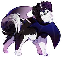
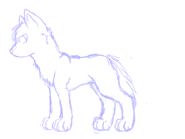
@wolf blood song :: i think wazzingator hit the biggest points —
the first thing that strikes me is that the torso is much too compact.
also, the head is a bit too large and the legs too long.
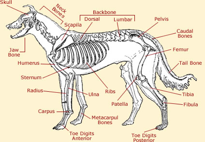
( this is a good reference for canine anatomy. )
you've got a really great grip on style, just make sure you study anatomy —
it's just as important as adding your own twist to things c:
———
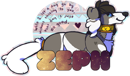
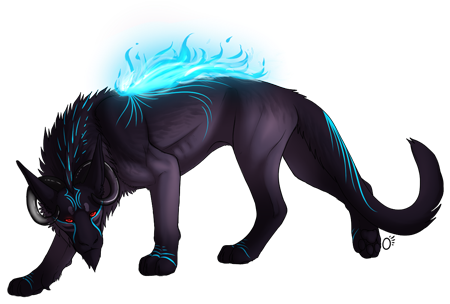
OKAY. phew. my turn.
just a quick commission for now:
kinda iffy about it, but yeah ~

so i guess you could say i have some experience ;
i'd say the painting of the mane and tail are very good, a lot of people
just use brushes to make them but you are obviously taking the harder/better route c:
maybe just make the ends of the strands fade more?
( especially in the tail)
as for the rest of the manip, i would just try to blend the horse into the background a bit more.
for example, a good way to do this is to pick an overall 'mood' —
blue for a depressing/sad mood, yellow or red for a high energy/happy mood, etc.
then you can paint over highlights or the entire picture with that color and put it on multiply or overlay ~
also, a good thing to do is to add the horse's shadow.
right now it looks a bit like the horse is floating, so adding a shadow helps make it more realistic.
( here is a very good tutorial on adding a shadow )
———
@wolf blood song :: i think wazzingator hit the biggest points —
the first thing that strikes me is that the torso is much too compact.
also, the head is a bit too large and the legs too long.
( this is a good reference for canine anatomy. )
you've got a really great grip on style, just make sure you study anatomy —
it's just as important as adding your own twist to things c:
———
OKAY. phew. my turn.
just a quick commission for now:
kinda iffy about it, but yeah ~


