Join or create fan clubs about your favorite things!
 by Marmoset » Sat May 26, 2012 5:33 pm
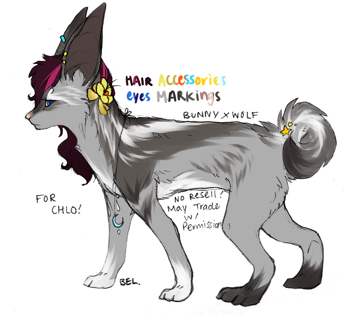
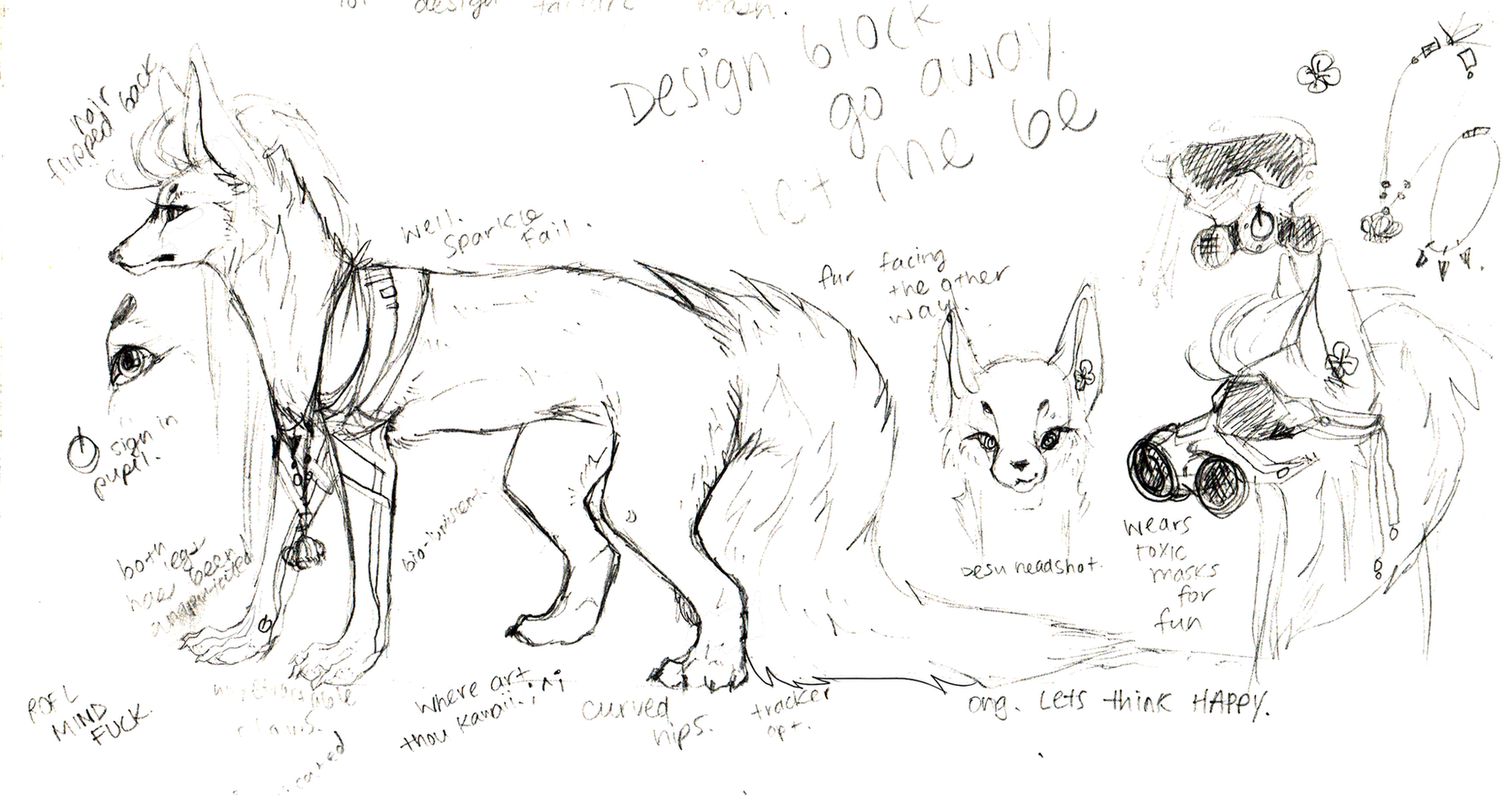
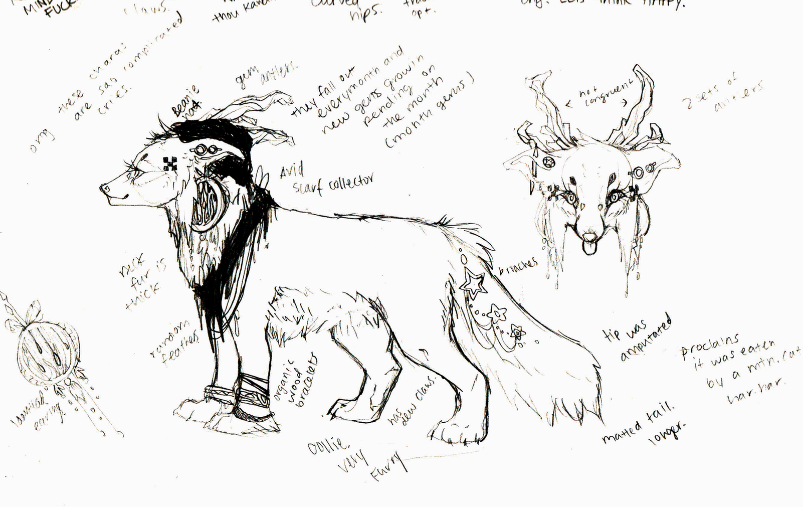
Lock wrote:Toki&Bel wrote:designing characters are so. much. fun.
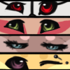
some recent designs ( excuse the anatomy issues rofl orz. last two was draw 2 in the morning in my bed ; v

ikr

D
The colors in the first are lovely, and the second and third are so interesting and uniqueee<3
Also can i just say that I adore how you draw faces? Those expressions. <3 x3
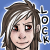
I just finished this one. ^^

adgh I hate how the eyes look. And some of the anatomy doesn't make any sense.

*makes grabby hands*
Awww Lock, you drew a tigger! Its so cute <3
https://join.me/899-169-971Join.me? Im bored and i may draw some free stoof :3 maybe
-
Marmoset
-
- Posts: 7803
- Joined: Wed Jul 06, 2011 12:24 pm
- My pets
- My items
- My wishlist
- My gallery
- My scenes
- My dressups
- Trade with me
-
by azalea » Sat May 26, 2012 5:36 pm
Lock wrote:I just finished this one. ^^
adgh I hate how the eyes look. And some of the anatomy doesn't make any sense.
Pffft. I love those eyes what are you talking about ;____; Love your designs too, how do you bust so many of these pretty things out so quickly?? Q____Q /has not been stalking your design shop cough >,> <,<
Okay crit time~~ You probably wanna make the head bigger and fluffier, the head looks a bit too small right now, but that's probably because the cheeks themselves aren't quite fluffy and rounded enough. The eyes should be farther apart, like Bel said, and the muzzle should be more square-ish(?), not sure how to describe it. Rather than a circular shape, it should be more of a...upside down ice cream cone shape...but not as slanty...oh my god I'm so bad at explaining these things. //shot |D; I hope you get what I mean xD The ear on the right (our right not the tiger's) looks a bit awkward to me, like the left ear is facing forward and the other is facing back, not sure if that was on purpose, if it was, ignore this xD; Neck is a bit long, should be a bit more stout and thick. The shoulder bump on it's back, I feel like that should be more forward, like covering the scarf a bit. It looks a tad disjointed from the foreleg right now. Back should maybe curve a bit more too. Legs look great, nice and muscular! The back paws look small in comparison to the front paws, which are a good size btw. The starting line of the hind leg should angle up a bit more, and one last thing, for sitting hind legs, it looks like one big bulge but it's actually constructed of two major bone segments, so I like to draw a slight fur line to show that. If it was me I'd add that slight fur line near the heel, and then move the heel itself down.
Kinda hard to explain the things I went over with words, but I wasn't sure if you wanted a redline xD; If you get confused by my awkward wording I will totes be happy to make a redline for you c: <3
~~~~~~~~~
continuing on with big cats ~ ヽ(;▽;)ノ
I am on a big cat obsession lately <3 Been drawing them for the past couple of weeks, click, click, and click. I recommend drawing big cats to everyone, the entire group is very varied in their anatomy so they are good practice and they also naturally have very interesting design patterns. ^^ I tried to find colors I didn't normally use, turquoise with magenta (bright palette), red with blues and purples (contrasting), and then a subdued simple palette because I rarely go simple. I quite like that lion though *3* Critiques/redlines welcome as always~
side note; I really want to learn digital painting, I kind of want to stray away from line-art and hard edges. I want to get out of this comfort zone, but not really sure where to start...Any advice/tips anyone? D:semi-hiatus
will be on very infrequently
art commissions will take a bit long, sorry ;-;
-

azalea
-
- Posts: 5112
- Joined: Tue Apr 14, 2009 4:47 am
- My pets
- My items
- My wishlist
- My gallery
- My scenes
- My dressups
- Trade with me
-
by plum » Sat May 26, 2012 6:09 pm
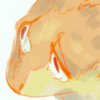
More and more big cats.. o3o I'd start drawing them but I'm working on a new species. That little, badly shaded thing I drew is becoming a species.
Here is a sketch of the species:

.
hello
call me plum
i do commissions for USD, list pets, and dA points
sorry, i'm not interested in art trades or c$
my typing is inconsistent and i do Not care
-
plum
-
- Posts: 8305
- Joined: Mon Sep 14, 2009 8:20 am
- My pets
- My items
- My wishlist
- My gallery
- My scenes
- My dressups
- Trade with me
-
by Lock » Sun May 27, 2012 1:54 am
Aza - ouo <33
Ahaha, that crit was actually really helpful. Cx
I don't draw big cats too often, so it made it a lot easier to see my mistakes. And pshaw, your wording was totally comprehensive. <3
I did notice that in your last design, the way the mane peaks makes the rest of the mane look... Awkward? I think it'd be helpful to make the rest of it a bit fluffier. Also, the cheeks look a little too puffy and the eyes look a little more canine than feline... Possibly because he doesn't have that dark "tearmark" thing that lions have. If that makes any sense. XD
But the expression is seriously adorable, and I absolutely love Tupaco! <3
-
Lock
-
- Posts: 2493
- Joined: Fri Mar 13, 2009 7:42 am
- My pets
- My items
- My wishlist
- My gallery
- My scenes
- My dressups
- Trade with me
by Atomic Blue » Sun May 27, 2012 3:04 am
Ivalynfyre wrote:Lock, I love the tiger, 'specially the bicolored eyes.
First drawing with my tablet back, not looking for crits, I know the legs and shading are bonkers.

Not a crit just an overall thing to take note of with your shading:
It looks extremely popupish if you now what I mean. I don't draw fur very often so I'm not going to give you tips on that but I think it would be worth your while to look into what ambient light is. There are so principles of light and shadows you could learn more about to help remove the popup effect. (as in, the shadow is darker where it first begins.) I hope you kind of understand what it means. I recommend the purplekecleon's color theory tutorial. That one section on light and shadows +backlight has really helped me.
congrats on the new tablet.
 SIE SIND DAS ESSEN
UND WIR SIND DIE JÄGER
-

Atomic Blue
-
- Posts: 3909
- Joined: Thu Oct 23, 2008 10:55 am
- My pets
- My items
- My wishlist
- My gallery
- My scenes
- My dressups
- Trade with me
by emberonis » Sun May 27, 2012 4:56 am

Soooo.... What do you think? Shading sucks, I know. The anatomy probably looks bad too. XD So, opinions anyone? Crits are okay, too.... hey I'm Neel! I'm a preschool teacher by day
... with a background in illustration and graphic design.
... I drop by CS from time to time to doodle, so feel free to
... send me a PM and I'll get back to you when I can!
Neel - they/she - cAAAAAAATS
-

emberonis
-
- Posts: 7837
- Joined: Tue Jun 14, 2011 2:47 pm
- My pets
- My items
- My wishlist
- My gallery
- My scenes
- My dressups
- Trade with me
Who is online
Users browsing this forum: No registered users and 3 guests


