Thank you for the comments guys, I'm glad to see that they seem popular
I'm sorry Nex, Most of the posts were feedback and some I couldn't see on my iPod. But I have been commenting on people's art without posting my own art for about a week since I'm too busy to do digital art during the week.
Artist Army {old thread}
-
Marmoset - Posts: 7803
- Joined: Wed Jul 06, 2011 12:24 pm
- My pets
- My items
- My wishlist
- My gallery
- My scenes
- My dressups
- Trade with me
Re: Artist Army
Atomic Blue: That looks great so far. From what I can see, I like your coloring style ;D One thing I noticed is that his left cheeks looks a little too round high up--like, the roundness should be a bit lower. But I know it's a WIP and for all I know you were probably going back to work more on the face later anyway.
So... just little piece I wanted to share because it makes me happy. (Drawing fanart always makes me happy). It's of Mako and Korra from Legend of Korra. It was originally just a doodly sketch, and then I was like "hmm maybe I actually want to color this", and I was going to outline it more neatly but I decided that I liked this. So yeah, Mako and Korra. 8D (Annnd today also marks the day I made a new dA account.
  )
)
So... just little piece I wanted to share because it makes me happy. (Drawing fanart always makes me happy).
-

Yunyi - Posts: 2119
- Joined: Mon Oct 11, 2010 1:40 pm
- My pets
- My items
- My wishlist
- My gallery
- My scenes
- My dressups
- Trade with me
Re: Artist Army
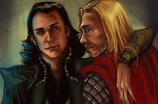
a correction. i don't know who's this is, i usually just download a bunch of them and draw over one when i'm bored
- Attachments
-
- wip-1.jpg (87.58 KiB) Viewed 99 times
I love drawing men and all things manly and gay.
I can't draw animals at all, I just like to look at them and wish I could
I rarely take commissions for anything other than real money, sorry kids
I can't draw animals at all, I just like to look at them and wish I could
I rarely take commissions for anything other than real money, sorry kids
- Alexander White
- Posts: 851
- Joined: Mon Dec 07, 2009 4:54 pm
- My pets
- My items
- My wishlist
- My gallery
- My scenes
- My dressups
- Trade with me
Re: Artist Army
Yunyi wrote:
ah thank you for the input! I will keep that in mind when I'm correcting.
I really like what you're doing. hope you don't mind a quick small crit. really digging mako,
just korra I don't know if it's just the angle but her neck is sort of looking a tad strange.
/goes to look at references
pardon me if I'm wrong
like I know korra is a bulkier build, but the neck is really ah, thick? underneath I mean
Alexander White wrote:a correction. i don't know who's this is, i usually just download a bunch of them and draw over one when i'm bored
/raises hand that would be mine.
yeah, I have no idea what I'm supposed to say haha thank you.
definitely was getting there with the face, yup.
SIE SIND DAS ESSEN
UND WIR SIND DIE JÄGER
-

Atomic Blue - Posts: 3909
- Joined: Thu Oct 23, 2008 10:55 am
- My pets
- My items
- My wishlist
- My gallery
- My scenes
- My dressups
- Trade with me
Re: Artist Army
Alexander, tat is awesome. What program do you use. I am always astounded by your work. c:
So I got my Tablet yesterday and this is what I drew today. I know it is bad but it's a start. c: http://monkeyajla.deviantart.com/#/d4zj069
So I got my Tablet yesterday and this is what I drew today. I know it is bad but it's a start. c: http://monkeyajla.deviantart.com/#/d4zj069
-

glitter. - Posts: 2039
- Joined: Mon May 02, 2011 4:56 am
- My pets
- My items
- My wishlist
- My gallery
- My scenes
- My dressups
- Trade with me
Re: Artist Army
Atomic Blue wrote:Yunyi wrote:
ah thank you for the input! I will keep that in mind when I'm correcting.
I really like what you're doing. hope you don't mind a quick small crit. really digging mako,
just korra I don't know if it's just the angle but her neck is sort of looking a tad strange.
/goes to look at references
pardon me if I'm wrong
like I know korra is a bulkier build, but the neck is really ah, thick? underneath I mean
Yeah, so here's how that went down... xD
I used myself as a reference by taking a photo with my webcam. (Sounds a bit awkward, I know). As I was drawing it, I was like, "Dang, Korra's neck looks so thick..." even though I was basing it off of myself. (I'm pretty sure that my neck is not... extra thick or anything...
And I just realized that I didn't shade her hair thingies. Bleh, another thing to fix later.
-

Yunyi - Posts: 2119
- Joined: Mon Oct 11, 2010 1:40 pm
- My pets
- My items
- My wishlist
- My gallery
- My scenes
- My dressups
- Trade with me
Re: Artist Army
DeathIsMe wrote:Alexander, tat is awesome. What program do you use. I am always astounded by your work. c:
So I got my Tablet yesterday and this is what I drew today. I know it is bad but it's a start. c: http://monkeyajla.deviantart.com/#/d4zj069
i use photoshop cs 5
i as like 13 or 14 when cs2 came out so i just kept upgrading with the program

I love drawing men and all things manly and gay.
I can't draw animals at all, I just like to look at them and wish I could
I rarely take commissions for anything other than real money, sorry kids
I can't draw animals at all, I just like to look at them and wish I could
I rarely take commissions for anything other than real money, sorry kids
- Alexander White
- Posts: 851
- Joined: Mon Dec 07, 2009 4:54 pm
- My pets
- My items
- My wishlist
- My gallery
- My scenes
- My dressups
- Trade with me
Re: Artist Army
Alex; Wonderful as usual!! I would like to point out your only fault! Nothing!  Nah, seriously, its amazing, i cannot wait to see it finished.
Might edit with more for other artists. Couldn't check links XD
Now for Mwah;
Shielow
Shie is the main character for a short story i wrote (Which i will be extending) called 'Suicide Note'. It's basically about a girl who is pushed past the limitation of self control and leaves a suicide note for her grandmother. She leave and goes to one of the buildings to, yeah, you know where that goes. But an officer called tony comes and tries to talk her down when a new helicopter comes up behind the building and Shielow loses her balance almost falling but tony had been edging closer and closer and was able to grab her before she left the buildings grasp. But at the moment thats where it ends. BUT Shielow (In the picture) is just on the ledge. It's like the cover for a book if you will. It's going to hopefully have the helicopter in the background and tony too. Then i'm going to put it in the 'share your art' section with the book.
But i'd love to hear everyones thoughts on how the picture looks so far! & I would love redlines for the hand/s if anyone has a chance.
I'd like to thank Alex for inspiring me to do the picture in the first place


Commissions: Closed
Designing: Closed
Breedings: Closed
Teddy Deer Shop!
Character Thread:
Currently building my
Toyhou.se
Main Characters
Adopted Characters
WME’s
Euro Quarter Horse
Lone Bashkir Curly
Range Trotters
Designing: Closed
Breedings: Closed
Teddy Deer Shop!
Character Thread:
Currently building my
Toyhou.se
Main Characters
Adopted Characters
WME’s
Euro Quarter Horse
Lone Bashkir Curly
Range Trotters
-

Oddly Shaded - Posts: 17375
- Joined: Fri Oct 30, 2009 10:58 pm
- My pets
- My items
- My wishlist
- My gallery
- My scenes
- My dressups
- Trade with me
Re: Artist Army
Something looks a bit off with the face, though it will probably look better when you add eyebrows. I suggest crosshatching on the coat, there, to give it some texture. I do not ave much to say about the hands, since what little advice I could give you probably isn't the best. I love her hair, though. It looks like it will be a very dramatic picture. To make things sort of pop more, you could deepen the shadows created by her hair on her coat and face, I have found it helps to get rid of a "flat" look in a picture.
I was going to use this weekend to practice on humans, but I got caught up with work. This was more of a background practice than anything. http://annavalar.deviantart.com/#/d4zilrv The characters are not mine, and look odd in this setting, but it was raining out, so I was feeling all inspired. I tried to make my fur shading more detailed, just like someone said, I corget who, but thank you for the tip! Critque on both the characters and the background would be great.
I was going to use this weekend to practice on humans, but I got caught up with work. This was more of a background practice than anything. http://annavalar.deviantart.com/#/d4zilrv The characters are not mine, and look odd in this setting, but it was raining out, so I was feeling all inspired. I tried to make my fur shading more detailed, just like someone said, I corget who, but thank you for the tip! Critque on both the characters and the background would be great.
-

Muggafinn - Posts: 3024
- Joined: Tue Aug 11, 2009 6:50 am
- My pets
- My items
- My wishlist
- My gallery
- My scenes
- My dressups
- Trade with me
Re: Artist Army
Oddly,
Looking very nice so far, and the story behind it is very cool. I love fantasy and crazy new worlds and things above all, but it's always nice to see stories that are centered in a much more tangible world too. :3
Hrmm, for critique-- I think the main things I see so far are that her limbs seem a bit small compared to her body. A bit too thin, and for the arms, a little too short. Maybe flesh those out a bit more-- especially in the hips and thighs?
Also, the shading on the face under her cheeks looks a bit too focused and sharp. It makes her cheeks protrude a bit too much, and gives the jaw a really hollow feeling. Perhaps smooth it out a bit more?
Hope you finish it through completely! C: -- Shading on the coat is looking awesome, btw.
Muggafinn,
Ohh, rainy scenes-- I always love rainy scenes~ CB
I really like the tones used, and the lightning in the background is a really nice touch. I love your brush choice for the clouds, as well.
Hrmm, I think to really bring out your backgrounds some more, you could maybe add some more detail to the foreground. Draw some more grass before your characters' bodies to really show that they're placed in the setting. Some other forms of plants, and tall grass in the very front can also make it pop. Perhaps some bushes, ferns-- don't be afraid to really fill your landscape with some more life.
Another good thing to do is make objects look less generic and repeated. Vary the shapes of the raindrops more; make the notches in the trees more like a puzzle piece, rather than a grate, so it's all over the place,rather than in straight lines. Nature can be pretty messy, so giving imperfections to things makes it more believable.
The last thing I think I'd say for the background is more regarding composition. With characters so close in the foreground, it really helps to show how close they are by making the horizon line in the far back somewhere below them. If that line is below them-- be it below their heads, their shoulders, or any other part of their body-- it gives the viewer more of a sense of depth, that they are looking onto a bigger scene. If you really want to make slopes above their heads though, then making those lighter, and desaturated will also give the same sense that it's farther away. Just imagine looking at some mountains far off, where the fog and light distort it into looking paler and less visible.
Backgrounds can be a pain, but they're definitely worth it in the end. Keep practicing with them, and try out all sorts of things to get different effects and results. :3

-

Susiron - Official Artist
- Posts: 6575
- Joined: Fri Apr 15, 2011 11:42 am
- My pets
- My items
- My wishlist
- My gallery
- My scenes
- My dressups
- Trade with me
Who is online
Users browsing this forum: No registered users and 12 guests

