
A.K.A Raptor wrote:Wibeke@Nice, I'm sorry but I can't help with Crit, 'Cause it looks Epic to me
Alex@...Epic...
Nebulas@ Can't help,sorry
But I need help badly
Give me the hardest Crit you have. I wanna inprove. Redlines? Yes please.
Alright~Here's about as harsh as I can go.
(No redline tonight, sorry folks.)
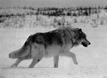
The wings, where that first little, uhh, digit sticks out from the back of the wing, that should be sharper, or have a claw, or something. Your wings are demon wings, so they should be sharp or have a claw sticking off.
Frankly, the paws just looks awkward. It's kind of, erm, scribbly, so it's hard to tell what digits are what. Plus I think you were going for Lion King paws, which are incorrect enough as it is.
Tails~ The bottom one looked good, but I felt like the top one should have been puffier.
The winged full body pose~
The eye is to slanted and to close to the edge of the face.
The muzzle is a tad to long.
The tail ends unatually, so unless your wolf has some sort of freaky popped up back behind those wings, it shouldn't end like that. The bottom of the tail shouldn't curve into the leg, what so ever. I don't know how well this picture works, but typing in the words 'Wolf Butt' into Goggle Images isn't the best idea in the word. XP But you see what I mean, right?
Wingless full body pose minus the paws~
Watch that tail, dude.
The front leg in the back looks pretty big in comparison to the first one, the first leg in the front has an odd elbow thing going on. You made a small indent on the belly line and that shouldn't be there.
You're back back leg seems to be lacking shape. Kind of just looks like you just drew two lines. That is a no-no, even for sketches.
It looks pretty good though!! I can't sketch though, my sketches look like crap XP
horse_lover0726 wrote:
This is the first time i've drawn any of these. I've done horses before, but never with that much detail...
The first is a 'Fairy', and the other is another mythical creature called a 'Nightmare'.
They were all done using a tutorial book i got for christmas(but i kinda skipped out on the shading for them)
What do you guys think of these?(NO red-lines please)
EDIT: Oh! and i know the face on the fairy is sorta messed up. I stink at drawing humanoid things!
And this, i just did it yesterday(i think)
(sorry they're so light, i used the scanner, but my sketch book is a little too long, so i blame it on that lolz)


Griffon~ Looks great!! The neck and head seem to be a little to straight though, I'd recommend having the neck go straight then bring his head down. Kind of like a horses. Does that make any sense?
Your front legs/claws seem to be awfully thin. Eagles still have meat on those X3
His feathers are also oddly angled in some places, it almost looks like he's molting, though I can't draw feather to save my life XP
Your fire horse looks beautiful, first off. I love the bone tail, that's just cool!!
However, the ears are a little to long.
You also did something with the front front leg, the one that's up. It seems you added a very faint line between the chest and the joint right there, I would recommend making that line halfway between that first line and the darker leg line. Make sense?
Your normal horse is also gorgeous, but I feel like the cheek dips a little.
Don't get me wrong, you're a wonderful artist!!I definatley suck in comparison to you -_-


