
signature respect! [v. 21]
Re: signature respect! [v. 21] (READ NEW RULE)
![]() by grizol » Sat Sep 02, 2017 10:49 am
by grizol » Sat Sep 02, 2017 10:49 am
I love the split gif on the left, it's very pleasing to look at! I also really love the quote! the bio is short but informative. I also love how everything of the right is pushed up to the top. It's a little bit empty, but still nice!

-

grizol - Posts: 10617
- Joined: Wed Jun 24, 2015 10:49 am
- My pets
- My items
- My wishlist
- My gallery
- My scenes
- My dressups
- Trade with me
Re: signature respect! [v. 21] (READ NEW RULE)
![]() by Dr. Potan » Sat Sep 02, 2017 11:19 am
by Dr. Potan » Sat Sep 02, 2017 11:19 am
very odd, something i haven't seen before, nice.
█
█
█
█
█
█
█
█
█
█
█
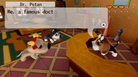
"When treating a patient, it doesn't matter what type of treatments you use... or who treats the patient... The only thing that matters is saving the patient any possible way."
Hello! I'm Dr Potan, some call me the best doctor on the dog island! I don't think I'm that famous, but I bet I can help you with your problem!
Credit: .normal.human.
-

Dr. Potan - Posts: 1975
- Joined: Tue Oct 25, 2016 11:32 pm
- My pets
- My items
- My wishlist
- My gallery
- My scenes
- My dressups
- Trade with me
signature respect! [v. 21] (READ NEW RULE)
![]() by wanda. » Sat Sep 02, 2017 8:08 pm
by wanda. » Sat Sep 02, 2017 8:08 pm
- I like how you've listed a few things that you like,
I like how its just a mix of games that you like all pushed into one signature.
-

wanda. - Posts: 8625
- Joined: Fri Jun 08, 2012 1:37 am
- My pets
- My items
- My wishlist
- My gallery
- My scenes
- My dressups
- Trade with me
Re: signature respect! [v. 21] (READ NEW RULE)
![]() by Guest » Sun Sep 03, 2017 2:59 am
by Guest » Sun Sep 03, 2017 2:59 am
I really love the color scheme and gifs in your signature, the rose borders are also very very cute, and the amount of detail is actually pretty nice!
+1 Sentence please
+1 Sentence please
- Guest
Re: signature respect! [v. 21] (READ NEW RULE)
![]() by LadyGalleth » Sun Sep 03, 2017 8:48 am
by LadyGalleth » Sun Sep 03, 2017 8:48 am
Kitties!! Yours looks so,organized. I like how you put your little bio above the cats. Brings attention to the bio.
----------☤John Watson☤----------
❝We can't giggle, it's a crime scene!❞

❝We can't giggle, it's a crime scene!❞


❤
_
✟
_
⊹
_
☺
_
❝We solve crimes, I blog about it,
he forgets his pants.❞
Signature By Crimson_Raven
-

LadyGalleth - Posts: 56033
- Joined: Fri Jan 18, 2013 8:04 am
- My pets
- My items
- My wishlist
- My gallery
- My scenes
- My dressups
- Trade with me
Re: signature respect! [v. 21] (READ NEW RULE)
![]() by Spacepvp » Sun Sep 03, 2017 8:55 am
by Spacepvp » Sun Sep 03, 2017 8:55 am
- I really like the gif and the font used in your signature!!
The purple magic (?) of the girl goes well with the purple of the font.
Also the fact that your signature matches your avatar is pretty cool! c:
▐
▐
▐
▐
▐
▐
▐
▐
▐
▐
▐
▐
▐
▐
▐
▐
▐
"Don't compare yourself
_______━━ ○ ♡ ○ ━━

_______━━ ○ ♡ ○ ━━
▐
▐
▐
▐
▐
▐
▐
▐
▐
▐
▐
▐
▐
▐
▐
▐
▐
___Deviantart__________Twitch
_______
┏_______________________┓
___She/Her || Asexual || INFP
_.German | Neutral Good | Pisces
___Memes | Paranormal | League
┖_______________________┚
_______
___Toyhouse__________Discord
_______
┏_______________________┓
___She/Her || Asexual || INFP
_.German | Neutral Good | Pisces
___Memes | Paranormal | League
┖_______________________┚
_______
___Toyhouse__________Discord
▐
▐
▐
▐
▐
▐
▐
▐
▐
▐
▐
▐
▐
▐
▐
▐
▐
to others. They aren't you."
_______━━ ○ ♡ ○ ━━

_______━━ ○ ♡ ○ ━━
▐
▐
▐
▐
▐
▐
▐
▐
▐
▐
▐
▐
▐
▐
▐
▐
▐
-

Spacepvp - Posts: 21997
- Joined: Fri Sep 28, 2012 12:26 am
- My pets
- My items
- My wishlist
- My gallery
- My scenes
- My dressups
- Trade with me
Re: signature respect! [v. 21] (READ NEW RULE)
![]() by heretyc » Sun Sep 03, 2017 8:59 am
by heretyc » Sun Sep 03, 2017 8:59 am
To start, I like the colours you used.
They blend nicely, but some shades of blue are a tad too bright and it hurts my eyes a bit. Maybe
you can make them darker ? Just a suggestion.
The simplicity is quite pleasing, and I like how there's two gifs, instead of a large amount
of them that can overwhelm some.
I also like you added your interests and some links. It's quite helpful.
Overall, your sig is immaculate. Kudos.

I have no name; I am but two days old...
a work in progress until i get my marbles together
art contest
-

heretyc - Posts: 1077
- Joined: Thu Nov 10, 2016 5:08 pm
- My pets
- My items
- My wishlist
- My gallery
- My scenes
- My dressups
- Trade with me
Re: signature respect! [v. 21] (READ NEW RULE)
![]() by Po0l5 » Sun Sep 03, 2017 9:04 am
by Po0l5 » Sun Sep 03, 2017 9:04 am
For; mads.
To begin with, I am madly in love with your color choice. I love gradients, especially ones including those two colors. I think they contrast each other very well and it gives it a soft and cute tone to your signature.
Secondly I really like the photos you used. You made sure to keep them with the scheme you have going on there and they add to the cute look. You made a good choice putting the hearts and dreamcatcher together.
It is very aesthetically pleasing, and it is something that I would call eye candy.
I really love your quote as well.
You did well for not coding in a while. :3
This is awesome! <3
-

Po0l5 - Posts: 715
- Joined: Fri Aug 04, 2017 11:59 am
- My pets
- My items
- My wishlist
- My gallery
- My scenes
- My dressups
- Trade with me
Re: signature respect! [v. 21] (READ NEW RULE)
![]() by miito » Sun Sep 03, 2017 11:08 am
by miito » Sun Sep 03, 2017 11:08 am
this is a vv nice and simplistic signature! the cherry blossoms give off a nice aesthetic, and double as some cool borders. the circles bordering your bio give the signature a kind of spark, and fills up space that would otherwise look plain. moving on to the bio, it is nice and lengthy for those of us that enjoy a bit of reading. even though i was never a fan of text-based sigs, this one goes very well with the simple vibe it gives off. the only problem i see is with the images, as they seem a bit squished (most likely from resizing). perhaps try cropping an image to the same dimensions to make it seem less stretched? overall, i believe it's very pleasing to look at, and, again, nice and simplistic.
(3+ sentences, please? i appreciate any feedback.
try my profile if the sig doesn't fit)

▒▒▒▒▒▒▒▒▒▒
▒▒▒▒▒▒▒▒▒▒
┌────────┐
│
│
│
└────────┘
▒▒▒▒▒▒▒▒▒▒
▒▒▒▒▒▒▒▒▒▒
▒▒▒▒▒▒▒▒▒▒
┌────────┐
│
│
│
│
│
mikaela ▪ any/all
adult ▪ pms open!
very big jongseob fan
❤
p1h 'duh' mv
adult ▪ pms open!
very big jongseob fan
❤
p1h 'duh' mv
│
│
└────────┘
▒▒▒▒▒▒▒▒▒▒
▒▒▒▒▒▒▒▒▒▒
-

miito - Posts: 4044
- Joined: Fri Jul 24, 2015 7:45 am
- My pets
- My items
- My wishlist
- My gallery
- My scenes
- My dressups
- Trade with me
![]() by passione » Sun Sep 03, 2017 12:10 pm
by passione » Sun Sep 03, 2017 12:10 pm
hi, xoa. i'm xia and i frickin' love your sig. yeah, it doesn't line up here but it looks perfect on
your profile! I love the red and blue colour scheme which is usually quite conflicting and really
wouldn't look good since it's so bright and too eye-catching but it fits well in your sig. i like how
it's not completely made out of images which would usually make computers lag and stuff. the
images you did use are high quality which is great. however, it seems a little cluttered to me
and other than the bio, i don't really know where to look first when it comes to the font images.
it's still a great sig and i know it'll be hard to move around or reorganize because of all that coding.
3+ lines if that's possible for you. thanks!
▉▉
▉▉
▉▉
▉▉
▉▉
▉▉
▉▉
▉▉
▉▉
▉▉
▉▉
▉▉
▉▉
▉▉
▉▉
▉▉
▉▉
▉▉
▉▉
I WISH I COULD
I WISH I COULD
I WISH I COULD
I WISH I COULD
┌────────────────┐
│
│
│
│
│
│
└────────────────┘
I WISH I COULD
I WISH I COULD
I WISH I COULD
┌────────────────┐
│
│
│
│
│
│
│
│
│
│
│
yo. i'm xia. gone from cs but never
forgotten. find me on fr!
i like jjba, lunch club and bts.
suffering from jschlatt brainrot.
they/them pronouns please
forgotten. find me on fr!
i like jjba, lunch club and bts.
suffering from jschlatt brainrot.
they/them pronouns please
│
│
│
│
│
└────────────────┘

LOVE MYSELF
LOVE MYSELF
LOVE MYSELF
LOVE MYSELF
▉▉
▉▉
▉▉
▉▉
▉▉
▉▉
▉▉
▉▉
▉▉
▉▉
▉▉
▉▉
▉▉
▉▉
▉▉
▉▉
▉▉
▉▉
▉▉
-

passione - Posts: 6367
- Joined: Tue Jan 10, 2017 1:36 pm
- My pets
- My items
- My wishlist
- My gallery
- My scenes
- My dressups
- Trade with me
Who is online
Users browsing this forum: Faith3344, hiimbee10, innocentvampire, jjumpydoll, McFluffins, morgie270 and 19 guests