Just a little fun for when you have time to kill
 by jellyeskimo » Mon Jan 16, 2017 11:00 am
i like how the sig is simple and small
i like the colour scheme how it is like pastely
i like how its not as image heavy and that even if its small
it fits alot of things
i like the images on the right and left (cloud things)
act as borders and how the lines also act as borders and
there is one on the middle side and right
i like how you have added links and a bio box too
i also like how ur sig has a theme in general it very cute and pretty
overall good job :3
░░░░░░░░░░░░░
░░░░░░░░░░░░░𝑑𝑜𝑛'𝑡 𝑢𝑛𝑑𝑒𝑟𝑠𝑡𝑎𝑛𝑑 𝑤𝘩𝑦 x
x
┏━━━━━━━━━━━━┓
Hi! I'm Jellyeskimo, but
you can just call me jelly >U<
I'm a female also an aries <3
Proud animal lover and supporter
Vet, Designer, Photographer, but
in my dreams, still chasing ~~
[PP | CC | SS | TM]┗━━━━━━━━━━━━┛
-

jellyeskimo
-
- Posts: 1181
- Joined: Sun Jan 25, 2015 2:28 pm
- My pets
- My items
- My wishlist
- My gallery
- My scenes
- My dressups
- Trade with me
by Spock and Kirk » Mon Jan 16, 2017 11:21 am
First of all, as someone who absolutely loves dogs, I think that its the cutest thing i've seen in a while. I adore the way that you have the quote starting at the left hand side working its way to the right in columns. The quote it's self is something that I can relate to as well and fits very nicely with the overall theme of your signature. Its extremely well planned out and has a simplistic style this fitting the grey and black palate of choosing. The links under your small Bio fit harmoniously with the style as well, being elegant and not off-putting.
Overall, its an amazing signature! Good job!
⋯⋯
{𝒦𝒾𝓇𝓀} ⋯⋯⋯⋯⋯⋯⋯⋯⋯⋯⋯⋯⋯⋯⋯⋯⋯⋯⋯⋯⋯⋯⋯⋯⋯⋯⋯
⋯⋯⋯⋯⋯⋯⋯⋯⋯⋯⋯⋯⋯⋯⋯⋯⋯⋯⋯⋯⋯⋯⋯⋯⋯⋯⋯⋯⋯⋯ {𝒮𝓅𝑜𝒸𝓀} ⋯⋯
-
Spock and Kirk
-
- Posts: 20156
- Joined: Sat Apr 02, 2011 10:17 am
- My pets
- My items
- My wishlist
- My gallery
- My scenes
- My dressups
- Trade with me
by sparrow; » Mon Jan 16, 2017 12:36 pm
I like the colour scheme you have in your signature, especially because you used
gradients which look really pretty. The light gray is a bit hard to see in the words
"leave them behind" though, maybe make it a little darker? Also, you could try
centering the column on the right so it looks a little neater. The gifs you chose go
well with the rest of the colours in your signature. Overall it's a good signature, and
you have nice coding, but it has a couple of things you might want to change to
make it even better.
3+ sentences if possible, critique welcome!

╭xxxxxxxxxxxxxxxxxxxx╮
text text text text text
text text text text text
text text text text text
╰xxxxxxxxxxxxxxxxxxxx╯
╭
xxxxxxxxxxxxxxxxxxxxxxxxxxxxxxxxxxxxxx╮
text text text text text text text text text
text text text text text text text text text
text text text text text text text text text
text text text text text text text text text╰
xxxxxxxxxxxxxxxxxxxxxxxxxxxxxxxxxxxxxx╯


-

sparrow;
-
- Posts: 5895
- Joined: Sat Sep 26, 2009 6:17 pm
- My pets
- My items
- My wishlist
- My gallery
- My scenes
- My dressups
- Trade with me
by rat » Mon Jan 16, 2017 12:53 pm
I love the color theme, and how it all ties into your username. I also love the little bio about yourself, its not too much but not too little. The only thing that bothers me is the "I'd rather be" text at the bottom, its off center, but i'm just being nitpicky. Overall nice, cute and simple siggy! <3
-

rat
-
- Posts: 1319
- Joined: Thu Jun 16, 2016 7:10 am
- My pets
- My items
- My wishlist
- My gallery
- My scenes
- My dressups
- Trade with me
by mucrospirifer . » Mon Jan 16, 2017 1:35 pm
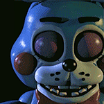
love the fonts used here! i think there's also something especially pleasing about the triangles that border "fanboy" - it gives a sense of border/definition that would be lovely to see added throughout the whole! the blue works well with the image on the left, and the consistency of subject and size ties both images together. also very much appreciate that the quote is easy to follow; the arrangement of quote and images gives a nice sense of balance on either side
-

mucrospirifer .
-
- Posts: 3219
- Joined: Sun Feb 07, 2010 5:26 am
- My pets
- My items
- My wishlist
- My gallery
- My scenes
- My dressups
- Trade with me
by Faded Darkness » Mon Jan 16, 2017 2:31 pm
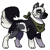
The way you have your signature is very exquisite and organized, I also love the color scheme and the picture of the wolf beside the little bit of info about yourself. Very neat I might say.
Salutations, I'm Ani as you can see I'm quite the dedicated fan to Fnaf & I love shipping. I just wanna say that no matter what others think of you keep being proud for who you are and be proud for the dreams you wish to follow whether we are human or not we can make the impossible happen.
Ani<>taurus<>lesbian<>female<>furry
-

Faded Darkness
-
- Posts: 6291
- Joined: Wed Jul 27, 2016 2:16 pm
- My pets
- My items
- My wishlist
- My gallery
- My scenes
- My dressups
- Trade with me
-
by chimique, » Mon Jan 16, 2017 8:25 pm
I love how you use the space given to you across wise.
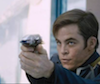
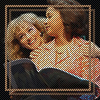
The two Gif's are nice, and they're not very... well, there's not a lot going on in them, so it doesn't distract you in a bad way.
They line up quite nicely, though maybe add borders to the text so it fills the space.
The two colours are nice, and they sort of fit with the images-although i'd try Fontmeme for a quote is you'd rather not have a border.
The normal bio is great, and i love the positive message there, it's really inspiring.
The smaller one below tells you enough information if you just scroll over it, so you know enough about you.
Overall, this is great and i love it!
((3+ detailed sentences, please! I spent three hours making this signature.))
┌
X
X
X
x
X
X
X
X
X
X
X
└
X
x
┐
X
X
X
x
X
X
X
X
X
X
X
┘
-
chimique,
-
- Posts: 4111
- Joined: Mon Nov 24, 2014 3:07 pm
- My pets
- My items
- My wishlist
- My gallery
- My scenes
- My dressups
- Trade with me
by yuketsu » Mon Jan 16, 2017 8:33 pm
cute signature first of all! both gifs are rlly high quality and match up with each other. the different fonts used for
the quotes is pretty interesting to see, it shows a small portion of your creative side! super cool that u managed to
fit a short bio + some links in there! however, your sig does seem a bit cramped, maybe expand it more to the right?
its also really red so maybe use some lighter/duller colors or colors that could match w/ the gifs. the lines are rlly
lined up @ the right end of your signature i thnk lining them up would give them a more cleaner appearance. im
not rlly good at explaining though haha ^^otherwise, good job!
bestie | art shop | chinese | ICU nurse
lu yuxiao as shangguan qian *chefs kiss BLEACH, world trigger, ow2, valorant ✌
taiwanese indie rock, c-dramas, fashion
making matcha, trying new fragrances~
-

yuketsu
-
- Posts: 18031
- Joined: Thu Apr 18, 2013 6:00 pm
- My pets
- My items
- My wishlist
- My gallery
- My scenes
- My dressups
- Trade with me
-
by Ohpossums » Mon Jan 16, 2017 10:08 pm
I really like the color scheme as the grey and blacks all match up, the gif is also interesting, I like the words and the sizes are just right. I might not see the other half/if there is another half of it but by what I can see its very pretty. Organized and most neat. Its nice the gif is the same color as the whole theme. its very pretty good job! Its small and very pretty so I think that you have a very nice signature in total!
plus. I added the words at the top of the song lyrics right now so please tell me if I should remove them. 2plus sentences please thank you!
-

Ohpossums
-
- Posts: 2715
- Joined: Sat Apr 16, 2016 4:25 am
- My pets
- My items
- My wishlist
- My gallery
- My scenes
- My dressups
- Trade with me
Who is online
Users browsing this forum: bloodclan666, jjumpydoll, Sealipup and 15 guests