Just a little fun for when you have time to kill
 by sea glass. » Tue Dec 20, 2016 2:23 am
i'm bummed that the images aren't showing up
because this sig has a lot of promise! but what
you do have is looking great,, the borders are
a nice touch & it's nice that you provide some
information about yourself in the middle. the
font on the right is cute too!.... nicely done!!
 you will get there (but right now you are here)
and here is wonderful.
-

sea glass.
-
- Posts: 25827
- Joined: Fri Mar 22, 2013 6:18 am
- My pets
- My items
- My wishlist
- My gallery
- My scenes
- My dressups
- Trade with me
by hollowfall. » Tue Dec 20, 2016 4:44 am
I love how your signature is so well-made yet simple. It isn't too cluttered and the pairing of the yellowy tone with black is super calming and easy on the eyes. I like how everything just flows together. And the gif on the right is definitely my favourite gif, heh. Also like the fact that you fit in a little basic info about yourself. Overall, awesome signature. :p
(sorrry if my grammar is a tad off or something, I am very tired. or sorry if my wording is a bit odd or nonsensical in general blah I make no sensee)
-

hollowfall.
-
- Posts: 2528
- Joined: Fri Feb 15, 2013 8:44 pm
- My pets
- My items
- My wishlist
- My gallery
- My scenes
- My dressups
- Trade with me
-
by nuvola » Tue Dec 20, 2016 8:33 am
to start off my respect-given response on your signature, I think I'm
first going to give a suggestion? if you don't mind that, of course. h
owever, judging from the sinplistic theme you have, nothing more r
eally should be added? mainly because I think it would interfere wi
th what you have and create a more cluttered feel. but! that's tota
ally besides what I was going to say (I'm just rambling, I'm sorry); w
hat I think you should do? if you want, is to add something a bit mo
re to the quote box that you have in the middle, because it's appea
ring, to me, as incredibly empty. other than that, I think that what
you have at the moment, for the simplistic theme that you have, l
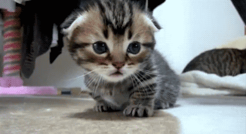
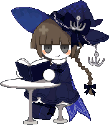
ooks really great! did you draw the pixel cat in the middle? whoeve
r DID can I jUST SAY that I absolutely love it because it's so adorable.
I'm thinking it might be espeon? Correct me if I'm wrong though.
What I like most about your signature is how everything seems to be
centered around what you like and your personality / identity. There
isn't too much, by I think it all gets the point across. and, in an
interestingly creative way as well, as you had used the button(?) to r
elay that information. The colors of the bottom buttons are very ple
asing to the eye as well.
Overall, I think that despite the emptiness of the signature, it's strai
ght to the point and very cute! With the little pixel art in the middle.
I think you did a nice job neatly arranging anything so it's not crowde
d or too empty, so it all works out well as it is. Keep up the great work!! <3
[ it would be super appreciated if the next person could give me 3+
sentences. and, critique is welcomed, if you want! ]
-

nuvola
-
- Posts: 8673
- Joined: Sat Oct 03, 2009 12:22 pm
- My pets
- My items
- My wishlist
- My gallery
- My scenes
- My dressups
- Trade with me
by venus. » Tue Dec 20, 2016 9:57 am
~~ as a starting note, I like how you organized
your signature. it's simple, straight to the point,
but isn't too plain or boring.
~~ the center graphic seems to act as the "focal
point" of the coding, and attracts the viewers
eyes ( the art is very well done as well )
~~ I really like the quote you added in between
your two smol bios. it matches the overall theme
and is nicely placed in an area where it will be
easy to see and read.
~~ I like how your bios are short and sweet, but
still give the viewer an idea of you and your
personality / interests
~~ the little moon icon is v cute, and compliments
the colours used in the main graphic
-- very well done !!
{{ new sig. still need to do a bio. please put some
effort into your post <3 }}
-
venus.
-
- Posts: 2548
- Joined: Sat Dec 21, 2013 3:07 pm
- My pets
- My items
- My wishlist
- My gallery
- My scenes
- My dressups
- Trade with me
by vviekki » Tue Dec 20, 2016 10:46 am
wow. i love your signature so much.
to start off, i love the fonts used in
your signature, they're really pretty
and not as used as others. which m-
-akes your signature unique in a
good way. there's just one thing about
it though, the font used for "dream" is
a bit hard read. the layout is super
pretty and well-coded too, i like
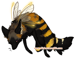
the two gifs underneath a picture
you put in your signature. your
signature is pretty good for being
a wip. overall i think all of the
images are nice, but the one to the
right is kind of "grainy" and its
quality should be fixed, other than
that, great signature!
{{4+ sentences}}
 𝑙𝑖𝑘𝑒 𝑡ℎ𝑒 𝑒𝑦𝑒 𝑜𝑓 ℎ𝑢𝑟𝑟𝑖𝑐𝑎𝑛𝑒, 𝑎 𝑑𝑎𝑖𝑠𝑦 𝑐𝑎𝑢𝑔ℎ𝑡 𝑖𝑛 𝑡ℎ𝑒 𝑠𝑢𝑚𝑚𝑒𝑟 𝑟𝑎𝑖𝑛 ♡───────────────────────────── ⊰ ─────────
── ⊱ ───────╮┊
┊
┊
𝐢. she/her 𝐢𝐢. IxFP? 𝐢𝐢𝐢. joyrene #1 fan &
art student i guess───────────╯
-

vviekki
-
- Posts: 4647
- Joined: Fri May 27, 2016 2:18 pm
- My pets
- My items
- My wishlist
- My gallery
- My scenes
- My dressups
- Trade with me
by leafkinz » Tue Dec 20, 2016 11:44 am
i love your sig. so much! to start, it's a simple colour scheme. the colour scheme is pretty, and i like the quote. the cat picture really adds to the beauty and simplicity of the colours. i also like the way you have different things about yourself in different boxes, and it's just enough information to keep people interested. over all, i really like your sig. :3
dear evan hansen - taylor swift - therian - asexual - slytherin - twenty one pilots - webkinz
-

leafkinz
-
- Posts: 1084
- Joined: Fri Jan 22, 2016 4:32 am
- My pets
- My items
- My wishlist
- My gallery
- My scenes
- My dressups
- Trade with me
-
Who is online
Users browsing this forum: </З, ClockworkAngel, CoffeeEX, horsefun, Kunzite and 16 guests


 ═══════════