
signature respect! [v. 20]
Re: signature respect! [v. 20]
![]() by nightclub » Wed Aug 24, 2016 7:57 am
by nightclub » Wed Aug 24, 2016 7:57 am
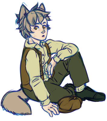
The colors are very soft, and I think that's the first thing I noticed. I really like the dull yet eye-catching colors you used. The bio succeeds in informing everyone about yourself, so it's really nice to read. The layout and the overall way it's set up is very nice; it's small, but very detailed. I enjoy the gif aligned to the left, it's not very fast so it doesn't hurt my eyes, the colors of match the signature so that's really nice! The little feather image above the links is actually really cute, and the colors match, too, so that's always good. I like the patterned borders you used, especially the polka dots separating the gif/words aligned to the left and the image/links aligned in the center. They aren't too big but they take up an excellent amount of space. I can tell you worked really hard with the coding, and it looks super nice, so fantastic job!
-
anything and everything is appreciated, but please keep in mind i'm kinda sensitive to criticism. so, all i ask is, please be detailed but not too harsh! thanks c,:

-

nightclub - Posts: 2436
- Joined: Mon Dec 08, 2014 9:34 pm
- My pets
- My items
- My wishlist
- My gallery
- My scenes
- My dressups
- Trade with me
Re: signature respect! [v. 20]
![]() by Ippolit » Wed Aug 24, 2016 7:59 am
by Ippolit » Wed Aug 24, 2016 7:59 am
This is extremely nice, for starters I adore the pyramid shape you've got. It just looks very nice that you've got the image at the top, then the bio and finally the quote. Furthermore you've got all the components for a good sig.  (picture, bio, quote) and it all matches very nicely colour and style wise. I also like the quote itself and the font you have used. The borders look great as well and they keep the whole thing neat and tidy. Well done!
I love detailed replies. <3
I love detailed replies. <3

╔═════════{♥}═════════╗
And so all things, time will mend
So this song will end...
╚═════════{♥}═════════╝
x➤ My OC Erik, I love to write storiesAnd so all things, time will mend
So this song will end...
╚═════════{♥}═════════╝
x➤ Sasha - ISFJ - vegetarian - adult
x➤ Proud tea drinker and cat lover
x➤ Feel free to send me a message! ©

 x
x  x
x 
-

Ippolit - Posts: 7116
- Joined: Sat Aug 13, 2016 9:51 pm
- My pets
- My items
- My wishlist
- My gallery
- My scenes
- My dressups
- Trade with me
Re: signature respect! [v. 20]
![]() by YuckyCoffin » Wed Aug 24, 2016 11:38 am
by YuckyCoffin » Wed Aug 24, 2016 11:38 am
I like it quite a bit. Is that German? Either way is look personal and simple. I wish the gif was a little thinner, then your eyes would go to the text as well instead of looking at the images the. The Text. Good job )
I would love a detailed reply. I just finished it and I'm getting the hand of bbcode.
(Also I am aware the 'to' and 'me' is a little light. I'm currently fixing it)
I would love a detailed reply. I just finished it and I'm getting the hand of bbcode.
(Also I am aware the 'to' and 'me' is a little light. I'm currently fixing it)
contact me on MSP: end credits
youtube: omae wa
im sorry i left C:
youtube: omae wa
im sorry i left C:
-

YuckyCoffin - Posts: 1423
- Joined: Tue Nov 10, 2015 11:10 am
- My pets
- My items
- My wishlist
- My gallery
- My scenes
- My dressups
- Trade with me
Re: signature respect! [v. 20]
![]() by changbin » Wed Aug 24, 2016 11:38 am
by changbin » Wed Aug 24, 2016 11:38 am
Oh, wow, this is gorgeous!
I LIVE for the colors!
I love how nice everything fits!
I can't really see the light orange part of the quote, maybe change it to a different color?
I also love the random circle thing at the top - it satisfies me for some reason X3
Overall, I really love this sig.
Good work <3
I LIVE for the colors!
I love how nice everything fits!
I can't really see the light orange part of the quote, maybe change it to a different color?
I also love the random circle thing at the top - it satisfies me for some reason X3
Overall, I really love this sig.
Good work <3
⊹
⊹
⊹
⊹
⊹
⊹
⊹
⊹
⊹
⊹
⊹
██
██
██
██
██
██
██
██
██
██
██
██
██
██
██
██
██
██
██
██
██
 xxxxx
xxxxxiiixi


xxxxxxxxx'


⊹
⊹
██
██
██
██
██
██
██
██
██
██
██
██
██
██
██
██
██
██
██
██
██
-

changbin - Posts: 3466
- Joined: Thu Jun 02, 2016 7:24 am
- My pets
- My items
- My wishlist
- My gallery
- My scenes
- My dressups
- Trade with me
Re: signature respect! [v. 20]
![]() by kook » Wed Aug 24, 2016 11:52 am
by kook » Wed Aug 24, 2016 11:52 am
i love your sig ^-^ the layout is simple yet very pleasing!
the blue color scheme is quite cute as well. i think the
font for the quote is so pretty honestly, and i like how
your bio is in the center of your sig. the borders are a
nice add-on to separate your bio from the pictures and
quote. overall, very cute and organized well c:
[@rater; all i ask for is honesty and effort, thank you!]

- kook
- Posts: 5011
- Joined: Mon Oct 26, 2015 5:55 am
- My pets
- My items
- My wishlist
- My gallery
- My scenes
- My dressups
- Trade with me
Re: signature respect! [v. 20]
![]() by K0Z1 » Wed Aug 24, 2016 2:56 pm
by K0Z1 » Wed Aug 24, 2016 2:56 pm
I love the layout.
The color scheme is perfect .
The quote is nice.
Nice bio.
And to be honest the gif isn't my taste so much sorry.
The color scheme is perfect .
The quote is nice.
Nice bio.
And to be honest the gif isn't my taste so much sorry.
The following user has left this site for the most part. They do not enjoy the site like they used to and wish everyone well. I will be on every so often, but I no longer seek what this place has to offer. If you seek to contact me my discord is: henri#0005
-

K0Z1 - Posts: 12882
- Joined: Tue Mar 29, 2016 1:12 pm
- My pets
- My items
- My wishlist
- My gallery
- My scenes
- My dressups
- Trade with me
Re: signature respect! [v. 20]
![]() by Taurpy » Wed Aug 24, 2016 3:10 pm
by Taurpy » Wed Aug 24, 2016 3:10 pm
Firstly, I find it adorable that you used Legos <3
Secondly, I find it funny ,in an "Awwe cute" way, how you added "Please don't kick me out of any RPS." I also like how the gifs are presented! Overall, the signature is a bit simple, but I can't judge since I'm a noob at coding cx
Secondly, I find it funny ,in an "Awwe cute" way, how you added "Please don't kick me out of any RPS." I also like how the gifs are presented! Overall, the signature is a bit simple, but I can't judge since I'm a noob at coding cx

hi! i'm nat.
[they/them please!] [©]
-

Taurpy - Posts: 7813
- Joined: Sun Dec 15, 2013 9:12 am
- My pets
- My items
- My wishlist
- My gallery
- My scenes
- My dressups
- Trade with me
Re: signature respect! [v. 20]
![]() by Woogwoo Wren » Wed Aug 24, 2016 3:14 pm
by Woogwoo Wren » Wed Aug 24, 2016 3:14 pm
Yasss! Lego! Anything with Lego is it is already awesome.  (although, in my opinion you lost some bonus points by calling it 'Legos' XD)
Right. I really love how you've lined up the gifs. They're all pretty smooth, and give us an idea of what kind of Lego you like. I like how there is an underlying yellow and purple theme, while there are other colours they seem to be the most consistent. idk. Might just be me. XD
I really like it!
@Nat.
I really really like the pet! It's well dressed, and fits really well with the rest of the signature. I like the stamps, and how you've separated them with the triangle things, and also how the orange in the Taurus stamps fits with the pet! I like how the pet is to one side, and the bio is in the centre.
One thing I would suggest is pushing the bio down a little, maybe a line or two. Other than that its awesome! Great job mate!
(Please 3 sentences, at least, thanks so much!)

"An eye for an eye
Hello! I'm Wren! I'm in my mid-teens and live
in New Zealand. I enjoy writing, reading, watching videos,
cosplaying, and drawing occasionally! I'm a Christian,
and always up to meeting new friends!
~ P ~ M ~ A ~
| Stories| A03 | Wattpad |
| RWBY | Merlin | Doctor Who | HP |
| 🐦| 🐺 | 🔬 | 🦊 | ✟ |
and the world goes blind."

-

Woogwoo Wren - Posts: 8621
- Joined: Tue Dec 23, 2014 10:15 am
- My pets
- My items
- My wishlist
- My gallery
- My scenes
- My dressups
- Trade with me
Re: signature respect! [v. 20]
![]() by truthbomb » Wed Aug 24, 2016 3:16 pm
by truthbomb » Wed Aug 24, 2016 3:16 pm
I love your signature so much it's really cute though I am not a doctor who fan or anything I just really like the creativeness and the fact you put your religion harry potter house and two fandoms really made me happy because nobody usually goes far out
truthbomb | adult | infp
they/she| genderfluid | autistic
they/she| genderfluid | autistic
-

truthbomb - Posts: 8792
- Joined: Sat Mar 05, 2016 11:03 am
- My pets
- My items
- My wishlist
- My gallery
- My scenes
- My dressups
- Trade with me
Re: signature respect! [v. 20]
![]() by yaku » Wed Aug 24, 2016 8:22 pm
by yaku » Wed Aug 24, 2016 8:22 pm
This is a really cute signature! I'm not really Up To Date™ on all the hot new ships in SU and frankly don't like Peridot oops but the image fits juuuuust right into the signature field (width-wise), and while the formatting of your song lyrics(?) is really plain it definitely sets it apart from other massive, exactly-the-width/height-of-the-field screenshot-based sigs.
┬┬┬┬┬┬┬┬┬┬┬┬┬┬┬┬┬┬┬┬┬┬┬┬┬┬┬┬┬┤


 x x
x x


━━━━━━━━━KEEP LISTENING TO

│
│
│
│
│
┘
♡
│
│
│
│
┘
♡
x x▌░░
▌░░
▌░░
▌░░
▌░░
▌░░

▌░░
▌░░
▌░░
▌░░
▌░░
❀ ( HEY SENSEI
━━━━━━━━━━━━━━ ━ ━
lesbian / scorpio / intp
━━━━━━━━━━━━━━ ━ ━
popstar / 1 / 2 / 3
━━━━━━━━━━━━━━ ━ ━
pms on
━━━━━━━━━━━━━━ ━ ━
 ⎬⎬
⎬⎬
━━━━━━━━━━━━━━ ━ ━
lesbian / scorpio / intp
━━━━━━━━━━━━━━ ━ ━
popstar / 1 / 2 / 3
━━━━━━━━━━━━━━ ━ ━
pms on
━━━━━━━━━━━━━━ ━ ━
⎬⎬━━━━━━━━━KEEP LISTENING TO
YOUR
VOICE
4EVER
VOICE
4EVER
├┬┬┬┬┬┬┬┬┬┬┬┬┬┬┬┬
━━━━━━━━━━━━━━━━━ ━ ━
━━━━━━━━━━━━━━━━━ ━ ━│
│
│
│
│
└
 xx♥
xx♥
i❀
i❀
i❀
i❀
i❀
i❀
i❀
i❀
i❀
i❀
i❀
█
━━━━━━━━━━━━━━━━━ ━ ━
━━━━━━━━━━━━━━━━━ ━ ━
│
│
│
│
└
xi❀
i❀
i❀
i❀
i❀
i❀
i❀
i❀
i❀
i❀
i❀
-

yaku - Posts: 1368
- Joined: Tue Jan 12, 2016 3:25 pm
- My pets
- My items
- My wishlist
- My gallery
- My scenes
- My dressups
- Trade with me
Who is online
Users browsing this forum: dsn1prr, NERV AGENT, Pigeonmilk, snowdrake and 1 guest