Please feel free to post your cloud attempts here, and I'll try to critique if I can! ;]
So, last night I did my first Oekaki in the beginners forum, and afterwards a couple people commented that they would like to know how I paint clouds.

Click image to follow the shameless plug!
Cloud Tutorial
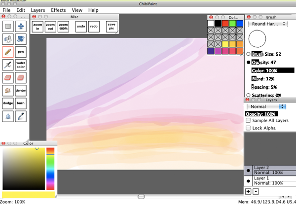
1. Lay out the place you want your clouds to go with a low opacity brush. This doesn't have to be exact. They're clouds, gatherings of miniscule drops of evaporated water, and as such tend to be pretty random in shape. Keep this in mind. I basically just said "Purple cloud in this area, pink cloud in this area, orange cloud in this area. There's a lot less planning involved than there is just going with the flow.
Here I used a bunch of different colors, but if you want your clouds to be one color (rather, one generic sort of color, you're going to be using a lot of colors anyway) than that's fine too. I made blue and white clouds for Cuttlesworth. Darker colored clouds are harder than lighter colored ones. White clouds are easiest to do in my opinion, because white is the brightest part and there's a lot of it in white clouds. Another thing to keep in mind as far as color palette goes, don't worry about planning out all your colors before hand. If you're doing really colorful clouds like these, just pick the basic colors and maybe one dark and one light. You'll be using a gamut of colors though, so no need to really be finicky. You can see my color choices in the bottom rows of my palette there.
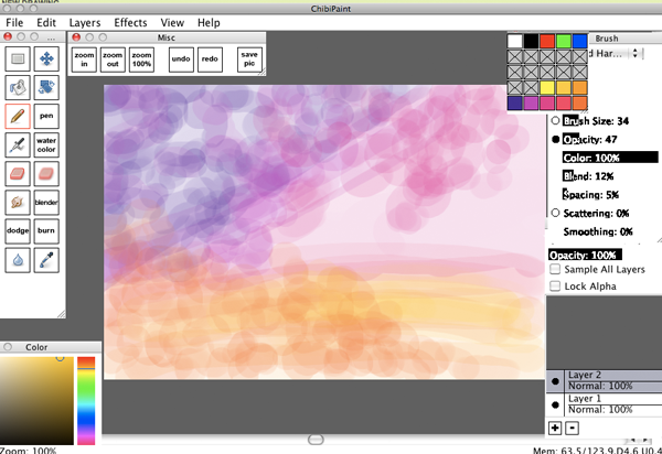
2. Dots! I get hand cramps when I make clouds because of this. Start big and change colors often within your chosen spectrum (or not! You can always experiment for rainbow clouds!) At this point I'm still laying out those basic colors and I'm just beginning to shape my clouds. You're starting to lay out the dark areas of the cloud now, but you don't have to be concerned with light yet.
You'll notice I do all of these clouds on one layer. I'm not very layer-attentive, but when I'm using opacity a lot like this I tend to use them even less. You may use multiple layers if you wish. If you do, it'd probably be best if you layed out each cloud "section" on it's own layer.
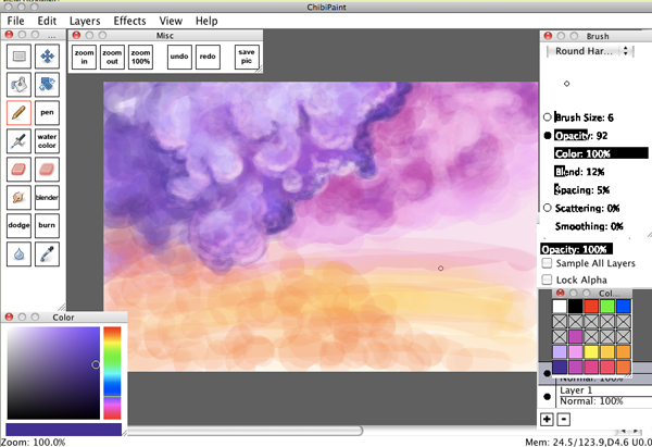
3. More dots! Here's where I start changing colors around. Lighter and darker. I still don't bother with the color palette much because it looks better with random colors. Start making some areas lighter and some areas darker. You should start thinking about lights now. Clouds are wonky when it comes to light planes because they're water, and thus refractive. Two clouds floating next to eachother can often look like they have different light sources because of refraction. Even so, they generally have a "light side" and a "dark side". Try to imagine where your light source (probably the sun) is in relation to your clouds. Are there other clouds in the way? Does that effect where your lights are? In my picture here, the light is coming from the far right. In the Cuttlesworth picture, the light is coming from directly above. Don't worry too much about it, since you'll be going over these sections again and again with more colors and there's nothing stopping you from fixing it as you go.

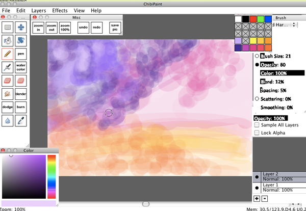
4. Keep going. Dots and little strokes. I tend to go from dark to light and then back to dark again. Just keep working upwards, like you're layering paint. The cloud is starting to take shape now and I've added in some blues and whites. I was trying to steer away from too much white, because if you're going for color white will desaturate your picture. Better to go with a lighter color that isn't white. So I went with a lavender sort.

5. See? I made it light and brought it forward. Now I'm adding more darks to take parts of it back again. Keep in mind I'm changing my brush size and my opacity pretty regularly and pretty much at random. I tend to use a lower opacity with dark colors and a higher one with light colors.
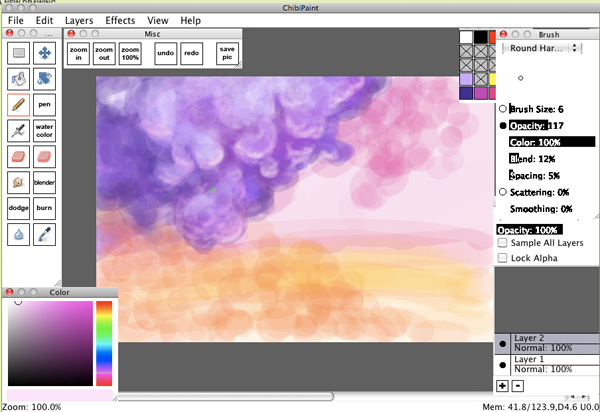
6. Now I want the edges of my cloud to be lighter, where the light is entering in and diffusing. Make your brush smaller and more opaque and pick a light color, then trace a bit around edges where you think light should be hitting. I used a light pink, because it was prettier than white and because it could be reflected light from the pink cloud. Who knows! I love reflected light. I also went in and made some dark parts darker using the same method.
7. Rinse and repeat with the pink cloud. This DOES NOT mean that I'm finished with the purple cloud. It just means I'm not working on it at the moment. You're not finished with any part of a painting until the whole painting is finished. I go back to that purple cloud repeatedly.
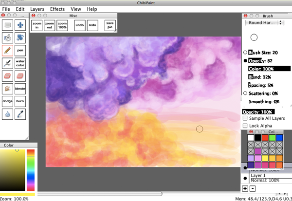
8. Start working on that orange cloud. This one actually is two colors instead of one. Though in the end it really looks like a red squid cloud is eating that orange cloud, or perhaps jetting orange cloud ink everywhere.
9. Adding highlights and defining edges. It's really important to remember I'm not just working on the orange cloud. I'm hopping back and forth between the others as well. I'm looking at the whole canvas, and I'm working on the whole canvas. I've never really seen the need for minute detail in clouds, so I won't zoom in. I like to see the big picture as much as possible.
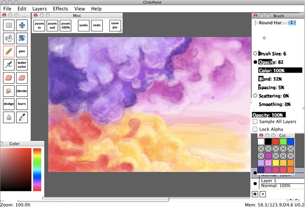
10. Trying to figure out what to do with that blank section on the right, and decide to kind of turn it into those flat line clouds. I also realized at this point that the darks on the pink cloud were too dark so I go back and lighten them up some.
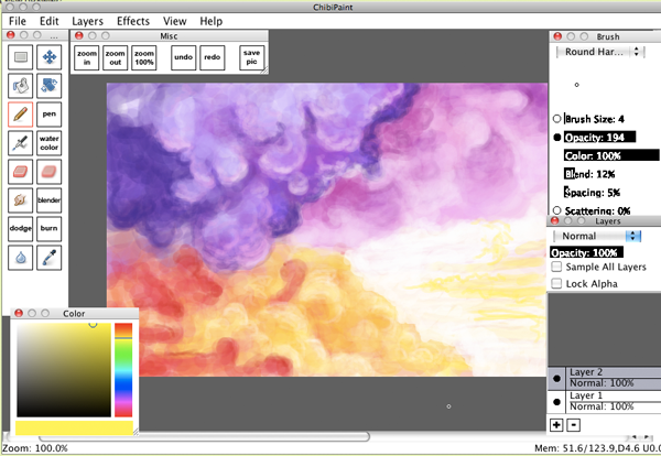
11. Just a bit more edge defining and some tweaks here and there and voila! You've got clouds. If you're not happy with them yet, just keep adding on layers of varying color until you are. Clouds are pretty forgiving when it comes to mistakes. They're too random to really mess up.
A note on smudging: a lot of people really over use the smudge and blur tools (and the burn and dodge tools, but that's another tutorial altogether). I only ever use the blur tool in specific situations where I want a a subject to actually be blurry. I don't use it to blend colors. The smudge tool I may use a little bit here and there to smooth things out, but for blending just using opacity is generally a way better method. Here I used the smudge tool a little at the very end to make the lightest highlight lines less drastic looking.
Clouds aren't difficult. Just go with the flow and don't worry too much about them. In any case, I hope I see a lot of paintings bearing clouds soon. I really hope that this was helpful!
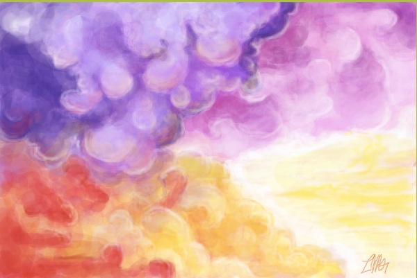
1. Lay out the place you want your clouds to go with a low opacity brush. This doesn't have to be exact. They're clouds, gatherings of miniscule drops of evaporated water, and as such tend to be pretty random in shape. Keep this in mind. I basically just said "Purple cloud in this area, pink cloud in this area, orange cloud in this area. There's a lot less planning involved than there is just going with the flow.
Here I used a bunch of different colors, but if you want your clouds to be one color (rather, one generic sort of color, you're going to be using a lot of colors anyway) than that's fine too. I made blue and white clouds for Cuttlesworth. Darker colored clouds are harder than lighter colored ones. White clouds are easiest to do in my opinion, because white is the brightest part and there's a lot of it in white clouds. Another thing to keep in mind as far as color palette goes, don't worry about planning out all your colors before hand. If you're doing really colorful clouds like these, just pick the basic colors and maybe one dark and one light. You'll be using a gamut of colors though, so no need to really be finicky. You can see my color choices in the bottom rows of my palette there.
2. Dots! I get hand cramps when I make clouds because of this. Start big and change colors often within your chosen spectrum (or not! You can always experiment for rainbow clouds!) At this point I'm still laying out those basic colors and I'm just beginning to shape my clouds. You're starting to lay out the dark areas of the cloud now, but you don't have to be concerned with light yet.
You'll notice I do all of these clouds on one layer. I'm not very layer-attentive, but when I'm using opacity a lot like this I tend to use them even less. You may use multiple layers if you wish. If you do, it'd probably be best if you layed out each cloud "section" on it's own layer.
3. More dots! Here's where I start changing colors around. Lighter and darker. I still don't bother with the color palette much because it looks better with random colors. Start making some areas lighter and some areas darker. You should start thinking about lights now. Clouds are wonky when it comes to light planes because they're water, and thus refractive. Two clouds floating next to eachother can often look like they have different light sources because of refraction. Even so, they generally have a "light side" and a "dark side". Try to imagine where your light source (probably the sun) is in relation to your clouds. Are there other clouds in the way? Does that effect where your lights are? In my picture here, the light is coming from the far right. In the Cuttlesworth picture, the light is coming from directly above. Don't worry too much about it, since you'll be going over these sections again and again with more colors and there's nothing stopping you from fixing it as you go.
4. Keep going. Dots and little strokes. I tend to go from dark to light and then back to dark again. Just keep working upwards, like you're layering paint. The cloud is starting to take shape now and I've added in some blues and whites. I was trying to steer away from too much white, because if you're going for color white will desaturate your picture. Better to go with a lighter color that isn't white. So I went with a lavender sort.
5. See? I made it light and brought it forward. Now I'm adding more darks to take parts of it back again. Keep in mind I'm changing my brush size and my opacity pretty regularly and pretty much at random. I tend to use a lower opacity with dark colors and a higher one with light colors.
6. Now I want the edges of my cloud to be lighter, where the light is entering in and diffusing. Make your brush smaller and more opaque and pick a light color, then trace a bit around edges where you think light should be hitting. I used a light pink, because it was prettier than white and because it could be reflected light from the pink cloud. Who knows! I love reflected light. I also went in and made some dark parts darker using the same method.
7. Rinse and repeat with the pink cloud. This DOES NOT mean that I'm finished with the purple cloud. It just means I'm not working on it at the moment. You're not finished with any part of a painting until the whole painting is finished. I go back to that purple cloud repeatedly.
8. Start working on that orange cloud. This one actually is two colors instead of one. Though in the end it really looks like a red squid cloud is eating that orange cloud, or perhaps jetting orange cloud ink everywhere.
9. Adding highlights and defining edges. It's really important to remember I'm not just working on the orange cloud. I'm hopping back and forth between the others as well. I'm looking at the whole canvas, and I'm working on the whole canvas. I've never really seen the need for minute detail in clouds, so I won't zoom in. I like to see the big picture as much as possible.
10. Trying to figure out what to do with that blank section on the right, and decide to kind of turn it into those flat line clouds. I also realized at this point that the darks on the pink cloud were too dark so I go back and lighten them up some.
11. Just a bit more edge defining and some tweaks here and there and voila! You've got clouds. If you're not happy with them yet, just keep adding on layers of varying color until you are. Clouds are pretty forgiving when it comes to mistakes. They're too random to really mess up.
A note on smudging: a lot of people really over use the smudge and blur tools (and the burn and dodge tools, but that's another tutorial altogether). I only ever use the blur tool in specific situations where I want a a subject to actually be blurry. I don't use it to blend colors. The smudge tool I may use a little bit here and there to smooth things out, but for blending just using opacity is generally a way better method. Here I used the smudge tool a little at the very end to make the lightest highlight lines less drastic looking.
Clouds aren't difficult. Just go with the flow and don't worry too much about them. In any case, I hope I see a lot of paintings bearing clouds soon. I really hope that this was helpful!
(This post is really long! Just gimme a sign and I'll move the tutorial to like the 5th post or something)