Forum rules
Reminder: Copying another person's art without permission to reproduce their work is a form of art-theft!

Click here to see the full Art Rules!
Need help using the Oekaki? Check out this Guide to the Oekaki!

The Ups and Downs of Highlighting by Blockbeap

Artist Blockbeap [gallery]
Time spent 1 hour, 24 minutes
Drawing sessions 1
3 people like this Log in to vote for this drawing

The Ups and Downs of Highlighting

Postby Blockbeap » Sun Jul 01, 2012 5:04 pm

Edit: If anyone is curious how I work with the layers and such then I'll give you access to open this up in chibipaint and look at the differences but if you do you MAY NOT repost it anywhere or claim it. Please guys.

Hi. :3 Every now and again I see artists that wish to make their art pop, well this is my theory to make you art do so.

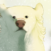
Look at the two different sides. Which one do your eyes pull to first/the most? Why? In all actuality these are the EXACT same pieces! One just has a different shading layer setting than the other and one has highlights while the other does not.
You see that in real life we don't have such high highlights and low shadows unless said object is under the perfect conditions to induce such things. For example this usually shows up in real life if you are in the dark and you turn a bright beam of light on you. Your backside will have very dark shadows and right where the beam of light is directed you will have high highlights, especially in your eyes. But in art you can choose whether to do this or not whether there is even a background to your art or not. In darker pictures that have an evil or demonic flare you perhaps should just choose the darker shadows instead of the high highlights and if it's a happy and lovey picture use the high highlights and just moderate shadows. This is called Contrast.

Tips:
    ♥Everything is in moderation, don't over shade it or over highlight it or both! Just like don't under do it as well. If you feel you've done enough stop there.

    ♥It never hurts to ask an artist you look up to for help. I am always willing to answer questions you have.

    ♥references, REFERENCES, REFERENCES!!! Use the world around you to help, stick a flashlight to your face and look at yourself in the mirror in the dark. Look at your household pets. Look at stock on google, deviantart and chickensmoothie. As long as you don't copy you can even look at other peoples art for help.

    ♥Now remember, the most important tip I can ever offer is to have fun! When I draw, once I get to the point where drawing becomes no fun because I am frustrated or been working on it too long and too hard and I take a step back to regain my positive energy and attitude.


Thanks for reading/looking and I hope this helps anyone at least a little bit!

Art and Character (C) me
I am only active on my deviantart.

If you need to contact me, GO THERE PLEASE.
User avatar
Blockbeap
 
Posts: 4279
Joined: Mon Apr 19, 2010 2:22 pm
My pets
My items
My wishlist
My gallery
My scenes
My dressups
Trade with me

Re: The Ups and Downs of Highlighting

Postby Xelinator » Wed Aug 22, 2012 6:49 am

That looks amazing. Can you please tell me how to use layers propably? I always move them about and mix them up and it gets so confusing. =_=
Image

hello !! i'm a little dead rn,
getting my life in order <: !
will be visiting back on
occasion <3
[ viscets ]
i'm a random art student who really likes animals


Image
User avatar
Xelinator
 
Posts: 8140
Joined: Mon Feb 07, 2011 1:50 am
My pets
My items
My wishlist
My gallery
My scenes
My dressups
Trade with me

Re: The Ups and Downs of Highlighting

Postby Blockbeap » Wed Aug 22, 2012 7:23 am

Well the lineart layer should almost always be on top since it goes over everything. The only exception is when you are using textures or if there are items on separate layers than those should be on top. The background layer should ALWAYS be underneath. The color layer should be right above the background layer most of the time and then shading should be between color and lineart. When you do shading you can use different layer setting to make things do you what you want it too. For example if you do black shading, keep your shading layer on Normal and put the Opacity down to about 19%. If you are using grays then set the layer to Multiply and dont mess around much with Opacity. You can also use other layer settings like Soft Light or Burn which effect what the layer will look like. An important thing to remember is to keep layers separate from one another. Never combine layers unless you feel you need to.
I am only active on my deviantart.

If you need to contact me, GO THERE PLEASE.
User avatar
Blockbeap
 
Posts: 4279
Joined: Mon Apr 19, 2010 2:22 pm
My pets
My items
My wishlist
My gallery
My scenes
My dressups
Trade with me

Re: The Ups and Downs of Highlighting

Postby Xelinator » Wed Aug 22, 2012 7:45 am

Thank you so much. ;o; *Bows to your holyness*
Image

hello !! i'm a little dead rn,
getting my life in order <: !
will be visiting back on
occasion <3
[ viscets ]
i'm a random art student who really likes animals


Image
User avatar
Xelinator
 
Posts: 8140
Joined: Mon Feb 07, 2011 1:50 am
My pets
My items
My wishlist
My gallery
My scenes
My dressups
Trade with me

Re: The Ups and Downs of Highlighting

Postby Blockbeap » Wed Aug 22, 2012 8:02 am

Lolz. Glad to help. ^^'
I am only active on my deviantart.

If you need to contact me, GO THERE PLEASE.
User avatar
Blockbeap
 
Posts: 4279
Joined: Mon Apr 19, 2010 2:22 pm
My pets
My items
My wishlist
My gallery
My scenes
My dressups
Trade with me

Who is online

Users browsing this forum: No registered users and 7 guests