
- I'll join in here I guess! I'll critique this here. c:

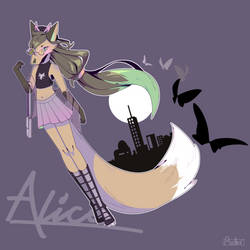
This piece overall has a really nice feel to it, its kind of dark and mysterious i would say. I really love how you've done the giant flower! The fact that you've even added the smaller details, like the lines in the petals, really makes it stand out. Although I would say that perhaps the inside of the flower (the middle) should be darker considering the shadow difference. Maybe even adding some highlights to the edges of the petals would be better as well, to give it an even better feel.
As for the character himself, I think he looks great! However there are some flaws to it, and one thing I had noticed were how skinny the legs are. Think if you were to take his pants off, his legs would be very skinny with how theyre proportioned right now, so perhaps if they were made a bit thicker, it would be fine. c: Another thing had notice was his hand/arm sizes. Because of how small his wrist is, his hand looks giant. If you had made the hand just a smidge smaller, it would have looked fine. The positioning of the hand is also a bit odd as well. Since his body is kind of 3/4 view, his hands should be too, but the way you've drawn them looks like a hand from side view instead of 3/4. His fingers also look a bit long too, I struggle with hands as well, the best thing to do for me is use as many references as possible to find those right proportions/angles/positions.
His clothes are very nicely done, but they could use some more shadowing in some areas, like under the arms/armpits. Everything else seems fine, but I would also suggest adding more highlights/lighting to the character as well, to help compliment the shading.
I hope this helps you out! You have a very nice style, and I look forward to seeing how much more you grow! c:


