Closed for now

Buy or sell custom-made art - using CS pets, items or C$ as payment. This does not include pre-made character sales.
Forum rules
Art theft is not tolerated here. Do not copy/trace/edit/use anybody's pictures without their express permission.
If you are unsure, read the full art rules here.

What's your favorite part about halloween?

Dressing up!
7
44%
Getting candy!
1
6%
Going out with friends!
0
No votes
All of the above :D!
4
25%
Nah, I'd rather stay at home umu
4
25%
 
Total votes : 16

Re: ●Ichi's Art Shop●[Critique for Art][OPEN]

Postby Ichi Mitsugi » Fri Feb 23, 2018 2:15 pm

Paper.dragonflies wrote:
Alright, I'm a bit rusty with critique so bear with me here.
I'd like to start off by saying I really like your artwork, you totally nail that anime-esque style!
I'm mainly going to be using this piece as an example.

1. You've got some pretty good color theory going on with your shading, but there are a few areas where it could be improved upon.
The yellow on the shirt is shaded with a darker, more saturated, and more orange color. This is great! An excellent display of color theory. However, in the places where you have used highlights they are done with solid or transparent white (I.e the stockings and the skin) It can work quite nicely in some places, especially like what you've done with the eyes! but although it's not a necessity, adding more diverse highlights can really, truly make all the difference. I think the drawing above would pop even more if you added a lighter color to the yellows!
Image
Source
As you can see, highlights can make a piece of artwork pop, and oftentimes all you have to do is reverse the process you use to get a shading color!

2. Next up I'm going to talk a little bit about some of the proportions and anatomy. Overall, they're pretty solid and proportions can be suggestive but I notice the feet on this piece specifically are short, especially if compared to the hands! I'd recommend essentially stretching them out so that they're a bit longer and more proportionate to everything else.

3. You seem to draw the cheek bone bump(?) a bit low for the mouth placement. Where the head is facing can affect this a lot!

Straight ahead: The mouth and cheekbone are relatively equal
Looking up: The cheekbone is somewhat below the mouth
Looking down: The mouth is somewhat below the cheekbone

Here's a good reference of this!
Image
Source

4. Now as for the hair, I notice some of the tufts are a bit too thick for that flowy anime style you're going for! I recommend breaking them up into smaller sections or making them thinner. :>

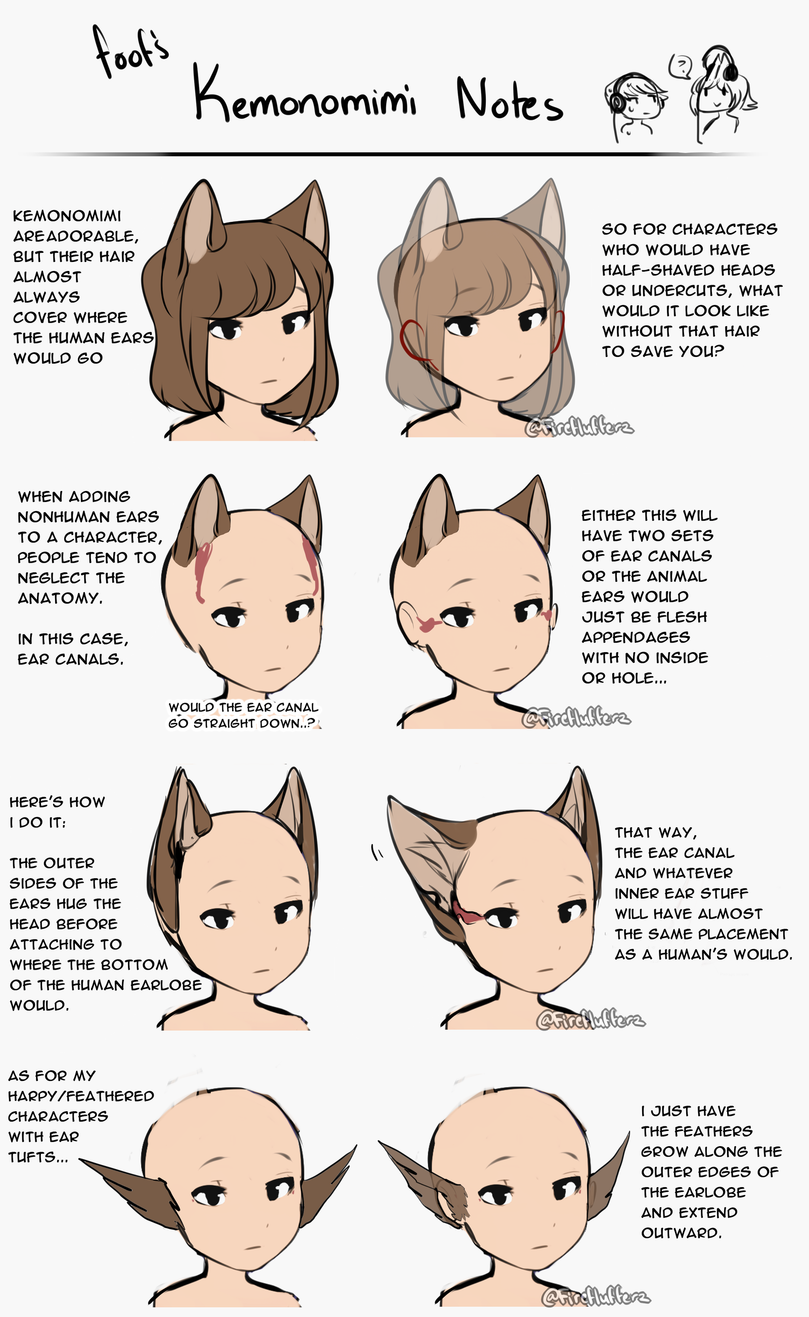
5. And this is my last piece of advice but perhaps it's a minor detail! The way you drew the ears here goes against ear canal anatomy for both animals and humans! The ears always kinda connect to the side of the head. This tutorial here puts it into words better than I can!
Image
Source

Whew, hopefully I was able to give you some helpful advice here! It was a lot of fun examining your artwork and finding where it could be improved upon. :>

I've also drawn up a redline for the last two points to give you a better idea. ^^
Image

★★★★★★★★ 8 stars! Woooh, I actually liked a lot of stuff here that I will find useful! :D
First off, love the visuals for for shading! I know I've seen that reference before, but it's still nice to look back on stuff. I also agree on testing out different colors for highlighting, since white isn't the most natural highlight unless something is really pale-colored. (Btw the skin isn't actually highlighted, the base is completely white ///w/// I just slathered it with a bunch of shading).
I've also been trying to get better at anatomy, so I'm glad it's shown! Obviously still need to work on hands and feet since those are where all the itty-bitty-gritty stuff is (fingers & toes along with just proportions in general) so I'll make sure to pay more attention to those next time.
And alas, the head pretty much my worse enemy next to hands and feet. I always thought the problem was that I make them too pointy, but it could also be because I place the cheeks far too low. Fixing this particularly could solve the problem, so I'll be sure to test this out!
As for the ears, I actually just don't like the appearance of how the anatomically correct one looks .v. Realistically, yeah there'd be a lot of problems if such a thing existed, but I just don't find them as appealing. Besides, if I decided to make the ears anatomically correct I would move her horn far closer to the center of her forehead as well as no loved creature has a horn right at the top of their head. I might decide to make the base of the ears bigger or my fluffy at the base anyway since they're kinda thin anyway.
Overall I liked this! It's all definitely useful and I'll be sure to start practicing right away!
Also, feel free to send me a reference! (btw by bust I meant half body but I'm dumb and only just realized that the bust is only the shoulders up, whoops-)
User avatar
Ichi Mitsugi
 
Posts: 1191
Joined: Wed Nov 05, 2014 8:49 am
My pets
My items
My wishlist
My gallery
My scenes
My dressups
Trade with me


Re: ●Ichi's Art Shop●[Critique for Art][OPEN]

Postby 90° » Sat Feb 24, 2018 2:25 pm

Critiquing this
Anatomy
Tip: Try breaking the body parts into shapes/3D figures.
You drew the chest and abdomen well but I think you could work on the clothing and folds. Here's a good tutorial on them
Since the rest of the body is facing towards you, the shading for the kneecap should be in the middle.
This goes for the shoes as well. You kinda drew it as the side view instead of the front view.
For the inner leg its more straight, it doesnt follow the same way the calves does.
The form of the hand is a bit good, however the position is a bit stiff. If you were to pose your hand like that, it would naturally be uncomfortable.
You actually have good body proportions but i think the head proportions kinda threw off the arms' position. I could tell you follow the rule with the shoulder length being drawn longer than the head. The head should be a bit smaller so it could follow the body proportions as well.
Image
┌──────────────────┐
xxxangle xxx she/her
xxxtwitter || th
└──────────────────┘
User avatar
90°
 
Posts: 871
Joined: Fri Oct 18, 2013 1:01 pm
My pets
My items
My wishlist
My gallery
My scenes
My dressups
Trade with me

Re: ●Ichi's Art Shop●[Critique for Art][OPEN]

Postby Ichi Mitsugi » Sun Feb 25, 2018 7:46 am

Mishiizzle wrote:
Critiquing this
Anatomy
Tip: Try breaking the body parts into shapes/3D figures.
You drew the chest and abdomen well but I think you could work on the clothing and folds. Here's a good tutorial on them
Since the rest of the body is facing towards you, the shading for the kneecap should be in the middle.
This goes for the shoes as well. You kinda drew it as the side view instead of the front view.
For the inner leg its more straight, it doesnt follow the same way the calves does.
The form of the hand is a bit good, however the position is a bit stiff. If you were to pose your hand like that, it would naturally be uncomfortable.
You actually have good body proportions but i think the head proportions kinda threw off the arms' position. I could tell you follow the rule with the shoulder length being drawn longer than the head. The head should be a bit smaller so it could follow the body proportions as well.
Image

★★★★★★★★★ 9 stars!
First thing I would like to say is that the redraw definitely helped, it makes it easier to see what I'm doing wrong and this is one of those things that also helps me the most ^w^
Especially about the advice of the legs, arms and head, I can definitely see better how to fix those with the visuals.
The shading tips also help, since looking at it now my shading makes the knees look kinda wonky.
The reference is also nice especially since I didn't realize it was all in one tutorial, since on Pinterest and Insta people post that tutorial into separate pieces which is not only a pain but I could never find the source.I can finally stalk them
Overall, good job! Please choose your art type and send a reference! :3
User avatar
Ichi Mitsugi
 
Posts: 1191
Joined: Wed Nov 05, 2014 8:49 am
My pets
My items
My wishlist
My gallery
My scenes
My dressups
Trade with me


Re: ●Ichi's Art Shop●[Critique for Art][OPEN]

Postby PaintedBeanz » Wed Mar 07, 2018 11:43 am

Your art is amazing your hands might need a little bit of work on your humans but other than that you are an amazing artist
Here is the guild I've been using to learn and its been helping
https://kirileonard.com/so-you-hate-drawing-hands/
Don't put so much bend at the wrist and when doing the fingers be sure to try and separate them so they dont end up looking like they are one bid body part

2 your proportions are fantastic I see that you try really hard to make sure everything is balanced

3 if your wanting tips on the hair the way you could do it is to add more strands to the hair so its not one solid mass
http://animedotnet.blogspot.com/2012/10 ... r.html?m=1
Maybe this could help

The eyes could use a little more flare or boldness to this. When I was learing I use this
https://www.pinterest.co.uk/pin/3555029 ... 4903657884
Last edited by PaintedBeanz on Wed Mar 07, 2018 11:17 pm, edited 3 times in total.
/Active/Not Active/....Female/Furry/Wolf Mix/ Nickname is Zero/Engaged
Image
User avatar
PaintedBeanz
 
Posts: 2659
Joined: Wed May 07, 2014 6:30 am
My pets
My items
My wishlist
My gallery
My scenes
My dressups
Trade with me

Re: ●Ichi's Art Shop●[Critique for Art][OPEN]

Postby Ichi Mitsugi » Wed Mar 07, 2018 2:11 pm

ZeroTheWolf10416 wrote:Your art is amazing your hands might need a little bit of work on your humans but other than that you are an amazing artist
Here is the guild I've been using to learn and its been helping
https://kirileonard.com/so-you-hate-drawing-hands/

2 your proportions are fantastic I see that you try really hard to make sure everything is balanced

3 the hair is so shiny and has a nice flow to it

★★★★★ 5 stars? I apologize, there's just not much to go off of besides the whole hands problem. The article is alright, I only find it's usefulness in the images it used as references, but otherwise the article itself isn't very substantial since it's really just saying you gotta learn the anatomy of the hand in order to draw it properly (I assumed this was a given, but to each their own, nya~).
I think it would've been more helpful if you went more in depth into why my hands were kinda weird ;w;
and the other 2 points were about stuff I was doing good which is great of course and I'm glad you like them, but I'm mainly looking for things to improve on (and I'm personally not even a fan of my own way of drawing hair :P)
User avatar
Ichi Mitsugi
 
Posts: 1191
Joined: Wed Nov 05, 2014 8:49 am
My pets
My items
My wishlist
My gallery
My scenes
My dressups
Trade with me


Re: ●Ichi's Art Shop●[Critique for Art][OPEN]

Postby PaintedBeanz » Thu Mar 08, 2018 1:37 pm

I did fix the form
/Active/Not Active/....Female/Furry/Wolf Mix/ Nickname is Zero/Engaged
Image
User avatar
PaintedBeanz
 
Posts: 2659
Joined: Wed May 07, 2014 6:30 am
My pets
My items
My wishlist
My gallery
My scenes
My dressups
Trade with me

Re: ●Ichi's Art Shop●[Critique for Art][OPEN]

Postby Ichi Mitsugi » Fri Mar 09, 2018 10:30 am

ZeroTheWolf10416 wrote:Your art is amazing your hands might need a little bit of work on your humans but other than that you are an amazing artist
Here is the guild I've been using to learn and its been helping
https://kirileonard.com/so-you-hate-drawing-hands/
Don't put so much bend at the wrist and when doing the fingers be sure to try and separate them so they dont end up looking like they are one bid body part

2 your proportions are fantastic I see that you try really hard to make sure everything is balanced

3 if your wanting tips on the hair the way you could do it is to add more strands to the hair so its not one solid mass
http://animedotnet.blogspot.com/2012/10 ... r.html?m=1
Maybe this could help

The eyes could use a little more flare or boldness to this. When I was learing I use this
https://www.pinterest.co.uk/pin/3555029 ... 4903657884

Upgraded to ★★★★★★ 6 stars~

I'm just going to add on to what you changed.
I appreciate the added references, they don't seem to really be my forte (did I use that right? well, I mean it's not really what I'm going for in terms of style) but they're nice anyway, might use them if I ever feel like experimenting.
I can see how to eyes can come off dull since they're pretty flat colored, so more characteristic eyelashes/eyeline could help.
Overall it's good enough now~
User avatar
Ichi Mitsugi
 
Posts: 1191
Joined: Wed Nov 05, 2014 8:49 am
My pets
My items
My wishlist
My gallery
My scenes
My dressups
Trade with me

Who is online

Users browsing this forum: DOGBURGER and 10 guests