
Closed for now
Forum rules
Art theft is not tolerated here. Do not copy/trace/edit/use anybody's pictures without their express permission.
If you are unsure, read the full art rules here.
Art theft is not tolerated here. Do not copy/trace/edit/use anybody's pictures without their express permission.
If you are unsure, read the full art rules here.
-

Ichi Mitsugi - Posts: 1191
- Joined: Wed Nov 05, 2014 8:49 am
- My pets
- My items
- My wishlist
- My gallery
- My scenes
- My dressups
- Trade with me
Re: ●Ichi's Art Shop●[Critique me for Art][OPEN]
![]() by Ichi Mitsugi » Sun Feb 11, 2018 10:32 am
by Ichi Mitsugi » Sun Feb 11, 2018 10:32 am
bump :U
-
Ichi Mitsugi - Posts: 1191
- Joined: Wed Nov 05, 2014 8:49 am
- My pets
- My items
- My wishlist
- My gallery
- My scenes
- My dressups
- Trade with me
Re: ●Ichi's Art Shop●[Critique me for Art][OPEN]
![]() by Novel » Sun Feb 11, 2018 10:47 am
by Novel » Sun Feb 11, 2018 10:47 am
Art Critique and Review
For my critique of your artwork, I will be providing you with information on how you can improve in each of the categories you have listed, in addition to my input on what I feel you are doing correct. I will also be linking image references of tutorials I personally find useful in my everyday artwork.
________________________________________________
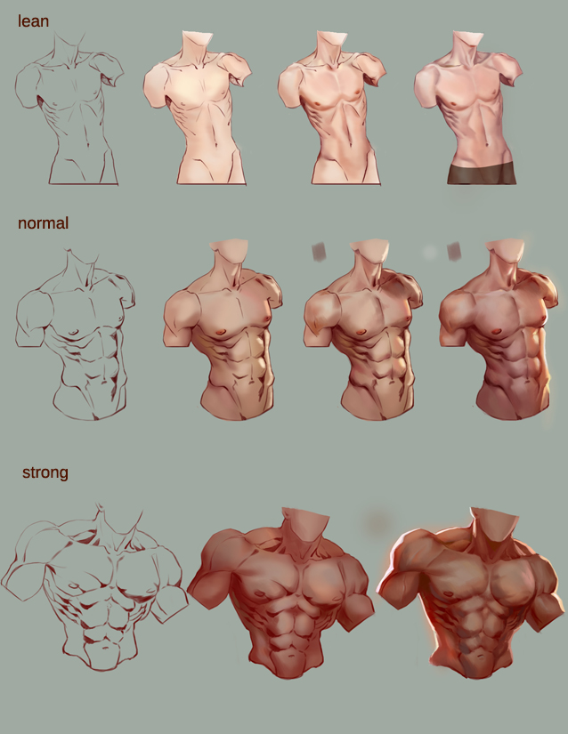
General Male Anatomy
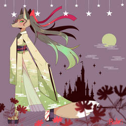
Reviewing Image(s) :: One
Applicable Tutorials/References :: One , Two , Three
:: What I like about your art ::
I'm personally a big fan of more gender neutral males in terms of muscle mass and anatomy, of which I feel you do a good job in creating. You do wonderful in conveying emotion through facial expression and gestures, as seen with the boy pointing his finger and the open, exaggerated mouth.
:: What can be improved ::
In terms of strictly speaking based on male anatomy versus female, to achieve a more masculine image, focus on better differentiating between your males and females with key muscle groups often visible in the neck (Like the Adams apple) and arms. Try playing around to finding out how your boys can be drawn differently from your girls. This could also be seen in different face shapes, eye shapes, or nose shapes.
________________________________________________
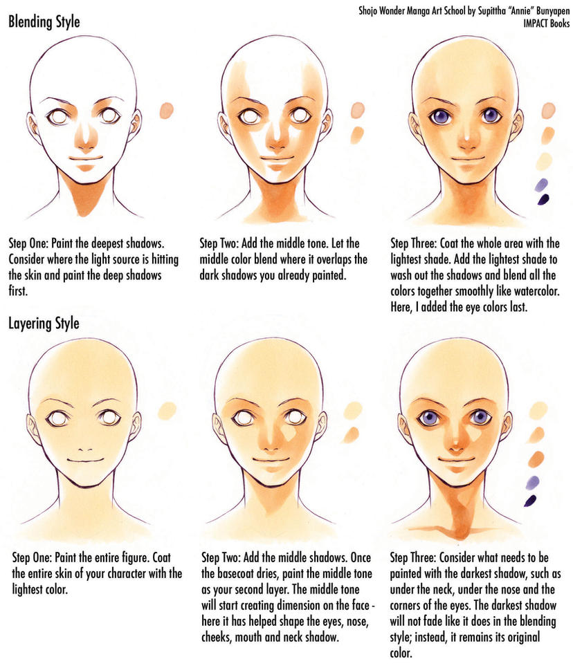
Hair
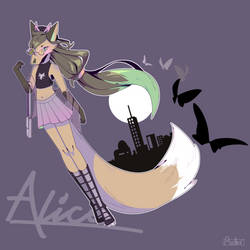
Reviewing Image(s) :: One , Two , Three
Applicable Tutorials/References :: One , Two , Three
:: What I like about your art ::
You're great at drawing different hair styles, which can be hard for some artists. You create gradients in the hair to better indicate lighting and add depth.
:: What can be improved ::
Try experimenting by adding depth and intricacy to your hair. Currently, it appears rather flat without many lines or strands for dimension. My personal favorite method of adding hair detail is via hair brushes which you can download, laying them down upon your hair base on a new layer, and gently erasing the beginning and ends of the strand sets with a soft eraser.
________________________________________________
Shading
Reviewing Image(s) :: Two , Three
Applicable Tutorials/References :: One , Two , Three
:: What I like about your art ::
Your cell shading it well done, especially with attention to soft gradients on the ends of some spots.
:: What can be improved ::
To create a softer and more natural look, experiment with gentle brushes and blurring effects, especially on the face shading. Attempt at adding a more diverse range of gradients in, and play around with soft erasers on your shading to form faded edges. Your clothing shading could use some more practice, of which wrinkles and highlighted portions that follow your light source should be added in more quantity and with sharper edges.
________________________________________________
Feet
Reviewing Image(s) :: N/A - None listed have feet shown.
Applicable Tutorials/References :: One , Two , Three
:: What I like about your art ::
N/A
:: What can be improved ::
Try out creating geometric shapes first for your feet. Don't be afraid to sketch them out multiple times first, and then do line-art once you shape it all out.
________________________________________________
Hands
Reviewing Image(s) :: One
Applicable Tutorials/References :: One , Two , Three
:: What I like about your art ::
Your hands have a lot of character to them. For this artwork of yours, I especially like the small detail which indicates the nail just past the finger tips. It's cute and gives a nice effect. I also enjoy the proper usage of shading to indicate your light source and angles.
:: What can be improved ::
Some of your hand's lineart is a tad wobbly, or with sharper edges on some portions than others. To help control that, be sure to adjust your drawing program's stabilization for the pen you use. This creates fewer errors in your lineart. As for the general hand, you did very well. I would suggest adding a few lines on the tops of the joints to better indicate shape.
________________________________________________
Legs
Reviewing Image(s) :: N/A - None listed have feet shown.
Applicable Tutorials/References :: One , Two , Three
:: What I like about your art ::
N/A - None shown for this category.
:: What can be improved ::
Experiment with different muscled characters. Legs are a great way of showing what a character's occupation is, as the muscles vary significantly for each person.
________________________________________________
Muscles
Reviewing Image(s) :: Two
Applicable Tutorials/References :: One , Two , Three
:: What I like about your art ::
Not many muscles are shown in the works you want critiqued, but I enjoy the practical proportions of everything.
:: What can be improved ::
Try adding more curves to your characters. Give them subtle form that better distinguishes them as humans, such as around the tops of the arms where there should be the most mass.
________________________________________________
Hope this was helpful! Please let me know what you would score my critique~.
For my critique of your artwork, I will be providing you with information on how you can improve in each of the categories you have listed, in addition to my input on what I feel you are doing correct. I will also be linking image references of tutorials I personally find useful in my everyday artwork.
________________________________________________
General Male Anatomy
Reviewing Image(s) :: One
Applicable Tutorials/References :: One , Two , Three
:: What I like about your art ::
I'm personally a big fan of more gender neutral males in terms of muscle mass and anatomy, of which I feel you do a good job in creating. You do wonderful in conveying emotion through facial expression and gestures, as seen with the boy pointing his finger and the open, exaggerated mouth.
:: What can be improved ::
In terms of strictly speaking based on male anatomy versus female, to achieve a more masculine image, focus on better differentiating between your males and females with key muscle groups often visible in the neck (Like the Adams apple) and arms. Try playing around to finding out how your boys can be drawn differently from your girls. This could also be seen in different face shapes, eye shapes, or nose shapes.
________________________________________________
Hair
Reviewing Image(s) :: One , Two , Three
Applicable Tutorials/References :: One , Two , Three
:: What I like about your art ::
You're great at drawing different hair styles, which can be hard for some artists. You create gradients in the hair to better indicate lighting and add depth.
:: What can be improved ::
Try experimenting by adding depth and intricacy to your hair. Currently, it appears rather flat without many lines or strands for dimension. My personal favorite method of adding hair detail is via hair brushes which you can download, laying them down upon your hair base on a new layer, and gently erasing the beginning and ends of the strand sets with a soft eraser.
________________________________________________
Shading
Reviewing Image(s) :: Two , Three
Applicable Tutorials/References :: One , Two , Three
:: What I like about your art ::
Your cell shading it well done, especially with attention to soft gradients on the ends of some spots.
:: What can be improved ::
To create a softer and more natural look, experiment with gentle brushes and blurring effects, especially on the face shading. Attempt at adding a more diverse range of gradients in, and play around with soft erasers on your shading to form faded edges. Your clothing shading could use some more practice, of which wrinkles and highlighted portions that follow your light source should be added in more quantity and with sharper edges.
________________________________________________
Feet
Reviewing Image(s) :: N/A - None listed have feet shown.
Applicable Tutorials/References :: One , Two , Three
:: What I like about your art ::
N/A
:: What can be improved ::
Try out creating geometric shapes first for your feet. Don't be afraid to sketch them out multiple times first, and then do line-art once you shape it all out.
________________________________________________
Hands
Reviewing Image(s) :: One
Applicable Tutorials/References :: One , Two , Three
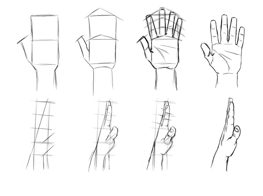
:: What I like about your art ::
Your hands have a lot of character to them. For this artwork of yours, I especially like the small detail which indicates the nail just past the finger tips. It's cute and gives a nice effect. I also enjoy the proper usage of shading to indicate your light source and angles.
:: What can be improved ::
Some of your hand's lineart is a tad wobbly, or with sharper edges on some portions than others. To help control that, be sure to adjust your drawing program's stabilization for the pen you use. This creates fewer errors in your lineart. As for the general hand, you did very well. I would suggest adding a few lines on the tops of the joints to better indicate shape.
________________________________________________
Legs
Reviewing Image(s) :: N/A - None listed have feet shown.
Applicable Tutorials/References :: One , Two , Three
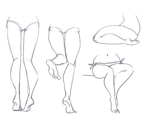
:: What I like about your art ::
N/A - None shown for this category.
:: What can be improved ::
Experiment with different muscled characters. Legs are a great way of showing what a character's occupation is, as the muscles vary significantly for each person.
________________________________________________
Muscles
Reviewing Image(s) :: Two
Applicable Tutorials/References :: One , Two , Three
:: What I like about your art ::
Not many muscles are shown in the works you want critiqued, but I enjoy the practical proportions of everything.
:: What can be improved ::
Try adding more curves to your characters. Give them subtle form that better distinguishes them as humans, such as around the tops of the arms where there should be the most mass.
________________________________________________
Hope this was helpful! Please let me know what you would score my critique~.
-

Novel - Posts: 641
- Joined: Fri Jan 09, 2009 12:16 pm
- My pets
- My items
- My wishlist
- My gallery
- My scenes
- My dressups
- Trade with me
Re: ●Ichi's Art Shop●[Critique me for Art][OPEN]
![]() by Ichi Mitsugi » Mon Feb 12, 2018 6:07 am
by Ichi Mitsugi » Mon Feb 12, 2018 6:07 am
Novel wrote:Art Critique and Review
For my critique of your artwork, I will be providing you with information on how you can improve in each of the categories you have listed, in addition to my input on what I feel you are doing correct. I will also be linking image references of tutorials I personally find useful in my everyday artwork.
________________________________________________
General Male Anatomy
Reviewing Image(s) :: One
Applicable Tutorials/References :: One , Two , Three
:: What I like about your art ::
I'm personally a big fan of more gender neutral males in terms of muscle mass and anatomy, of which I feel you do a good job in creating. You do wonderful in conveying emotion through facial expression and gestures, as seen with the boy pointing his finger and the open, exaggerated mouth.
:: What can be improved ::
In terms of strictly speaking based on male anatomy versus female, to achieve a more masculine image, focus on better differentiating between your males and females with key muscle groups often visible in the neck (Like the Adams apple) and arms. Try playing around to finding out how your boys can be drawn differently from your girls. This could also be seen in different face shapes, eye shapes, or nose shapes.
________________________________________________
Hair
Reviewing Image(s) :: One , Two , Three
Applicable Tutorials/References :: One , Two , Three
:: What I like about your art ::
You're great at drawing different hair styles, which can be hard for some artists. You create gradients in the hair to better indicate lighting and add depth.
:: What can be improved ::
Try experimenting by adding depth and intricacy to your hair. Currently, it appears rather flat without many lines or strands for dimension. My personal favorite method of adding hair detail is via hair brushes which you can download, laying them down upon your hair base on a new layer, and gently erasing the beginning and ends of the strand sets with a soft eraser.
________________________________________________
Shading
Reviewing Image(s) :: Two , Three
Applicable Tutorials/References :: One , Two , Three
:: What I like about your art ::
Your cell shading it well done, especially with attention to soft gradients on the ends of some spots.
:: What can be improved ::
To create a softer and more natural look, experiment with gentle brushes and blurring effects, especially on the face shading. Attempt at adding a more diverse range of gradients in, and play around with soft erasers on your shading to form faded edges. Your clothing shading could use some more practice, of which wrinkles and highlighted portions that follow your light source should be added in more quantity and with sharper edges.
________________________________________________
Feet
Reviewing Image(s) :: N/A - None listed have feet shown.
Applicable Tutorials/References :: One , Two , Three
:: What I like about your art ::
N/A
:: What can be improved ::
Try out creating geometric shapes first for your feet. Don't be afraid to sketch them out multiple times first, and then do line-art once you shape it all out.
________________________________________________
Hands
Reviewing Image(s) :: One
Applicable Tutorials/References :: One , Two , Three
:: What I like about your art ::
Your hands have a lot of character to them. For this artwork of yours, I especially like the small detail which indicates the nail just past the finger tips. It's cute and gives a nice effect. I also enjoy the proper usage of shading to indicate your light source and angles.
:: What can be improved ::
Some of your hand's lineart is a tad wobbly, or with sharper edges on some portions than others. To help control that, be sure to adjust your drawing program's stabilization for the pen you use. This creates fewer errors in your lineart. As for the general hand, you did very well. I would suggest adding a few lines on the tops of the joints to better indicate shape.
________________________________________________
Legs
Reviewing Image(s) :: N/A - None listed have feet shown.
Applicable Tutorials/References :: One , Two , Three
:: What I like about your art ::
N/A - None shown for this category.
:: What can be improved ::
Experiment with different muscled characters. Legs are a great way of showing what a character's occupation is, as the muscles vary significantly for each person.
________________________________________________
Muscles
Reviewing Image(s) :: Two
Applicable Tutorials/References :: One , Two , Three
:: What I like about your art ::
Not many muscles are shown in the works you want critiqued, but I enjoy the practical proportions of everything.
:: What can be improved ::
Try adding more curves to your characters. Give them subtle form that better distinguishes them as humans, such as around the tops of the arms where there should be the most mass.
________________________________________________
Hope this was helpful! Please let me know what you would score my critique~.
★★★★★★★★★★ 10 stars and more, if getting more stars was possible! *0*
Thank you so much, I'm glad you gave advice on everything so I'll have a lot to work off of ^w^
The references are also great, in fact I think I already had one or two of them bookmarked so it's good to know they're reliable
You also tell me what I can try to do to improve, and I find that sort of criticism helps me a lot since I have something to work off of.
Overall it's great since now I know where I can start.
You can reply or PM with a character you want art of (I can only draw humans/humanoids and attempt furries ;w;), you can get a fullbody or any lower tier art (they all have shading).
-
Ichi Mitsugi - Posts: 1191
- Joined: Wed Nov 05, 2014 8:49 am
- My pets
- My items
- My wishlist
- My gallery
- My scenes
- My dressups
- Trade with me
-
Ichi Mitsugi - Posts: 1191
- Joined: Wed Nov 05, 2014 8:49 am
- My pets
- My items
- My wishlist
- My gallery
- My scenes
- My dressups
- Trade with me
Re: ●Ichi's Art Shop●[Critique me for Art][OPEN]
![]() by winkatuck » Mon Feb 12, 2018 11:53 am
by winkatuck » Mon Feb 12, 2018 11:53 am
Is your little edited gif from yoosung off of mystic messenger >,> ?
Hey, I'm Wink and I own Goblin Gators!
I'm temporarily active here so if you got a question about them feel free to shoot me a pm!

I'm temporarily active here so if you got a question about them feel free to shoot me a pm!

-

winkatuck - Posts: 12308
- Joined: Tue Jul 26, 2011 10:22 am
- My pets
- My items
- My wishlist
- My gallery
- My scenes
- My dressups
- Trade with me
Re: ●Ichi's Art Shop●[Critique me for Art][OPEN]
![]() by Ichi Mitsugi » Mon Feb 12, 2018 1:18 pm
by Ichi Mitsugi » Mon Feb 12, 2018 1:18 pm
❼⓿❼ wrote:Is your little edited gif from yoosung off of mystic messenger >,> ?
Ah sadly no, it's actually my husband a guy called Tsukasa from a vocaloid series called Kotonoha Project (Im super obsessed with it so that's why it's my siggy)
Also, bump!~
-
Ichi Mitsugi - Posts: 1191
- Joined: Wed Nov 05, 2014 8:49 am
- My pets
- My items
- My wishlist
- My gallery
- My scenes
- My dressups
- Trade with me
Re: ●Ichi's Art Shop●[Critique me for Art][OPEN]
![]() by winkatuck » Tue Feb 13, 2018 5:34 am
by winkatuck » Tue Feb 13, 2018 5:34 am
I meant this little gif. Lololol

Hey, I'm Wink and I own Goblin Gators!
I'm temporarily active here so if you got a question about them feel free to shoot me a pm!
I'm temporarily active here so if you got a question about them feel free to shoot me a pm!
-
winkatuck - Posts: 12308
- Joined: Tue Jul 26, 2011 10:22 am
- My pets
- My items
- My wishlist
- My gallery
- My scenes
- My dressups
- Trade with me
Re: ●Ichi's Art Shop●[Critique me for Art][OPEN]
![]() by Ichi Mitsugi » Tue Feb 13, 2018 12:59 pm
by Ichi Mitsugi » Tue Feb 13, 2018 12:59 pm
❼⓿❼ wrote:I meant this little gif. Lololol
Ah yea the little animation is, but he himself is from another fandom. He's my other husband from an RPG game called End Roll and his name is Tabasa, he's a precious cinnamonroll ^w^
Also, bump~
-
Ichi Mitsugi - Posts: 1191
- Joined: Wed Nov 05, 2014 8:49 am
- My pets
- My items
- My wishlist
- My gallery
- My scenes
- My dressups
- Trade with me
-
Ichi Mitsugi - Posts: 1191
- Joined: Wed Nov 05, 2014 8:49 am
- My pets
- My items
- My wishlist
- My gallery
- My scenes
- My dressups
- Trade with me
Who is online
Users browsing this forum: liquordogg and 8 guests