
signature respect! [v. 21]
Re: signature respect! [v. 21] (READ NEW RULE)
![]() by Malleus » Wed Mar 14, 2018 11:20 am
by Malleus » Wed Mar 14, 2018 11:20 am
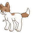
Your signature is really simple, but looks nice! I like how the two little buttons you have stick to a greyscale color theme! And the bolded font for your interests makes it stand out, so that's probably what people will notice first! Which is good for finding people who share interests! I also like how you used little --> arrows to point to yout links!


君 も YES YES!!━━━━━━━
━━━━━━━ suck in that oxygen

━━━━━━━━ [ 采配は そこにあんだ ] ━━━━━━━━
━━━━━━━ suck in that oxygen
━━━━━━━━ [ 采配は そこにあんだ ] ━━━━━━━━
-

Malleus - Posts: 12701
- Joined: Sat Apr 14, 2012 4:49 pm
- My pets
- My items
- My wishlist
- My gallery
- My scenes
- My dressups
- Trade with me
Re: signature respect! [v. 21] (READ NEW RULE)
![]() by cribunni » Wed Mar 14, 2018 11:23 am
by cribunni » Wed Mar 14, 2018 11:23 am
sjkdkoso I love your sig.! The grey and red mix well together! And you’ve organized all of your information very neatly. I love the little pixel too! Your sig matches your avatar as well, which is always a big plus! It’s simplistic, yet not boring. Great job!


-

cribunni - Posts: 9227
- Joined: Wed Mar 12, 2014 12:24 pm
- My pets
- My items
- My wishlist
- My gallery
- My scenes
- My dressups
- Trade with me
Re: signature respect! [v. 21] (READ NEW RULE)
![]() by divine. » Wed Mar 14, 2018 11:45 am
by divine. » Wed Mar 14, 2018 11:45 am
- i love how simple the signature is! your avatar clearly fits well with the succ in your signature, and they both are really cute/well drawn. i also love how you state you are here to listen to anyone who needs it c: it always makes me very happy to see kind users like you!! the small bio about yourself is nice too - simple, but sweet c:
x
x
x
x
x
x
x
x
to my sweet baby angel,
i hope you found peace
i love and miss you everyday
one day we'll meet again
x
x
x
x
x
x
x
to my sweet baby angel,
i hope you found peace
i love and miss you everyday
one day we'll meet again

Pet's name: jack. ‘07-‘23
-

divine. - Posts: 7407
- Joined: Tue Apr 14, 2015 4:26 am
- My pets
- My items
- My wishlist
- My gallery
- My scenes
- My dressups
- Trade with me
Re: signature respect! [v. 21] (READ NEW RULE)
![]() by Libitina_ » Wed Mar 14, 2018 12:40 pm
by Libitina_ » Wed Mar 14, 2018 12:40 pm
I really like your signature! But the big font is a bit too big for me. I like how the images are aligned, very neat. I like how the links are organized too. Your signature isn't really simple, but it looks good. But the big letters kinda break the small and medium word size. I also like the red and black color scheme. The black goes well with your avatar. The quote is good too. In my opinion, I give your signature an 8.6/10.
3+ Sentences with detail, please ^^
3+ Sentences with detail, please ^^
-

Libitina_ - Posts: 2401
- Joined: Tue Jul 19, 2016 7:49 am
- My pets
- My items
- My wishlist
- My gallery
- My scenes
- My dressups
- Trade with me
Re: signature respect! [v. 21] (READ NEW RULE)
![]() by ʕ·ᴥ·ʔ » Wed Mar 14, 2018 1:04 pm
by ʕ·ᴥ·ʔ » Wed Mar 14, 2018 1:04 pm
Your sig is so pretty! And Rap Mon <3333 The gifs are very nice, and not too hard to look at. I like how its really symmetrical, and the script is a really nice touch too c: I also love the way you made the descriptions as well, a lot was able to fit in a small space, but it's still super neat. Overall, really nice job! Keep up the good work <3
xxxxxxxxxxxxxxxxxxxxx
x
x
xxxxxxx
 xxx
xxx xxx
xxx xxxxxxxxxxxxxxxxxxxxx
┌── ⋯ ────────────────────────┐
xx xxxxxxxxxxxxxxxxxx
xx
xxxxxxxxxxxxxxxxxx
 xNatalie|She/Her|INFPx
Hi! I love animals, especially cats and fish!
 xI have my own betta named Octavius <3xxx
I also love trading,
so don't be afraid to shoot me a trade
xI have my own betta named Octavius <3xxxI also love trading,
so don't be afraid to shoot me a trade

-

ʕ·ᴥ·ʔ - Posts: 544
- Joined: Sat Jan 18, 2014 11:43 am
- My pets
- My items
- My wishlist
- My gallery
- My scenes
- My dressups
- Trade with me
Re: signature respect! [v. 21] (READ NEW RULE)
![]() by Hubble » Wed Mar 14, 2018 1:10 pm
by Hubble » Wed Mar 14, 2018 1:10 pm
The first thing that catches my eye is the flow of colors
in the gifs. I don't know if it's intentional, but the gold
and navy combination is one of my favorite color schemes
and it's super pretty. The symmetry is also interesting. I'm
usually not a fan of symmetrical signatures but the gifs here
make it work alright. The text does seem kind of clustered
and a bit much, but the font you chose works well with the
theme and the special characters help space it out a lot
more. I do appreciate how it's separated. The bit of basic
information in the upper left is perfect and pleasant to read.
The division into basic info, likes, some detailed info, and
positivity (which I really appreciated, thank you for having
that there) is nice to look at and a good way to divide
everything. I can definitely tell that you have plenty of
potential and you're already going somewhere good! c:
Aw, you sneaky ninja!
I really love the yellows throughout your signature! That's
usually a hard color to pull off, but you did it very well and
the signature looks very peaceful. The gifs and subtle pixel
art are pleasing to the eye and I like how they fit together.
The round photos are really pretty and neatly organized. Can
I just say that I adore how you framed your information?
The little pixel antlers and stars and the cat and space art are
all so so so stunning and really put it together well!! I love it
and I like the minimal information. Overall, very pretty,
especially for a more simple signature!
[ 2+ if you can? ♥ ]
emptying this account out for art // voskhodd on discord, if you need me.
- Hubble
- Posts: 4583
- Joined: Sun Oct 12, 2014 3:59 pm
- My pets
- My items
- My wishlist
- My gallery
- My scenes
- My dressups
- Trade with me
Re: signature respect! [v. 21] (READ NEW RULE)
![]() by Pied_piper » Wed Mar 14, 2018 1:59 pm
by Pied_piper » Wed Mar 14, 2018 1:59 pm
First, I love the format of your signature. It's very organized and everything fits in nicely.
The gray colors and the pale brown matches perfectly.
I also like how you chose soft colors in terms of theme.
The quote is very nice and inspirational and the font you used is very nice to look at.
The borderlines keep everything together, though I noticed the one to the very right is
slightly shorter than all the other ones. Overall, your signature is really nice!
║
♥
║
║
║
║
║
║
║
║
║
║
║
║
║
║
║
║
║
║
║
♥
║
║
║
║
║
║
║
║
║
║
║
║
║
║
║
║
║
║
║

║
♥
║
║
║
║
║
║
║
║
║
║
║
║
║
║
║
║
║
║
♥
║
║
║
║
║
║
║
║
║
║
║
║
║
║
║
║
║
║
xx

┏──────────────────────────┓
Hi there!I'm always very friendly
and I've never been rude so PM me!
I like Kpop,mostly KNK &Astro, journaling, and dramas
KPOP DISCORD SERVER: https://discord.gg/NyJRGTu
┖──────────────────────────┚

▆▆▆▆▆▆▆▆▆▆▆▆▆▆▆▆▆▆▆▆▆▆▆▆▆
 xx
xx xx
xx
xxx


xx☁
 ☁
☁xxx

xxxxxx
 xxxxxxxxxxxxxxxxxx
xxx

-

Pied_piper - Posts: 6753
- Joined: Wed May 07, 2014 10:26 am
- My pets
- My items
- My wishlist
- My gallery
- My scenes
- My dressups
- Trade with me
Re: signature respect! [v. 21] (READ NEW RULE)
![]() by kkpuff » Wed Mar 14, 2018 3:44 pm
by kkpuff » Wed Mar 14, 2018 3:44 pm
I love the semi pastel colouring and the little Pokemon are so cute!!


Please trade me Dragons!
-

kkpuff - Posts: 1053
- Joined: Thu Mar 08, 2018 9:25 pm
- My pets
- My items
- My wishlist
- My gallery
- My scenes
- My dressups
- Trade with me
Re: signature respect! [v. 21] (READ NEW RULE)
![]() by bärbel » Wed Mar 14, 2018 4:03 pm
by bärbel » Wed Mar 14, 2018 4:03 pm
- ❥ I love the colors and that it has such a cold atmosphere.
Also it's so smooth!! And it is really simple, which I love.

-

bärbel - Posts: 1619
- Joined: Sat Oct 15, 2016 5:16 am
- My pets
- My items
- My wishlist
- My gallery
- My scenes
- My dressups
- Trade with me
Re: signature respect! [v. 21] (READ NEW RULE)
![]() by jade, » Thu Mar 15, 2018 2:32 am
by jade, » Thu Mar 15, 2018 2:32 am
I love the colors! The layout is clean and neat, and not hard to read at all c:
The fonts and colors of them match perfectly, and the dividers make them not messy and super easy to read! Overall, this sig is amazing!
The fonts and colors of them match perfectly, and the dividers make them not messy and super easy to read! Overall, this sig is amazing!


★ ★ ███████████████
𝐎𝐅 𝐒𝐓𝐀𝐑𝐒 ────────★
│
│
│
│
│

jay | she/her | sep. 2
hihi im jade/jay, im n
ot very active on this
site anymore but still
feel free to pm me <3
██
██
██
★ ────── 𝐌𝐔𝐑𝐀𝐋𝐒 𝐎𝐍


█████████
────────┐

───────


★─────𝐁𝐔𝐓

────────┐
★
★
★
★
★
───────
████
★─────𝐁𝐔𝐓
★
-
jade, - Posts: 9041
- Joined: Fri Jul 07, 2017 7:00 am
- My pets
- My items
- My wishlist
- My gallery
- My scenes
- My dressups
- Trade with me
Who is online
Users browsing this forum: Cerberussi, honeyxye, Lex. and 8 guests