
i like the layout, im not sure if its my browser but it seems theres a lot of empty space under the gifs..?
but it's very symmetrical, i like that, and the quote is good!
color scheme is pretty simple too (which is good in my opinion)
my sig is the first sig i've made myself thats this complex, what do you think (next poster)??
signature respect! [v. 21]
Re: signature respect! [v. 21] (READ NEW RULE)
![]() by madeth » Sat Sep 23, 2017 1:19 pm
by madeth » Sat Sep 23, 2017 1:19 pm
█
█
█
█
█
█
█
█
█
█
█
█
█
█
█
❤ ═══════
➤ art shop
➤ adult/autistic
➤ she/it
PPS collector,
cat mom, klo-
noa, umineko,
hetalia ♡
═══════ ❤
➤ art shop
➤ adult/autistic
➤ she/it
PPS collector,
cat mom, klo-
noa, umineko,
hetalia ♡
═══════ ❤
║
║
║
║
║
║
║
║
║
║
║
║
║
║
║
║
║
║
║

█
█
█
█
█
█
█
█
█
█
█
█
█
█
█
-

madeth - Posts: 2143
- Joined: Mon Aug 03, 2015 4:53 am
- My pets
- My items
- My wishlist
- My gallery
- My scenes
- My dressups
- Trade with me
Re: signature respect! [v. 21] (READ NEW RULE)
![]() by min. » Sat Sep 23, 2017 1:22 pm
by min. » Sat Sep 23, 2017 1:22 pm
- i adore it so much
the colors of the gifs/imgs and text go well together and i love them
very nicely made, organized, complex!
i love how you included japanese words, it's very interesting and unique c:
overall rating: 11/10 <3

░░░░░░░░░░░░░░░░░░░░░
═════════════════════
hello everyone~ c: i am min., nice to meet you!
i have a ton of interests (which you can read in my
profile). maybe we share one, so pm me if you want
to talk about it. i'm very open to trades and pms~
(i'm a student so i'll be inactive during weekdays!)
═════════════════════i have a ton of interests (which you can read in my
profile). maybe we share one, so pm me if you want
to talk about it. i'm very open to trades and pms~
(i'm a student so i'll be inactive during weekdays!)


● ● ● ● ● ● ● ● ● ● ● ● ● ●


██
██
██
██
██
-

min. - Posts: 1873
- Joined: Sun Sep 03, 2017 11:54 am
- My pets
- My items
- My wishlist
- My gallery
- My scenes
- My dressups
- Trade with me
Re: signature respect! [v. 21] (READ NEW RULE)
![]() by beezki » Sat Sep 23, 2017 1:27 pm
by beezki » Sat Sep 23, 2017 1:27 pm
i adooooore your signature. I see you around a lot and my eye is always drawn to your sig! It's neat, well out together and cohesive both in gif styles and colours. Brilliant

-

beezki - Posts: 2665
- Joined: Sun May 01, 2016 4:36 pm
- My pets
- My items
- My wishlist
- My gallery
- My scenes
- My dressups
- Trade with me
Re: signature respect! [v. 21] (READ NEW RULE)
![]() by yuketsu » Sat Sep 23, 2017 7:28 pm
by yuketsu » Sat Sep 23, 2017 7:28 pm
- your sig is so pretty & simple ahh the flow is nice
i really like how you colored some of the font of the imp text which makes it easy to read
& navigate thru your sig
its really organized and i like how you divided it between your interests, other profiles, bio,
& links
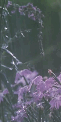
the flower img matches really well w/ color of font and rest of sig
love it overalll ♥

-

yuketsu - Posts: 18031
- Joined: Thu Apr 18, 2013 6:00 pm
- My pets
- My items
- My wishlist
- My gallery
- My scenes
- My dressups
- Trade with me
Re: signature respect! [v. 21] (READ NEW RULE)
![]() by Jarra-Jen » Sun Sep 24, 2017 4:13 am
by Jarra-Jen » Sun Sep 24, 2017 4:13 am
- it's a very clean looking signature! i love the accent color you've chosen and the addition of japanese (?) characters give it a unique look. the placing of the links and text box is also really nice. everything lines up completely perfectly, which makes it lovely to look at.
hey i haven't logged on since 2018 if you feel like i abandoned smth please don't be mad at me i am extremely dumb and will cry i don't even remember what happened in 2018 i have no clue what is going on
-

Jarra-Jen - Posts: 1202
- Joined: Thu Aug 11, 2016 2:21 pm
- My pets
- My items
- My wishlist
- My gallery
- My scenes
- My dressups
- Trade with me
![]() by scxr » Sun Sep 24, 2017 4:16 am
by scxr » Sun Sep 24, 2017 4:16 am
- the soft pastel color scheme is very pleasing to the eye.
i like the simplicity of your signature as well. it looks effortlessly elegant.
i also admire the compliment you put at the end of your bio. you seem very nice.
x

[ 𝗌𝖼𝖺𝗋𝗅𝖾𝗍𝗍 | 𝗌𝗁𝖾/𝗁𝖾𝗋 | 𝗂𝗇fj | 𝖼𝖺𝗉𝗋𝗂𝖼𝗈𝗋𝗇 | 𝗐𝗋𝗂𝗍𝖾𝗋 | 𝗌𝗍𝗎𝖼𝗄 𝗂𝗇 𝟤𝟢𝟣𝟧 ]
─────────[ 𝘪 𝘸𝘪𝘭𝘭 𝘧𝘭𝘺 𝘸𝘪𝘵𝘩 𝘯𝘰 𝘩𝘰𝘱𝘦, 𝘯𝘰 𝘧𝘦𝘢𝘳 ]──────────
[ 𝗌𝖼𝖺𝗋𝗅𝖾𝗍𝗍 | 𝗌𝗁𝖾/𝗁𝖾𝗋 | 𝗂𝗇fj | 𝖼𝖺𝗉𝗋𝗂𝖼𝗈𝗋𝗇 | 𝗐𝗋𝗂𝗍𝖾𝗋 | 𝗌𝗍𝗎𝖼𝗄 𝗂𝗇 𝟤𝟢𝟣𝟧 ]
─────────[ 𝘪 𝘸𝘪𝘭𝘭 𝘧𝘭𝘺 𝘸𝘪𝘵𝘩 𝘯𝘰 𝘩𝘰𝘱𝘦, 𝘯𝘰 𝘧𝘦𝘢𝘳 ]──────────
-

scxr - Posts: 4070
- Joined: Fri Jun 27, 2014 10:56 am
- My pets
- My items
- My wishlist
- My gallery
- My scenes
- My dressups
- Trade with me
Re: signature respect! [v. 21] (READ NEW RULE)
![]() by BananaSocks » Sun Sep 24, 2017 4:27 am
by BananaSocks » Sun Sep 24, 2017 4:27 am
- om i love it!
it's simple and the gif really fits into the overall black theme and
works amazing as a sort of divider it makes me feel really calm and
it's easy to read too! it also matches with your avatar! overall i
love it's simplicity and how clean it is i really like it!
- xxx
xxx
xxx
xxx
im electric, a romantic cliché
heather • löded diper fanatic
im an art student, hoping to do
something that i like. talk to me
about film books music anything.
i listen to a ton of rock and indie
bands, if you like declan mckenna
wolf alice nothing but thieves
lorde the strokes florence + the
machine we are friends, it is the
law. uh i wish i had some fish
discord [#6740] insta spotify
xxxxxx

-

BananaSocks - Posts: 1244
- Joined: Sat Dec 17, 2016 6:57 pm
- My pets
- My items
- My wishlist
- My gallery
- My scenes
- My dressups
- Trade with me
Re: signature respect! [v. 21] (READ NEW RULE)
![]() by na'vi. » Sun Sep 24, 2017 7:49 am
by na'vi. » Sun Sep 24, 2017 7:49 am
I like that it is simple- however at the same time I do wish a bit more was going on, however that is just my preference.
The quote, albeit simple, is nice and to the point.
Your information section gives enough information without being too much and it makes you sound super sweet!
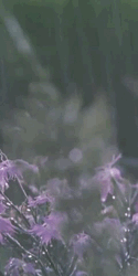
I like the little artwork piece, as it's quite serene and pulls the entire photo together, I do wish though that
somewhere it said who the artist was- or if you drew it!
Overall- a nice and simple siggy with a calm yet almost rustic vibe.
3+ sentences please! <3
The quote, albeit simple, is nice and to the point.
Your information section gives enough information without being too much and it makes you sound super sweet!
I like the little artwork piece, as it's quite serene and pulls the entire photo together, I do wish though that
somewhere it said who the artist was- or if you drew it!
Overall- a nice and simple siggy with a calm yet almost rustic vibe.
3+ sentences please! <3
Last edited by na'vi. on Sun Sep 24, 2017 7:50 am, edited 1 time in total.


-

na'vi. - Posts: 4260
- Joined: Tue Jan 14, 2014 3:54 pm
- My pets
- My items
- My wishlist
- My gallery
- My scenes
- My dressups
- Trade with me
Re: signature respect! [v. 21] (READ NEW RULE)
![]() by ._.savvy._. » Sun Sep 24, 2017 7:50 am
by ._.savvy._. » Sun Sep 24, 2017 7:50 am
I love your signature!
i never get on here anymore but when i do it's just to organize stuff as a distraction
-

._.savvy._. - Posts: 1012
- Joined: Sun Apr 09, 2017 8:14 am
- My pets
- My items
- My wishlist
- My gallery
- My scenes
- My dressups
- Trade with me
Re: signature respect! [v. 21] (READ NEW RULE)
![]() by heresalittlefaith » Sun Sep 24, 2017 10:32 am
by heresalittlefaith » Sun Sep 24, 2017 10:32 am
@♛ Mist ♛ The Images are very amazingly split. I don't know how you did that but it looks amazing. I love how complex it is yet it flows together so beautifully. All of the mixed text styles look so beautiful together. Its overall a very beautiful and creative signature. The coding is phenomenal and the theme is amazing!
@BloofBlof
It's very simple, not much coding. The pets are cute. It doesn't really speak to your personality. I would suggest adding some more stuff to it to personalize it? That little message is very sweet btw. (Although it would be You're not Your) It's very simple and a good starting signature for those who aren't super experienced in coding.
On a side note, please read the first page of this thread. That response is too short.
│
│
│
│
│
│
│
│
│
│
│
│
│
│
│
│
│
│
│
│
│
│
│
│
│
│
│
│
│
│
│
│
│
│
│
│
│
│
│
│
│
│
│
│
│
│
│
│
│
│
│
│
│
│
│
│
│
│
│
│
│
│
│
│
│
│
│
│
│
│
│
│
│
│
│
│
|Faith - She/They - Adult|
|Special Needs Teacher - Artist - Writer|
|Trade With Me! |
||All Hail Swiftpaw||
I don't know how to feel
But someday, I might
Someday, I might
|Special Needs Teacher - Artist - Writer|
|Trade With Me! |
||All Hail Swiftpaw||
I don't know how to feel
But someday, I might
Someday, I might
-
heresalittlefaith - Posts: 5647
- Joined: Fri Apr 05, 2013 3:01 pm
- My pets
- My items
- My wishlist
- My gallery
- My scenes
- My dressups
- Trade with me
Who is online
Users browsing this forum: bunnyboy, ChocoDog935, Faith3344, jjumpydoll and 26 guests