Just a little fun for when you have time to kill
 by QUITTING WAHH » Sun Oct 05, 2014 9:52 am
Both ten
@Below *Cough* I think I'm allowed to pick my own theme and I don't see any bad quality in my avatar... Just sayin
Last edited by
QUITTING WAHH on Sun Oct 05, 2014 9:55 am, edited 1 time in total.
 ✖ ✖ ✖ ✖ ✖╭xxxxxxxxxxxxxxxxxxxxxxxx
╮
Saki ● ♀ ● Dino ● Guinea pig
I'm quitting because idk ;_;
Byebye loveliessss
I will miss
╰
xxxxxxxxxxxxxxxxxxxxxxxx╯╭
xxxxxxxxxxxxxxxxxxxxx╮--
Bab--
Kyary--
Lilac--
--link--link--link--
--link--link--link--
╰xxxxxxxxxxxxxxxxxxxxx╯

-

QUITTING WAHH
-
- Posts: 3388
- Joined: Fri Jul 18, 2014 8:17 am
- My pets
- My items
- My wishlist
- My gallery
- My scenes
- My dressups
- Trade with me
-
by Charchar2 » Sun Oct 05, 2014 9:53 am
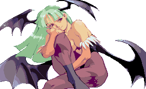
Avatar; 3/10, it's OK but the image just isn't that high quality, idk.
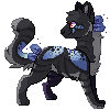
Signature; 4/10 Eh, it's interesting but it doesn't really tie together well with a single theme (see mine below for example) Idk, if you added more guinea pigs and things it might be better. Maybe some warrior cats instead? Ships and things are kinda more interesting c;
I'm traveling til Friday w/ no access to my tablet!
Mostly quitting CS; I'll check messages on occasion but
DA or Skype is probably a better place to contact me.
-
Charchar2
-
- Posts: 20200
- Joined: Mon Dec 19, 2011 5:04 am
- My pets
- My items
- My wishlist
- My gallery
- My scenes
- My dressups
- Trade with me
-
by Charchar2 » Sun Oct 05, 2014 9:56 am
Avatar; 5; it's pretty good, idk, the image quality is a little low but its ok? Animals are good avatars
Signature; 3; I like that it's warriors but honestly it's just a bunch of images/code/text ... Having two of the same image is kinda repetitive also.
I'm traveling til Friday w/ no access to my tablet!
Mostly quitting CS; I'll check messages on occasion but
DA or Skype is probably a better place to contact me.
-
Charchar2
-
- Posts: 20200
- Joined: Mon Dec 19, 2011 5:04 am
- My pets
- My items
- My wishlist
- My gallery
- My scenes
- My dressups
- Trade with me
-
by косатка » Sun Oct 05, 2014 9:58 am
avvie - 3. sorry, its just not very appealing to the eye. i also prefer avvies that match the sig's theme.
siggy - 2. way too crowded and needs a better layout. and the picture is cut off. all it is is the same stamp repeated again and again, a large picture, and text. it just needs a lot more work. sorry...
Last edited by
косатка on Sun Oct 05, 2014 10:03 am, edited 3 times in total.
-
косатка
-
- Posts: 40906
- Joined: Sat Mar 30, 2013 12:14 pm
- My pets
- My items
- My wishlist
- My gallery
- My scenes
- My dressups
- Trade with me
Who is online
Users browsing this forum: Deturath, Google [Bot], kromer, Lunarhaven, Pyca and 18 guests