
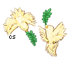
CHALLENGE ONLY YOURSELF [325 Store Pets] RESULTS
Forum rules
Art theft is not tolerated here. Do not copy/trace/edit/use anybody's pictures without their express permission.
If you are unsure, read the full art rules here.
Art theft is not tolerated here. Do not copy/trace/edit/use anybody's pictures without their express permission.
If you are unsure, read the full art rules here.
Re: CHALLENGE ONLY YOURSELF [325 Store Pets + Skelebun Raff
![]() by moomooaulait » Sat Mar 18, 2023 7:10 am
by moomooaulait » Sat Mar 18, 2023 7:10 am
marking!
I'm new here and still learning, so if I do something wrong lemme know!
I have a C$ store, and I pay C$ for WL pets! I also have an art shop!
I have a C$ store, and I pay C$ for WL pets! I also have an art shop!
-
moomooaulait - Posts: 413
- Joined: Sat Feb 25, 2023 11:32 am
- My pets
- My items
- My wishlist
- My gallery
- My scenes
- My dressups
- Trade with me
![]() by traumereii » Sun Mar 19, 2023 8:58 pm
by traumereii » Sun Mar 19, 2023 8:58 pm
────────────────»
Link to gallery: here
Selected artworks: one, two, three, four
Entry: here
Prize preference: -02, -01, 00, 03, 10, 16, 23, 20, 24
────────────────»
there were a lot of things that were different from my usual process. i'm still in the process of getting used to my new tablet (it's a lot smaller than my previous one so working with the space i've got now has been an interesting experience) and csp (program changes are kind of wack in general but i want to feel more comfortable with csp, hence why i've been mostly using that). i also don't often include proper backgrounds to my art, experiment with different poses, or forego lineart in the final product, so i decided to force myself out of my comfort zone a little bit to draw things i don't usually draw. admittedly, the quality kind of took a nosedive, but given how i haven't been drawing much due to other irl obligations and general art block, i'm glad that i at least tried to sit down and draw something.

─────────────────────────────────────────────────────────────────────────
rei. they/them. adult. carrd. art. writing. aes. sin. busy in uni/exam hell pls run me over.
very normal about vocaloid(ps), the colour blue, various gacha games, link click, & vtubers!
im not here super often but i just want to vibe lol. born to be silly, forced to stem. smo save me!!
─────────────────────────────────────────────────────────────────────────

x
-

traumereii - Posts: 136
- Joined: Thu Nov 16, 2017 9:47 am
- My pets
- My items
- My wishlist
- My gallery
- My scenes
- My dressups
- Trade with me
Re: CHALLENGE ONLY YOURSELF [325 Store Pets] ENDS 31st
![]() by Asvoria » Tue Mar 21, 2023 5:18 am
by Asvoria » Tue Mar 21, 2023 5:18 am
Updates!
────────────────»
- traumereii was registered for the contest.
Good luck!
────────────────»
- traumereii was registered for the contest.
Good luck!
-
Asvoria - Posts: 6178
- Joined: Tue Aug 23, 2011 1:15 am
- My pets
- My items
- My wishlist
- My gallery
- My scenes
- My dressups
- Trade with me
Re: CHALLENGE ONLY YOURSELF [325 Store Pets] ENDS 31st
![]() by LokiToons » Thu Mar 23, 2023 4:25 pm
by LokiToons » Thu Mar 23, 2023 4:25 pm
I would like to enter this contest!
────────────────»
Link to gallery: Art Shop Examples and my Toyhouse Gallery
Selected artworks: Scenic Forest | Sunset Shadows | Purple Moonlight | Cartoony | Disney Portrait
Entry: Talaith and the Koi Pond
Prize preference: 00, -01, -02, 03, 01, 02, 12, 05, 16, 23, 18, 24, 26, 28, 34, 36, 29, 31, 33, 40, 42, 50, 49, 59, 58, 51, 45, 66, 67, 71
────────────────»
I apologize in advance for the long and image/link heavy explanation that is about to follow but I'm incredibly proud of this piece and wanted to do it as much justice as possible when it came to explaining my challenged skillset. The areas I decided to tackle in this entry were character design, feminine anatomy, exploring new procreate brushes, fully painted scenery, and lineless character work.
Character Design
I spent a good few days looking through each character and reading the species information provided with each one. I highly considered doing one of the high elves, but it didn't come with the fun of reimagining a character like the rest of the equines did. So I began to consider what animal species I wanted to adapt, something I hardly draw, like reptiles, birds, perhaps mythical beasts of valor... Giving it more thought, I believed it was almost too easy to take a design and slap it on a new set of lines, it was easier to adapt a feral animal design into a another feral animal design than it was to really sit down and consider how to incorporate palette, features, traits, and clothes into a humanoid design. It had just the right amount of complexity for me. I started with something a little different. I knew I wanted to turn Talaith into a Dryad humanoid of sorts and I immediately looked at a couple references online to get an idea of what a typical dryad looks like. Originally, I made my initial sketch incorporating the black markings on Talaith as these tree like growths, similar to this. But paired with the sections of blue scales, and the fact it ended up covering 70% of the body, I thought it made my initial design too crowded and wouldn't have used the provided character palette enough. Instead, I thought about the kind of clothes she could wear, using the tan base color she sports in her reference. I wanted something simple, but decorative, something that seemed loose but effective for the character. I really liked the way those tan sash and flowy dresses would look, and I thought it matched the palette well enough, especially if it were decorated with the jeweled chains. True to the reference, I also included some white forearm gloves, similar to the way her legs appear to be wearing "socks" in her equine form. Overall, the clothing design was the largest factor when it came to adapting Talaith.
Feminine Anatomy
It's hard to have steady practice in everything. I did not start actively drawing humanoid figures until mid 2020. Since I was a kid, I was always oriented towards canine art. Wolves and dogs were all I knew how to draw for nearly a decade before I started to spread outwards and work with cats and other similar anatomy animals. I am always learning, I still manage to capture four legged, pawed creatures better than birds, horses, and aquatic creatures. Humanoids are recent for me, and even when I began my journey, I was almost strictly doing fanart of male characters, particularly Loki. Feminine characters were not really in my interest apart from a couple gift art pieces I did of my friend's characters that happened to be female in presentation. I got practice here and there, but even in my "Purple Moonlight" selected piece, I managed to skip 95% of the anatomy by taking advantage of the bulky furred cape. For this piece, I decided to explore outside my comfort zone a little and use references that helped me understand feminine anatomy, from the petite shoulders, to the way a chest works with the clothing, to thicker thighs, I really tried to capture a laid back pose using this reference by Kibbitzer. Thus, I ended up with my final sketch!
Brand New Brush Set
Just for the occasion, I went digging around online and found this beautiful huge free (paid donation optional) set of foliage brushes for Procreate- the program I use. Id been wanting to paint scenery and backgrounds for a while, I've practiced in the past using some other free brush packs but this was the first time I found something so helpful and easy to use and learn. Granted, the first day I tried them, I struggled. I wasn't sure what kind of background I was going for at first. My initial trial turned out... very shaky. Similar to my "Scenic Forest" piece, I was stuck trying to make my luscious soft forest too hard on the edges, giving a very straight edged and awful appeal. It just didn't look right... Even when I tried the blur it into oblivion and vaguely make it look like scenery, well that didn't work out either. But hey, I had my grass. I gave it an overnight break and returned to work the next day, deciding to scrap what I normally do and instead, stay loose with it. Work with the brushes and not against them, they aren't meant for extremely realistic detail and that was my problem. I was trying to make them work in ways not designed. A big inspiration for me was Studio Ghibli, known for how soft and beautifully painted their scenic backgrounds are. Eureka! Loose is just the formula I was missing. Gave it two hours and I finally had the majority of my background painted and done.
Painted Scenery
Scenery in itself is a challenge for me. Normally a character centered cartoonist, I depend a lot on the figure and subject of my pieces and often paid little attention or cut as many corners as I possibly could when it came to background work. I often blurred my scenery to obscure the poor details and left it at that. It's also hard to pick a composition that fits both the character medium and their placement. My first challenge was choosing a setting. I had the brushes. The sketch. The idea in mind. Now how did I use all of it and make it work? More reference research. I ended up finding something that captured the atmospheric aesthetic I was going for. I wanted something peaceful and something that had an element I don't paint hardly at all: water. Water, lakes, streams, rivers, ponds, fish tanks... I don't do them. They have a lot of properties going on, reflections, shadows, depth, its a lot of hassle I'm not all that eager to concern myself with. So why do it? Challenge. Room for improvement. I want to extend my skills, that's the purpose of entering! Of course, I used a little tutorial help with this, which was extremely helpful to someone who only interacts with water by consuming it on a daily basis. Now that I had my water painted, let's push a little further and put things on top and submerged in it. There were lily pads in my reference, albeit a lot more than I included but I didn't want to obstruct the koi fish too much. Do koi randomly live in a forest pond? No. Does it fit the majestic scenery? No, but let's pretend it does for the sake of a Dryad with a tail also present in the piece.
Lineless
A couple months ago, I entered an art contest with "Scenic Forest" and was told that the character did not appear to fit the scenery and therefore look wildly out of place. At the time, I was very interested in the way Bambi II seamlessly blended 2D animation with soft painted backgrounds... however, I did not achieve the same. Again, I knew I wanted to do scenery and have a character present, but I was faced with the dilemma that like the cat in the forest, Talaith would look out of place in the world she's drawn in. So there were things I had to consider. My background was painted, it appeared soft, loose, blended. My character art tends to be very dependent on lineart. I always have smooth, clear lines on the subjects of my piece, but maybe that was the problem. While my backgrounds carry this soft and scattered look, my character art was too smooth in comparison and that made it stand apart from the scenery instead of blend it in. You see this in animation all the time, the characters always have an element that helps blend them into the world, whether its similar lineart, shading, light, or coloring, you need everything to look like they compliment each other. So I did something I never do. I ditched my lineart. And had to find a new way to communicate every part of the character without the guidelines. The only part I decided to line out were the eyes and facial features, the rest used a gradual system of shading to show depth and values, but it worked beautifully and after rendering the shadows and light into the piece, it all came together nicely and I may have found a new way of painting scenic pieces!
---------------
Reference sources to ensure I'm following CS Rules:
Dryad Picture
Tan Dress
Sitting Reference by Kibbitzer on DA
Digital Pond Tutorial by TheCecile on DA
────────────────»
Link to gallery: Art Shop Examples and my Toyhouse Gallery
Selected artworks: Scenic Forest | Sunset Shadows | Purple Moonlight | Cartoony | Disney Portrait
Entry: Talaith and the Koi Pond
Prize preference: 00, -01, -02, 03, 01, 02, 12, 05, 16, 23, 18, 24, 26, 28, 34, 36, 29, 31, 33, 40, 42, 50, 49, 59, 58, 51, 45, 66, 67, 71
────────────────»
I apologize in advance for the long and image/link heavy explanation that is about to follow but I'm incredibly proud of this piece and wanted to do it as much justice as possible when it came to explaining my challenged skillset. The areas I decided to tackle in this entry were character design, feminine anatomy, exploring new procreate brushes, fully painted scenery, and lineless character work.
Character Design
I spent a good few days looking through each character and reading the species information provided with each one. I highly considered doing one of the high elves, but it didn't come with the fun of reimagining a character like the rest of the equines did. So I began to consider what animal species I wanted to adapt, something I hardly draw, like reptiles, birds, perhaps mythical beasts of valor... Giving it more thought, I believed it was almost too easy to take a design and slap it on a new set of lines, it was easier to adapt a feral animal design into a another feral animal design than it was to really sit down and consider how to incorporate palette, features, traits, and clothes into a humanoid design. It had just the right amount of complexity for me. I started with something a little different. I knew I wanted to turn Talaith into a Dryad humanoid of sorts and I immediately looked at a couple references online to get an idea of what a typical dryad looks like. Originally, I made my initial sketch incorporating the black markings on Talaith as these tree like growths, similar to this. But paired with the sections of blue scales, and the fact it ended up covering 70% of the body, I thought it made my initial design too crowded and wouldn't have used the provided character palette enough. Instead, I thought about the kind of clothes she could wear, using the tan base color she sports in her reference. I wanted something simple, but decorative, something that seemed loose but effective for the character. I really liked the way those tan sash and flowy dresses would look, and I thought it matched the palette well enough, especially if it were decorated with the jeweled chains. True to the reference, I also included some white forearm gloves, similar to the way her legs appear to be wearing "socks" in her equine form. Overall, the clothing design was the largest factor when it came to adapting Talaith.
Feminine Anatomy
It's hard to have steady practice in everything. I did not start actively drawing humanoid figures until mid 2020. Since I was a kid, I was always oriented towards canine art. Wolves and dogs were all I knew how to draw for nearly a decade before I started to spread outwards and work with cats and other similar anatomy animals. I am always learning, I still manage to capture four legged, pawed creatures better than birds, horses, and aquatic creatures. Humanoids are recent for me, and even when I began my journey, I was almost strictly doing fanart of male characters, particularly Loki. Feminine characters were not really in my interest apart from a couple gift art pieces I did of my friend's characters that happened to be female in presentation. I got practice here and there, but even in my "Purple Moonlight" selected piece, I managed to skip 95% of the anatomy by taking advantage of the bulky furred cape. For this piece, I decided to explore outside my comfort zone a little and use references that helped me understand feminine anatomy, from the petite shoulders, to the way a chest works with the clothing, to thicker thighs, I really tried to capture a laid back pose using this reference by Kibbitzer. Thus, I ended up with my final sketch!
Brand New Brush Set
Just for the occasion, I went digging around online and found this beautiful huge free (paid donation optional) set of foliage brushes for Procreate- the program I use. Id been wanting to paint scenery and backgrounds for a while, I've practiced in the past using some other free brush packs but this was the first time I found something so helpful and easy to use and learn. Granted, the first day I tried them, I struggled. I wasn't sure what kind of background I was going for at first. My initial trial turned out... very shaky. Similar to my "Scenic Forest" piece, I was stuck trying to make my luscious soft forest too hard on the edges, giving a very straight edged and awful appeal. It just didn't look right... Even when I tried the blur it into oblivion and vaguely make it look like scenery, well that didn't work out either. But hey, I had my grass. I gave it an overnight break and returned to work the next day, deciding to scrap what I normally do and instead, stay loose with it. Work with the brushes and not against them, they aren't meant for extremely realistic detail and that was my problem. I was trying to make them work in ways not designed. A big inspiration for me was Studio Ghibli, known for how soft and beautifully painted their scenic backgrounds are. Eureka! Loose is just the formula I was missing. Gave it two hours and I finally had the majority of my background painted and done.
Painted Scenery
Scenery in itself is a challenge for me. Normally a character centered cartoonist, I depend a lot on the figure and subject of my pieces and often paid little attention or cut as many corners as I possibly could when it came to background work. I often blurred my scenery to obscure the poor details and left it at that. It's also hard to pick a composition that fits both the character medium and their placement. My first challenge was choosing a setting. I had the brushes. The sketch. The idea in mind. Now how did I use all of it and make it work? More reference research. I ended up finding something that captured the atmospheric aesthetic I was going for. I wanted something peaceful and something that had an element I don't paint hardly at all: water. Water, lakes, streams, rivers, ponds, fish tanks... I don't do them. They have a lot of properties going on, reflections, shadows, depth, its a lot of hassle I'm not all that eager to concern myself with. So why do it? Challenge. Room for improvement. I want to extend my skills, that's the purpose of entering! Of course, I used a little tutorial help with this, which was extremely helpful to someone who only interacts with water by consuming it on a daily basis. Now that I had my water painted, let's push a little further and put things on top and submerged in it. There were lily pads in my reference, albeit a lot more than I included but I didn't want to obstruct the koi fish too much. Do koi randomly live in a forest pond? No. Does it fit the majestic scenery? No, but let's pretend it does for the sake of a Dryad with a tail also present in the piece.
Lineless
A couple months ago, I entered an art contest with "Scenic Forest" and was told that the character did not appear to fit the scenery and therefore look wildly out of place. At the time, I was very interested in the way Bambi II seamlessly blended 2D animation with soft painted backgrounds... however, I did not achieve the same. Again, I knew I wanted to do scenery and have a character present, but I was faced with the dilemma that like the cat in the forest, Talaith would look out of place in the world she's drawn in. So there were things I had to consider. My background was painted, it appeared soft, loose, blended. My character art tends to be very dependent on lineart. I always have smooth, clear lines on the subjects of my piece, but maybe that was the problem. While my backgrounds carry this soft and scattered look, my character art was too smooth in comparison and that made it stand apart from the scenery instead of blend it in. You see this in animation all the time, the characters always have an element that helps blend them into the world, whether its similar lineart, shading, light, or coloring, you need everything to look like they compliment each other. So I did something I never do. I ditched my lineart. And had to find a new way to communicate every part of the character without the guidelines. The only part I decided to line out were the eyes and facial features, the rest used a gradual system of shading to show depth and values, but it worked beautifully and after rendering the shadows and light into the piece, it all came together nicely and I may have found a new way of painting scenic pieces!
---------------
Reference sources to ensure I'm following CS Rules:
Dryad Picture
Tan Dress
Sitting Reference by Kibbitzer on DA
Digital Pond Tutorial by TheCecile on DA
-
LokiToons - Posts: 9914
- Joined: Thu Apr 29, 2010 2:21 pm
- My pets
- My items
- My wishlist
- My gallery
- My scenes
- My dressups
- Trade with me
Re: CHALLENGE ONLY YOURSELF [325 Store Pets] ENDS 31st
![]() by Asvoria » Sat Mar 25, 2023 9:16 am
by Asvoria » Sat Mar 25, 2023 9:16 am
Updates!
────────────────»
- Løki was registered for the contest.
Good luck!
────────────────»
- Løki was registered for the contest.
Good luck!
-
Asvoria - Posts: 6178
- Joined: Tue Aug 23, 2011 1:15 am
- My pets
- My items
- My wishlist
- My gallery
- My scenes
- My dressups
- Trade with me
Re: CHALLENGE ONLY YOURSELF [325 Store Pets] ENDS 31st
![]() by moomooaulait » Sat Mar 25, 2023 3:18 pm
by moomooaulait » Sat Mar 25, 2023 3:18 pm
I would like to enter this contest!
────────────────»
Link to gallery: Here
Selected artworks: Artwork 1, Artwork 2, Artwork 3 I chose the two I felt were the best while also being more comparable to this piece, and one post with two pieces that are much more in my typical comfort zone.
Entry: Here
Prize preference: 23, 28, 15, 40, 26, 33, 25, 36, 57, 71 in order of preference
────────────────»
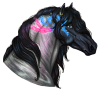
As for how I challenged myself: hoo, I tried to stick to the spirit of the contest and push my limits. I tend to sketch a lot, but even when I finish pieces, it's usually humans/humanoid characters without a proper background, usually a transparent png. So for this piece I chose to stay true to design and draw horses, which I think I've only done once before. I also gave the piece a background, and tried to experiement with new texture brushes to make the trees and grass look less bland. I also tried to be more bold with my lighting and shadows, with mixed results. All in all, it was all things I thought I could push myself in without losing too much quality, and I'm actually extremely proud of how it came out! I hope you enjoy, and thank you so much for the opportunity, it was a lot of fun!
Edit: Apologies for the edits I realized I didn't have my prize preferences in order!
────────────────»
Link to gallery: Here
Selected artworks: Artwork 1, Artwork 2, Artwork 3 I chose the two I felt were the best while also being more comparable to this piece, and one post with two pieces that are much more in my typical comfort zone.
Entry: Here
Prize preference: 23, 28, 15, 40, 26, 33, 25, 36, 57, 71 in order of preference
────────────────»
As for how I challenged myself: hoo, I tried to stick to the spirit of the contest and push my limits. I tend to sketch a lot, but even when I finish pieces, it's usually humans/humanoid characters without a proper background, usually a transparent png. So for this piece I chose to stay true to design and draw horses, which I think I've only done once before. I also gave the piece a background, and tried to experiement with new texture brushes to make the trees and grass look less bland. I also tried to be more bold with my lighting and shadows, with mixed results. All in all, it was all things I thought I could push myself in without losing too much quality, and I'm actually extremely proud of how it came out! I hope you enjoy, and thank you so much for the opportunity, it was a lot of fun!
Edit: Apologies for the edits I realized I didn't have my prize preferences in order!
Last edited by moomooaulait on Sun Apr 23, 2023 3:12 am, edited 6 times in total.
I'm new here and still learning, so if I do something wrong lemme know!
I have a C$ store, and I pay C$ for WL pets! I also have an art shop!
I have a C$ store, and I pay C$ for WL pets! I also have an art shop!
-
moomooaulait - Posts: 413
- Joined: Sat Feb 25, 2023 11:32 am
- My pets
- My items
- My wishlist
- My gallery
- My scenes
- My dressups
- Trade with me
Re: CHALLENGE ONLY YOURSELF [325 Store Pets] ENDS 31st
![]() by Asvoria » Mon Mar 27, 2023 3:56 am
by Asvoria » Mon Mar 27, 2023 3:56 am
Updates!
────────────────»
- moomooaulait was registered for the contest.
Good luck!
────────────────»
- moomooaulait was registered for the contest.
Good luck!
-
Asvoria - Posts: 6178
- Joined: Tue Aug 23, 2011 1:15 am
- My pets
- My items
- My wishlist
- My gallery
- My scenes
- My dressups
- Trade with me
Re: CHALLENGE ONLY YOURSELF [325 Store Pets] ENDS 31st
![]() by Asvoria » Tue Mar 28, 2023 7:24 am
by Asvoria » Tue Mar 28, 2023 7:24 am
bump, four days are left!
-
Asvoria - Posts: 6178
- Joined: Tue Aug 23, 2011 1:15 am
- My pets
- My items
- My wishlist
- My gallery
- My scenes
- My dressups
- Trade with me
Re: CHALLENGE ONLY YOURSELF [325 Store Pets] ENDS 31st
![]() by Asvoria » Wed Mar 29, 2023 7:01 am
by Asvoria » Wed Mar 29, 2023 7:01 am
bump, three days are left!
-
Asvoria - Posts: 6178
- Joined: Tue Aug 23, 2011 1:15 am
- My pets
- My items
- My wishlist
- My gallery
- My scenes
- My dressups
- Trade with me
Re: CHALLENGE ONLY YOURSELF [325 Store Pets] ENDS 31st
![]() by JuneyAmy » Wed Mar 29, 2023 8:18 am
by JuneyAmy » Wed Mar 29, 2023 8:18 am
I would like to enter this contest!
────────────────»
Link to gallery: i don’t have any ^^”
Selected artworks: Pretty much the only artworks i have saved..
Halloween Challenge
stick figure
sketch
Entry: Finished product!
I’ve never drawn a horse before, never a “rea” fullbody. and never wings. so this was fun. XD very frustrating but fun. i’ve also never spent 3+ hours on a single drawing.. it took me a week but i did it! <3
Prize preference: -02 , -01, 00, 03, 04,06,07,08,09but honestly, any XD
────────────────»
(please let me know if i misread something or posted something wrong, i’m Dyslexic and English isn’t my native lamguage! ^^”)
Add: For some reason the pics show really small,but if you zoom in they shouldn’t lose quality.. i hope
────────────────»
Link to gallery: i don’t have any ^^”
Selected artworks: Pretty much the only artworks i have saved..
Halloween Challenge
stick figure
sketch
Entry: Finished product!
I’ve never drawn a horse before, never a “rea” fullbody. and never wings. so this was fun. XD very frustrating but fun. i’ve also never spent 3+ hours on a single drawing.. it took me a week but i did it! <3
Prize preference: -02 , -01, 00, 03, 04,06,07,08,09but honestly, any XD
────────────────»
(please let me know if i misread something or posted something wrong, i’m Dyslexic and English isn’t my native lamguage! ^^”)
Add: For some reason the pics show really small,but if you zoom in they shouldn’t lose quality.. i hope


╔═══════════════════════════╗
Hey everyone! My username is JuneyAmy,
but feel free to call me Juney, Amy, or whatever
you can think of ^_^ I'm an experienced roleplayer,
i already roleplay for about 7 years! I can do from
1 line, until 30+ sentences , but since i'm from
Holland, my English isn't the greatest. I am a huge
fan of Daniela Ruah, Eric Christian Olsen,and Renee
Felice Smith, they are amazing people ^_^ i love
NCIS: L A too (: I had a Flight rising account too ,but banned for no reason
i lived with family who also did play FR, we never sent anything to eachother or gifted but we both got banned. I also play Howrse and Pokeheroes, both by the name Juney
╚═══════════════════════════╝
(pronoun,gender, and other buttons could go here!)
╔═══════════════════════════╗
My Dutch Howrse account!
╚═══════════════════════════╝
-
JuneyAmy - Posts: 44337
- Joined: Fri Feb 10, 2012 6:41 am
- My pets
- My items
- My wishlist
- My gallery
- My scenes
- My dressups
- Trade with me
Who is online
Users browsing this forum: No registered users and 2 guests