
Aaa, sorry I haven't posted in a while again! If I missed you, feel free to pm me! It seems however a lot of you asked for reviews and got them, so I will try and respond to reviews starting from the last page, sorry!! gonna code this so I don't take too much space ^^ some of it may not be in order.
--
@ everyone who did for my last sig - aaah, thank you all for your reviews!! *v* It means a lot!
@ Gold - I also really like the signature you made! I'm really in love with the images, and the black text of the quote pops out enough so that the images don't totally distract you from it. Also, some good editors I would suggest are Online Image Editor, Lunapic, and Ezgif (all online and free, and work with both gifs and regular images)
@ sedition - gosh, your signature all finished looks amazing now! The layout is so well done and creative, and the fonts look lovely together. I also like the monochrome, I think it works well with the theme and the gifs are of high quality. Your quote is a little hard to find, however, especially the beginning of it since the font is a little small, but once you do find it it is easy to read. Overall, a job well done!
@ October; - I don't think yours look too basic looking! <:0 Anyways, I love the whole theme of it in general, the gifs are of really good quality and I really love the fonts you chose. The gifs however do look a little bit repetitive since they're all of the wings opening, but they still look really cool!! I also like how easy your quote is to read, even though it's all spread out.
@ oxy - ooh, your signature is so cute! I love the images you used and the simplicity in general. Your bio area is also extremely easy to navigate and read, and honestly the whole signature is just very charming :>
@ BlackenedShadow - yours fits fine on my screen! I really like your sig, the layout is unique and the colors are so pleasing to look at but aren't blinding. I really like the image weaves as well, but the image weave with the bird dingbat does seem to be a little cut near the top.
@ kalplantal - I like your sig! The orange looks great and I like the transparent on the left. The fonts you also used for "if" and "garbageman" look great as well and fit nicely, however your quote is hard to find because the other words are so small and spread out.
@ neko - your sig is so small and cute!! I love the simplicity of it and the borders. Maybe try colorcoding the text ones a little bit so it looks more fitting with the other images? I love though how the images are also in the borders as well, overall it's just a very cute and smol sig :>
@ arts - your signature mostly looks okay to me, however part of your quote looks like this
--
I have also been working on a new sig now, any thoughts on it? ;w;
Signing Off: A Signature Fanclub - Come Join!
Re: Signing Off: A Signature Fanclub - Come Join!
![]() by loves, » Sun Jan 08, 2017 5:13 am
by loves, » Sun Jan 08, 2017 5:13 am

♦ You must be homesick.
《 loves: infp, lawful neutral 》
《 loves: infp, lawful neutral 》
-

loves, - Posts: 1845
- Joined: Thu Apr 16, 2015 6:22 am
- My pets
- My items
- My wishlist
- My gallery
- My scenes
- My dressups
- Trade with me
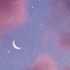
![]() by nah » Sun Jan 08, 2017 5:24 am
by nah » Sun Jan 08, 2017 5:24 am
@sheila;
ooh, this is really pretty!!
i like the use of the borders on the left and right,
perhaps parenthesis? im not quite sure, but it gives
the signature a fancy flare to go along with the
crown 'n' such. the images are pretty, they're the
sky! its a good set of images to add with the quote
as it doesnt mean space altogether, it just means
stars, and i really love it.
the colors go with each other really well, the purple
separating it from the grey text, it sorta grabs your
attention as it doesnt blend in with the rest of the color,
its very nice. altogether, it may be small, & it may not
look like much, but its very pretty in my opinion.
@arts
aa,, i love your signature already, however, it looks like
this on my screen,
im on a laptop with chrome so the only thing thats some
what weird is that the s and the exclamation point is push-
ed down lower.
@leda.
hey!! glad you're back!! i always loved your coding so
its nice to see it around again.
@loves1098
woah, i rarely see see earthbound themed signatures, so
its nice to see the sprites 'n' such again. i love how its so
small, personally i like smaller signatures and you make
that idea work just right, nothing is out of place and it
remains a normal size for everybody. the quote's very
cute?? ive never played earthbound or heard the quote
but i still really enjoy it, gives me a weird nostalgic
feeling, tbh. altogether, i love it a lot?? holy jeez
━━━━━━━━━━━━━━━━━━━━━━━━
sorry i couldnt do as many people, i'm suuuper
lazy and i always feel bad bc im not able to give as many
people critique as i want to,,
speaking of critique, i was wondering if i could get any
on my own signature, i made it yesterday and i wanna see
if it looks fine on other screens and if anyone likes it,, hha
SO SQUEEZE ME, TEASE ME, SAY IM YOUR OWN, BUT IM NO GIRL'S TOY!
OH, CHARM ME, CHASE ME, FOLLOW ME HOME ..... FORGET IT, SWEETIE!
⋯ ⋯ ⋯ ⋯ ⋯ ⋯ ⋯ ⋯ ⋯ ⋯ ⋯ ⋯ ⋯ ⋯ ⋯ ⋯ ⋯ ⋯ ⋯ ⋯ ⋯ ⋯ ⋯ ⋯ ⋯ ⋯ ⋯ ⋯ ⋯ ⋯ ⋯ ⋯
hello, my name is dorothy and im mostly inactive! i am a mortuary sciences
student with an affinity for musical theatre, horror, and 80's things. i also
used to be a pretty good coder here. i mostly check in to play forum games,
but if you have any questions, feel free to dm me! ill do my best to check.
⋯ ⋯ ⋯ ⋯ ⋯ ⋯ ⋯ ⋯ ⋯ ⋯ ⋯ ⋯ ⋯ ⋯ ⋯ ⋯ ⋯ ⋯ ⋯ ⋯ ⋯ ⋯ ⋯ ⋯ ⋯ ⋯ ⋯ ⋯ ⋯ ⋯ ⋯ ⋯
≺ click the image above for a song! or dont, i guess! [she/her, lesbian] ≻
-

nah - Posts: 3192
- Joined: Mon Sep 14, 2015 12:17 pm
- My pets
- My items
- My wishlist
- My gallery
- My scenes
- My dressups
- Trade with me
Re: Signing Off: A Signature Fanclub - Come Join!
![]() by Junhui; » Sun Jan 08, 2017 7:32 am
by Junhui; » Sun Jan 08, 2017 7:32 am

- Username:
- Darkness Rising
Name/Nickname[s]:
- Kylie, Darkness, whatever you want c:
Pronouns:
- She/her c:
Do you have an signature shop?:
- ❀𝓒𝓱𝓮𝓻𝓻𝔂 𝓑𝓵𝓸𝓼𝓼𝓸𝓶 𝓢𝓲𝓰𝓷𝓪𝓽𝓾𝓻𝓮𝓼❀ - just opened yesterday!
What's your favourite and least favourite part about coding:
- Usually trying to find different layouts.
When did you begin making signatures?:
- A bit after I joined, so a few months ago.
Tell us a bit about yourself?:
- Uhm, well, I'm really awkward haha. My name's Kylie, I'm in highschool, my
birthday is May 17th. I love pizza and cats. My favorite colors are black and
pastel pinks and purples. I'm extremely awkward. Hahaha
Irisid, I'd like to sign up!
- .
Jayden | he/him
-

Junhui; - Posts: 1918
- Joined: Sun Sep 18, 2016 7:17 am
- My pets
- My items
- My wishlist
- My gallery
- My scenes
- My dressups
- Trade with me
Re: Signing Off: A Signature Fanclub - Come Join!
![]() by qeu9nveq7vn » Sun Jan 08, 2017 7:34 am
by qeu9nveq7vn » Sun Jan 08, 2017 7:34 am
- @Darkness Rising;; Welcome!
-

qeu9nveq7vn - Posts: 10107
- Joined: Sat Apr 19, 2014 8:15 am
- My pets
- My items
- My wishlist
- My gallery
- My scenes
- My dressups
- Trade with me
Re: Signing Off: A Signature Fanclub - Come Join!
![]() by moriarty, » Sun Jan 08, 2017 7:49 am
by moriarty, » Sun Jan 08, 2017 7:49 am
- heyheyhey!! :)
thank you everyone who commented on my wip siggy!
@Tsar - hey dude!! i totally know what youre going through.
that inevitably happened every time i made a signature shop so it does
get pretty annoying :// but every time i felt like that, i closed my sho
p for about a week, maybe less, to wrap my head together, take a bre
ak, and make myself a new siggy. it feels really nice finally having tha
t time to yourself, and i highly suggest it! though i do know you dont
want to close your shop, so i understand if this advice isnt very helpful
@sedition - ohmygosh can i please just say that your signature is absolutely
stunning! i love the gifs. they all work very well together. im a sucker for m
onochrome signatures, and yours takes the cake!! i like the triangles that m
ake up part of the text box, thats really really cool!! one critique i could gi
ve you though is that the word "EYES" is really really fuzzy. but thats literally
the only problem i see out of your whole signature!!
@October; - i love it!!! the raven theme is really cool, and the gifs have a n
ice quality to them! the layout is vv nice and different - a good different! i c
ould literally stare it for hours :)
@kaplanti - pls teach me. your signature is absolutely gorgeous! i applaud e
veryone who can make color schemes work, bc i sure cannot. its vv birght and
lovely, and 0ehfw0rhge im literally in LOVE. one critique i could give you is that
the flowers by "garbageman" dont really match with the rest of the sig bc every
thing is oranges and reds. but thats it, really. its super amazing!!
@neko.. - !!!!!! kittens! i love cats so like !!! amazing! its so pretty and it
makes me smile :) like leda said, however, it would be cool if the borders were di
fferent (like lets say the last one has the big rectangle, and then the smaller line)
i think that would make it look really good.
@alleyoop - its good! i like the theme :) but, the fonts dont really go together at
all, and theres a lot of empty space. it looks great apart from that, and the border
s at the end of the signature are really unique!!
@art - *jaw drop* that color scheme man oh man! but mine shows up the exact same
as the screenshot leda sent you so it is a bit messed up. but it looks super well done
for a wip, pls teach me your ways <3
@leda - welcome back ily i missed you
@oz. i -- *starts tearing up* its beautiful!!! i just cant, its so pretty! the fonts, the
image, EVERYTHING just works so well together! its insanely gorgeous ! and so unique.
all the different fonts and such work great together, and the color scheme man. man oh man.
even the heart emojis look great with it! wowie. im awestruck. great job!!!
(teach me pls)
heyo!! i finally finished my signature, and im SUPER proud of it. i was wondering if i could
ask for some critiques and comments?
also this is what it looks like for me :)
Last edited by moriarty, on Sun Jan 08, 2017 6:00 pm, edited 1 time in total.


ARTEMIS ━
heyo! arty here
getting back int
o cs and the co
ding world! love
you all! feel fre
to pm me anyti
me! uwu uwu
│getting back int
o cs and the co
ding world! love
you all! feel fre
to pm me anyti
me! uwu uwu
│
│
└─────
━━━━━ oh,
-
moriarty, - Posts: 5175
- Joined: Mon Nov 17, 2014 5:08 am
- My pets
- My items
- My wishlist
- My gallery
- My scenes
- My dressups
- Trade with me
Re: Signing Off: A Signature Fanclub - Come Join!
![]() by watts » Sun Jan 08, 2017 9:58 am
by watts » Sun Jan 08, 2017 9:58 am
- New signature;
It's soooo simple and very different to what I'm used to.
What can I do to make it better, though? I just started
copying/pasting because of lazyness and it turned out
better than I thought it would (which wasn't very much
anyways...) Anyhow, thoughts?
edit;;
i'm editing my sig little by little so it might
look different depending on when you see this.

rpnt watts ; polyfrag DID system
it/they
apex legends || icon (c) tinivy @ tumblr
-

watts - Posts: 6182
- Joined: Mon Jul 27, 2015 11:18 am
- My pets
- My items
- My wishlist
- My gallery
- My scenes
- My dressups
- Trade with me
Re: Signing Off: A Signature Fanclub - Come Join!
![]() by ✦ nemuri » Sun Jan 08, 2017 5:58 pm
by ✦ nemuri » Sun Jan 08, 2017 5:58 pm
Yoo this is Nishinoya Yu with a brand new username!! I chose a gender neutral one bcos why not :')
Anyways have some short replies, don't have much time and replies usually take a whole ton longer. If I skipped you or you would like a more lengthy reply/review/critique on your coding, please PM me!
From page 799:
@Tsar
ohmygosh yes that feeling of unproductivity is surreal. Unfortunately I just force myself to finish it usually, the only time that I've ever cancelled on my commissions was a week or so ago when I was feeling super stressed with irl
@October
If anything, your signatures are for the most part not basic. It's just the commands that seem really easy and now that you're experienced putting it together seems effortless, so that's why you think it looks too simple when really it's gorgeous and something to be proud of.
@kaplantai
aaaa it's adorable?? and man those beautiful shades of red and orange really makes your signature stand out. o man i wish there was a garbageman to take me out since i'm a somewhat accurate depiction of trash :')
@neko
It's so cute and small can I hug it
The only thing that's minorly bugging is that it's not centered, maybe shift it over with transparent letters or list tags?
@alleyoop
That's a very nice looking signature! I dunno, the only thing that looks remotely off is the fact that the words stars and cant aren't lined up, and there's a small gap above can't.
@leda
aaaaaa welcome back!!
@loves
o geez you've killed me again with one of your cute and adorable signatures holy crap i'm dying so much rn is it because i'm listening to people from diabolik lovers sing whoops
and yes you've made use of those arrows again,,, somehow you always manage to make them a nice addition to your signature ngl
From page 800
@Darkness Rising
Welcome!!
----
O crap i legit have two minutes now but oh well
Would it be possible for me to have some comments on my signature? This time the dude in my signature doesn't have his elbow chopped up bless uP

┌────────────┐
御影密bot - inactive
if you have questions, the
answer is probably "no"
└────────────┘
-

✦ nemuri - Posts: 11438
- Joined: Tue Jun 30, 2015 3:04 pm
- My pets
- My items
- My wishlist
- My gallery
- My scenes
- My dressups
- Trade with me
Re: Signing Off: A Signature Fanclub - Come Join!
![]() by Thebattleangel » Sun Jan 08, 2017 11:09 pm
by Thebattleangel » Sun Jan 08, 2017 11:09 pm
- Username:
- ~Emmy~
Name/Nickname[s]:
- Em or Emmy is fine
Pronouns:
- She/Her
Do you have an signature shop?:
- no i have been put off signature making for a while
What's your favourite and least favourite part about coding:
- my favourite would be how happy it makes the person when the recieve it and my least favourite is when it the coding is bigger than the signature box
When did you begin making signatures?:
- when i first joined cs because i saw everyone coding and i thought i'd give it a shot
Tell us a bit about yourself?:
- i love dragons,im year 11 in high school (Hardest year yay Xd),i have a wee puppy,i have red hair
Irisid, I'd like to sign up!
-

Thebattleangel - Posts: 3682
- Joined: Sat May 14, 2016 6:43 pm
- My pets
- My items
- My wishlist
- My gallery
- My scenes
- My dressups
- Trade with me
Re: Signing Off: A Signature Fanclub - Come Join!
![]() by Tsukỉ » Sun Jan 08, 2017 11:35 pm
by Tsukỉ » Sun Jan 08, 2017 11:35 pm
- @em
welcome to the club!
-

Tsukỉ - Posts: 5203
- Joined: Wed Aug 01, 2012 7:35 am
- My pets
- My items
- My wishlist
- My gallery
- My scenes
- My dressups
- Trade with me
Re: Signing Off: A Signature Fanclub - Come Join!
![]() by pink?pink. » Mon Jan 09, 2017 1:33 am
by pink?pink. » Mon Jan 09, 2017 1:33 am
- @oz.
- i positively love the color scheme and how
you arranged the quote. the fonts also go
very nicely together and it is an overall
clean and neat signature. {and it shows up
correctly on my browser}
- @moriaty,
- you should be super proud of that! the way
everything falls into place is satisfying and
double splendid for them chaps dan and phil!
(i also love siggies with lots of text)
- @kaede.
- again i love text focused signatures and the
monochrome scheme if very appealing. the
only thing i'd like to point out is that your
image-based fonts don't all fit together, i
would have used fewer fonts to avoid disr-
upting the flow and continuity. however it
is overall lovely <3
- from pg. 799 ;;
- @sedition
- sadly i am not enough pop-culture savvy to
understand where the theme is from but the
signature catches my eye nonetheless! the
monochrome scheme ties everything together
and the gifs aren't choppy. i really do adore
how everything falls into place in this one <3
- ══════════════════════════════════════════════════
any comments on the new one? i'd much appreciate
the feedback and always love hearing what ya'll have to say <3

𝚌𝚘𝚞𝚕𝚍 𝚎𝚟𝚎𝚛
𝚕𝚎𝚊𝚟𝚎 𝚖𝚎,
────────
feminist, INFJ,
vegan, she/her,
leo, adult
────────
█
█
█
█
█
❤
█
█
█
█
█
❤
█

███████████████████

┌──────────────────┐
hi! i'm pink and i love hiking, doing
crafts, reading, & cooking! i love to
make friends so pm me anytime <3
└──────────────────┘
┌──────────────────┐
hi! i'm pink and i love hiking, doing
crafts, reading, & cooking! i love to
make friends so pm me anytime <3
└──────────────────┘

❤ ❤ ❤ ❤ ❤ ❤ ❤
𝚋𝚞𝚝 𝚠𝚑𝚘 𝚌𝚘𝚞𝚕𝚍
𝚜 𝚝 𝚊 𝚢 . . .


█
❤
█
█
█
█
█
❤
█
█
█
█
█
-
pink?pink. - Posts: 3580
- Joined: Fri Nov 15, 2013 3:11 pm
- My pets
- My items
- My wishlist
- My gallery
- My scenes
- My dressups
- Trade with me
Who is online
Users browsing this forum: No registered users and 6 guests