
- I love it!
The simplicity is very beautiful and the quote is easy to follow.
Utter perfection.
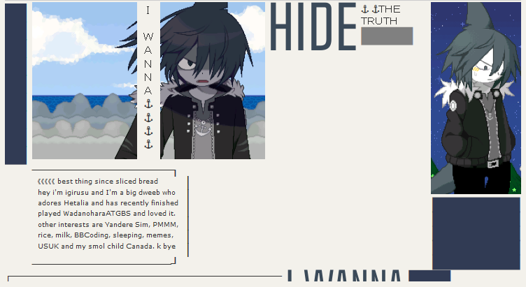
igirusu
- Not very much I can say because it is still a wip,
but it's very cute and I like it a lot so far.
oxy.
- I, too, have a love for the ocean<3
I also have a love for that sig!! It's so cute and adorable.
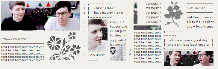
moriarty,
- Very lovely!
Normally I'm not much of a fan of dan and phil signatures,
but yours really takes the cake, as of right now.
It's very creative, and a nice simplistic layout. Love!
G0LDST4R
- I have no words.
It looks like something out of a magazine; I think I'm in love.
I adore what you did with the edges of the signature, very cool technique!
BlackenedShadow
- Whoa! That's something I've actually never seen before.
A very nice signature overall; and I really like the little quote you added!
Very very nice c:
kaplantai
- I really love the color scheme!
I also love sigs without bios; not hating on ones that do have it,
but I just like that all signatures like these do is show something
that the signature owner likes with a quote to reflect them. Awesome!
The only thing I would say is that the quote you did put in is a little
hard for me to follow. Otherwise, very cool!
My own signature is a wip so it will not be attached to this post c:


