
Signing Off: A Signature Fanclub - Come Join!
Re: Signing Off: A Signature Fanclub - Come Join!
![]() by Vincent Van Goat » Mon Jan 02, 2017 12:38 pm
by Vincent Van Goat » Mon Jan 02, 2017 12:38 pm
@Kristen;; It looks amazing!  You did a really great job with the gifs.
  The color scheme goes well together, and I love the quote. Everything looks nice and organized too. Overall, great job.
Last edited by Vincent Van Goat on Mon Jan 02, 2017 1:21 pm, edited 1 time in total.
ALL OF MY ADOPTION CENTERS AND GIVEAWAYS ARE CLOSED// INACTIVE
-

Vincent Van Goat - Posts: 4166
- Joined: Sun Mar 13, 2016 8:39 am
- My pets
- My items
- My wishlist
- My gallery
- My scenes
- My dressups
- Trade with me
Re: Signing Off: A Signature Fanclub - Come Join!
![]() by qeu9nveq7vn » Mon Jan 02, 2017 1:15 pm
by qeu9nveq7vn » Mon Jan 02, 2017 1:15 pm
- Ahsoka here, thought it was time for a name change.
@kristen;; Every sig you do is perfect tbh. You're the reason I started coding.
@G0LDST4R;; I think it's best not to complain about ratings. Learn from my mistakes.
Also maybe you should colour scheme a bit more - the black clashes far too much with the images, especially on the pink one.
@loves;; It keeps getting better - I'd never be able to combine colour images with black text.
@shini;; I love the font choices, though the smaller image looks a bit off to me? I don't know what it is, but it looks weird.
@Vincent;; I think you can work on colours a bit more too - the purple is too vibrant to match the images, and the pink/green doesn't really fit in. Also, maybe you could try getting the bottom two columns to hug?
Comments on my nearly done sig would be great!
-

qeu9nveq7vn - Posts: 10107
- Joined: Sat Apr 19, 2014 8:15 am
- My pets
- My items
- My wishlist
- My gallery
- My scenes
- My dressups
- Trade with me
Re: Signing Off: A Signature Fanclub - Come Join!
![]() by airam » Mon Jan 02, 2017 1:30 pm
by airam » Mon Jan 02, 2017 1:30 pm
- Thanks for the feedback @ everyone who said my coding shop thing looked nice
i somehow received about nine marks
-
airam - Posts: 5590
- Joined: Sun Aug 28, 2011 6:16 pm
- My pets
- My items
- My wishlist
- My gallery
- My scenes
- My dressups
- Trade with me
![]() by storm coming. » Mon Jan 02, 2017 1:35 pm
by storm coming. » Mon Jan 02, 2017 1:35 pm
- i only replied to people from the previous two pages, sorry but i don't have time to reply to everyone and all of you have already got replies while the below people didn't really.
sedition, although this doesn't relate to your signature i like the name change a lot. anyways, onto your signature! the monochrome is wonderful, monochrome signatures are always the best. the quote is nice so far and i'm excited to see the finished product. the gifs are a little flashy, but there's nothing wrong with that since it draws great attention to your signature. if anything, i think those gifs were a lovely idea of yours. the box is a bit messed up but for the most part it looks neat. boxes are tricky to work with and they don't usually fit on everyone's screens but you managed to make it work properly, for the most part at least ( the right side is a bit crooked but hardly noticeable unless you're me and you're overly critical... oops ). the part around 'open your' is creative and i love it! the different fonts are a nice choice and the overall layout is eye-catching, nice job!
kristen, why hello! even though you probably have no idea who the heck i am i really do like your signatures! all of them have the lovely edits and they're stunning. literally everything about it is breath-taking... the edits are my favorite part! i love them so much oh my goodness. the quote is also amazing and the way you laid it out is creative. the gif on the far left doesn't seem to have the best quality though. also, your entire signature is very small and i like how it's complex and compact. the different fonts compared to each other look nice, too. i adore how there's a consistent color scheme and how they match with the gifs and transparent image you used. the gifs and transparent image also seem to fit well with the quote. overall, i would rate this signature 100/10! keep up your wonderful work.
G0LD, don't get me wrong but i do think it's a bit uncalled for to shout out people's ratings that you don't like on this thread. things like this have happened in the past, only with the signature respect thread, and i think we should just refrain from complaining on either threads altogether. that's my input on the matter, i figured i'd say something since no one else seemed to.
as for your signature, it looks the same to me as rayn ; and i'm also using windows. it might be the zoom of your screen, perhaps, or the size of your screen might be different than most everyone else's. in the future i would try and be cautious when making signatures very wide because they might tend to fall off other's screens, for instance the galaxy signature that you made. though, i think it's really wonderful. i'm a huge fan of the pictures that are with it and how they match beautifully with the quote! the overall feeling to this signature is amazing. i think it's the symbols around 'the' and 'is being' that are throwing you off and making it not fit on other people's screens, if i were you i wouldn't use them in the future? for you they are smaller but for us they are longer and therefore make the signature not fit. the font for apart fits good and i like all of the different fonts that you used! it's wonderful <3 the first one that you showed fits a lot better! i love everything about it, though maybe color the fonts so that there's a consistent color scheme? the images, the quote, i adore it.
loves, i have yet to even watch the movie star wars but from your signature i can tell that it's based off of the new movie, rogue one. i like the quote, and the dingbat of the small little planet fits perfectly oh my goodness! there seems to be more space to the left than to the right, was that intention or...? i like the gifs, especially the largest one. i understand it's a work in progress but i can't wait to see the color scheme and such! it's a really small signature but you managed to make the signature layout complex and i respect that.


-

storm coming. - Posts: 34951
- Joined: Tue Oct 14, 2014 12:10 pm
- My pets
- My items
- My wishlist
- My gallery
- My scenes
- My dressups
- Trade with me
![]() by venus. » Mon Jan 02, 2017 2:11 pm
by venus. » Mon Jan 02, 2017 2:11 pm
- 'ello everyone.. i'm going to try and reply to as many people as possible, I guess x3 apologies for the briefness of my replies.. and im sorry if I may have skipped you.
i think this is in order ?? ish ??
@izuku
that's an interesting story!^^ best of luckto you in your class <3
@Vincent Van Goat
I like it !! the layout is nice and simple, but it's not too plain. I love the font you used for the quote, though the red seems to not quite fit with the images, but more that's personal preference. the images coalesce together nicely, and go well with the colours of the black font. overall, really nice!!
@odasaku
I love the simple yet somehow aesthetically pleasing colour scheme you chose. the coding is simple but looks very organized, which is good for a first impression for customers that have never met you before. hopefully, once you open it, you'll have plenty of clients^^
@oz.
the first thing that I notice when I see your sig is the very unique font <3 it's large and attracts the viewers eye with the iconic "dear diary" quote. for me, however, the quote is a little hard to follow, but it's very good nonetheless. I like the images you chose, and the coding looks very complex and interesting !!
@1000 Minus 1
can't wait to see it !!^^
@charlotte.
welcome !!
on the topic of your signature, I really like the subtle and neutral color scheme !! your fonts were chosen well and they go nicely together. the use of transparent images goes well with the subdued colours.
@UNDYNE.
i love how it turned out as well !! the border weave is great, and the fonts and flowers are a nice added touch. what stands out to me is the way you seamlessly made each image a link. the colours you chose also go nicely together, and compliment the cartoon graphic. your bio is very informative, as well. in sum, your signature is very impressive^^
@salty potato.
the coding you utilized for your storage is fantastic. i love the unique borders and fonts, and the theme you used. the images are great, and have similar overall ambiance as the fonts and quote. the use of wide text, cursive fonts, arrows, and "░" boxes looks really nice and shows off your style of coding.
@ärtemis
your coding never fails to amaze me. the way you cut your images is very complex, but you made it look organized and not haphazard. the different blocks of text allows for you write detailed information about your character.
@loves1098
I like it !! generally, small signature are fairly simple, but you managed to use many varying techniques in the small amount of space. the little text symbols and small images look nice in the signature, since large fonts and images would usually look out-of-place. it's also nice that your entire signature is based off of one theme^^
@G0LDST4R
there's varying reasons why people rate signatures and avatars the way they do, but... maybe it's just that people aren't overly fond of the style? a lot of times, people like large, fancy, and complex signatures, and since your signature is on the smaller side, people might think it's not worth a nine or a ten.
@Kristen
your sig looks great !! the overlay looks nice, and the border colours blend well together. the bio stands out amongst the images and coding, and your links and such are easy to locate, also. the quote is easy to follow, and I like how some words are emphasized, whereas other aren't.
@sedition
love the name change btw your signature look v good so far !! it is a bit wide for my screen, but it doesn't affect how good your signature looks. the graphic in the image to the far left looks very cool, and I like how you put text on the gif. the monochrome scheme is nice and simple, with the images coalescing together nicely. i'm not the biggest fan of the symbols under the words "open your", but that's my personal preference once again.
- venus.
- Posts: 2548
- Joined: Sat Dec 21, 2013 3:07 pm
- My pets
- My items
- My wishlist
- My gallery
- My scenes
- My dressups
- Trade with me
Re: Signing Off: A Signature Fanclub - Come Join!
![]() by Tsukỉ » Mon Jan 02, 2017 2:55 pm
by Tsukỉ » Mon Jan 02, 2017 2:55 pm
- @all feedback
thank you! I'll keep all that in mind!
I intend to add the last word to the form but I was too lazy at the time.
-

Tsukỉ - Posts: 5203
- Joined: Wed Aug 01, 2012 7:35 am
- My pets
- My items
- My wishlist
- My gallery
- My scenes
- My dressups
- Trade with me
Re: Signing Off: A Signature Fanclub - Come Join!
![]() by deaf » Mon Jan 02, 2017 3:00 pm
by deaf » Mon Jan 02, 2017 3:00 pm
- rip @ me. my sig took way too long T_T
i'm just glad to be back from hiatus tbh,
edit: i just realized its probably wonky on others screens, so could
anyone give me some insight on that? + i still have to do my avatar... T_T

comet; they/them; adult
-

deaf - Posts: 888
- Joined: Mon Nov 05, 2012 10:12 am
- My pets
- My items
- My wishlist
- My gallery
- My scenes
- My dressups
- Trade with me
Re: Signing Off: A Signature Fanclub - Come Join!
![]() by ✦ nemuri » Mon Jan 02, 2017 5:53 pm
by ✦ nemuri » Mon Jan 02, 2017 5:53 pm
Eeek first of all I'd like to apologize if I miss you, I'm only going back as far as page 793 because otherwise I'd end up killing myself and my brain :'))
If you do want some comments on your coding, just hmu with a PM, and I'll respond as soon as I can ;0c
whelp here goes nothing
-- From page 793 --
@sedition/ahsoka
Looks great for a WIP! I seriously adore how you always manage to make your monochrome signatures look so good ahaha. The quote reminds me of something a rebel character form Star Wars would say, and correct me if I'm wrong, but I don't think your gifs imply a Star Wars theme oopsies. Two of the gifs you chose are nice and slow, but one of them (I think it was a hand holding a cell phone) is really fast, and the way the background is flashing sort of makes me want to crawl into a hole and never climb out because it's fast and it sort of hurts my eyes.
@izuku
aaAAA That quote is so creepy I love it
The way the eyes move in the center image is so cool as well, it stands out a lot and gives the signature a very eerie vibe, as well as the two heads underneath "EMOTIONS" and "I FELT". That little you have also stands out and livens up the signature slightly, but not to the point where there's a lot of stuff going on. It's centered and nicely placed, and honestly this is a really nice signature that I've seen you pump out of course since you're an amazing coder ;000, and the small line of Japanese words adds a very nice touch as well. c:
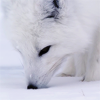
@Vincent Van Goat
Very nice for your first order! I like the general monochrome theme of the signature, although the blaring red text does bother me a little, as well as the fact that it doesn't have a period, although that's just me being very nitpicky. The large gap between the wolf on the left and the wolf and the right looks a bit strange, maybe fill it up with some unicode symbols since I realize that if you get rid of the gap the sides of the signature won't match with the length of the top quote.
@odasaku
It's lovely???!!! I don't see how you can call that repetitive to be honest, I'd much rather order at your shop seeing the front than my own, since I basically used the same template throughout. The pale shade of green is beautiful, and it doesn't hurt my eyes at all which I really adore, and it matches with the gray silhouette of the owl as well as the green haired person. Like a very wise person had once said, there is beauty in simplicity, and honestly you couldn't have proved that fact better.
@oz.
Looks nice for a WIP! However, I'm not able to see the words "MY TEENAGE ANGST" unless I highlight it, but maybe that's intentional. There's also the end of a cursive 'y' that you trimmed off that doesn't match up with the top part, maybe shift it over with transparent x's? It's on the same line as "MY TEENAGE ANGST" so I dunno maybe that small phrase was supposed to be transparent and I'm just a dunce. I'm also not quite sure what "the five stages '''ger, barganing" means, but I get the feeling that what was supposed to be added on after that was cut off. The "A BODY" that was repeated another time is also pushed down a tad under everything else, and again, I'm not sure if that's intentional or not. Overall, I enjoy the gifs and colour palette that you used, definitely soothing my poor, worn out eyes *^*
-- From page 794 --
@shinimonogurui
Man you have an awesome profile but your username is so hard to spell gaah
Nonetheless welcome to the club! I hope you enjoy your stay c:
Regaring your post on page 795, there isn't much for me to critique, since it's very well coded and everything flows very well together. However, it'd be nice if you considered adding a little more on the right, it just seems a tiny bit empty.
@salty potato.
Your storage is definitely an epitome of awesome o.O Your old storages couldn't have been that bad, right?
Concerning your storage, the green is a nice colour to look at, and the gifs are very calming as well. However, I'm super confused because there's a humongous white gap with absolutely nothing in it on the bottom of everything. If you want to add something there, maybe links leading to each piece of coding/roleplay character that you add in the future?
But oh man your signature is the gorgeous of the gorgeous because it has precious Chuuya in it. *looks at my super old and bad Dazai one #Soukoku4lyfe* anYWAYS the gifs you used are absolutely gorgeous, and the darker shades of maroon fit in with Chuuya's hair colour and basically everything else about him haH
@artemis
Unlike other people, your form was only very slightly messed up, and those were the code boxes. At first glance I can definitely tell that it's a super complicated piece of code, and gaWD judging by the sheer size of it the code is also very long and probably tedious to make, not to mention the generally high quality images that you had to crop/resize/maybe both, and as far as I can tell those three options are possible ways to lower the quality of the images used. The amount of text that I see and that you're planning to write is definitely making my head spin,, oops,,,
-- From page 795 --
@loves
is thaT ROGUE ONE I SEE
Anyways like usual it's a very beautiful WIP, and I'm never going to be able to get over your masterful use of those arrow unicode symbols that I only see you using ohmigod. It's so small and adorable, and it's centeredddd. That little black planet dingbat is also very cute and fits in with the Star Wars theme well. However, due to the gifs being very small the quality is somewhat grainy but I suppose that can't be helped ;'))
@G0LDST4R
Those signatures are lovely, I love how you are able to make use of so many images of the same theme and fit them all into one small signature agh I'm melting over them.
Regarding to how you kept getting rated a 7/10, if I may give my own two cents, seven is still a high rating, compared to the other numbers below seven like six and five and ect. Maybe the people that rated you liked your signature but not enough to give you an 8 or a 9 or a 10. Don't worry, if you keep trying and keep coding then one day your efforts will be recognized uwu
7 is not a crap rating, please don't let this get to you!
@Kristen
Man just like the rest of your signatures, your current one is a masterpiece. Your overlays are very nicely done, and the colours once again fit very nicely with the rest of the theme and gifs. I love how you have a little menu section, it's adorable and it tells people about your links and how if you want to click them, they're all organized in that small space. My only nitpicky detail would be how you squashed that humongous quote into one area, I suppose. Nonetheless, it still looks gorgeous, and again, it was wonderfully coded uwu
---
i'M FINALLY DONE GOD?? THIS TOOK ME AROUND AN HOUR?? AND ?? IM?? SPENT??
liKe seriously i'M barely holding on here
Anyways, to add onto my piles of misery and suffering I coded my last signature from 2016, and I added another little thing to the left today. Any thoughts? For once my signature actually fills up nearly the entire space in the forum signature space haAAAH
If you do want some comments on your coding, just hmu with a PM, and I'll respond as soon as I can ;0c
whelp here goes nothing
-- From page 793 --
@sedition/ahsoka
Looks great for a WIP! I seriously adore how you always manage to make your monochrome signatures look so good ahaha. The quote reminds me of something a rebel character form Star Wars would say, and correct me if I'm wrong, but I don't think your gifs imply a Star Wars theme oopsies. Two of the gifs you chose are nice and slow, but one of them (I think it was a hand holding a cell phone) is really fast, and the way the background is flashing sort of makes me want to crawl into a hole and never climb out because it's fast and it sort of hurts my eyes.
@izuku
aaAAA That quote is so creepy I love it
The way the eyes move in the center image is so cool as well, it stands out a lot and gives the signature a very eerie vibe, as well as the two heads underneath "EMOTIONS" and "I FELT". That little
you have also stands out and livens up the signature slightly, but not to the point where there's a lot of stuff going on. It's centered and nicely placed, and honestly this is a really nice signature that I've seen you pump out of course since you're an amazing coder ;000, and the small line of Japanese words adds a very nice touch as well. c:@Vincent Van Goat
Very nice for your first order! I like the general monochrome theme of the signature, although the blaring red text does bother me a little, as well as the fact that it doesn't have a period, although that's just me being very nitpicky. The large gap between the wolf on the left and the wolf and the right looks a bit strange, maybe fill it up with some unicode symbols since I realize that if you get rid of the gap the sides of the signature won't match with the length of the top quote.
@odasaku
It's lovely???!!! I don't see how you can call that repetitive to be honest, I'd much rather order at your shop seeing the front than my own, since I basically used the same template throughout. The pale shade of green is beautiful, and it doesn't hurt my eyes at all which I really adore, and it matches with the gray silhouette of the owl as well as the green haired person. Like a very wise person had once said, there is beauty in simplicity, and honestly you couldn't have proved that fact better.
@oz.
Looks nice for a WIP! However, I'm not able to see the words "MY TEENAGE ANGST" unless I highlight it, but maybe that's intentional. There's also the end of a cursive 'y' that you trimmed off that doesn't match up with the top part, maybe shift it over with transparent x's? It's on the same line as "MY TEENAGE ANGST" so I dunno maybe that small phrase was supposed to be transparent and I'm just a dunce. I'm also not quite sure what "the five stages '''ger, barganing" means, but I get the feeling that what was supposed to be added on after that was cut off. The "A BODY" that was repeated another time is also pushed down a tad under everything else, and again, I'm not sure if that's intentional or not. Overall, I enjoy the gifs and colour palette that you used, definitely soothing my poor, worn out eyes *^*
-- From page 794 --
@shinimonogurui
Man you have an awesome profile but your username is so hard to spell gaah
Nonetheless welcome to the club! I hope you enjoy your stay c:
Regaring your post on page 795, there isn't much for me to critique, since it's very well coded and everything flows very well together. However, it'd be nice if you considered adding a little more on the right, it just seems a tiny bit empty.
@salty potato.
Your storage is definitely an epitome of awesome o.O Your old storages couldn't have been that bad, right?
Concerning your storage, the green is a nice colour to look at, and the gifs are very calming as well. However, I'm super confused because there's a humongous white gap with absolutely nothing in it on the bottom of everything. If you want to add something there, maybe links leading to each piece of coding/roleplay character that you add in the future?
But oh man your signature is the gorgeous of the gorgeous because it has precious Chuuya in it. *looks at my super old and bad Dazai one #Soukoku4lyfe* anYWAYS the gifs you used are absolutely gorgeous, and the darker shades of maroon fit in with Chuuya's hair colour and basically everything else about him haH
@artemis
Unlike other people, your form was only very slightly messed up, and those were the code boxes. At first glance I can definitely tell that it's a super complicated piece of code, and gaWD judging by the sheer size of it the code is also very long and probably tedious to make, not to mention the generally high quality images that you had to crop/resize/maybe both, and as far as I can tell those three options are possible ways to lower the quality of the images used. The amount of text that I see and that you're planning to write is definitely making my head spin,, oops,,,
-- From page 795 --
@loves
is thaT ROGUE ONE I SEE
Anyways like usual it's a very beautiful WIP, and I'm never going to be able to get over your masterful use of those arrow unicode symbols that I only see you using ohmigod. It's so small and adorable, and it's centeredddd. That little black planet dingbat is also very cute and fits in with the Star Wars theme well. However, due to the gifs being very small the quality is somewhat grainy but I suppose that can't be helped ;'))
@G0LDST4R
Those signatures are lovely, I love how you are able to make use of so many images of the same theme and fit them all into one small signature agh I'm melting over them.
Regarding to how you kept getting rated a 7/10, if I may give my own two cents, seven is still a high rating, compared to the other numbers below seven like six and five and ect. Maybe the people that rated you liked your signature but not enough to give you an 8 or a 9 or a 10. Don't worry, if you keep trying and keep coding then one day your efforts will be recognized uwu
7 is not a crap rating, please don't let this get to you!
@Kristen
Man just like the rest of your signatures, your current one is a masterpiece. Your overlays are very nicely done, and the colours once again fit very nicely with the rest of the theme and gifs. I love how you have a little menu section, it's adorable and it tells people about your links and how if you want to click them, they're all organized in that small space. My only nitpicky detail would be how you squashed that humongous quote into one area, I suppose. Nonetheless, it still looks gorgeous, and again, it was wonderfully coded uwu
---
i'M FINALLY DONE GOD?? THIS TOOK ME AROUND AN HOUR?? AND ?? IM?? SPENT??
liKe seriously i'M barely holding on here
Anyways, to add onto my piles of misery and suffering I coded my last signature from 2016, and I added another little thing to the left today. Any thoughts? For once my signature actually fills up nearly the entire space in the forum signature space haAAAH

┌────────────┐
御影密bot - inactive
if you have questions, the
answer is probably "no"
└────────────┘
-

✦ nemuri - Posts: 11438
- Joined: Tue Jun 30, 2015 3:04 pm
- My pets
- My items
- My wishlist
- My gallery
- My scenes
- My dressups
- Trade with me
![]() by storm coming. » Mon Jan 02, 2017 6:34 pm
by storm coming. » Mon Jan 02, 2017 6:34 pm
- jaywalker, oh my goodness?!! that's so beautiful, i'm at a lost for words, honestly... it's a really sweet, simple, and small signature yet very complex at the same time. i love the color scheme so much, the quote and the way it's displayed, and the dingbats are a lovely choice! the bio boxes do seem to be a bit messed up on my screen but it's almost impossible for it to fit on everyone's screens while using boxes unless you screenshot it and you it as an image instead. that's the struggle of coding, it doesn't view the same on everyone's devices ;u; but hey - this signature is one of my favorites that i've seen! i love how the colors match well with your avatar, that's amazing,,
noya, i really like the edit but i don't think it was the best idea to chop off the poor guy's elbow oh poor him </3 rip... besides that my only other critique is how bright the colors seem to be... i'm not that big of a fan when it comes to bright colors but it's really nice since it's blue!! blue is definitely one of my favorite color schemes to use. the gun placed behind the font fits really well with the art and i have to admit that is my favorite part because it's really creative and you don't see that often! honestly, your whole signature is super creative. especially the edits on the left and right. though some of the dots do seem to be not in the center of the bar? i like the quote, somehow it seems familiar to another quote i have heard of, and i like the different fonts that you used. overall, amazing signature! i would definitely rate this 100/10 ;')
-
storm coming. - Posts: 34951
- Joined: Tue Oct 14, 2014 12:10 pm
- My pets
- My items
- My wishlist
- My gallery
- My scenes
- My dressups
- Trade with me
Re: Signing Off: A Signature Fanclub - Come Join!
![]() by arabella !! » Mon Jan 02, 2017 6:39 pm
by arabella !! » Mon Jan 02, 2017 6:39 pm
@Kristen
It's gorgeous as usual! The colour scheme is amazing and organized to perfection. <3
It's gorgeous as usual! The colour scheme is amazing and organized to perfection. <3
░░
░░
░░
░░
░░

hii ! call me ara :3 i luv
all things cute n insane
all things cute n insane
└───── ♥ ♡ ♥ ─────┘


⧼ she/her • writer • adult • silly ⧽
────────────────────

-
arabella !! - Posts: 27691
- Joined: Thu Oct 31, 2013 1:17 pm
- My pets
- My items
- My wishlist
- My gallery
- My scenes
- My dressups
- Trade with me
Who is online
Users browsing this forum: Amazonbot [Bot] and 16 guests