Join or create fan clubs about your favorite things!
 by canada » Sat Jan 09, 2016 6:36 pm
oml guys. i did it again. omlomlomloml
i diiiiid itttttt!! i made an actually ok-looking sig!!
is it alright??? 
xxxxxxxxxxxxxxxxxxxxxxxxxxx
────────────────
pls say hi to rocket ✩
────────────────
┓
┃
┃
┃
┃
┃
┃
┃
┛
────────────
⋆˚࿔hi i'm
canada!!! you can
call me
can-can! ILYSM
i luv anime, coding & U!
┈ ┈ ┈ ┈ ┈ ┈ ┈ ┈ ┈
adult, christian┈ ┈ ┈ ┈ ┈ ┈ ┈ ┈ ┈
straw.pg ⋆
codingdolce's lair ⋆
umas࿔˚⋆ ──────────────
┏
┃
┃
┃
┃
┃
┃
┃
┗
-

canada
-
- Posts: 21283
- Joined: Sat Feb 01, 2014 3:34 pm
- My pets
- My items
- My wishlist
- My gallery
- My scenes
- My dressups
- Trade with me
-
by vanitas. » Sat Jan 09, 2016 7:01 pm
Mowi wrote:Mowi wrote:Working on a sig, but I need a piece of artwork to have a transparent background. I can't work with Pixlr (it makes me restart my computer every time I try) so I was wondered if any of you can do it (your welcome to use Pixar to make it transparent, but I just can't use it myself)? Thanks, and just quote this and write if you can. I'll give you the art.
I just use Paint Tool Sai. I mean, it's not free but really easy when it comes to make things transparent.
@Canada ahhhH omg YOu're siggy is wonderful ;o;
It looks lovely~!
---
So again, I remade my siggy and I was hoping that this one actually fits on your screen because the last one didn't fit on all screens ;u;🧿 xxxxxxxxxxxxxxxxxxxxxxxxxxxx
O
U
R
B
L
U
E
▌
▌
▌
▌
▌
▌
▌
▌
▌
◸xxxxxxxxxxxxxxxxxxxxxxxxxxxxxxxxxxxxxxxxxx◹
"WE'LL SEE EACH OTHER AGAIN, WON'T WE?"──────────────────────
VANI • ADULT • THEY/THEM • ART • ART SHOP
シャシャ░░☂░░░░░░░░░░░░░░◺xxxxxxxxxxxxxxxxxxxxxxxxxxxxxxxxxxxxxxxxxx◿
-

vanitas.
-
- Posts: 15886
- Joined: Fri Mar 26, 2010 11:08 am
- My pets
- My items
- My wishlist
- My gallery
- My scenes
- My dressups
- Trade with me
by leda. » Sun Jan 10, 2016 4:25 am
@dinitrix
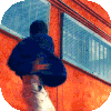
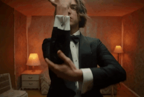
well first of all as a first impression,your siggy is with the blue color scheme.let's talk about the pro's.i really like how you combined/merged the border and rounded corner of the left image,it looks unique and gives it more sympathy for the diferent shades of blue.that image in the background though,wow.the way it's blurry and focuses on the transparent overlayed image is like BRAH.the colored shadows,again are amazing and add onto the beautiful shades of blue.i really like how you split the gif to kinda center the small piece of text.the arrow symbols though,they match so well with the whole theme cause in multiple images/gifs,they have guys holding arrows so great detail!that one last border,omg it's sooooo simple but its such a good transition for possibly most.
and now the con's,but do keep in mind these are opinions,not that im forcing you to change these.
well the rounded corner on the left,just that the borders/lines of different shades of blue going off course from the rounded gif kinda bothers me.also the way you split the gif to fit into the bio bothers me as the man looks,tall and stretched if you piece it together,which i usually do and i know others do it as well.also,i bet your siggy is a wip,but in case you're about to finish it,maybe put some more things like a quote and such on the right where the siggy ends?
-

leda.
-
- Posts: 3861
- Joined: Sun Apr 19, 2015 1:29 pm
- My pets
- My items
- My wishlist
- My gallery
- My scenes
- My dressups
- Trade with me
-
by sibylline, » Sun Jan 10, 2016 7:48 am
seong. wrote:@dinitrix
well first of all as a first impression,your siggy is with the blue color scheme.let's talk about the pro's.i really like how you combined/merged the border and rounded corner of the left image,it looks unique and gives it more sympathy for the diferent shades of blue.that image in the background though,wow.the way it's blurry and focuses on the transparent overlayed image is like BRAH.the colored shadows,again are amazing and add onto the beautiful shades of blue.i really like how you split the gif to kinda center the small piece of text.the arrow symbols though,they match so well with the whole theme cause in multiple images/gifs,they have guys holding arrows so great detail!that one last border,omg it's sooooo simple but its such a good transition for possibly most.
and now the con's,but do keep in mind these are opinions,not that im forcing you to change these.
well the rounded corner on the left,just that the borders/lines of different shades of blue going off course from the rounded gif kinda bothers me.also the way you split the gif to fit into the bio bothers me as the man looks,tall and stretched if you piece it together,which i usually do and i know others do it as well.also,i bet your siggy is a wip,but in case you're about to finish it,maybe put some more things like a quote and such on the right where the siggy ends?
Thanks! Honestly, a quote is like the most difficult thing. I'd like to use a quote from Hawkeye in one of the Avengers movies, but all the ones I want to use are too long.
I think I know how to fix the stretched man, I might change the bottom gif to another part of the image on the left, because that was bugging me too.
Again, Thanks so much. It was awesome to hear someone elses opinion, and it opened my eyes quite a bit.
-
sibylline,
-
- Posts: 4697
- Joined: Wed May 08, 2013 12:41 pm
- My pets
- My items
- My wishlist
- My gallery
- My scenes
- My dressups
- Trade with me
-
Who is online
Users browsing this forum: No registered users and 3 guests


