
A thought:
I feel like your drawing should have its basis in reality, even if it's a cartoon. Always work from a reference for posing, IMO, because otherwise it's hard and looks weird in the end. For anything; humans, dogs, cats. If you want to draw anything use a reference just for the pose and basic anatomy, and then you can make it weird or cute or cartoony! You know?
@Nightsent
The hair position is really cute! This drawing looks really nice IMO ♥ My only thing is that it's a bit small, correct? It looks like you really had to zoom in for the photograph. So my suggestion is draw big, because then you can add detail and make it really lovely! Otherwise I think this idea is really cute and I love it ♥
PS: I am working on something and about to start my first wall mural! I'm really excited, but I need to plan, buy paint, all that borin' stuff
The Artist Army
Re: The Artist Army
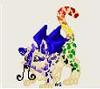
![]() by non » Wed Nov 15, 2017 11:26 am
by non » Wed Nov 15, 2017 11:26 am
-
non - Posts: 10775
- Joined: Sun Apr 12, 2015 4:22 am
- My pets
- My items
- My wishlist
- My gallery
- My scenes
- My dressups
- Trade with me
![]() by sagittarius. » Thu Nov 16, 2017 5:00 am
by sagittarius. » Thu Nov 16, 2017 5:00 am
- @Nightsent: i agree with non. The bigger the drawing the more detail you can then include in it. Besides this, i love your style. it's very cute.
@non: i look forward to hopefully seeing what you're working on, and perhaps even seeing the wall mural? i'd love to see the process/final outcome if you wouldn't mind sharing it with us?
recently i've been using my tablet to draw rather than drawing traditionally. this is one of my latest pieces, and i was wondering if anyone would be kind enough to offer some critique on it?

-

sagittarius. - Posts: 5220
- Joined: Tue Sep 25, 2012 8:19 am
- My pets
- My items
- My wishlist
- My gallery
- My scenes
- My dressups
- Trade with me
Re:
![]() by ryukrem » Tue Nov 21, 2017 6:43 am
by ryukrem » Tue Nov 21, 2017 6:43 am
amor. wrote:@Nightsent: i agree with non. The bigger the drawing the more detail you can then include in it. Besides this, i love your style. it's very cute.
@non: i look forward to hopefully seeing what you're working on, and perhaps even seeing the wall mural? i'd love to see the process/final outcome if you wouldn't mind sharing it with us?
recently i've been using my tablet to draw rather than drawing traditionally. this is one of my latest pieces, and i was wondering if anyone would be kind enough to offer some critique on it?
- woman, why didn't you ever draw for me? this is amazing!


-
ryukrem - Posts: 8793
- Joined: Fri Sep 28, 2012 9:09 am
- My pets
- My items
- My wishlist
- My gallery
- My scenes
- My dressups
- Trade with me
Re:
![]() by non » Tue Nov 21, 2017 12:22 pm
by non » Tue Nov 21, 2017 12:22 pm
amor. wrote:@Nightsent: i agree with non. The bigger the drawing the more detail you can then include in it. Besides this, i love your style. it's very cute.
@non: i look forward to hopefully seeing what you're working on, and perhaps even seeing the wall mural? i'd love to see the process/final outcome if you wouldn't mind sharing it with us?
recently i've been using my tablet to draw rather than drawing traditionally. this is one of my latest pieces, and i was wondering if anyone would be kind enough to offer some critique on it?
I could post some WIP's and such.
I'll start the mural after Thanksgiving. I'll take lots of pictures haha
here's a wip of lil drawing of amy poehler

so yeah
Also that painting looks amazing I'm dead seriously??? how long did it take??
william <3
HI I FINALLY GOT ACCESS TO THIS ACCOUNT AGAIN AFTER YEARS!!!!!!!!!!!! i don't think any of my friends are on here anymore..? but this is so nostalgic to me. i probably won't ever participate in the trading again, but i'll try to be around on the oekaki boards n maybe giving my stuff away in various ways<3
HI I FINALLY GOT ACCESS TO THIS ACCOUNT AGAIN AFTER YEARS!!!!!!!!!!!! i don't think any of my friends are on here anymore..? but this is so nostalgic to me. i probably won't ever participate in the trading again, but i'll try to be around on the oekaki boards n maybe giving my stuff away in various ways<3
-
non - Posts: 10775
- Joined: Sun Apr 12, 2015 4:22 am
- My pets
- My items
- My wishlist
- My gallery
- My scenes
- My dressups
- Trade with me
![]() by sagittarius. » Wed Nov 22, 2017 9:26 am
by sagittarius. » Wed Nov 22, 2017 9:26 am
trico wrote:
woman, why didn't you ever draw for me? this is amazing!
- you never asked??? i can draw for you now if you want
non wrote:I could post some WIP's and such.
I'll start the mural after Thanksgiving. I'll take lots of pictures haha
here's a wip of lil drawing of amy poehler
so yeah
Also that painting looks amazing I'm dead seriously??? how long did it take??
- i love your style!!! it's so unique. the tone is beautiful too
and thank you!! i appreciate it!! it took about three hours, maybe a little less.
-
sagittarius. - Posts: 5220
- Joined: Tue Sep 25, 2012 8:19 am
- My pets
- My items
- My wishlist
- My gallery
- My scenes
- My dressups
- Trade with me
Re: The Artist Army
![]() by emberonis » Wed Nov 29, 2017 5:03 am
by emberonis » Wed Nov 29, 2017 5:03 am
Sorry for how long this post is in advance xD
Part of that is just the time I had to draw it. These were from models and were 20 minute drawings. Drawing from life is hard! Models are great, but they're human and can't stay perfectly still. But it's definitely worthwhile to learn how to draw from reference though, and it's always good to study from life. It doesn't have to be photorealism, but like Non said, all good cartoon styles are simplified from realism.
Your drawing is really cute! It is pretty stylized, so in order to give you good critique/advice, I'd have to know what it is you're going for. If you want it to be a little more consistent with real proportions, starting with lowering the mouth would help a lot. Also adding a nose. Alternatively, you could just raise the chin so that it looks a little less bare and a little more intentional. But I love the mood your drawing's expressing! It's adorable.
And don't doubt what you can do if you put your mind to it. This is one of my earliest human drawings that I drew here on CS, next to one of my recent ones:


Neither of which are especially 'realistic', bc they're both very stylized, but in the second one, having studied how to draw human faces has definitely informed how I went about stylizing it.
@amor: That looks great so far! Just a few things:
For skin, hue variation is super important. I usually overexaggerate this, but generally when you're painting anything you're going to want to shift your color when you go to do the shading and lighting. Generally you'll shift the shadow to a cooler hue and the light a warmer hue, but it really depends on the environment.
Also don't be afraid to really push values! Let your darks be dark and your lights be really light. When I first started doing a lot of shading, that freaked me out. I didn't like the way my shading looked, so I kept it really subtle. But I didn't start really learning and understanding values until I started using a wide range of them. For the most part you seem to be doing pretty good here, but her nose gets a little lost on the face, for example.
And one last note, for hair: When it comes to drawing hair, focusing on the shape rather than the individual strands is crucial for giving the hair good flow. So usually I focus on putting in the general shape, then adding detail to the roots and the ends of the hair. This even works for super detailed hair. The best example of it I have in my art is this. There's still a lot of lines there showing individual strands, but there's more focus on the overall shape of sections/clumps of the hair.

Loish is a really good example of this in digital paintings. See how there's more detail at the ends, connections between different sections of hair, and roots, but less in the rest of it? It still reads very well as hair without each individual strand being shown.
This painting is also a really great example of that hue shifting for skin I was talking about. the main skin tone is that really light peachy color, and then it's shaded with a darker pink color. But if you look closely, you'll see that there are light blue highlights.

(source)
@non: THAT's A SUPER COOL STYLE, kinda poster-y? I like it! super different from anything I've done before so I don't really have any critique.
Nightsent wrote:notifyneelix : oh I really like your drawing. I’m trying to shape up my human drawings, but my style is a bit too cartoony to draw something realistic like that. I really like the shading, but it seems a bit unrealistic in a few places. I’m not really sure if that’s how you wanted it, it’s just kinda what I noticed :)
Part of that is just the time I had to draw it. These were from models and were 20 minute drawings. Drawing from life is hard! Models are great, but they're human and can't stay perfectly still. But it's definitely worthwhile to learn how to draw from reference though, and it's always good to study from life. It doesn't have to be photorealism, but like Non said, all good cartoon styles are simplified from realism.
Your drawing is really cute! It is pretty stylized, so in order to give you good critique/advice, I'd have to know what it is you're going for. If you want it to be a little more consistent with real proportions, starting with lowering the mouth would help a lot. Also adding a nose. Alternatively, you could just raise the chin so that it looks a little less bare and a little more intentional. But I love the mood your drawing's expressing! It's adorable.
And don't doubt what you can do if you put your mind to it. This is one of my earliest human drawings that I drew here on CS, next to one of my recent ones:

Neither of which are especially 'realistic', bc they're both very stylized, but in the second one, having studied how to draw human faces has definitely informed how I went about stylizing it.
@amor: That looks great so far! Just a few things:
For skin, hue variation is super important. I usually overexaggerate this, but generally when you're painting anything you're going to want to shift your color when you go to do the shading and lighting. Generally you'll shift the shadow to a cooler hue and the light a warmer hue, but it really depends on the environment.
Also don't be afraid to really push values! Let your darks be dark and your lights be really light. When I first started doing a lot of shading, that freaked me out. I didn't like the way my shading looked, so I kept it really subtle. But I didn't start really learning and understanding values until I started using a wide range of them. For the most part you seem to be doing pretty good here, but her nose gets a little lost on the face, for example.
And one last note, for hair: When it comes to drawing hair, focusing on the shape rather than the individual strands is crucial for giving the hair good flow. So usually I focus on putting in the general shape, then adding detail to the roots and the ends of the hair. This even works for super detailed hair. The best example of it I have in my art is this. There's still a lot of lines there showing individual strands, but there's more focus on the overall shape of sections/clumps of the hair.
Loish is a really good example of this in digital paintings. See how there's more detail at the ends, connections between different sections of hair, and roots, but less in the rest of it? It still reads very well as hair without each individual strand being shown.
This painting is also a really great example of that hue shifting for skin I was talking about. the main skin tone is that really light peachy color, and then it's shaded with a darker pink color. But if you look closely, you'll see that there are light blue highlights.
(source)
@non: THAT's A SUPER COOL STYLE, kinda poster-y? I like it! super different from anything I've done before so I don't really have any critique.
... hey I'm Neel! I'm a preschool teacher by day
... with a background in illustration and graphic design.
... I drop by CS from time to time to doodle, so feel free to
... send me a PM and I'll get back to you when I can!
... with a background in illustration and graphic design.
... I drop by CS from time to time to doodle, so feel free to
... send me a PM and I'll get back to you when I can!

Neel - they/she - cAAAAAAATS
-

emberonis - Posts: 7837
- Joined: Tue Jun 14, 2011 2:47 pm
- My pets
- My items
- My wishlist
- My gallery
- My scenes
- My dressups
- Trade with me
Re: The Artist Army
![]() by catra » Fri Dec 15, 2017 1:19 pm
by catra » Fri Dec 15, 2017 1:19 pm
i've never really made art besides once in a blue moon when i draw something and throw it out
i want to draw more and improve, but i have no idea where to start
i know it takes a lot of practice, but it just makes me upset because it looks embarrassing
i want to draw more and improve, but i have no idea where to start
i know it takes a lot of practice, but it just makes me upset because it looks embarrassing
╭──────────.★..─╮
.˳·˖✶𓆩𓁺𓆪✶˖·˳.
just here to be silly :3
eli ~ adult ~ EST
feel free to say hello!
.˳·˖✶𓆩𓁺𓆪✶˖·˳.
╰─..★.───────────────╯
.˳·˖✶𓆩𓁺𓆪✶˖·˳.
just here to be silly :3
eli ~ adult ~ EST
feel free to say hello!
.˳·˖✶𓆩𓁺𓆪✶˖·˳.
╰─..★.───────────────╯
-

catra - Posts: 9660
- Joined: Thu Jul 18, 2013 2:58 am
- My pets
- My items
- My wishlist
- My gallery
- My scenes
- My dressups
- Trade with me
Re: The Artist Army
![]() by Pear » Thu Dec 28, 2017 2:25 pm
by Pear » Thu Dec 28, 2017 2:25 pm
LeHolibomber wrote:i've never really made art besides once in a blue moon when i draw something and throw it out
i want to draw more and improve, but i have no idea where to start
i know it takes a lot of practice, but it just makes me upset because it looks embarrassing
Starting out really is hard and discouraging, but it's important to remember that you just gotta press through it. :3 Some things I would suggest doing would be to look up art tutorials on DeviantArt and also looking up reference photos for you to practice from. c: (Make sure not to use other people's art as anatomy references though, cause then their mistakes may become your mistakes as well.)


-

Pear - Posts: 12371
- Joined: Sun Oct 31, 2010 1:27 am
- My pets
- My items
- My wishlist
- My gallery
- My scenes
- My dressups
- Trade with me
Re: The Artist Army
![]() by Hush » Wed Jan 03, 2018 7:06 pm
by Hush » Wed Jan 03, 2018 7:06 pm
@ amor.
Your digital skills are stunning. What program do you use? I’ve always wanted to get one for my computer since I have an art tablet as well. But I keep talking myself out of it since they can get kind of expensive and I’m not an art major. For now I just use chickensmoothie though I haven’t for a while and struggle with clean line work. It’s a bit frustrating when you can draw half decent on paper but digital art is so much harder to get a hang of. It’s like “that’s not what I drew on the paper as reference” XD
@LeHolibomber
Just sketch anything and everything you can. When I was little I used to draw my stuffed animals, then when I got into middle/high school I would carry a giant sketch book everywhere. I practiced by drawing what I and many people struggled with, eyes and noses. So I have full pages of just eyes, noses and lips in a Picasso esk fashion.
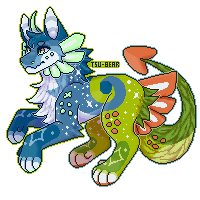
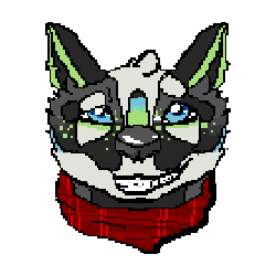
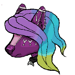
I found a free website that lets you make moving pixel art called piskelapp.com . It’s pretty fun playing around with it and I even made a shopso I could practice without just drawing my oc over and over again and get other people’s ideas for poses/ actions.
that I drew and the second one is my oc Laith. Laith was my first try at it and a lot smaller pixels than the second one I did. I got a bit carried away with the lighten tool. Animation isn’t as smooth either because it’s 3 slides instead of the second one’s 8. I’ve been struggling with Laith’s color pallet recently, specifically the dark blue on her chest, tip of her right ear, base of her left ear, nose and eyebrows. I’d appreciate some feed back on her and the fabric on the other one’s scarf since I don’t draw clothes very often.


Your digital skills are stunning. What program do you use? I’ve always wanted to get one for my computer since I have an art tablet as well. But I keep talking myself out of it since they can get kind of expensive and I’m not an art major. For now I just use chickensmoothie though I haven’t for a while and struggle with clean line work. It’s a bit frustrating when you can draw half decent on paper but digital art is so much harder to get a hang of. It’s like “that’s not what I drew on the paper as reference” XD
@LeHolibomber
Just sketch anything and everything you can. When I was little I used to draw my stuffed animals, then when I got into middle/high school I would carry a giant sketch book everywhere. I practiced by drawing what I and many people struggled with, eyes and noses. So I have full pages of just eyes, noses and lips in a Picasso esk fashion.
I found a free website that lets you make moving pixel art called piskelapp.com . It’s pretty fun playing around with it and I even made a shopso I could practice without just drawing my oc over and over again and get other people’s ideas for poses/ actions.
that I drew and the second one is my oc Laith. Laith was my first try at it and a lot smaller pixels than the second one I did. I got a bit carried away with the lighten tool. Animation isn’t as smooth either because it’s 3 slides instead of the second one’s 8. I’ve been struggling with Laith’s color pallet recently, specifically the dark blue on her chest, tip of her right ear, base of her left ear, nose and eyebrows. I’d appreciate some feed back on her and the fabric on the other one’s scarf since I don’t draw clothes very often.

x
x
x
x
x
x
╔══════════════╗
xx
* id #256165
* Pantry Puffs
* Art shop
* Toyhouse
╚══════════════╝
xxxxart credit*stamp credit

x
x
x
x
x
╔══════════════╗
xx
* id #256165
* Pantry Puffs
* Art shop
* Toyhouse
╚══════════════╝
xxxxart credit*stamp credit
-

Hush - Posts: 7527
- Joined: Sun Oct 02, 2011 4:03 am
- My pets
- My items
- My wishlist
- My gallery
- My scenes
- My dressups
- Trade with me
Re: The Artist Army
![]() by Bastet4 » Fri Mar 23, 2018 3:16 pm
by Bastet4 » Fri Mar 23, 2018 3:16 pm
Hi Artists!!!!!
I need your help and opinions please.
My 10yr old daughter loves to draw (constantly) and has asked for a
Digital Art/Graphics tablet for her birthday.
I know NOTHING about them.
I think ? you also need a computer or laptop to hook them
up to, and sadly all she has is a kindle, and access to my iPad.
There is no way her teen brother is sharing his computer with her.
She's going on 11, and pretty responsible with her electronics,
but a computer to go with a graphic tablet is not in the budget.
Do they all work with a computer/laptop or are there any suggestions out there
on what I should look into? Maybe a good app? Or a stand alone tablet?
Thanks so much guys!! I really appreciate it. ♥️

Click to see hatchery!

Wind Nests available for free!

CS Malk's Dragon Hoarder--Trade your extra Dragons here
CS$ available. (I'm IVICAT on FR!)
-
Bastet4 - Posts: 3434
- Joined: Mon Sep 29, 2008 3:38 pm
- My pets
- My items
- My wishlist
- My gallery
- My scenes
- My dressups
- Trade with me
Who is online
Users browsing this forum: No registered users and 6 guests