
@sahrotaar: Those are very nice! Are you using charcoal for that wolf drawing?
@.mochi: Aww those pixels are adorable, I love your style <3
@shut up,sweetie: The best tip I can suggest to you is to experiment and explore, and most of all just to draw, and to draw a lot. There are a ton of resources online, too, for improving anatomy and such. Here's a masterlist of some that I've been collecting.
I made a quick little linear perspective tutorial, if anyone's interested in taking a look!
The Artist Army
Re: The Artist Army
![]() by emberonis » Sun Aug 27, 2017 10:42 am
by emberonis » Sun Aug 27, 2017 10:42 am
... hey I'm Neel! I'm a preschool teacher by day
... with a background in illustration and graphic design.
... I drop by CS from time to time to doodle, so feel free to
... send me a PM and I'll get back to you when I can!
... with a background in illustration and graphic design.
... I drop by CS from time to time to doodle, so feel free to
... send me a PM and I'll get back to you when I can!

Neel - they/she - cAAAAAAATS
-

emberonis - Posts: 7837
- Joined: Tue Jun 14, 2011 2:47 pm
- My pets
- My items
- My wishlist
- My gallery
- My scenes
- My dressups
- Trade with me
Re: The Artist Army
![]() by Winstalgia » Sun Aug 27, 2017 1:00 pm
by Winstalgia » Sun Aug 27, 2017 1:00 pm
@notifyneelix
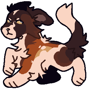
Actually, no. Does it look like I did? *goes to fetch sketchbook* eh, kind of, actually. It does. Speaking of charcoal, I have charcoal pencils and charcoal but I've never used them. I hate the feel of it and the sound of it hitting paper. I tried once but its harder for me. Any tips?
Actually, no. Does it look like I did? *goes to fetch sketchbook* eh, kind of, actually. It does. Speaking of charcoal, I have charcoal pencils and charcoal but I've never used them. I hate the feel of it and the sound of it hitting paper. I tried once but its harder for me. Any tips?

adult
Hi! Call me Rain or Wins! hope all is well.
I love philosophy, paradoxes, and thought
experiments. Fermi paradox is my favorite.
Really avid blink-182 fan! I love their music.
I also really like DnD and fantasy stuff.
Currently working on a visual novel!
"𝖎𝖘 𝖘𝖎𝖑𝖛𝖊𝖗 𝖆𝖓𝖉 𝖌𝖔𝖑𝖉."
-

Winstalgia - Posts: 13113
- Joined: Sat Feb 25, 2017 12:52 pm
- My pets
- My items
- My wishlist
- My gallery
- My scenes
- My dressups
- Trade with me
Re: The Artist Army
![]() by emberonis » Sun Aug 27, 2017 1:11 pm
by emberonis » Sun Aug 27, 2017 1:11 pm
@Sahrotaar: Ahh yeah charcoal can squeak sometimes, it's noooot really a fun noise. I don't know if there are really any good tips for charcoal other than to just... kinda... go with it? It's a pretty forgiving medium because it's easy to erase away and redraw when you make a mistake though (at least, vine charcoal is. Charcoal pencils aren't going to be as easy to erase). I had to do a bunch of charcoal work for my foundation art classes and I was just happy to go back to digital once it was over.
... hey I'm Neel! I'm a preschool teacher by day
... with a background in illustration and graphic design.
... I drop by CS from time to time to doodle, so feel free to
... send me a PM and I'll get back to you when I can!
... with a background in illustration and graphic design.
... I drop by CS from time to time to doodle, so feel free to
... send me a PM and I'll get back to you when I can!
Neel - they/she - cAAAAAAATS
-
emberonis - Posts: 7837
- Joined: Tue Jun 14, 2011 2:47 pm
- My pets
- My items
- My wishlist
- My gallery
- My scenes
- My dressups
- Trade with me
Re: The Artist Army
![]() by nimuulap » Sun Aug 27, 2017 2:14 pm
by nimuulap » Sun Aug 27, 2017 2:14 pm
shut up,sweetie wrote:
hiya.i'm still quite young and after studying animals and plants {which i'm still drawing don't you worry.},I was looking at a game and suddenly felt inspired to try drawing humans,any tips?{for drawing people}
studying plants and animals is a good start! I remember I first got into drawing cats, dogs, wolves and foxes before I decided to try drawing humans again ( ' v ' )b as for tips, there isn't much other than practice and observation. for human anatomy, I made a post about it here with a few guides to anatomy and how to observe real life references (and put them to use). It's a lot about breaking down what you see or what you imagine into shapes and very basic things. It also depends on what style you're going for; cartoon, anime, chibi, realism etc. Every style has its own "rules" and guidelines that help define it.
For styles such as cartoon, anime and chibi, they won't pay too much attention to facial proportions as much as realism.
So in the end, just keep drawing and practicing ( ' 7 ' )
For styles such as cartoon, anime and chibi, they won't pay too much attention to facial proportions as much as realism.
So in the end, just keep drawing and practicing ( ' 7 ' )
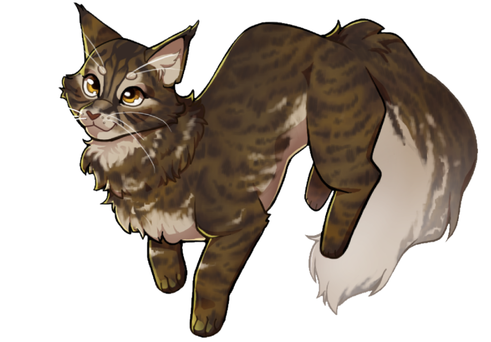
Sahrotaar wrote:Hello! Thought I'd pop in... I'm Sahrotaar (Sah for short-Or Weba) and I love to draw. I've never taken any art class and have been drawing often for at least 4-5 years now. Here are some art examples;
I realize I draw the hearts and designs when I'm down/Depressed otherwise I do animal sketches.
I mainly draw stuff from video games, though.
Anyways, I really need tips for drawing anime. I'm learning it and I have the most trouble with the body (Legs and hands, really speaking).
like I said previously, I made a post here about anatomy and the process of observing references and using them properly ( ' v ' )b if you're trying to draw anything really, doing a bit of research always helps, doesn't matter if it's humans, wolves,
hearts etc. Exposing yourself to a lot of art (e.g. deviantart, following art accounts on instagram, tumblr etc.) will also help boost your creativity and observational skills. The only art classes I've taken before drawing anime were this one art class for little children back in grade 1 (and I quit after a few weeks) and school art classes (where I picked up a few traditional skills). No one ever taught me about anatomy or how to draw the human figure, but it's all just a matter of practice and observation. I also thankfully knew that if you wanted to draw from a reference, the most beneficial way to do it is to break it down into shapes and draw those shapes, compare, measure etc.
Now, looking at your drawing of the wolf, it's a good start, but my suggestion would be again, to break it up into shapes and draw from references first. The more you acknowledge and know how the wolf body works, the easier it will be to draw them without a reference. Know how their paws work, how their head rotates, how their legs bend, the length differences, how big the head is compared to the tail, body, etc. It's a lot of work and it takes a lot of practice, but the more you do, the better it gets ( ' v ' )b
Another suggestion is to expand your value scale. I can tell that the lightest shade and darkest shade are there, but you have to remember that only small portions of a realism drawing (if that's what your going for) are white and completely black. (lightest value and darkest value) Your world seems to be mostly outlined rather than shaded (which is not what you want to do unless you're planning on drawings something cartoony or anime-ish). you also need to find the line that separates the main shadow and the "base colour" like so:

(picture from google images, you can do the same with any object) (try to start with real life objects rather than photos)
even in the image above, the darkest area is only found in one little spot of the entire image and so is the lightest area. When you first start to sketch this drawing, you would first squint your eyes and cover everything that's dark in one shade and gently shade everything that isn't as dark. Then you would later add details in the shadows (like which parts are even darker than dark,
eventually leading up to the darkest in one spot). Remember to compare your shades with other shades and the actual object to see if they match, because you can accidentally (for example) make the shadow on the desk the same shade as the apple (near the light), which isn't supposed to be. Only until the very very very very end, can you add details such as fur. For portfolio prep class,
I was assigned to draw a drawing of a wolf as well, but only a headshot:

(click for bigger version)
at the time, I was very proud of this drawing because my art teacher couldn't say much to it (which means I've met his expectations, something that rarely happens ahaha) but after a while, I can now see a few mistakes here and there. Although the reference he gave me was not a complete sketch (so there's lots of white areas when there shouldn't be), you can still tell that the contrast brings emphasis and makes the object more 3D. It's not shown, but I also first divided the shades into blocks and shaded those blocks before adding fur. It will look more realistic if you shade the appropriate value below the fur first before adding the fur (or else it will all look like one shade of just fur). Smudging also needs to be used precisely and only in places that are needed (which takes experience and practice, so try not to smudge at first). Lastly, I want to point out there's not much of an outline going on. If you want something to look realistic, never make a huge contrast between the outline and the background+object. Ask yourself if the object is lighter or darker than the background, and that changes throughout the object. If the object is darker,
shade that side of the object more. If the background is darker, start from the object and shade outwards into the background.
The last thing you want in a realistic drawing is an outline. As for backgrounds, try not to pay too much attention to them. Shade their general shade but don't add too much contrast or detail in them because that's probably not the main focus of the picture.
Overall, realism/sketching is a lot of work, but there's a lot you can learn from it too. From my first sketch to my first recent,
I've improved a lot, but it's only through tons and tons of practice. With lots of practice and observing, I'm sure you'll get the hang of it too ( ' v ' )b
---------------------------
To add on the topic of charcoal, I've always admired charcoal portraits (my art teacher has a lot of those and they look super realistic but artistic at the same time), so I bought a charcoal pencil the other day. I haven't opened it, but I plan on trying it out soon ;O; I'm assuming it's pretty similar to graphite, just messier;;; But I really can't wait to do dramatic contrasts and portraits like my teacher /////
hearts etc. Exposing yourself to a lot of art (e.g. deviantart, following art accounts on instagram, tumblr etc.) will also help boost your creativity and observational skills. The only art classes I've taken before drawing anime were this one art class for little children back in grade 1 (and I quit after a few weeks) and school art classes (where I picked up a few traditional skills). No one ever taught me about anatomy or how to draw the human figure, but it's all just a matter of practice and observation. I also thankfully knew that if you wanted to draw from a reference, the most beneficial way to do it is to break it down into shapes and draw those shapes, compare, measure etc.
Now, looking at your drawing of the wolf, it's a good start, but my suggestion would be again, to break it up into shapes and draw from references first. The more you acknowledge and know how the wolf body works, the easier it will be to draw them without a reference. Know how their paws work, how their head rotates, how their legs bend, the length differences, how big the head is compared to the tail, body, etc. It's a lot of work and it takes a lot of practice, but the more you do, the better it gets ( ' v ' )b
Another suggestion is to expand your value scale. I can tell that the lightest shade and darkest shade are there, but you have to remember that only small portions of a realism drawing (if that's what your going for) are white and completely black. (lightest value and darkest value) Your world seems to be mostly outlined rather than shaded (which is not what you want to do unless you're planning on drawings something cartoony or anime-ish). you also need to find the line that separates the main shadow and the "base colour" like so:
(picture from google images, you can do the same with any object) (try to start with real life objects rather than photos)
even in the image above, the darkest area is only found in one little spot of the entire image and so is the lightest area. When you first start to sketch this drawing, you would first squint your eyes and cover everything that's dark in one shade and gently shade everything that isn't as dark. Then you would later add details in the shadows (like which parts are even darker than dark,
eventually leading up to the darkest in one spot). Remember to compare your shades with other shades and the actual object to see if they match, because you can accidentally (for example) make the shadow on the desk the same shade as the apple (near the light), which isn't supposed to be. Only until the very very very very end, can you add details such as fur. For portfolio prep class,
I was assigned to draw a drawing of a wolf as well, but only a headshot:

(click for bigger version)
at the time, I was very proud of this drawing because my art teacher couldn't say much to it (which means I've met his expectations, something that rarely happens ahaha) but after a while, I can now see a few mistakes here and there. Although the reference he gave me was not a complete sketch (so there's lots of white areas when there shouldn't be), you can still tell that the contrast brings emphasis and makes the object more 3D. It's not shown, but I also first divided the shades into blocks and shaded those blocks before adding fur. It will look more realistic if you shade the appropriate value below the fur first before adding the fur (or else it will all look like one shade of just fur). Smudging also needs to be used precisely and only in places that are needed (which takes experience and practice, so try not to smudge at first). Lastly, I want to point out there's not much of an outline going on. If you want something to look realistic, never make a huge contrast between the outline and the background+object. Ask yourself if the object is lighter or darker than the background, and that changes throughout the object. If the object is darker,
shade that side of the object more. If the background is darker, start from the object and shade outwards into the background.
The last thing you want in a realistic drawing is an outline. As for backgrounds, try not to pay too much attention to them. Shade their general shade but don't add too much contrast or detail in them because that's probably not the main focus of the picture.
Overall, realism/sketching is a lot of work, but there's a lot you can learn from it too. From my first sketch to my first recent,
I've improved a lot, but it's only through tons and tons of practice. With lots of practice and observing, I'm sure you'll get the hang of it too ( ' v ' )b
---------------------------
To add on the topic of charcoal, I've always admired charcoal portraits (my art teacher has a lot of those and they look super realistic but artistic at the same time), so I bought a charcoal pencil the other day. I haven't opened it, but I plan on trying it out soon ;O; I'm assuming it's pretty similar to graphite, just messier;;; But I really can't wait to do dramatic contrasts and portraits like my teacher /////
┌───────────────┐
│
│
└───────────────┘
│
│
│
M I N - 旻
// visual development / animation //
commission info (closed)
// visual development / animation //
commission info (closed)
│
└───────────────┘
.
││
│
│
xxxxx
.
.
.
.
.
.
.
.
.
.
.
.
.
.
.
.
┌─────────────────────────┐


 x│
x│
│
│
│
│
└─────────────────────────┘
│
│
│
│
│
│
│
│
│
.
x│
│
│
│
└─────────────────────────┘
-
nimuulap - Posts: 3373
- Joined: Fri May 17, 2013 10:07 am
- My pets
- My items
- My wishlist
- My gallery
- My scenes
- My dressups
- Trade with me
Re: The Artist Army
![]() by satuurnity » Mon Aug 28, 2017 1:19 am
by satuurnity » Mon Aug 28, 2017 1:19 am
@Paluumin - that's amazing! c: I love the texture in its ears c:
I was wondering if anyone has any tips for a level art? I'm starting it the week after next along with biology, chemistry and physics so I want to be prepared. I know it'll be a lot of work but I really enjoy it so I want to do the best I can c:
I was wondering if anyone has any tips for a level art? I'm starting it the week after next along with biology, chemistry and physics so I want to be prepared. I know it'll be a lot of work but I really enjoy it so I want to do the best I can c:
-
satuurnity - Posts: 17198
- Joined: Sun Nov 27, 2011 10:41 pm
- My pets
- My items
- My wishlist
- My gallery
- My scenes
- My dressups
- Trade with me
Re: The Artist Army
![]() by Winstalgia » Mon Aug 28, 2017 2:59 am
by Winstalgia » Mon Aug 28, 2017 2:59 am
O.o @paluumin wow! You explained all of that so well it made a lot of sense! Yeah, I have a huge problem with outlining my drawings when I shouldn't be. I went off a picture for the wolf. For most of the years I've been drawing its been cartoon dragons (partially realistic) and doodles. I only got into drawing realistically (attempting to) last year probably? I've also been trying to work with pen better. If I mess up I try something else usually, later coming back to the drawing I messed up one. On mobile so... This is shorter than I want it to be
adult
Hi! Call me Rain or Wins! hope all is well.
I love philosophy, paradoxes, and thought
experiments. Fermi paradox is my favorite.
Really avid blink-182 fan! I love their music.
I also really like DnD and fantasy stuff.
Currently working on a visual novel!
"𝖎𝖘 𝖘𝖎𝖑𝖛𝖊𝖗 𝖆𝖓𝖉 𝖌𝖔𝖑𝖉."
-
Winstalgia - Posts: 13113
- Joined: Sat Feb 25, 2017 12:52 pm
- My pets
- My items
- My wishlist
- My gallery
- My scenes
- My dressups
- Trade with me
Re: The Artist Army
![]() by emberonis » Mon Aug 28, 2017 3:32 am
by emberonis » Mon Aug 28, 2017 3:32 am
@paluumin: In my experience it's not as much like graphite as you'd think. I primarily used vine charcoal (I was in college level drawing 1 and figure/life drawing). It is messier, and also much less controlled, moves around more, etc. It's hard to be precise with vine charcoal, which is a good thing to some extent because it forces you to focus more on general than specific, on the major shapes and values rather than tiny details. Along with being really cheap, that's probably why they use it for life drawing? Having learned how to draw digitally first, I found it really hard to balance more than one tool, so I generally just used the vine charcoal, though charcoal pencils have their place too, generally in adding that detail? It's fun if you're in the right mindset for it, but I found it really difficult to produce finished looking drawings. To be fair though, all traditional art is hard and a little frustrating for me, just because I'm not really fluent in the mediums and can't get the same results that I can get digitally.
You should definitely look into buying a spray fixative so that you can preserve any charcoal drawings you do. If you have access to a spray booth, do it there, if you're at home make sure to go outside or do it in a room with lots of open windows. The fumes can be bad. But in any case, it's very easy to accidentally wipe away hours of work if you don't fix it with something.
We had a day where we did just did portraits instead of the usual full body stuff in Life Drawing. I bet the model was a little less cold, since he got to stay clothed for that. pfft.
- Attachments
-
- bob2.jpg (137.98 KiB) Viewed 125 times
-
- bob.jpg (109.42 KiB) Viewed 125 times
... hey I'm Neel! I'm a preschool teacher by day
... with a background in illustration and graphic design.
... I drop by CS from time to time to doodle, so feel free to
... send me a PM and I'll get back to you when I can!
... with a background in illustration and graphic design.
... I drop by CS from time to time to doodle, so feel free to
... send me a PM and I'll get back to you when I can!
Neel - they/she - cAAAAAAATS
-
emberonis - Posts: 7837
- Joined: Tue Jun 14, 2011 2:47 pm
- My pets
- My items
- My wishlist
- My gallery
- My scenes
- My dressups
- Trade with me
Re: The Artist Army
![]() by crystal gryphon » Tue Oct 10, 2017 2:09 pm
by crystal gryphon » Tue Oct 10, 2017 2:09 pm
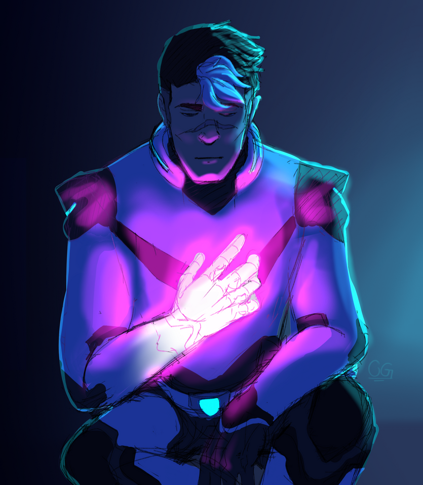
Hey guys! I was hoping to get a little critique on this Voltron fanart I did the other day!
This is a very rough drawing, so I'm mostly looking on advice on anatomy, and maybe lighting and color! (And I am aware that his legs lack shading, and I totally abused the airbrush in this haha)
I'm not very experienced with humans, so anatomy is my main focus right now. I feel like I've gotten faces down for the most part, and hands aren't a problem (oddly enough). But I'm awful at bodies and connecting limbs to said bodies lmao
A redline would be amazing!

-
crystal gryphon - Posts: 1463
- Joined: Mon Oct 12, 2009 2:44 pm
- My pets
- My items
- My wishlist
- My gallery
- My scenes
- My dressups
- Trade with me
Re: The Artist Army
![]() by Bloom & Katt » Sat Oct 28, 2017 8:05 am
by Bloom & Katt » Sat Oct 28, 2017 8:05 am
@Crystal Gryphon: Looks nice! :) I don't have human anatomy completely figured out but I thought you might still want to hear my opinion xD
The face is pretty nice, though I feel like the perspective isn't quite right? If the head is tipped in our direction the face features would be lower. I tried to do some kind of redline, I hope that helps xD
Other than that his right arm is too thick and the arms vary a lot in length even if you take perspective into account.
And the last thing I noticed is his right leg which just doens't make sense to me? xD If it is resting, the leg would be more "bumpy" on the top. If it is in some kind of "kneeling" position, the upper leg would be more bumpy and more "on top" of the lower leg if that makes sense? I don't know if it is pointing more at the viewer or to the side but in both cases the leg would be longer. Maybe drawing the whole person and then cropping the image would help you figure out the pose and anatomy a bit better?
And I'm honestly so jealous of that hand :D I hope this ^^^^^ helped and if you didn't understand something please tell me and I can try to explain a little more :D

After years doing next to no digital art, here's something I finally did today
Critiques are of course welcome! :)

The face is pretty nice, though I feel like the perspective isn't quite right? If the head is tipped in our direction the face features would be lower. I tried to do some kind of redline, I hope that helps xD
Other than that his right arm is too thick and the arms vary a lot in length even if you take perspective into account.
And the last thing I noticed is his right leg which just doens't make sense to me? xD If it is resting, the leg would be more "bumpy" on the top. If it is in some kind of "kneeling" position, the upper leg would be more bumpy and more "on top" of the lower leg if that makes sense? I don't know if it is pointing more at the viewer or to the side but in both cases the leg would be longer. Maybe drawing the whole person and then cropping the image would help you figure out the pose and anatomy a bit better?
And I'm honestly so jealous of that hand :D I hope this ^^^^^ helped and if you didn't understand something please tell me and I can try to explain a little more :D
After years doing next to no digital art, here's something I finally did today
Critiques are of course welcome! :)
Art Shop[/center]
-

Bloom & Katt - Posts: 1824
- Joined: Sun Nov 16, 2008 10:42 pm
- My pets
- My items
- My wishlist
- My gallery
- My scenes
- My dressups
- Trade with me
Re: The Artist Army
![]() by Nightsent » Thu Nov 09, 2017 5:28 pm
by Nightsent » Thu Nov 09, 2017 5:28 pm
notifyneelix : oh I really like your drawing. I’m trying to shape up my human drawings, but my style is a bit too cartoony to draw something realistic like that. I really like the shading, but it seems a bit unrealistic in a few places. I’m not really sure if that’s how you wanted it, it’s just kinda what I noticed :)
crystal gryphon : that hand is so cool! Heh.. sorry. I really struggle at hands, so it’s hard not to make something like that the center of my attention, expecially when it’s so well drawn. The glowing you did makes the art look way cooler than it might’ve been with just the flat coloring, but I think you should soften the lines a little, make it slightly more faded. Might turn out cool, ya know? If that’s not your jam, though, that’s ok. I like strawberry jam myself. (Hehe)
Er anyway I just kinda wanted to show this sketch I did a few days ago... Er if you find it absolutely revoltingly hideous bad or good or what. I dunno. I’m not really sure what i’m trying to ask being here... Oh I just noticed there are eraser shavings on it :/

(Did I do this right? This is my first time posting on this thread, sorry..)
Oh and feel free to ‘Redline’ it or whatever
crystal gryphon : that hand is so cool! Heh.. sorry. I really struggle at hands, so it’s hard not to make something like that the center of my attention, expecially when it’s so well drawn. The glowing you did makes the art look way cooler than it might’ve been with just the flat coloring, but I think you should soften the lines a little, make it slightly more faded. Might turn out cool, ya know? If that’s not your jam, though, that’s ok. I like strawberry jam myself. (Hehe)
Er anyway I just kinda wanted to show this sketch I did a few days ago... Er if you find it absolutely revoltingly hideous bad or good or what. I dunno. I’m not really sure what i’m trying to ask being here... Oh I just noticed there are eraser shavings on it :/
(Did I do this right? This is my first time posting on this thread, sorry..)
Oh and feel free to ‘Redline’ it or whatever
-

Nightsent - Posts: 6600
- Joined: Tue Nov 25, 2014 10:04 am
- My pets
- My items
- My wishlist
- My gallery
- My scenes
- My dressups
- Trade with me
Who is online
Users browsing this forum: No registered users and 9 guests