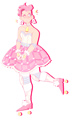
Hi guys! I don't have art of my own to really post right now but I'm going to kick myself in the tail to get stuff done this summer! =D I like to make comments on people's art so I think this is the right place for me.
Feel free to open up a discussion about art (be it personal stuff like motivation or objective things like color theory) with me via PM anytime.
One of my future goals may be to teach art in my upcoming years so this could help me on that matter as well. ^_^
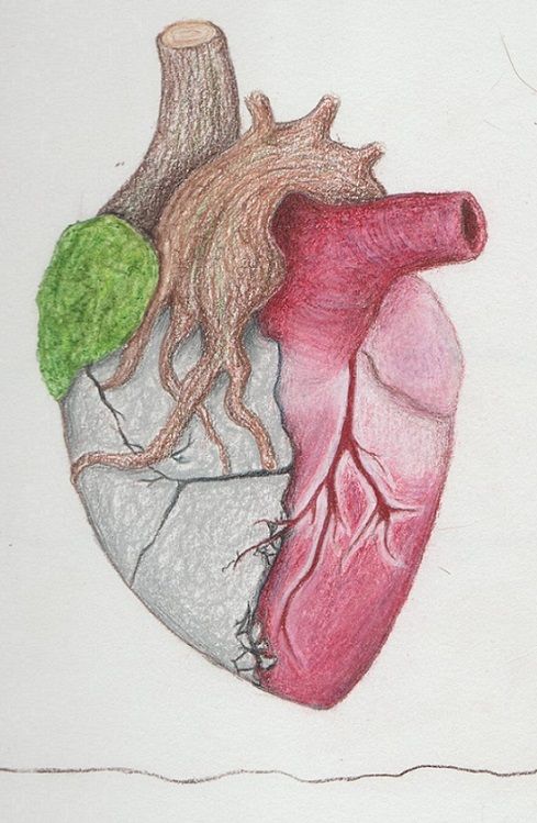
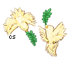
@Rainpelt: Hey there stranger, lol ;D Well I've gotta say, Rainy, I'm so in awe of your concept! Have you ever seen those little rock garden things you like put on your desk or whatever to make you relax or reconnect with nature or whatever? Your artwork, to me, is like an illustration version of that! I find it very charming, usually the idea of a rock composed in a heart would be jarring but yours is so peaceful. It's like the rock is showing that the heart is fortified and durable. Just as your intuition was to not draw anything too busy, I also advise against any busy or complicated background. It throws off the tranquility of the piece. For background matters I'd look into
Eastern Ink Paintings. I say this because in this art style, balance is a huge consideration. The art done in this traditional style most always adheres to the idea that the elements inside the painting must be balanced. I think in your heart drawing you should make sure background elements balance the heart, instead of disrupting the visual harmony. You can read more about balance
here because it is an abstract concept that I will go through too much trouble by trying to explain it all on here. Other than that, just stick to adding details in the leaves and trunk and you're set.
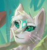
@bethe2003: Glad to see you here looking for some fellow artists! I'm Sola, an artist of all trades but primarily a character animator! (As what could go better with writing speculative fiction?) I love your talent in balancing a realistic cat shape with personality and large, colorful eyes. What I also like is how your lineart and highlights move around the form. Maybe what could improve your artwork's appeal would be if you had a colorful, distinguished source of light. Though your cat has shading and highlights, it doesn't feel like light is really shining on it from a particular direction. Having directional lighting can really make a difference in conveying not only believability of form, but emotion. Next time I suggest you try doing something like shining a lamp or flashlight onto your paper at evening. Seeing how the light from the source falls over the page could give you a reference point of where to place your highlights and shadows to manipulate, enhance, or even dramatize how lighting looks on your cat. That's my advice for specific improvement. For overall improvement, I'd say you need to start practicing fullbody cats, other animals, or backgrounds. Getting out of a comfort zone is always a nice way to improve. P.S. I love the curl of the black markings and the unique way you draw the ears!
@reydiant: Immediately I'm caught by the strong horizontal composition and the spectrum of hues that are so nicely juxtaposed together. The first thing that comes to mind is "fish", mostly because of your dark blue/orange scheme and the fact that watercolors are well... watery? I noticed from the URL this is titled "Resplendence"; very catching! As you say you are going for realism, I think it would be advantageous for you to study how value and light shapes the form. In the most basic description, every form has a highlight, a shadow curving on it, and a cast shadow which it drops onto the ground below it. You have no issue with anatomy or style so I think light and value specific work will be your ticket. Though you strive for realism, I advise you to stay away from tight details. Especially as a watercolorist. You'll want to make believable forms using light manipulation before you make your work more complicated with detailed textures or forms. And simplicity looks beautiful in your hand, so don't shy from it. Best!
@Yunyi: I'm very impressed with your first work. It is such a nice integration of the animal features with the human ones. The smooth transitions in are noticeable in the aesthetic of the features, unifying the piece. The fawning expression and clear blue eyes give me the impression that this character is honest and innocent, almost like an animal which she represents. This gives me a reason to empathize with the character. Your second work also shows off your strength in smooth transitioning. Once again animal features are mixed into human ones, yet this time the combinations is less equal and the figure is more human than animal. Because of this, it reads more as a portrait piece whereas the other read more as a conceptual piece to me. It is well crafted in measurement, color, and value. Next time you settle down to draw I'd suggest working with more uncommon or expressive facial features, facial expressions, or overall poses and see where you can go with a highly dynamic subject. =)


