
I sketched out a design and did a colour test, but I'm thinking the proportions are off and need correcting before I start fixing up the details (also I'm thinking of going lineless but not so sure now). I don't suppose anyone wants to redline? I think it's mostly the arm length and the leg positioning that isn't quite right. Are the legs too small?

Stonefly - For the guy with the mohawk, it looks like the head is sideview with the nose positioning, but the body 3/4 view. Maybe try rendering the head in 3/4 view too? For the girl the hair sketch at the bottom looks pretty cool to me. Sorry I don't have any suggestions for it :c
Mythic - that is a really cool background in the triangle there! I think it'd make a great t-shirt design c:
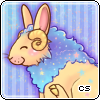
Floofems - Is he going to be fluffy? I would maybe suggest puffing the chest out a bit, it should hide a bit of that far arm if you get what I mean. He looks so sad with the tears and eyebrows like that! Really expressive.
whymp3 - wow those wings are really nice. The front legs look quite shaded by the back legs are a little harder to make out, maybe add a few more shadows there? Not sure how you like to render eyes, but maybe try to make them a little less rounded at the ends or curve the middle one up slightly so it really synergises with the top one? I like the rainbowy character. Have you tried colourlovers for palettes? It's a nice place to look if you decide you want something different.
Encyof - cool animation! Maybe add an extra frame so the drool has 3 stages instead of 2? It looks really neat as it is though.
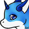
NaosRain - oooh that's really cool. I think you did a great job! I like the gradients you've used on the lineart.
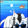
Reydiant - hmm, I like the bottom one the most, I think c:


