
I know many tablets can be orientated for left handed or right handed people. (Me and my boyfriend are different, and I forgot about it after he used it once and everything was flipped for me!) Some are inexpensive (compared to others, what was the bamboo line by wacom was under £100,) so maybe you could try that, also I found a tablet pen was easier to control than a mouse-pad. If you have windows, theres paint.net...it's pretty basic but basically you just have to try stuff and find what works for you, I've been using GIMP for a while and while I can pop out pretty good drawings, they will improve (I need to work on my shading) but they are a lot better than past stuff...
Early digital drawing - before a tablet (2012) : http://monotsleigh.deviantart.com/art/S ... -316679537
Most recent digital drawing (2015): http://monotsleigh.deviantart.com/art/A ... -526680126
The Artist Army
-
meowool - Posts: 6093
- Joined: Fri Oct 23, 2009 7:03 am
- My pets
- My items
- My wishlist
- My gallery
- My scenes
- My dressups
- Trade with me
Re: The Artist Army
![]() by Crazyclaww » Thu May 28, 2015 1:12 pm
by Crazyclaww » Thu May 28, 2015 1:12 pm
@Crystal gryphon
NICE STYLE!
I actually really like the perspective one.
It doesn't look like a huge example for perspective, pretty subtle actually.
But doesn't look weird at all imo, love the leg placement.
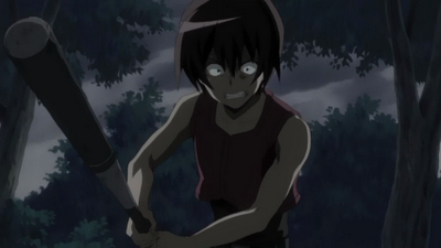
I can offer some help for you on the Batter drawing :b
The general pose is accurate, but doesn't have a lot of power behind it.
To show more power the forearms can be brought up more, taking the bat closer to his head.
Like what this kid's doing! Or right here.
You don't necessarily need to move the bat though.
Like how in this pic the right arm is bent slightly outward and the bat's brought a bit more toward the center.
That would probably fit your drawing pretty well because of how front-facing the batter is!
You can even bend his legs more to show a powerful stance.
Like in that picture of the kid, or here.
But here's a nice little example of not-so-bent legs being used instead.
Sorry to flood with all these pics haha, looking up reference bat pictures helps a lot :^)
Your drawing actually doesn't need tweaked very much, but I couldn't help but drop off all the nice stuff I found.
@Juvia Lockser
Ooo I instantly gotta recommend Paint Tool Sai as a good starting art program, but it isn't free.
I hear a lot of good things about Fire Alpaca, so that's another you could try?
GIMP was hard for me to get used to as well, and once I found something better I improved a lot!
I'm no good at helping with tablet/mouse purchases and left/right handed;
but I did find this really nice mini-guide for using mouse to draw!
Also for anatomy altogether, this is an AMAZING index of tutorials and tips!
Bit of WARNING THOUGH!! There are bits of artistic nudity involved in some tuts.
That whole blog in general is massively useful though.
@mitochondrial eve
THAT is beautiful!
Lovely colour choices and delicate application <3
I can't offer solid help though; I'm bad at facial construction and have no painting skills.
My only bit of advice would be to add some darker purple to the eyebrows, similar to what's in the eyelashes.
--------------------------------------------
Onto my own art issue..
I'm terrible at backgrounds, geometric shapes, buildings, perspective, etc etc.
Even more-so, I'm bad at learning from my own art mistakes.
Would someone please redline the deck thing in this pic?
Advice is helpful as well, tips on the BG are welcome too.

The lines are wobbly, I'll admit to that laziness.
The background was intended to look paintery but eh..
Help me :'U
NICE STYLE!
I actually really like the perspective one.
It doesn't look like a huge example for perspective, pretty subtle actually.
But doesn't look weird at all imo, love the leg placement.
I can offer some help for you on the Batter drawing :b
The general pose is accurate, but doesn't have a lot of power behind it.
To show more power the forearms can be brought up more, taking the bat closer to his head.
Like what this kid's doing! Or right here.
You don't necessarily need to move the bat though.
Like how in this pic the right arm is bent slightly outward and the bat's brought a bit more toward the center.
That would probably fit your drawing pretty well because of how front-facing the batter is!
You can even bend his legs more to show a powerful stance.
Like in that picture of the kid, or here.
But here's a nice little example of not-so-bent legs being used instead.
Sorry to flood with all these pics haha, looking up reference bat pictures helps a lot :^)
Your drawing actually doesn't need tweaked very much, but I couldn't help but drop off all the nice stuff I found.
@Juvia Lockser
Ooo I instantly gotta recommend Paint Tool Sai as a good starting art program, but it isn't free.
I hear a lot of good things about Fire Alpaca, so that's another you could try?
GIMP was hard for me to get used to as well, and once I found something better I improved a lot!
I'm no good at helping with tablet/mouse purchases and left/right handed;
but I did find this really nice mini-guide for using mouse to draw!
Also for anatomy altogether, this is an AMAZING index of tutorials and tips!
Bit of WARNING THOUGH!! There are bits of artistic nudity involved in some tuts.
That whole blog in general is massively useful though.
@mitochondrial eve
THAT is beautiful!
Lovely colour choices and delicate application <3
I can't offer solid help though; I'm bad at facial construction and have no painting skills.
My only bit of advice would be to add some darker purple to the eyebrows, similar to what's in the eyelashes.
--------------------------------------------
Onto my own art issue..
I'm terrible at backgrounds, geometric shapes, buildings, perspective, etc etc.
Even more-so, I'm bad at learning from my own art mistakes.
Would someone please redline the deck thing in this pic?
Advice is helpful as well, tips on the BG are welcome too.
The lines are wobbly, I'll admit to that laziness.
The background was intended to look paintery but eh..
Help me :'U
Last edited by Crazyclaww on Thu May 28, 2015 2:13 pm, edited 1 time in total.


-

Crazyclaww - Posts: 5839
- Joined: Mon Apr 02, 2012 10:03 am
- My pets
- My items
- My wishlist
- My gallery
- My scenes
- My dressups
- Trade with me
Re: The Artist Army
![]() by crystal gryphon » Thu May 28, 2015 1:43 pm
by crystal gryphon » Thu May 28, 2015 1:43 pm
Crazyclaw+ wrote:@Crystal gryphon
-snip-
Thank you! This helps a lot. Yeah, the last two pics are more of what I was going for, but I couldn't get his arms right and ended up lowering them. I really should use references more haha

-
crystal gryphon - Posts: 1463
- Joined: Mon Oct 12, 2009 2:44 pm
- My pets
- My items
- My wishlist
- My gallery
- My scenes
- My dressups
- Trade with me
Re: The Artist Army
![]() by Crazyclaww » Thu May 28, 2015 2:15 pm
by Crazyclaww » Thu May 28, 2015 2:15 pm
Oh man, same here!
I replaced the picture by the way, hope it works now :0
Thanks for letting me know.
I replaced the picture by the way, hope it works now :0
Thanks for letting me know.
-
Crazyclaww - Posts: 5839
- Joined: Mon Apr 02, 2012 10:03 am
- My pets
- My items
- My wishlist
- My gallery
- My scenes
- My dressups
- Trade with me
Re: The Artist Army
![]() by crystal gryphon » Thu May 28, 2015 2:43 pm
by crystal gryphon » Thu May 28, 2015 2:43 pm
Crazyclaw+ wrote:Oh man, same here!
I replaced the picture by the way, hope it works now :0
Thanks for letting me know.
Its there now! I cant find much to fix, (You're WAY better at scenery than i am) But the blur in some spots seems a bit overdone, especially in the mountains. Maybe try using solid strokes and sort of block in the colors (lighting and all), then blend it together.
It should turn out a bit like this (but less lazy and more detailed lmao, i took like 5 minutes on this):

-
crystal gryphon - Posts: 1463
- Joined: Mon Oct 12, 2009 2:44 pm
- My pets
- My items
- My wishlist
- My gallery
- My scenes
- My dressups
- Trade with me
Re: The Artist Army
![]() by KogasBabyGirl » Thu May 28, 2015 2:49 pm
by KogasBabyGirl » Thu May 28, 2015 2:49 pm

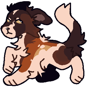
Just finished this up its a Dog Griffin First Background to do on Chicken Smoothie. Looking for any tips that would be Helpful
Crazyclaw+ wrote:Onto my own art issue..
I'm terrible at backgrounds, geometric shapes, buildings, perspective, etc etc.
Even more-so, I'm bad at learning from my own art mistakes.
Would someone please redline the deck thing in this pic?
Advice is helpful as well, tips on the BG are welcome too.
The lines are wobbly, I'll admit to that laziness.
The background was intended to look paintery but eh..
Help me :'U[/center][/color]
Im Not Much help in Backgrounds and stuff but Your style i must say is Very Lovely

╒═══════════════════╕
If you need anyone to talk to feel free
to message me. Im here to listen!
C$ shop | ArtFight | My Ocs | Rares 4 Art
╘═══════════════════╛
-

KogasBabyGirl - Posts: 7734
- Joined: Sat Mar 07, 2009 2:28 pm
- My pets
- My items
- My wishlist
- My gallery
- My scenes
- My dressups
- Trade with me
Re: The Artist Army
![]() by meowool » Thu May 28, 2015 8:41 pm
by meowool » Thu May 28, 2015 8:41 pm
Adding onto that I love how you colour and also the water where it's splashing up!

.jpg)
.jpg)


-
meowool - Posts: 6093
- Joined: Fri Oct 23, 2009 7:03 am
- My pets
- My items
- My wishlist
- My gallery
- My scenes
- My dressups
- Trade with me
Re: The Artist Army
![]() by CaptiveLegacy » Fri May 29, 2015 4:22 am
by CaptiveLegacy » Fri May 29, 2015 4:22 am
@Crystal gryphon
I really like the poses! I don't see anything wrong with it, though then again i'm not the best at poses at all.
It all looks good to me in my opinion! Can't wait to see more of it finished!
@Juvia Lockser
I recommend giving paint tool sai a try! Ever since I started using it, ive drastically improved. Its my favorite program!
I think you can do a thirty day trial to see if you like it!
Also, I used to have the same problem since I am left handed. I bought a pretty good tablet (Bamboo Wacom Tablet), and it fixed the problem with awkwardly using a mouse.
@Crazyclaw+
Oh I love it! I really like the scene, its very full of life and movement from the way you draw it. Though, the background is a tad bit too blurry, but still good! I'd do what Crystal gryphon recommended, I think that'll do the trick!
@KogasBabyGirl
I think the background in the sky needs more depth and colors. The sky feels all one red color, and the clouds seem too thick. Maybe make the clouds more soft looking? like blur them out a bit so it looks like they fade?
-------------------------------------------------------
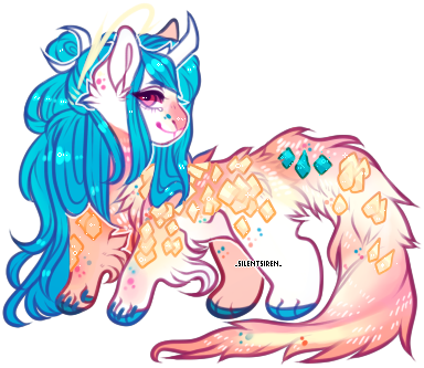
PHEW! I drew this a little bit ago, and I love how it turned out!
Its was my third or so time drawing anything remotely anthro like, and I drew it in celebration of summer and bikini weather!

I really like the poses! I don't see anything wrong with it, though then again i'm not the best at poses at all.
It all looks good to me in my opinion! Can't wait to see more of it finished!
@Juvia Lockser
I recommend giving paint tool sai a try! Ever since I started using it, ive drastically improved. Its my favorite program!
I think you can do a thirty day trial to see if you like it!
Also, I used to have the same problem since I am left handed. I bought a pretty good tablet (Bamboo Wacom Tablet), and it fixed the problem with awkwardly using a mouse.
@Crazyclaw+
Oh I love it! I really like the scene, its very full of life and movement from the way you draw it. Though, the background is a tad bit too blurry, but still good! I'd do what Crystal gryphon recommended, I think that'll do the trick!
@KogasBabyGirl
I think the background in the sky needs more depth and colors. The sky feels all one red color, and the clouds seem too thick. Maybe make the clouds more soft looking? like blur them out a bit so it looks like they fade?
-------------------------------------------------------
PHEW! I drew this a little bit ago, and I love how it turned out!
Its was my third or so time drawing anything remotely anthro like, and I drew it in celebration of summer and bikini weather!
--------------------------
hello! feel free to drop a pm if you want
to chat or have any questions, and if I haven't
responded please don't mind sending
me a reminder ✉ !!
myo's : ask
⚘ kalon site ⚘
--------------------------
avatar by yoonbit
signature art by _silentsiren_
-

CaptiveLegacy - Posts: 17648
- Joined: Sun Sep 20, 2009 10:44 am
- My pets
- My items
- My wishlist
- My gallery
- My scenes
- My dressups
- Trade with me
Re: The Artist Army
![]() by serendipity- » Fri May 29, 2015 4:56 am
by serendipity- » Fri May 29, 2015 4:56 am
Hello!  I'm not digital artist AT ALL
  , so can traditional art specialists be a part of things?
-

serendipity- - Posts: 7322
- Joined: Tue Jul 16, 2013 8:53 am
- My pets
- My items
- My wishlist
- My gallery
- My scenes
- My dressups
- Trade with me
Re: The Artist Army
![]() by emberonis » Fri May 29, 2015 7:28 am
by emberonis » Fri May 29, 2015 7:28 am
serendipity. wrote:Hello! :D I'm not digital artist AT ALL :oops: , so can traditional art specialists be a part of things?
Sure thing! Any artist can join. ouo
@carrie911: Ahh it's beautiful as always. I love your art, and your anatomy is great.
@KogasBabyGirl: I don't know that I have any tips to give you, I'm not very good with backgrounds, but I would agree with Carrie about the sky. Often the sky has more than one color, or at least more than one shade. (often starting light near the horizon and getting darker the further up.) It's a great start though! I look forward to seeing your future work <3 I really like the design of the gryphon.
Also! I wanted to share with you guys this program I found. Or rather, my friend Shire found it and linked me to it. It's a new digital painting program called Paintstorm Studio. Like... it just came out early this year, so it has a few issues but so far everything seems to be developing quickly and the brush engine is great. I have no doubt that given enough time it'll even greater than it already is. Also I love all the textures you can get in it. ANYWAYS. It's not free, but at the moment it's only 20 USD. which is amazingly cheap?
And I'm not like... affiliated with the program at all, btw, I just really like it and wanted to share it with any interested parties x3
... hey I'm Neel! I'm a preschool teacher by day
... with a background in illustration and graphic design.
... I drop by CS from time to time to doodle, so feel free to
... send me a PM and I'll get back to you when I can!
... with a background in illustration and graphic design.
... I drop by CS from time to time to doodle, so feel free to
... send me a PM and I'll get back to you when I can!

Neel - they/she - cAAAAAAATS
-

emberonis - Posts: 7837
- Joined: Tue Jun 14, 2011 2:47 pm
- My pets
- My items
- My wishlist
- My gallery
- My scenes
- My dressups
- Trade with me
Who is online
Users browsing this forum: No registered users and 8 guests