The Artist Army

Join or create fan clubs about your favorite things!

Re: The Artist Army

Postby Crazyclaww » Sun Mar 15, 2015 1:43 am

@gwanu
That looks amazing man!!
Don't sell yourself short, you did a lot of lovely texturing
and managed to successfully use a dark palette without anything looking dull.
All I'd say is remember to look at reference pictures and maybe some tutorials, there's tons of great info there.

@ Soteria
Adorable!
I love that even though the pose is a dynamic one,
you still managed to express a gentle demeanor~
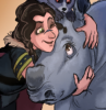
@orion.
AYE that's really cool :'0
If anything I say you could darken some of the background a bit.
Make the creature's shape and glows POP even more <3
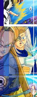
@yami.
Ciriun said it well :b
But I want to compliment the drawing's composition;
I really like the way you've placed the character.
All the anatomical proportions seem spot-on, and the emotion's well expressed c:
Maybe add some other colours in the sky/bg?
I know in a lot of space-y pictures the colours can morph into all sorta of dark purples and blues!
Just a small idea though I'm not sure if it'd muddy stuff up or not.

----------AHK now for my pic

Image

I almost didn't post the darn thing on DA cause I was so bugged about this.
That darn back-paw that's facing the viewer! (our right, her left)
I couldn't figure out a decent shape/angle for it that didn't look horribly deformed.
That's the best I could get it without full-on starting over on the leg.
Any red-lines or redraws would be very helpful.
ImageImageImage
I'm Crazyclaww!
DMs and trades are always open <3
(check out my art stuff!)
ImageImageImage
ImageImageImage
User avatar
Crazyclaww
 
Posts: 5839
Joined: Mon Apr 02, 2012 10:03 am
My pets
My items
My wishlist
My gallery
My scenes
My dressups
Trade with me

Re: The Artist Army

Postby A.K.A Raptor » Sun Mar 15, 2015 6:06 pm

Street Soldier@ I did a little redline for you So far, not bad. I suggest refrencing as much as you can also, rah-bop made a really usefull wing turtorial right here Also, in your drawing the head is currently bigger than the body, while it should be smaller. Remember, Creatures with wings have to have massive chest mussles so most will have big chests compaired to their head.
Salt@ I had just liked a nose tutorial a little while ago, so here's the link Overall, very good drawing. I can't see anything wrong with it.
Soteria@
Looks great! The only thing is I can't really tell apart the back legs from each other but it's still really good!
Orion@ So I don't know much about deer, but it looks great. I like the flowy tail.
Yami@ I think you might've forgoten to shade the lower "box" on the tardis, but otherwise looks really good.
Crazyclaw+@ I really love that drawing! Truthfully, I didn't even notice the paw thing at first.
Very sorry for not being able to give very good advice, but I just don't know much about those topics.


So For the last day I've been working on a short animation of my crane character jumping. Now I'm stuck at a point of what to fix next. Any help at all would be helpful.
ImageImage
I'm an old player from back in 2010 and really just on here to look for art
If you like any of the pets I have that are only uncommon/common if you send me a pun I'll almost certainly give them to you for free :)

Hey friends check out my adopts here : )
Ps- If i ever had any beef with any of you i am so, so sorry i was an arrogant jerk of a child who threw a fit whenever I didn't get my way
User avatar
A.K.A Raptor
 
Posts: 12368
Joined: Sun Nov 21, 2010 4:06 am
My pets
My items
My wishlist
My gallery
My scenes
My dressups
Trade with me

Re: The Artist Army

Postby EmberWolf » Sun Mar 15, 2015 6:29 pm

@yami.- oh gosh that looks so good! your anatomy is like, spot on but theres still a definite style to it that looks amazing. so so great

@Crazyclaw+- I absolutely love your shading, and your style in general. it looks amazing. i guess the only thing i could maybe recommend is to tilt the paw in the opposite direction of the other one?? i dunno tho. it looks great as is in my opinion but perhaps it might look better to you if you tilt it further right (her left), which would probably also make it easier to cover up any other spots of the leg you might not care for (cheaty cheats), but really like i said... already looks great in my opinion, thats the only thing i could think of.

@ A.K.A Raptor- looking like a really solid concept so far, one thing I would suggest is maybe a few frames before the jump, have the crane lower itself down and bend its knees in preparation to spring. since it needs to gain some upward momentum going into the jump, just suddenly going up looks a little weird, it needs the coil before springing up and it might look a bit more natural and fluid then. would probably look sort of like, bending further to spring, legs straighten out almost entirely and then bend a bit in preparation to land, instead of bending throughout and only being straight-ish when the crane is grounded. And generally with something like this, the upwards action is fast, there is a few extra frames of idle in the air, and then the downward action is fast again, so less frames in those and more frames in the very peak of the jump, instead of consistent. Additionally, to make it loop nice, the impact the body's graviy will give on the legs would make them bend a bit to absorb the shock when the crane lands, and again, would probably flow decently well into the legs bending to spring. Otherwise, really awesome so far! Animation is one of my most favorite and least favorite things to work on. can look great in the end but really hard to get there and look good, flow nicely, and you know... all the time it takes to draw it out, so props to you!
Image
G.B.
"hi, i'm G.B., one of Ember's real life cats.
just so you know, Ember is always looking for
missed monthlies on her wishlist.
feel free to shoot her a trade!
Image
Rosie
"hey, i'm Ember's other cat, Rosie.
if you're wondering, Ember's PM's are always
open if you have other questions or
just want to chat. she does not
take commissions anymore.
"

she/her | adult | full-time artist

Image
Koda

User avatar
EmberWolf
 
Posts: 10975
Joined: Sun Nov 23, 2008 5:20 pm
My pets
My items
My wishlist
My gallery
My scenes
My dressups
Trade with me

Re: The Artist Army

Postby PFDC » Mon Mar 16, 2015 2:06 am

A.K.A Raptor: it seems very unnatural. A cute animation and I know it isn't easy to do, but can cranes even hop? To make it more natural, maybe have him flap his wings so it looks like he's being lifted a little off of the ground, instead of hopping. That would make the motion more natural

Crazyclaw+ I think the only problem is that the closest back paw to the "camera" could be stretched out a little, and the pawpads should be shaded. That's the only problem, it's very well done!!!!

Yami: awesome!!!!!!! The only thing is his feet are a little to big!!! That's it though I love his expression!

Orion. The butt looks funny, like the Galaxy shouldn't be outlined in black, so it doesn't look lie part of the body. Other than that really pretty!


Okay I have some stuff

Image


Image
I know the lines are thick but this is an older piece and my lines are thinner now

This one ONLY comment on the shading. The pose was from here: http://ipoophere.tumblr.com/post/107092 ... if-u-wanna
Image
Ps the black guys hair starts dark green then gradients to to bright green, so shading that was harder lol

Also what do you guys think of lithographs like http://sta.sh/2pt3fw9lba9?edit=1 ?

And my new species
Image
Last edited by PFDC on Mon Mar 16, 2015 12:01 pm, edited 1 time in total.
Leaving CS
User avatar
PFDC
 
Posts: 10047
Joined: Thu Oct 07, 2010 10:41 am
My pets
My items
My wishlist
My gallery
My scenes
My dressups
Trade with me

Re: The Artist Army

Postby Zoker » Mon Mar 16, 2015 4:45 am

@PFDC : I can tell you the shading is brilliant. Its very detailed and intricate especially the muscles. The hair shading seems fine too. But one thing is kinda bothering me. Where is the light source in this art piece, is it from the top? Your shading of the body says the light is from above but if it we so, the green hair too would have been illuminated more on the top. Because, I don't know, to my eyes only for the green hair the light seems to be coming from the side.
As for the lithographs : Love them! They look so neat! C:
And as for the species, the hind legs look sorta wrong to me. But you might want to get more expert opinion on that one as I can't pinpoint how it exactly looks wrong.

@A.K.A Raptor : It looks a bit weird to me. Why is the ground moving? Or is it a big leaf or sponge? Because if it is solid ground it shouldn't move like that.

@Crazyclaw+ : A very beautiful piece! I didn't really notice the paw thing so I don't think its a big issue.The colors look so grand and the shading is very attractive. Good work!

@yami. : Love the artwork! The background is beautiful and the character and his anatomy is spot on. I especially loved how you did the smoke. Maybe the police box could have used a bit more shading? Its a little thing so don't worry about it much though.

@orion.: Very majestic! The only thing I could say about it is maybe a bit more work on the background would have looked nice? Sparkling it up a bit or just in general shading or using gradient.


Alright, so this is just a quick messy sketch. I was very lazy with the hair as I have never drawn hair like this. My question is, for a sketch does it look anatomically correct or is anything out of place?
Image
Image
Pet's name: ♥~Nocte~♥
[ Hell is empty and all the devils are here ]

My Deersserts.
My "Supernatural" Characters (Human).
My Quad and Other Characters
Image
Pet's name: ♥ Ƶισ ♥

( TokioHotel_alien is my little sister )
-------------------------------------------------------------------------------------------------------------------------------------
" History theirs whose language is the sun. "
- Stephen Spender
User avatar
Zoker
 
Posts: 3510
Joined: Fri Sep 16, 2011 3:41 am
My pets
My items
My wishlist
My gallery
My scenes
My dressups
Trade with me

Re: The Artist Army

Postby EmberWolf » Mon Mar 16, 2015 5:15 am

@PFDC- for your species, the paws look a little "floaty," which I'm not sure was intentional or not. But if you want to make the illusion they are on solid ground you'll have to have them bend enough and be almost entirely flat on the very bottom to give that effect, and also have them all on the same plane of dimension, because they look a bit skewed and wobbly right now. Otherwise, the anatomy looks good and the fur is a bit sharp looking which I assume was intentional or stylistic, and it looks like an interesting species concept in general.

@Zoker- I think AKA Raptors moving ground is just because it's a messy sketch, and in the final piece I assume they'll have a solid unmoving ground or none at all, but for now the purpose is just a base :)
As for your art-
Your sketch looks nice, but I might suggest changing the shoulders a bit for more anatomical correctness. The join of the neck and shoulder isnt a strict right angle, there's a less harshly angled slope first. If you look at this ref image >> http://thumbs.dreamstime.com/t/woman-s- ... 530355.jpg
you can kind of see its like, the neck, a big triangle at the base (with the lines of the collar bones for the bottom of the triangle), and then the straight-out shoulders at the corners of the triangle. I outlined it to maybe help >> http://i.imgur.com/ew0jZzZ.png
Image
G.B.
"hi, i'm G.B., one of Ember's real life cats.
just so you know, Ember is always looking for
missed monthlies on her wishlist.
feel free to shoot her a trade!
Image
Rosie
"hey, i'm Ember's other cat, Rosie.
if you're wondering, Ember's PM's are always
open if you have other questions or
just want to chat. she does not
take commissions anymore.
"

she/her | adult | full-time artist

Image
Koda

User avatar
EmberWolf
 
Posts: 10975
Joined: Sun Nov 23, 2008 5:20 pm
My pets
My items
My wishlist
My gallery
My scenes
My dressups
Trade with me

Re: The Artist Army

Postby Silverhart » Mon Mar 16, 2015 3:12 pm

I figured I'd share this with my fellow artists, as it's fun to watch, and has taught me so much.


He posts tons of fantastic video art tips, and I simply love watching his time lapse paintings. I'm always astonished by how simple his sketches start out, and watching how they evolve and come alive. It's both humbling, and inspiring to be reminded of how simple the principles of art are. Sometimes I feel we artists who are still learning get a little too caught up in all the fancy stuff, and we lose sight of the foundation of a good piece. ^^

I would critique some of these awesome pieces here, but honestly, I think everything I would've said has already been said. XD
Image
User avatar
Silverhart
 
Posts: 2603
Joined: Tue Nov 03, 2009 9:21 am
My pets
My items
My wishlist
My gallery
My scenes
My dressups
Trade with me

Re: The Artist Army

Postby Zoker » Thu Mar 19, 2015 7:23 pm

@EmberWolf : Thank you so much, that was really helpful. I always mess up the shoulders!
Now that I see it the way I drew her, looks like she is shrugging. I will change it as soon as I can get back to it.

On a side note,I just finish a colored sketch of my character Zeke, any thoughts on those?
Image
Image
Pet's name: ♥~Nocte~♥
[ Hell is empty and all the devils are here ]

My Deersserts.
My "Supernatural" Characters (Human).
My Quad and Other Characters
Image
Pet's name: ♥ Ƶισ ♥

( TokioHotel_alien is my little sister )
-------------------------------------------------------------------------------------------------------------------------------------
" History theirs whose language is the sun. "
- Stephen Spender
User avatar
Zoker
 
Posts: 3510
Joined: Fri Sep 16, 2011 3:41 am
My pets
My items
My wishlist
My gallery
My scenes
My dressups
Trade with me

Re: The Artist Army

Postby Utterly. » Sat Mar 21, 2015 9:11 am

Hi guys!I've never posted before,but this thread has always helped me a lot since I stalk it ^^.
I wanted some advice and critiques on this piece here. This is actually the first piece of digital art I've ever done, so any tips would be appreciated very much! I'm just now paying some attention to my Wacom Bamboo Tablet after about 4 years of having it and want to get more into digital art.
Image
I wasn't really going for lineless, but I have a hard time doing lined artwork/giving a sketch figure after drawing it up and ended up erasing every line afterwards. Do you guys usually start with thin lines or thick lines?


@PFDC -
I really like your art style!The only thing I have to say is that the head structure of your species is a bit off.The forehead should be just a bit more defined from the snout.And the bottom line of the jaw a little sharper.This might help a little with the head shape. But that's it. It's a very interesting species to look c:.

@Zoker-
I don't see anything wrong with your sketch.Looks great ^^!~

@CrazyClaw+-
That's amazing!I didn't notice the backpaw until I read your comment. It looks natural c:.
User avatar
Utterly.
 
Posts: 17269
Joined: Thu Jun 30, 2011 2:49 pm
My pets
My items
My wishlist
My gallery
My scenes
My dressups
Trade with me

Re: The Artist Army

Postby gwanu » Sat Mar 21, 2015 9:25 am

@Utterly.
I quite like the style of the drawing, it looks slightly messy which in certain situations looks quite nice. I'm not sure if that's what you intended. Critique part and improvement - Improvement needs to be done to the eyes, they look extremely unnatural for that style and for that matter most other. What I suggest is first of laying down a base colour, using burn and lighten create some detail to it and after that you can literally play with layers, I mostly suggest overlay for a glowy effect if that is what you want with your eyes. Second of all, the colours are not blended well, and using the smudge tool you could get a much better finish on the skin. The lines are very thick and it doesn't look too appealing, so either soften them out, make them thinner or eliminate them. That is completely up to you. Also, when doing the leaves use pictures as a reference. With the smudge tool, a brush and some layers you can create a very nice effect whilst still sticking to the theme of your drawing.

And to answer your question, if doing a no lines drawing I will very often do a small sketch as a first layer. The first layer of colour will go on top with a separate layer and lowered opacity so I can get the shape right. From that point on I will mostly Add up onto the faded layer of colour until I'm happy with it. Then I put it on full opacity and that's basically it, of course fixes and other things go after. Layers are extremely important.

- - - - - - -

After a few weeks of not using my drawing tablet due to many issues regarding my personal life I have gotten unpleasant news when I tried to plug it in. It was not working and at this moment still isn't. I've tried shifting around the cable and that only creates a blinking blue light which fades to nothing after, the tablet is not useable during the blinking light period either. I own a wacom bamboo and have had it for around 2 or more years I think. I am shifting between other options that I could maybe buy as a replacement that would suit 2+ years of digital art experience. Could you guys tell me which tablet would be best to choose? I've been thinking about the intuos, but I'm not sure.
Image
Image
xxxxxxxxxxxxxxxxxxx
Greetings, I happen to be the
mad knight and you've
stumbled upon my profile.

xxxxxxxxxxxxxxxxxxx
Image
female • INTP • eru
Most call me Gwanu.
I love fictional characters.
I'm a rather nice person.

________________________
maki ari noya
Image
Image
Image
User avatar
gwanu
 
Posts: 3335
Joined: Thu Nov 07, 2013 8:48 am
My pets
My items
My wishlist
My gallery
My scenes
My dressups
Trade with me

Who is online

Users browsing this forum: No registered users and 16 guests