The Artist Army

Join or create fan clubs about your favorite things!

Re: The Artist Army

Postby PFDC » Mon Jul 07, 2014 5:14 am

Macgyver: the digital needs more definition to it. More shading and highlight with fur detailing will really make it pop!
Acethekidd: he's short a finger And he has no pelvis. I'd ad more booty and a finger. That's it really it's super well done
SolarDæmon: I'll PM you a redline when I can finish and upload it ^^

Katstiel: darker shading and a BG of some sort ^^

Shasha~Chibi: from what I know of the show, very good I don't see anything to be changed!

Ciriun: add more detail to the shading to help you ^^ shade between each scale and highlight the tops of them

Tanetane: don't change a darn thing

Yuki: if you're scanning it in get a blue pencil made so it doesn't show up when scanned. Then you can sketch with that and line witha thin marker or even a pencil. And it really cleans up your work ^^


Crits on these WIP of characters? Redlines welcome. Both design and anatomy crits a great!
Plant dude that turns into that dragon when he takes off his bracelet. Ignore black spot on right side of face
Image
Bat dude. The buckles hold his clothes together since they can't go through his bat wings
Image
Leaving CS
User avatar
PFDC
 
Posts: 10047
Joined: Thu Oct 07, 2010 10:41 am
My pets
My items
My wishlist
My gallery
My scenes
My dressups
Trade with me

Re: The Artist Army

Postby honeydont » Tue Jul 08, 2014 3:55 pm

i didn't know this thread existed i'm probs gonna chill here because wow artists ✿◕ ‿ ◕✿

PFDC; i really love the bat guy {especially w/the thought of the buckles!} and mmm those wings are nice. bat wings are a personal demon of mine ironically my fursona's a bat but they look so good! the only crit i have really is that in the first picture the dragon's hind legs seem a bit off; it looks like there's one too man joints {unless, of course, that's what you were going for in which case ✔} and the plant man's shoulder-to-waist ratio seems off as well. i think his shoulders are just a tinch too wide and one of his legs seems shorter than the other. loving the designs though!


Yuki. wrote:
Ace the kid, thats cute! Really cool! The only major thing that stands out to me is his hand. The fingernails seem too large and his hand just kind of has a straight line to the sleeve. Other than that I love the design and the pixels <3


So I have an issue. I cant really draw digitally, but I can traditionally. However, it becomes a huge problem getting that finished traditional piece turned into something digital that i can send commissioners. I kind of stopped my art shop because i was afraid the quality was low. Does anyone have any idea how to get that clear picture. Like its not so much when i ink, but when i commission sketches i tend to sketch lighter and i have some parts that barely show up so i will have to darken it but the it darkens spots on the paper and the whole thing turns into a mess. Does anyone have any tips? Thanks!
~Yuki


hmm maybe try using a pencil with softer lead? those run darker. i'm not sure what you're using to sketch but if it's pencils {and mechanical ones at that} your problem is probs that the lead isn't softer enough. you say you sketch light so i don't want to say 'well just draw harder' so try softer leads {like b grades!} and see if that helps. c:

also hmmmmmmm can i maybe ask for critique on this? it's the last major piece is did and even though the background's crap {and i'm not too keen on the highlights either ughugh} i think the anatomy is decent {except for fitz on the left, i'm not sure what happened there} so other opinions please ´・◡・`

Image
Image


🍓 david // he/they // adult
🍓 art shop
🍓 icon art
🍓 sig art @ me


User avatar
honeydont
 
Posts: 6244
Joined: Thu Nov 20, 2008 3:03 pm
My pets
My items
My wishlist
My gallery
My scenes
My dressups
Trade with me

Re: The Artist Army

Postby Bast » Sun Jul 13, 2014 2:04 pm

Solar Daemon:
On Lightning Protector, if you where going for an angle from underneath then that looks good. If not then the head looks too small and the legs to thick and long.
On your Nekoi entry, I'm not very good with felines or canines but the right front paw looks a little to twisted. I could be wrong on that.

katstiel:
I'd suggest maybe bringing out the chest a bit more. It looks like a bobble head figure. :lol:

MacGyver:
I can't really help you with that, sorry. I hope it goes well though.

Sasha~Chibi:
They look pretty good for simple work although you could practice more on cleaning the lines a little. I see where your meeting points are.

cirium:
They look good. Maybe make the scale lines a bit darker, that should show them more. And the lighting is ok but, like the scales, make the shading a little darker or make a third part lighter at the top to indicate better lighting.

Tanetane:
Since it's your interpretation of the subject then that piece looks great. The white noise fits in it, it's not to much nor to little. I don't see anything wrong with it.

Yuki.:
I see what you mean as I had that same problem. One thing that I would suggest is taking the picture under a window in the middle of the day so you get the best lighting possible. I found that using natural sunlight helps pop out your pencil lines better. This also depends on the type of camera your using but none the less it should help some.

PFDC:
On "Bat Dude", pop out the mouth just a tad. It looks a little flat. I'd say use anime stock to study the facial structure that others imply, maybe even practice on some.

Yami Baishi:
Not very good with people but they look ok. Maybe tone down the girl's arm as it looks a little masculine, just lower the opacity of the muscle toning.


I need a redline for my piece on his arms and where the wings would go. I'm not very good with limbs and positioning. Nothing fancy, if anything a skeletal structure of where they go. Thanks to whoever helps me out here. Link:
http://saamura.deviantart.com/art/Requi ... 1405214857
Credits:
Plushie made by Cerestes
Pixel by lunamoth19
Avatar Base by BronzeHalo
~~~~~~~~~~~~~~~
Saamura is my character so
DO NOT steal her.


Prayer to the lost soul:
By the blood of our ancestors,
The breath of the present,
And the will of the future,
In the name of the holy trinity
I pray for your soul
A safe passage to Valhalla.

Image
Image
Will Trade
For PPS
Taby Cat
Ponies
<----

Image
Saamura
:-: Spawn of Hades and Ares :-:

Image
User avatar
Bast
 
Posts: 12216
Joined: Fri Jun 03, 2011 3:22 pm
My pets
My items
My wishlist
My gallery
My scenes
My dressups
Trade with me

Re: The Artist Army

Postby Da Muffinz » Wed Jul 16, 2014 4:43 am

Hello folks
Decided to finally comment on this thread and get a bit of help with my art.
So many great artists here ouo

@katstiel
That looks great, really love the fur! Sadly, I have no advice to offer on how to make it look more finished though

@shasha~chibi
I don't know that much about invader zim, but from what I can tell, it holds true to the style and looks great. The animation is really great :0

@Ciriun
The Betta fish look very nice! The bigger size looks better in my opinion since you can see all the detail. The color choice is great as well :)

@Tanetane
The noise adds quite a lot to the picture, and I think you did a wonderful job making it look like a changeling!

@PFDC
The characters in your art are really cool. Love the bat dude especially! The feet on the first one are much better than I could do as well.

@yami baishi
The guy on the left's hat looks really good. The face of the person in the middle is a bit uneven, but other than that, the piece looks very good overall.

@Bast
Sorry I can't do a redline, but the jaw looks very good. I'd recommend either raising or lowering one of the arms to make them look more even, but it looks very nice so far and I can't wait to see what it comes out as c:

I'd like a bit of critique or comments on this piece of one of my OCs. Her face is a tad bit uneven and the eyes are not quite lined up, but is there anything else really wrong with it or that I could improve on?
Image
ImageImage
User avatar
Da Muffinz
 
Posts: 799
Joined: Mon Dec 10, 2012 11:53 am
My pets
My items
My wishlist
My gallery
My scenes
My dressups
Trade with me

Re: The Artist Army

Postby yikes » Wed Jul 16, 2014 4:44 am

*throws boy onto thread*

Yo.
Image

Image
xImage i <3 the computer
xImage artist + creature owner
xImage my website

Image
User avatar
yikes
 
Posts: 10406
Joined: Mon Dec 24, 2012 4:26 am
My pets
My items
My wishlist
My gallery
My scenes
My dressups
Trade with me

Re: The Artist Army

Postby antler apathy » Wed Jul 16, 2014 1:14 pm

da muffinz - hey I love the shading on the piece, very nice! one thing I could say is that the eyes are pretty huge and make her look more childlike than adult like ^^

Tuffnut - I can't redline right now, but I must say it's very good for just recently starting! C: one thing I noticed is that the angles of the eyes seem a little bit off in comparison to the muzzle, the left one would be almost not showing

- - -

okay I just came in to post a little rant ;a;
I've been doing a lot of wiggle icons as commissions lately (as seen in my signature ^^). on this last one I'm trying to do my drawing program has quit really far into the process three times now. my god, after the last time I just was done, over. I'll try again later but it's so frustrating! uuuuhg.
Image
[ oh you were a phonograph, I was a kid
I sat with an ear close, just listening
was there when the rain tapped her way down your face
you were a miracle and I was just holding your space ]

art trades: ask | commissions: closed [info here]
my character list | my deviant art
User avatar
antler apathy
 
Posts: 13423
Joined: Fri Jan 30, 2009 4:46 am
My pets
My items
My wishlist
My gallery
My scenes
My dressups
Trade with me

Re: The Artist Army

Postby Bast » Thu Jul 17, 2014 6:24 am

Da Muffinz:
Thanks on the crit. On your piece either make the eyes just a bit smaller OR lower the chin line a little. The face looks a bit squashed/crowded.

Tuffnut:
It looks pretty good for a chibi based character. Though you should make the eye lines lighter to fit into the picture better. There to bold in my opinion.

----------------------------------

Anyone using photoshop:
Why is it that mine doesn't have the warp tool? I can't seem to find it anywhere...
Credits:
Plushie made by Cerestes
Pixel by lunamoth19
Avatar Base by BronzeHalo
~~~~~~~~~~~~~~~
Saamura is my character so
DO NOT steal her.


Prayer to the lost soul:
By the blood of our ancestors,
The breath of the present,
And the will of the future,
In the name of the holy trinity
I pray for your soul
A safe passage to Valhalla.

Image
Image
Will Trade
For PPS
Taby Cat
Ponies
<----

Image
Saamura
:-: Spawn of Hades and Ares :-:

Image
User avatar
Bast
 
Posts: 12216
Joined: Fri Jun 03, 2011 3:22 pm
My pets
My items
My wishlist
My gallery
My scenes
My dressups
Trade with me

Re: The Artist Army

Postby Stonefly » Thu Jul 17, 2014 7:00 am

@PFDC

Someone else pointed this out, but I have to agree with them. The back legs of the dragon in the first picture look like they have to many joints. And it could just be me bu it kind of looks like the neck is a little thin? Also I really like your idea for the bat-boy, and having the buckles on him! its a neat idea!

@yami baishi

Since i cant draw humans, and have very little knowledge how to draw them correctly I wouldn't feel comfortable pointing something out. But I really like the picture! the only thing I might suggest is adding a little but more shading to the girl with the dress?

So, I am realy into drawing heroes/Villans/Anit-heroes from comic books of late. So I have my picture here of Red Hood from DC:
Image
(Sorry for bad quality, I had to use the version I uploaded to facebook since I lost my power bar for my computer.)

And I was wondering if I could get some critiques or tips on how to make it look better? I really struggle with clothing (If you cant tell..)
▪ ▪ ▪ ▪ ▪ ▪ ▪ ▪ ▪ ▪ ▪ ▪ ▪ ▪ ▪ ▪ ▪ ▪ ▪ ▪ ▪ ▪ ▪ ▪ ▪ ▪ ▪ ▪ ▪ ▪ ▪ ▪ ▪ ▪ ▪ ▪ ▪ ▪

"I always feel like I am fighting, but I never know what"

▪ ▪ ▪ ▪ ▪ ▪ ▪ ▪ ▪ ▪ ▪ ▪ ▪ ▪ ▪ ▪ ▪ ▪ ▪ ▪ ▪ ▪ ▪ ▪ ▪ ▪ ▪ ▪ ▪ ▪ ▪ ▪ ▪ ▪ ▪ ▪ ▪ ▪

-- ToyHouse -- Free art requests -- Commissions Open --
Stonefly | Adult | Semi Inactive

Image
▾|
▴|
▾|
▴|
▾|
▴|
▾|
▴|
▾|
▴|
▾|
▴|
▾|
▴|
▾|
User avatar
Stonefly
 
Posts: 19867
Joined: Thu Jul 23, 2009 7:50 am
My pets
My items
My wishlist
My gallery
My scenes
My dressups
Trade with me

Re: The Artist Army

Postby geinkotsu » Thu Jul 17, 2014 10:58 am

@Yuki
A good idea for your sketches is to sketch with something that is naturally dark and easy to show up. Dark colored penciles or charcoal penciles are a great way to keep the contrast against the paper where you need it without it entirely throwing off the values when you scan it. I recommend sketching light over all and then use a darker tool to go over it. Pressing harder is not a good answer when it comes to colors/contrast on traditional works. It's best to change to something that is naturally darker, don't force it to be darker.

Also for inking, I don't recomend anything with a lot of ink in it such a most permanent markers and markers in general. Regular ballpoints with black ink is a good choice, or if you really do want to use markers, get a good one that is meant for working on art. Otherwise it'll bleed all over your paper or dry out and then leave faded spots.

Also if your scanner has options for the lighting, play with that and see if you can improve the values it presents from the scan instead of blasting all the detail off with light.


@PFDC
Here are the redlines I did for the main problems in the anatomy and a little bit on the focus of the silhouets for design. {The sillouete isn't very good, the composition is pretty cluttered to be honest. But it's just to give an idea}
http://sta.sh/0sazjcil2tz
http://sta.sh/01926j2zdoor

For the anatomy on your plant/dragon character, I say the most notable things are the shoulders, waist, and legs. The shoulders are fairly wide compared to the rest of the body, it definitely throws off the rest of the proportions. The waist because of the connection of the left leg {closest one to us} is pushed out a lot and makes it look very thin compared to the torso and shoulders. Moving the leg back enough can easily fix that.

As for proportions in your legs, the part of the legs that include the calves are looking shorter in comparison to the thighs. A good way to keep an eye on the proportion of both parts of your legs, disincluding the foot in the equation will help until you can start seeing relations to the body and proportions better. The left leg as well is also longer in comparison to the other.

The dragon, the main issue I see is with the legs. The back legs have an extra joint to it. Between the heel and the toes you've seemed to have added another joint. And the front legs look very slanted and unstable. Puttign the paws higher and making it slant less would technically be better. Also over all, the body is rather small for the head and neck, it is also rather short in length.

As for the design on this one. The concept is definitely there but it doesn't translate well between both the forms. The design is also very mild and so the concept is also lost in that sense. The sillouhetes are also very vaugue for the design. Composition in design is just as important in any other kind of work. Without it, it doesn't draw the eye or keep it there and it ends up lost or bland.

I personally think you should go further. Push the plant concept on that dragon and really ttry to translate the idea and create more interest. Put some thought into why the vines would be where and where it'd create focus and interest. As is, they look purposeless and have very little visual interest.

Now for the bat, I think the belts were a great choice and creates a very define line of focus to draw the eye. It creates a nice composition against the large area of the wings. However there are still choices you can make to improve the design. Remember sillhouetes create a memorable design and character. If you were to block this character out as a sillhouete, he'd just look like another run of the mill bat character. So definitely think about that.

As for anatomy, the only thing I could pick out is, again, calf to thigh ratio on the bent leg and that your neck seems a little thin. For the face, the main thing I see is you have no space for the chin area . The nose and the lips take up a lot of the space on the face and leaves little room for it.


@yami Baishi
I think you did a great job. The antomy is pretty good and there's nothing entirely I can point out on it. Your composition is alright and does it's job. I think the best thing you could be working on is colors and values. Work on playing with darker shadows where you need them so you can bring some depth. Eveything looks very soft right now, and it doesn't make the characters stand out like it should since that and the Tardis seem to be the main focus. But I find myself staring at the Tardis more since it's such a heavy blue and the characters are so soft.


@bast
http://sta.sh/01dg1opyiqhu

A quick redline just for an idea of the wings. The left-back- arm probably should be raised higher. And as a note, to make it easier for people to redline, don't use a dark backround and use red lines yourself. It makes it impossible to draw on.


@Da Muffinz
I would say your best bet would be to try working on light sources and shading. Right now you seem to be shading where ever to define what you can. But it leaves it looking flat and bland. Using lightsources definitely helps with shading and lighting forms. Also try working on playing with the colors you use for shading. See what you can come up with. Right now the shading you are just darker saturated versions of the main color you use. Colors reflect and change depending on how much light it gets.
___________________________________________________________

So I'm working on this commission
and I'm not so certain on the face of the girl on the left and how to proceed with it
and also exactly what to do with the arms on the right one.
Any idea or help would be useful! <3


Image


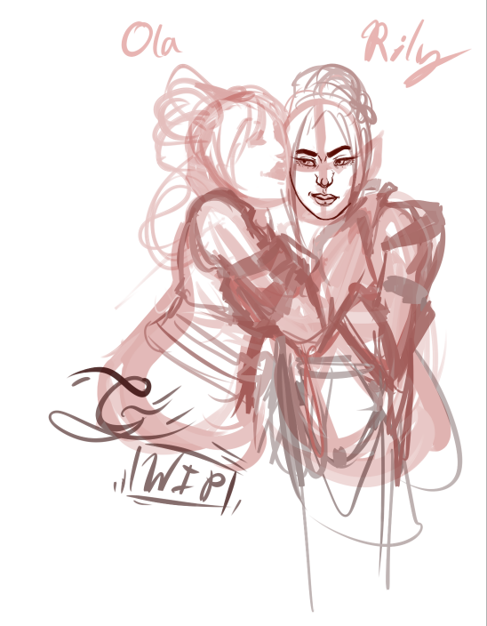
:EDIT: Also I apologize for using red on my sketches,
I forgot to change the color before I posted it. Although I am not asking for a redline, the option is still present.
If need be I can change the color or you are free to.
User avatar
geinkotsu
 
Posts: 4278
Joined: Sun Sep 05, 2010 8:33 am
My pets
My items
My wishlist
My gallery
My scenes
My dressups
Trade with me

Re: The Artist Army

Postby Bast » Thu Jul 17, 2014 11:26 am

Geinkotsu:
Well I figured they'd use bright blue or lime green to red line, it doesn't have to be red just cuz that's what it's called. lol. But thank you for everything.
What mood are you trying to give the piece? What are they feeling? It depends on that to make Ola's face, depending on what she's trying to do is the response to Rily's arm positions. Are they intimate, telling a secret, or plotting something not so nice?
Credits:
Plushie made by Cerestes
Pixel by lunamoth19
Avatar Base by BronzeHalo
~~~~~~~~~~~~~~~
Saamura is my character so
DO NOT steal her.


Prayer to the lost soul:
By the blood of our ancestors,
The breath of the present,
And the will of the future,
In the name of the holy trinity
I pray for your soul
A safe passage to Valhalla.

Image
Image
Will Trade
For PPS
Taby Cat
Ponies
<----

Image
Saamura
:-: Spawn of Hades and Ares :-:

Image
User avatar
Bast
 
Posts: 12216
Joined: Fri Jun 03, 2011 3:22 pm
My pets
My items
My wishlist
My gallery
My scenes
My dressups
Trade with me

Who is online

Users browsing this forum: No registered users and 9 guests